Healthcare Software Careers Website Template
Triage is a healthcare membership management landing page template built for benefits directors, third-party administrators, and union health fund managers. It uses a dark Data Command visual theme, a side-by-side comparison table, and real-world case study blocks to move visitors from problem awareness to a live product demo in one confident scroll.
by Rocket studio
Quick summary
Triage is a single-page, click-through landing page template for a healthcare membership management platform. It opens with a full-width product screenshot header, moves through an industry stat bar and a three-column comparison table, and closes with mini case studies and a persistent demo call-to-action. The design uses a Midnight Blue color system built to make data feel authoritative.
Who this template is for
This template is built for healthcare operations teams who need to demonstrate platform value fast and push qualified visitors toward a scheduled product demo.
- Benefits directors at mid-size hospital systems managing large open enrollment cycles
- Third-party administrators reconciling carrier feeds and eligibility files under time pressure
- Union health fund managers who need audit-ready coverage data before grievance calls
What problem this template solves
Enrollment and eligibility management is fragmented. Spreadsheets, carrier PDFs, and disconnected legacy tools create reconciliation errors, slow dispute resolution, and audit gaps that cost teams real time and money. This template frames those pain points with hard industry data, then positions the platform as the single solution.
- Visitors arrive with scattered workflows and no clear benchmark for improvement
- Legacy software comparisons are rarely shown side by side in a way that sticks
- Prospects need proof, not promises, before booking a demo with a new vendor
What you get with this template
You get a fully structured, single-page landing page designed to convert healthcare operations professionals into demo bookings. Every section is purpose-built and sequenced to escalate from problem to proof.
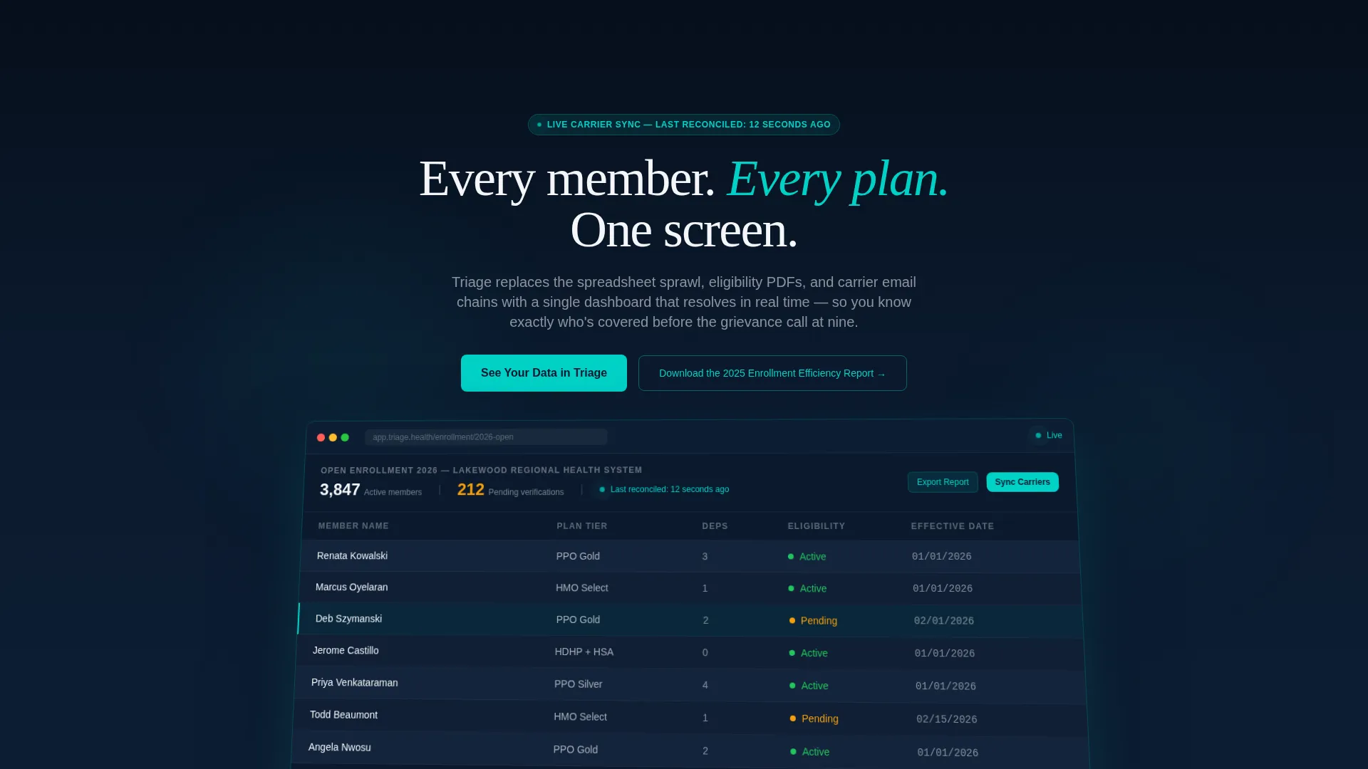
- A perspective-rotated product screenshot header with a live-data feel and headline overlay
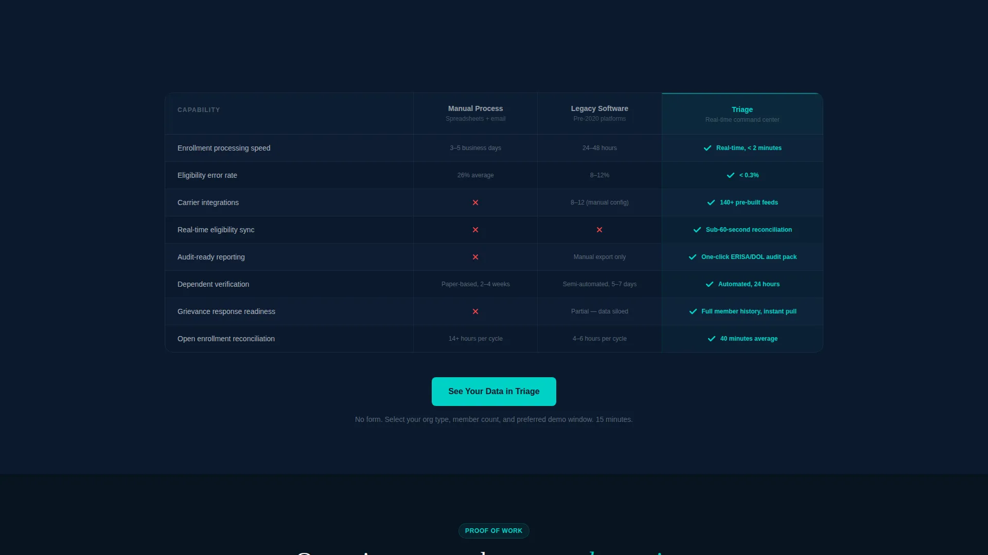
- A three-column comparison table contrasting manual processes, legacy software, and the platform across five key dimensions
- Two mini case study blocks with specific performance outcomes and a persistent primary call-to-action appearing in three locations
Feature list
This template ships with a focused set of layout components, each matched to a specific conversion moment in the visitor journey.
Stat Bar with Industry Benchmarks
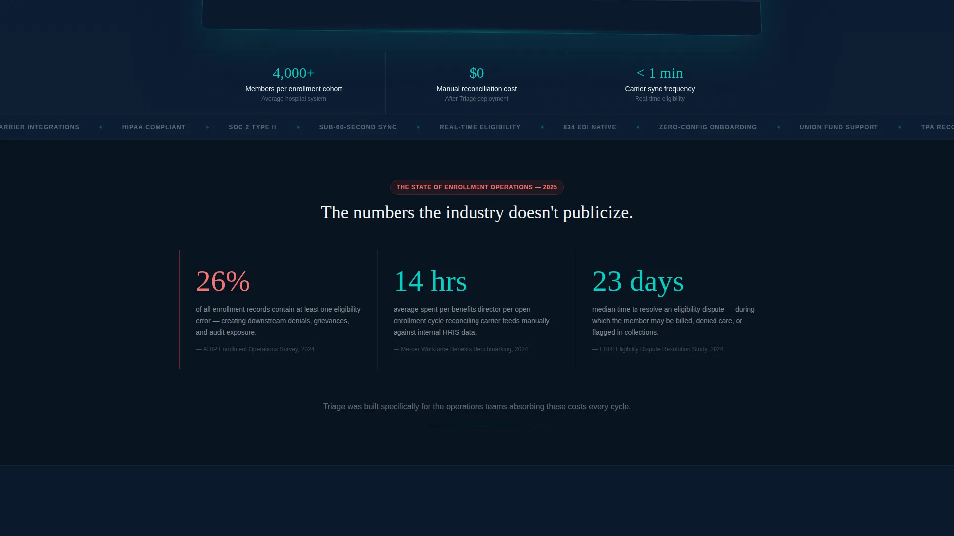
Three hard-number callouts appear directly below the header. They cover enrollment error rates, manual reconciliation hours, and average days to resolve eligibility disputes. Each stat is presented as a cited, specific data point designed to create urgency before the comparison table appears.
Three-Column Comparison Table
The comparison table runs across three columns: Manual Process, Legacy Software, and the platform. Rows compare enrollment speed, error rate, audit readiness, carrier integration count, and real-time sync capability. Teal checkmarks and metric callouts highlight platform advantages at a glance.
Mini Case Study Blocks
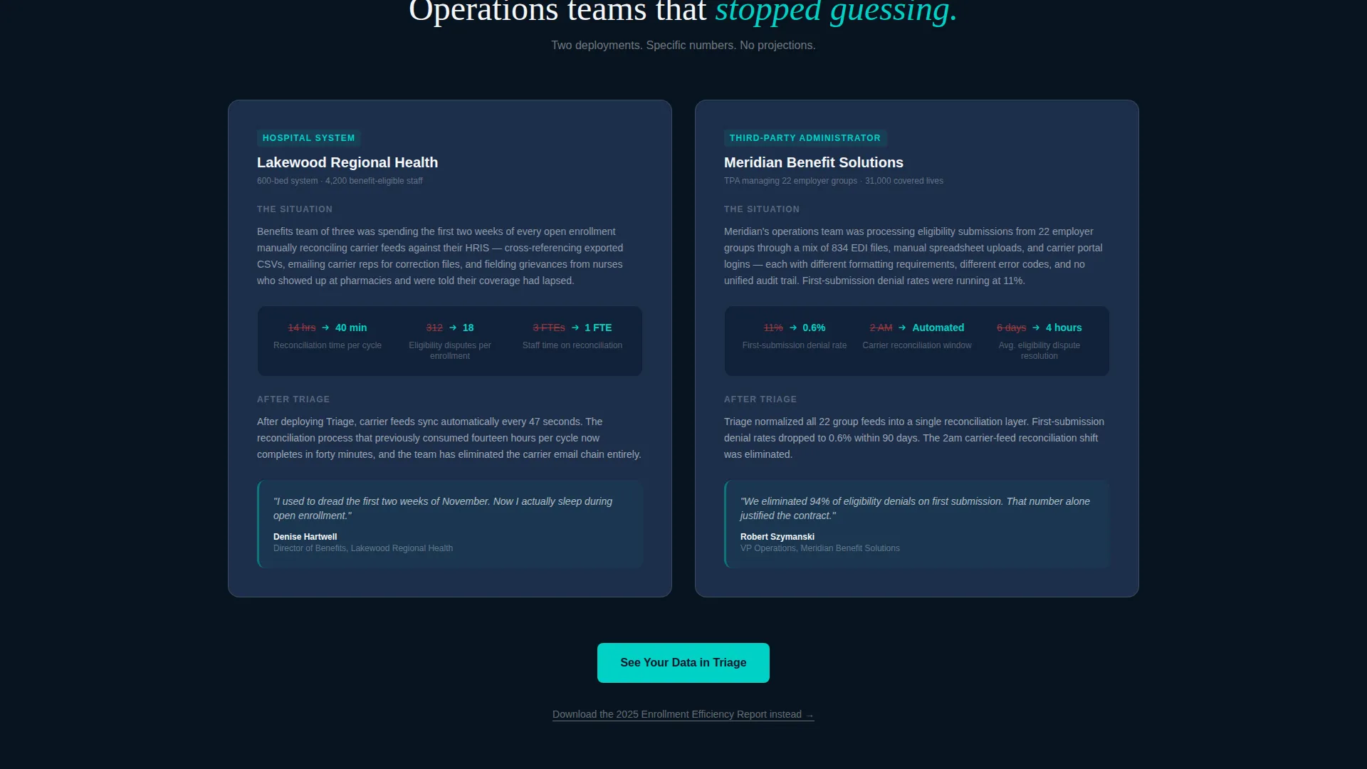
Two case study sections follow the comparison table. The first covers a 600-bed health system that reduced reconciliation time from fourteen hours to forty minutes. The second covers a third-party administrator that eliminated 94 percent of eligibility denials on first submission. Each block ties a named scenario to a specific measured outcome.
Persistent Demo Call-to-Action
The primary call-to-action reads "See Your Data in Triage" and appears in three locations: pinned in the navigation bar after the first scroll, below the comparison table, and after the final case study block. No form exists on this page. The click routes visitors to a dedicated demo scheduling page.
Secondary Lead Capture Link
A text link labeled "Download the 2024 Enrollment Efficiency Report" is placed for visitors not yet ready to book a demo. It captures email on a separate page and re-uses the same industry data presented on the landing page as the value exchange.
Product Screenshot Header
The header features a full-width dashboard screenshot mid-session, showing 3,847 active members, 212 pending verifications, and a carrier sync timestamp. The screenshot is slightly rotated on a perspective plane, floats above a midnight background, and carries a soft teal glow along its bottom edge.
Page sections overview
| Section | Purpose |
|---|---|
| Navigation Bar | Anchors persistent demo call to action after first scroll |
| Product Screenshot Header | Establishes platform credibility with live dashboard visual |
| Headline Overlay | Delivers core value statement above the screenshot |
| Industry Stat Bar | Creates urgency with three cited enrollment benchmarks |
| Comparison Table | Contrasts three approaches across five performance rows |
| Case Study Block One | Proves reconciliation time reduction at a 600-bed system |
| Case Study Block Two | Proves eligibility denial reduction for a TPA |
| Final call to action Block | Repeats primary demo button after all proof is delivered |
| Secondary Capture Link | Offers report download for visitors not ready to book |
Design & branding system
The template uses a Data Command theme built on a Midnight Blue color system. The palette feels like a command center at night: backgrounds are dark enough to make data glow, and accent colors fire only where attention is needed.
- Deep navy (#0B1A2E) dominates backgrounds and navigation; active-row slate (#1C2E4A) separates content tiers; clinical white (#F4F6F9) fills comparison table cells and card surfaces
- Status-pulse teal (#00D2C6) appears on live indicators, toggle states, primary buttons, teal checkmarks, and metric callouts inside the comparison table
Mobile & speed optimization
The template layout is structured to remain readable and functional on smaller screens, with a section-led flow that stacks clearly without losing the visual hierarchy of the comparison table or case study blocks.
- The comparison table is designed to prioritize the platform column on narrow viewports so key differentiators stay visible
- The pinned navigation call-to-action remains accessible across scroll depth on both desktop and mobile screen sizes
How this template helps you convert
The page is structured as a click-through landing page. Every section moves the visitor one step closer to clicking the demo call-to-action, with no form friction on the page itself.
- The header and stat bar establish the cost of inaction before the visitor reads a single product claim, making the comparison table feel like a relief rather than a sales pitch.
- The case study blocks replace abstract promises with specific, measurable outcomes tied to recognizable org types, so the visitor can self-identify before they click.
Other information about this template
This template is built specifically for the healthcare membership management software category, where buyer skepticism is high and demo conversion depends on establishing data credibility early. The Industry Report creative direction gives the page editorial authority that typical software landing pages lack.
- The template style is a Comparison Table layout, which works well when the platform competes against both manual workflows and legacy software in the same buying cycle
- The click-through landing page direction means no conversion happens on this page itself; all lead capture moves to downstream pages, keeping this page fast and focused
- The demo scheduling page linked from the primary call-to-action is described in the brief as collecting org type, member count range, and preferred demo window
- The secondary report download link is positioned as a parallel conversion path for mid-funnel visitors who are researching but not yet ready to commit to a demo
Theme
Data Command
Creative direction
Industry Report
Color system
Midnight Blue
Style
Comparison Table
Direction
Click-Through
Page Sections
Three-column Comparison Table
Persistent Demo Call-to-action
Product Screenshot Header
Industry Stat Bar
Mini Case Study Blocks
Secondary Lead Capture Link
Related questions
Who is this landing page template designed for?
Does this template include a contact form or lead capture form?
Can I adapt the comparison table rows for different platform features?
How does the page handle visitors who are not ready to book a demo?
What makes the Midnight Blue color system a good fit for healthcare software?



