AI for Senior Care Complete Professional Website Template
Triage is a bold brutalist landing page template built for a senior care AI recommendation engine. It opens with a live-terminal code snippet, escalates through hard comparison data, and drives visitors toward an app download. The design is confrontational and clear, using void black, phosphor green, and warning magenta to make a complex placement problem feel immediately solvable.
by Rocket studio
Quick summary
Triage is a single-page, data-forward landing page template for an AI-powered senior care recommendation engine. It opens with a live terminal header, walks visitors through stark national statistics, and delivers brutalist comparison tables that prove algorithmic superiority over traditional placement methods. Every design decision pushes toward one action: downloading the app and running a first match.
Who this template is for
This template is built for teams launching or marketing an AI-driven senior care placement tool. It speaks directly to high-urgency audiences who need answers fast and do not have time for soft selling.
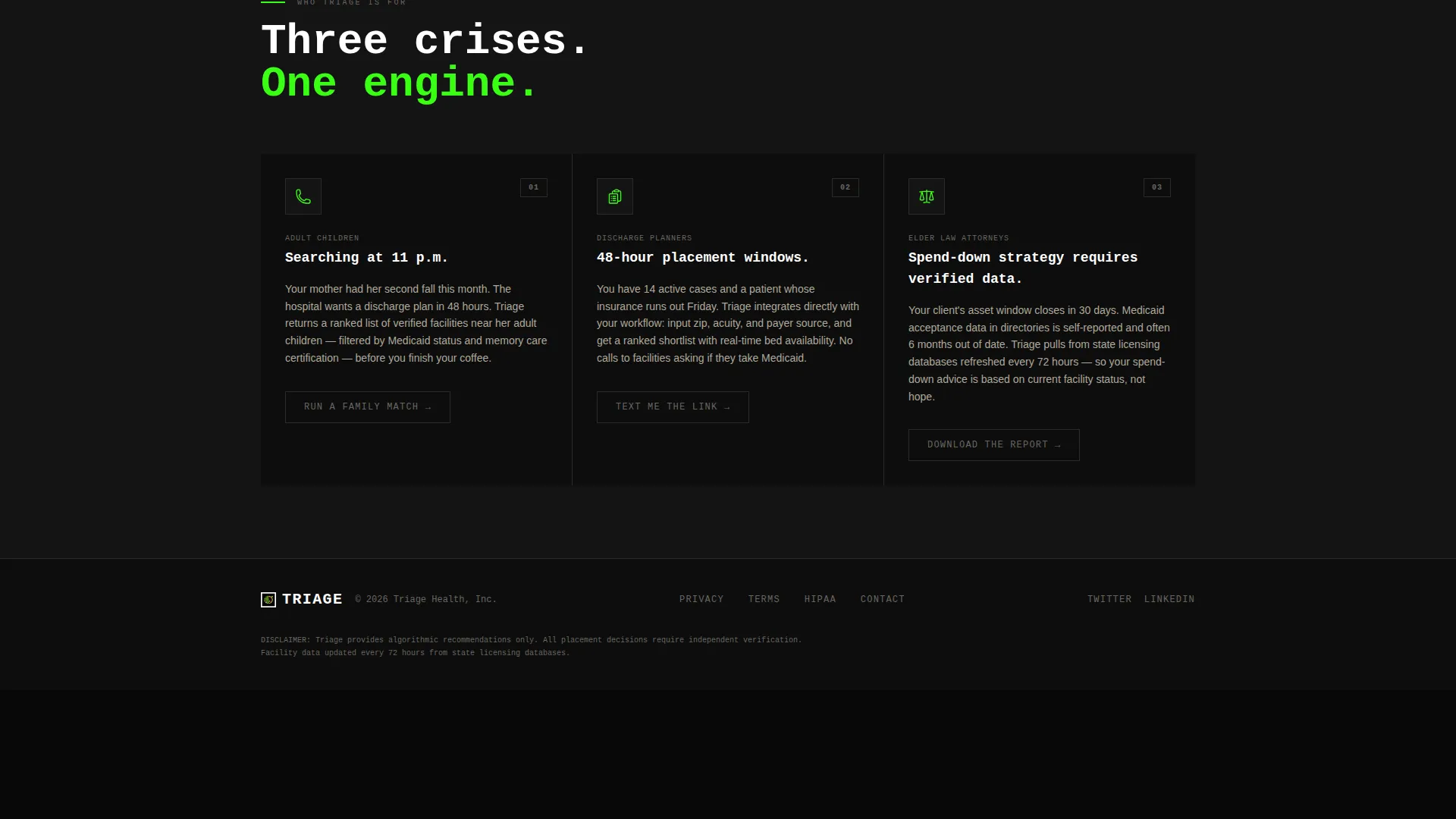
- Adult family members searching for care options during an acute crisis
- Hospital discharge planners working against a tight placement deadline
- Elder law attorneys guiding clients through care cost and spend-down decisions
What problem this template solves
Finding the right senior care facility is slow, opaque, and costly when done without structured data. Families and professionals cycling through directories or referral agencies face delays, mismatches, and expensive corrections.
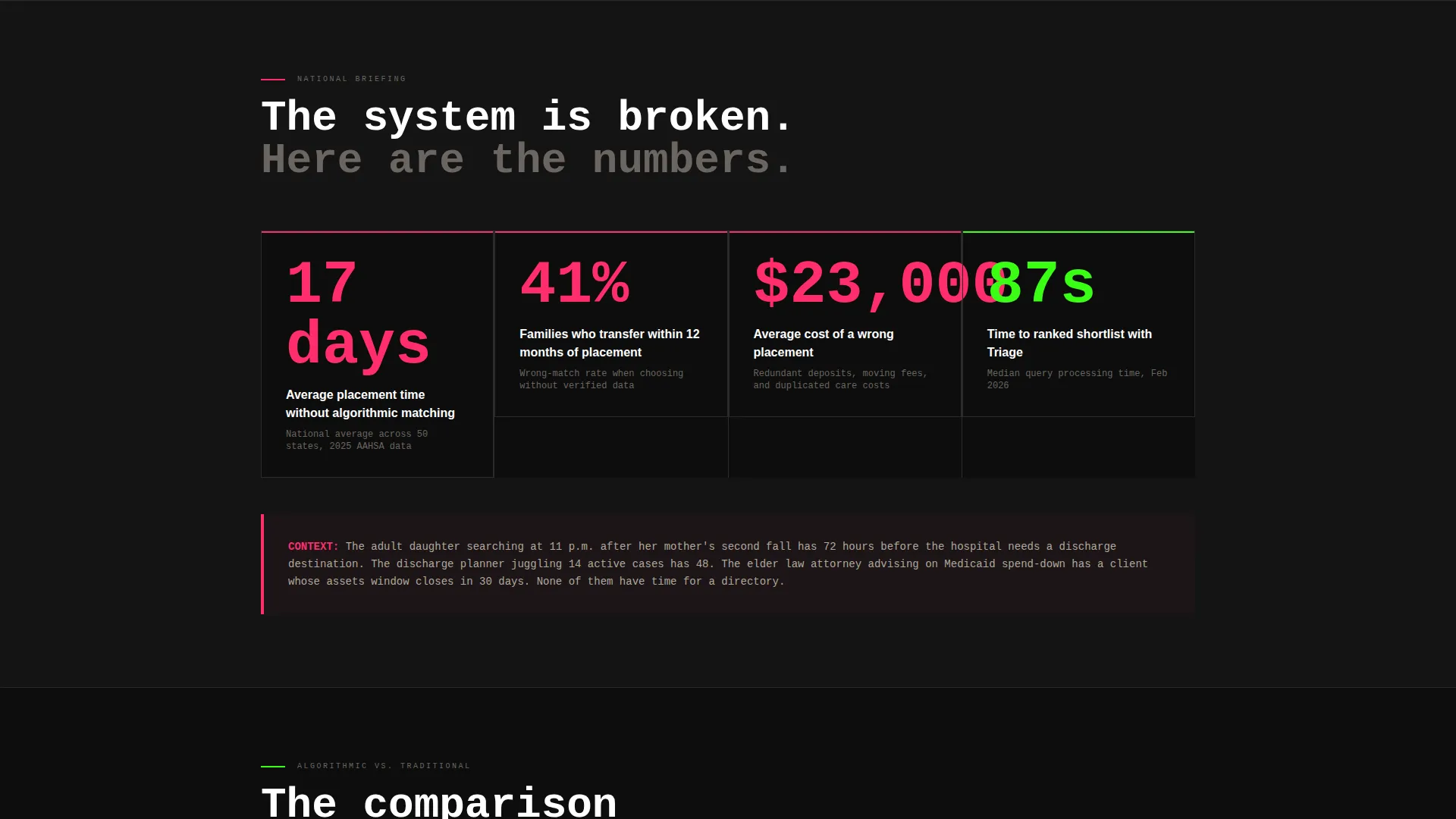
- Average placement time runs 17 days without a data-driven tool
- 41 percent of families who choose without data transfer their loved one within 12 months
- Wrong placements cost an average of $23,000 in redundant deposits and moves
What you get with this template
You get a fully structured landing page that leads with proof and closes with action. Every section is designed to move a skeptical, time-pressed visitor from awareness to download without friction.
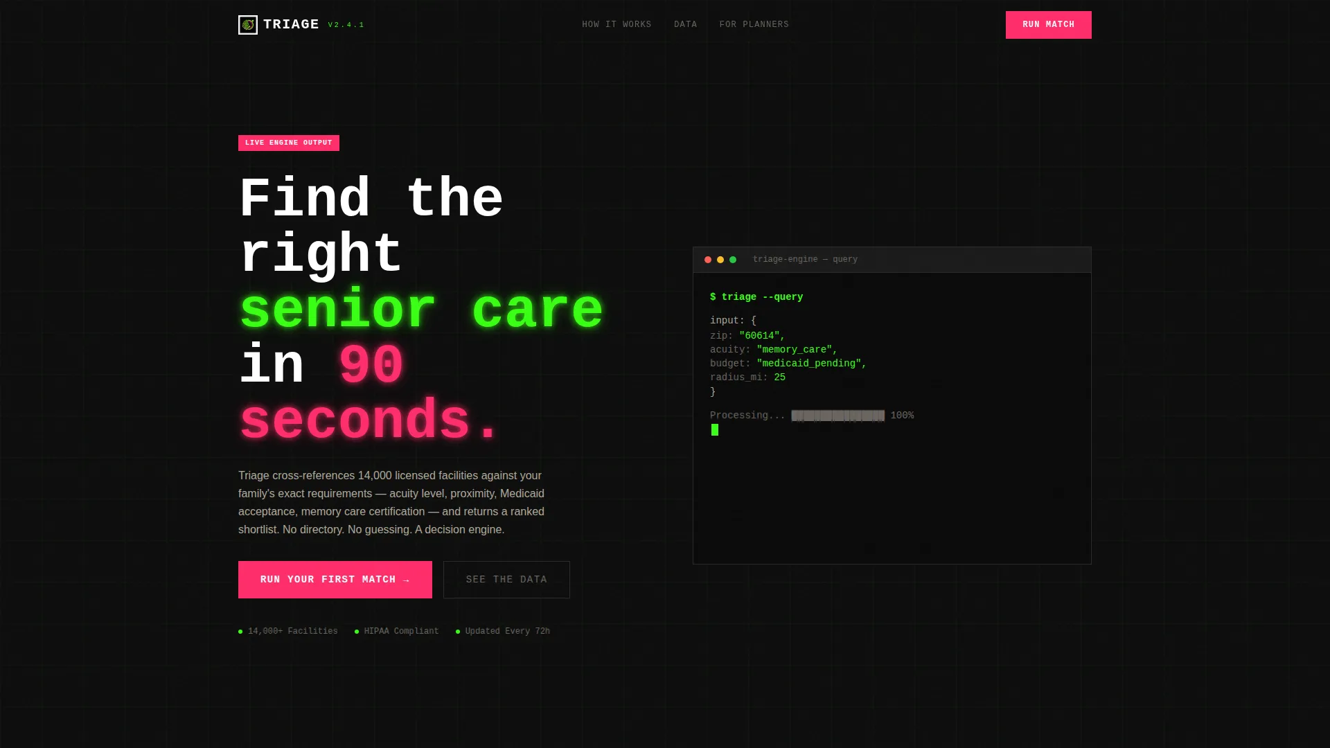
- A viewport-filling terminal header showing a live query and streaming JSON response
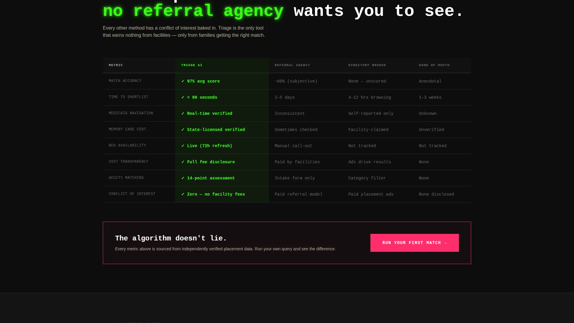
- Brutalist comparison tables pitting AI results against referral agencies, directories, and word-of-mouth
- A two-step app download flow with a secondary "Text Me the Link" path for desktop users
Feature list
This template is built around a tight set of high-impact components, each serving a specific role in the visitor's decision journey.
Terminal Viewport Header
The header fills the full viewport with a monospaced code block styled as a live terminal window. It shows a real query being processed, including zip code, acuity level, budget status, and radius, followed by a streaming JSON response with facility names, match percentages, and bed availability. There is no stock photography. The code itself communicates the product's value instantly.
National Statistics Briefing
A data briefing section immediately follows the header. It presents three hard statistics: 17-day average placement time, a 41 percent wrong-placement transfer rate, and $23,000 in average redundant costs. These figures establish urgency and frame the AI tool as the rational alternative to traditional methods.
Brutalist Comparison Tables
Multiple stark comparison grids pit the AI engine against referral agencies, directory browsing, and word-of-mouth recommendations. Each table scores methods across match accuracy, time to placement, cost transparency, and Medicaid navigation. Winning cells are highlighted in phosphor green on a void black background, making superiority immediately readable.
Two-Step App Download Flow
The primary call to action reads "Run Your First Match" in warning magenta on black. Tapping it opens a two-step flow: Step 1 collects zip code and care type; Step 2 routes to the App Store or Google Play with a deep link that pre-loads the query. The first results screen appears immediately after install.
Sticky Mobile Call to Action
The primary call-to-action button is pinned to the bottom of the viewport on mobile. This ensures the download prompt is always within reach as visitors scroll through the comparison data and statistics sections.
Secondary Desktop Path
Discharge planners working from a desktop have a dedicated secondary path. A single phone number field lets them request a text link, removing any friction between interest and install for users who are not on a mobile device.
Page sections overview
| Section | Purpose |
|---|---|
| Terminal Header | Demonstrate the AI query and streaming results in real time |
| National Stats Briefing | Establish urgency with hard placement cost and error data |
| First Comparison Table | Prove AI superiority over referral agencies across four metrics |
| Primary call to action Block | Drive the first app download after comparison proof |
| Extended Comparison Tables | Score AI against directories and word-of-mouth methods |
| App Download Flow | Capture zip and care type, then route to App Store or Google Play |
| Desktop Secondary Path | Offer a text-link option for discharge planners on desktop |
Design & branding system
The visual identity follows a bold brutalist theme built on an Acid Digital color system. Every color has a strict functional role, preventing decorative drift and keeping the page readable under high contrast.
- Void black (#0D0D0D) dominates all backgrounds, creating maximum contrast and focus
- Terminal phosphor green (#39FF14) is reserved for data outputs, match scores, and active interface states
- Warning magenta (#FF2D6B) marks alerts, urgency badges, and all primary call-to-action elements
- Raw concrete (#B0A999) carries body text and divider lines to reduce pure contrast fatigue
Mobile & speed optimization
The template is structured for high-priority mobile use cases. Many of the target users, particularly family members and discharge planners, will arrive on a phone under time pressure.
- The sticky bottom call-to-action keeps the download prompt visible at all times during scroll
- The two-step app flow is designed for minimal taps, collecting only zip code and care type before routing
- The deep-link integration pre-loads the query so results appear immediately after the app installs
How this template helps you convert
This template earns the download before it ever asks for one. Conversion is built into the content sequence, not layered on top of it.
- The terminal header removes all ambiguity about what the product does within the first three seconds of the visit
- The national statistics and comparison tables build a data-backed case that makes the app feel necessary rather than optional
- The two-step flow and sticky call-to-action remove every possible friction point between conviction and install
Other information about this template
This template is designed for use in the senior care AI recommendation engine category, sitting at the intersection of technology and high-stakes family decision-making. It is a strong fit for teams building or relaunching products in the AI for senior care space.
- The template style is a comparison table layout, giving it structural credibility as an industry report
- The creative direction is intentionally clinical and urgent, matching the emotional reality of the target audience
- It works equally well as a standalone launch page or as a campaign-specific destination for paid traffic
- The header concept, a live code snippet, signals immediately to technically sophisticated users such as discharge planners and attorneys that this is a data product, not a consumer directory
Theme
Bold Brutalist
Creative direction
Industry Report
Color system
Acid Digital
Style
Comparison Table
Direction
App Download
Page Sections
Terminal Viewport Header Block
Urgency Statistics Briefing
Brutalist Comparison Grid
Two-step App Download Flow
Sticky Mobile Call to Action Button
Desktop Text-link Path
Related questions
Who is this landing page template designed for?
Can I use this template without a development background?
What makes the comparison table layout effective for this use case?
Does the template support both App Store and Google Play downloads?
What is the purpose of the 'Text Me the Link' option?



