Triage - Powerful Veterinary ERP Landing Page Template
Triage is a veterinary ERP landing page template built for cloud platforms that unify appointment scheduling, pharmacy inventory, lab integrations, and billing across multi-location animal hospitals. The Data Command design uses an AI Iridescent color system with a Problem-to-Solution comparison layout, Feature Tab Switcher header, and two conversion paths that guide practice managers, CFOs, and associate veterinarians toward a qualified demo or feature matrix download.
by Rocket studio
Quick summary
Triage is a single-page comparison landing page template for a veterinary enterprise resource planning platform. It connects appointment books, pharmacy shelves, lab integrations, and billing ledgers into one interface for multi-location animal hospitals. The layout follows a Problem-to-Solution arc and converts visitors through a two-path system built around a live qualifier form and a gated feature matrix download.
Who this template is for
This template is designed for veterinary software companies and SaaS founders marketing an all-in-one cloud platform to clinical operations teams. It speaks directly to the people who feel the daily cost of disconnected systems.
- Practice managers running three legacy systems that do not communicate with each other
- Veterinary group CFOs reconciling revenue across multiple clinic locations by hand
- Associate DVMs losing time every consult toggling between patient records and diagnostic dashboards
What problem this template solves
Veterinary practices operating across multiple locations struggle to present a unified view of their operations to potential platform buyers. A generic product page fails to show the real cost of fragmented workflows. This template closes that gap by making the visitor see their own broken process before they ever read a feature list.
- It replaces abstract feature claims with a side-by-side "Without versus. With" comparison that maps directly to daily pain points
- It escalates stakes from routine annoyances to quarterly financial loss as the visitor scrolls
- It captures intent through a short qualifier form rather than a cold contact request
What you get with this template
The template delivers a complete, single-page conversion layout built for a veterinary ERP platform. Every section is purposefully sequenced to move a skeptical clinic operator from recognition of pain to readiness to act.
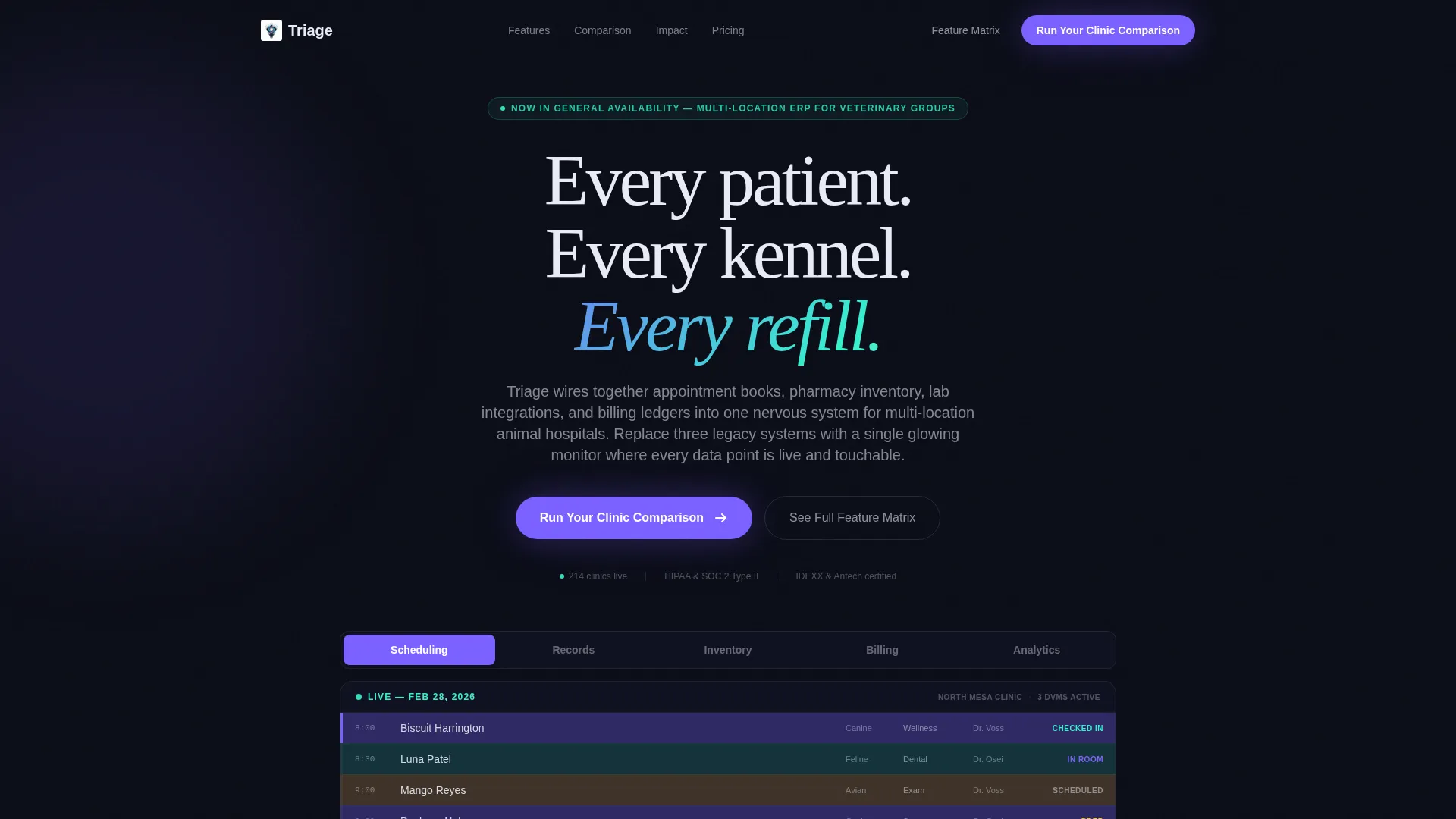
- A Feature Tab Switcher header with five interactive tabs showing real veterinary data mockups for Scheduling, Records, Inventory, Billing, and Analytics
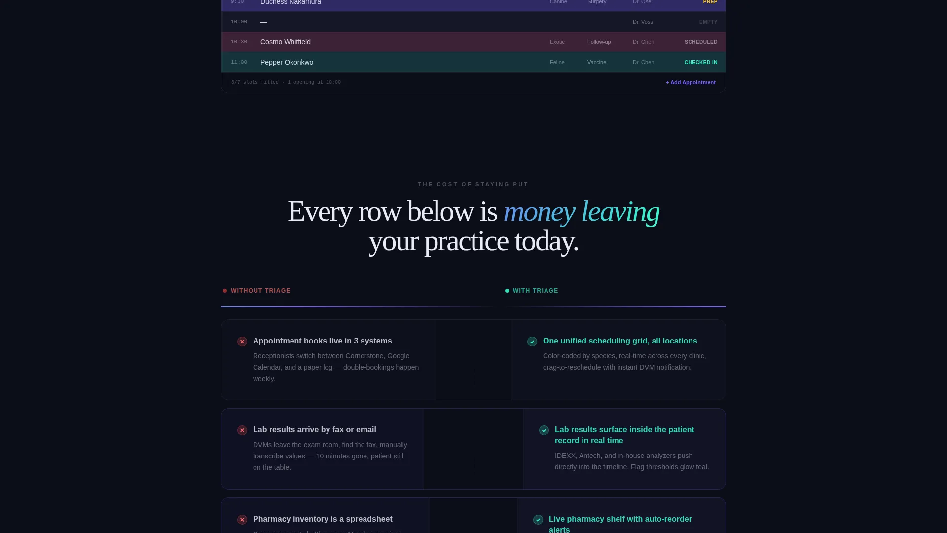
- A full Problem-to-Solution comparison arc with stacking rows that highlight time saved, errors eliminated, and revenue recovered
- Two conversion paths: a primary "Run Your Clinic Comparison" qualifier form and a secondary gated feature matrix PDF download
Feature list
This template is built around five purpose-driven components. Each one earns its place in the conversion flow.
Feature Tab Switcher Header
Five clickable tabs labeled Scheduling, Records, Inventory, Billing, and Analytics each trigger a contained user interface mockup that slides into frame. Each mockup uses real veterinary data: a species-coded appointment grid, a patient timeline with vaccine history and weight curves, a pharmacy shelf with reorder-point alerts, a split invoice view, and a revenue heatmap by location. The active tab glows in holographic violet while inactive tabs sit in muted pearl white.
Problem-to-Solution Comparison Arc
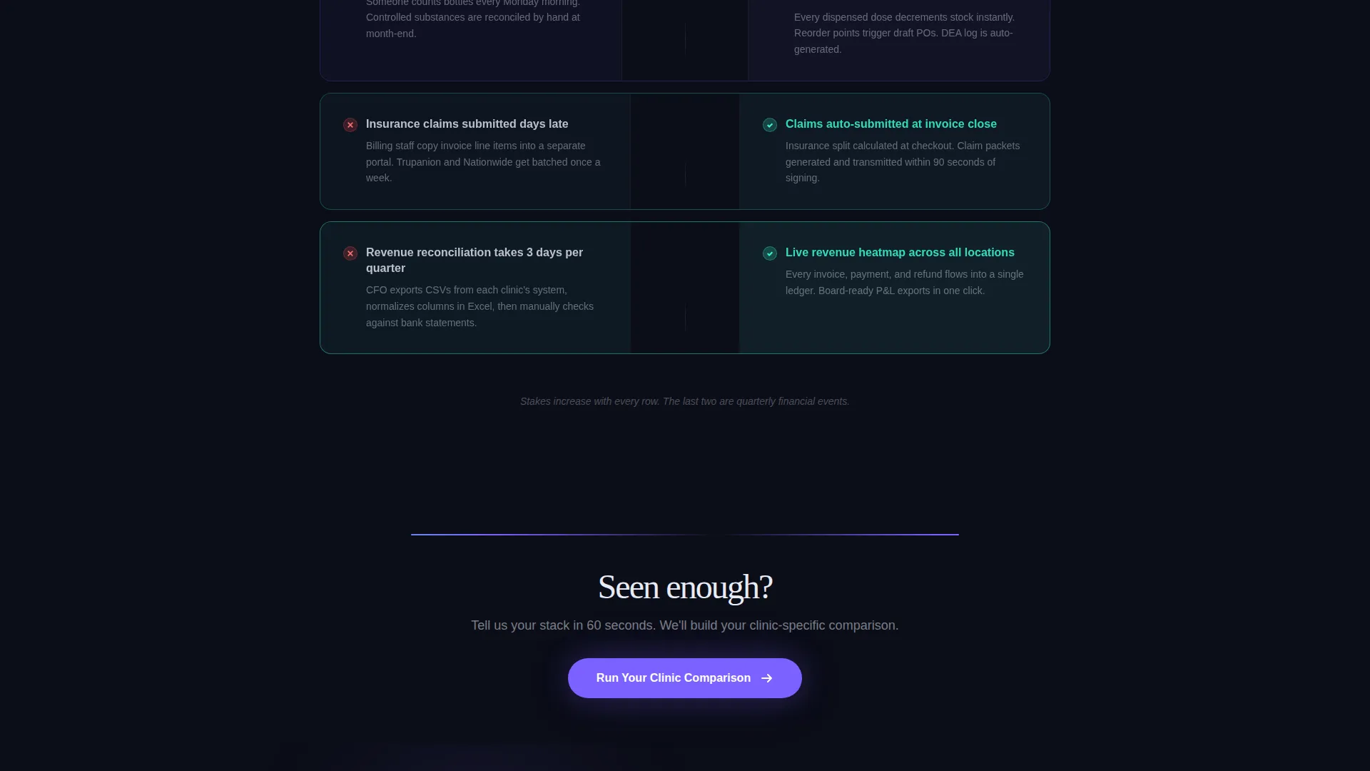
The page opens with a "Without Triage" column showing spreadsheet chaos, manual inventory counts, and handwritten lab requests. A pulsing iridescent divider line separates it from the "With Triage" column, where each pain point is answered by a live-data card. Comparison rows stack on scroll and auto-highlight the delta between the two states, tightening the argument as financial stakes rise.
Qualifier Conversion Form
The primary call to action, "Run Your Clinic Comparison," opens a short qualifier. It asks for number of locations using a simple selector (1, 2 to 5, or 6 and above), a dropdown of known competitor platform names, and a single free-text field for the visitor's biggest daily frustration. The form is placed at the header and repeated after the final comparison row.
Gated Feature Matrix Download
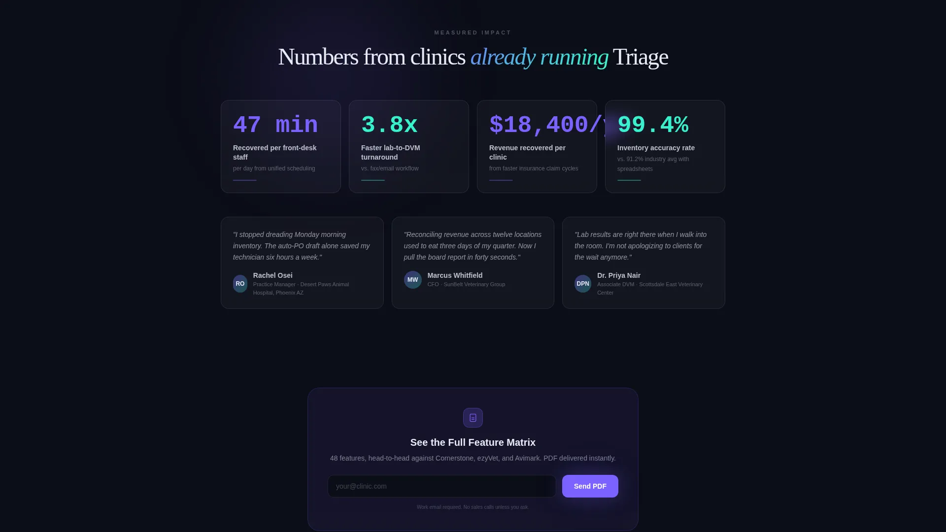
A secondary conversion path offers "See the Full Feature Matrix" as a downloadable PDF. Access is gated by a work email input only, keeping the barrier low while capturing a qualified lead. This path serves visitors who prefer detailed evaluation before committing to a demo or comparison.
Data Command Visual System
The interface is built on a void black background with holographic violet marking primary actions and active states. Spectral teal pulses on live-data indicators and confirmation states. Pearl white lifts comparison rows and modal surfaces so they appear to float above the dark background. Every element is product-focused with no stock photography anywhere on the page.
Page sections overview
| Section | Purpose |
|---|---|
| Tab Switcher Header | Showcases five platform modules through interactive user interface mockups |
| Without Triage Column | Illustrates fragmented workflow pain points with visual evidence |
| Iridescent Divider Line | Marks the visual and emotional transition from problem to solution |
| With Triage Column | Answers each pain point with a live-data card counterpart |
| Comparison Row Stack | Highlights measurable deltas on time, errors, and revenue per row |
| Primary call to action Block | Triggers the "Run Your Clinic Comparison" qualifier form |
| Feature Matrix Gate | Captures work email for PDF feature matrix download |
Design & branding system
The visual identity follows a Data Command theme using an AI Iridescent color system. The palette is designed to feel clinical and precise while carrying an unexpected luminous quality, like a prism resting on a surgical steel surface.
- Core colors: deep void black (#0B0D17) for backgrounds, holographic violet (#7B61FF) for primary actions and active tab states, spectral teal (#36F1CD) for live-data indicators and success states, and shifting pearl white (#E8EAF6) for comparison rows and modal card surfaces
- No stock photography is used anywhere; every visual element is a product user interface mockup built with real veterinary data scenarios
- Violet marks active states and primary calls to action; teal pulses on real-time data points and confirmation moments throughout the scroll
Mobile & speed optimization
The template layout is built for a single-page scroll flow, which keeps the structure lightweight and easy to adapt for smaller screens. Each section is self-contained and stacks naturally in a vertical reading order.
- The tab switcher header transitions cleanly to a touch-friendly tab selector on smaller viewports, keeping each user interface mockup fully visible without horizontal scroll
- Comparison rows are designed as contained card units, so they reflow to a single-column stacked layout on mobile without losing the side-by-side contrast logic
- Modal surfaces and the qualifier form are sized to fit smaller screens so the two conversion paths remain reachable without zooming or excessive scrolling
How this template helps you convert
The conversion strategy is built into the page architecture itself. Visitors are not asked to take action before they understand the cost of inaction.
- The Problem-to-Solution arc earns trust by reflecting the visitor's real daily workflow in the "Without" column before ever presenting a feature or a form, making the case for change feel personal rather than promotional.
- The primary "Run Your Clinic Comparison" call to action is framed as a diagnostic tool, not a sales form, which lowers resistance and qualifies intent at the same time by capturing location count, current platform, and top frustration in three short fields.
- The secondary gated feature matrix offers a low-commitment alternative for evaluators who need detailed information first, creating a second lead-capture path that serves a different buyer stage without competing with the primary conversion goal.
Other information about this template
This template is built specifically for the veterinary ERP and veterinary software SaaS market. It is a strong fit for platforms positioning against legacy practice management systems and fragmented point solutions used by independent clinics and multi-location hospital groups.
- The template style is a Comparison Table layout, which is well suited for competitive positioning pages where the buyer already uses an existing system
- The creative direction follows a Problem-to-Solution Arc, a format that works particularly well for high-consideration B2B software where the buyer needs to justify switching costs internally
- The header concept, a Feature Tab Switcher, is designed to communicate platform depth without overwhelming the visitor with a long feature list on first scroll
- The landing page direction is Comparison/Versus, making it effective for campaigns targeting users of specific competing veterinary practice management platforms
- This template can support customization for practices of any size, from a single-location clinic to a group operating twelve or more hospital locations
Theme
Data Command
Creative direction
Problem→Solution Arc
Color system
AI Iridescent
Style
Comparison Table
Direction
Comparison/Versus
Page Sections
Feature Tab Switcher Header
Problem-to-solution Comparison Arc
Two-path Conversion System
Data Command Visual System
Vertical Scroll Comparison Rows
Related questions
Can I customize the competitor names in the qualifier form dropdown?
Does the template include the actual data shown in the user interface mockups?
Is this template suitable for a single-location veterinary clinic platform?
How does the gated PDF download work within the template?
Can the comparison rows be edited to reflect different pain points?



