Local Dental Software Comparison Website Template
Triage is a hub-and-spoke dental case management landing page template built for the Comparison/Versus conversion goal. It routes dental cases from chairside scan to lab delivery, tracking every approval, revision, and material spec along the way. The Feature Matrix layout, Dynamic Motion animations, and Monochrome Steel palette make a clear, confident case against paper-based and legacy workflows.
by Rocket studio
Quick summary
Triage is a single-page dental case management landing page template built around a hub-and-spoke anchor navigation structure. It serves multi-location dental service organizations, solo practitioners, and lab owners who need a faster, cleaner way to route and track cases. The Feature Matrix layout builds a column-by-column verdict in favor of a modern, connected workflow.
Who this template is for
This template is designed for dental operations professionals who manage high case volumes across multiple parties. It speaks directly to people who feel the daily cost of slow, disconnected case workflows.
- Multi-location dental service organization operations managers coordinating dozens of labs and providers
- Solo practitioners buried in paper prescription forms and manual follow-ups
- Lab owners losing revenue when cases sit unread in an inbox for days at a time
What problem this template solves
Dental case workflows break down in the gaps between the chair, the lab, and the patient. Approvals get missed, material specs change without notice, and nobody knows where a case actually stands. This template gives practices and labs a single place to present the solution clearly.
- Cases move through crowns, implants, ortho alignments, and full-mouth rehabs without a reliable tracking system
- Revision requests and approval sign-offs get lost between providers and lab technicians
- Revenue stalls when labs and clinics use incompatible or outdated tools that cannot communicate in real time
What you get with this template
You get a complete, ready-to-customize landing page that presents a dental case management platform with authority and clarity. Every section is built to move a skeptical buyer from recognition of pain to request for a demo.
- A hub-and-spoke anchor navigation with five spoke sections: Routing, Tracking, Approvals, Lab Connect, and Analytics
- A Feature Matrix layout with animated comparison grids that pit the platform against paper-based and legacy alternatives
- A primary call-to-action bar pinned to each spoke section and a secondary diagnostic form that generates a personalized inefficiency estimate before the demo booking screen
Feature list
This section covers the core structural and interactive capabilities built into the Triage landing page template.
Anchor Navigation Hub
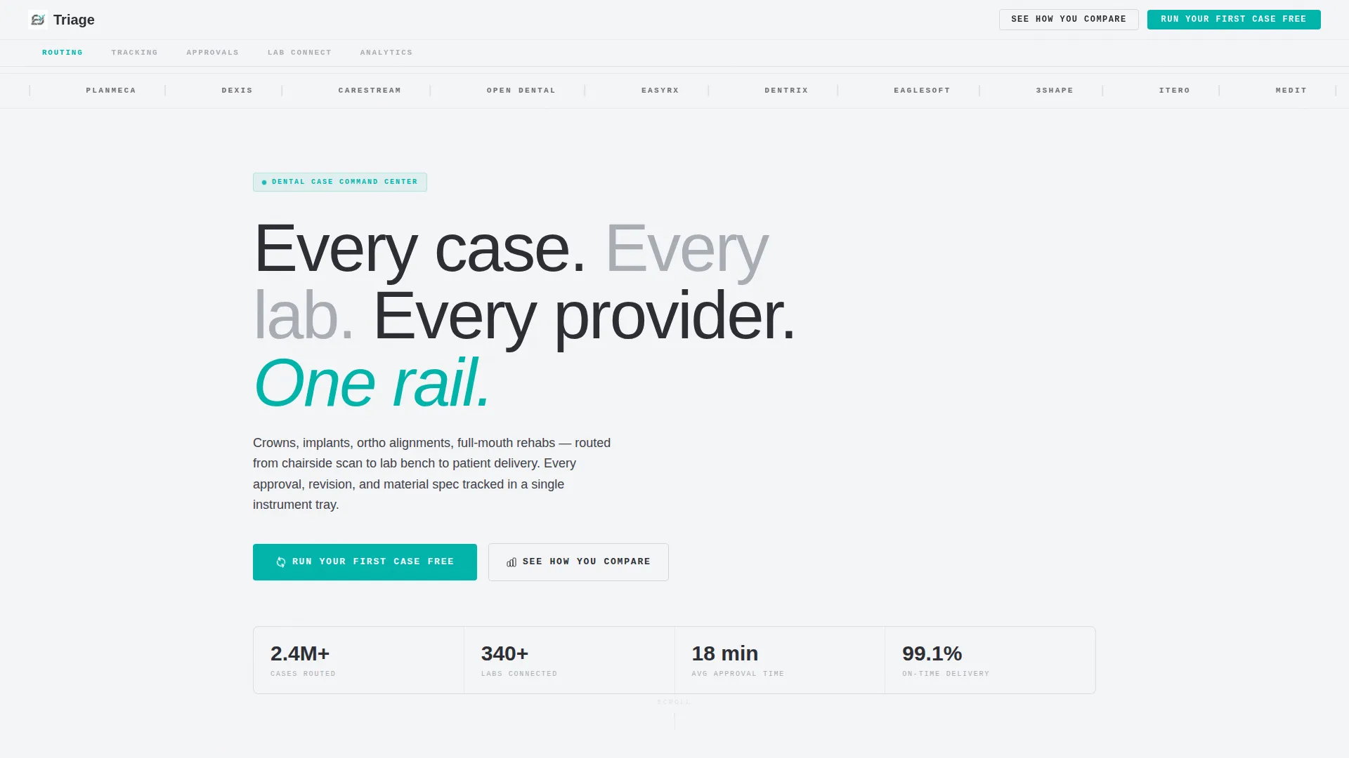
A fixed horizontal spoke menu sits below the header. Each label (Routing, Tracking, Approvals, Lab Connect, Analytics) is a jump link that drops the reader directly into the relevant comparison section. Navigation stays visible as the reader scrolls, so moving between sections is always one click away.
Animated Feature Matrix
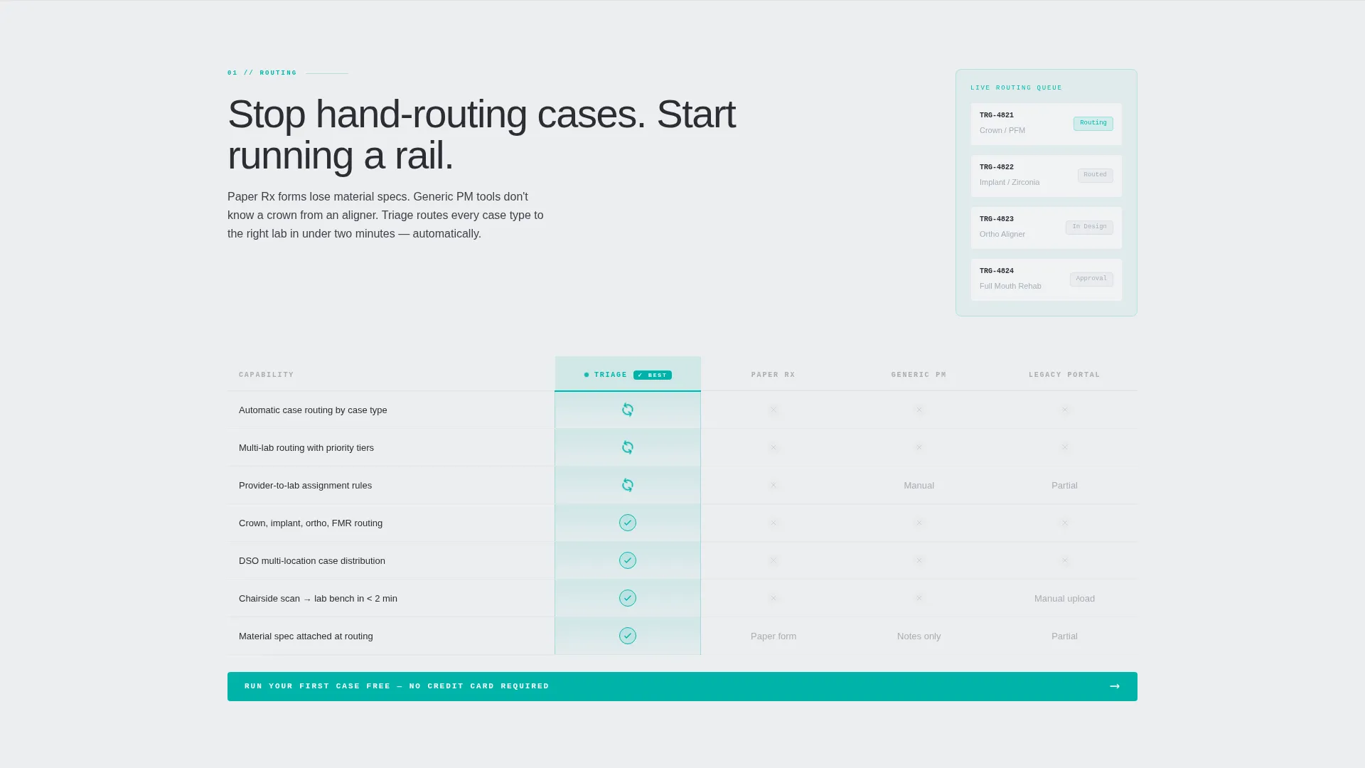
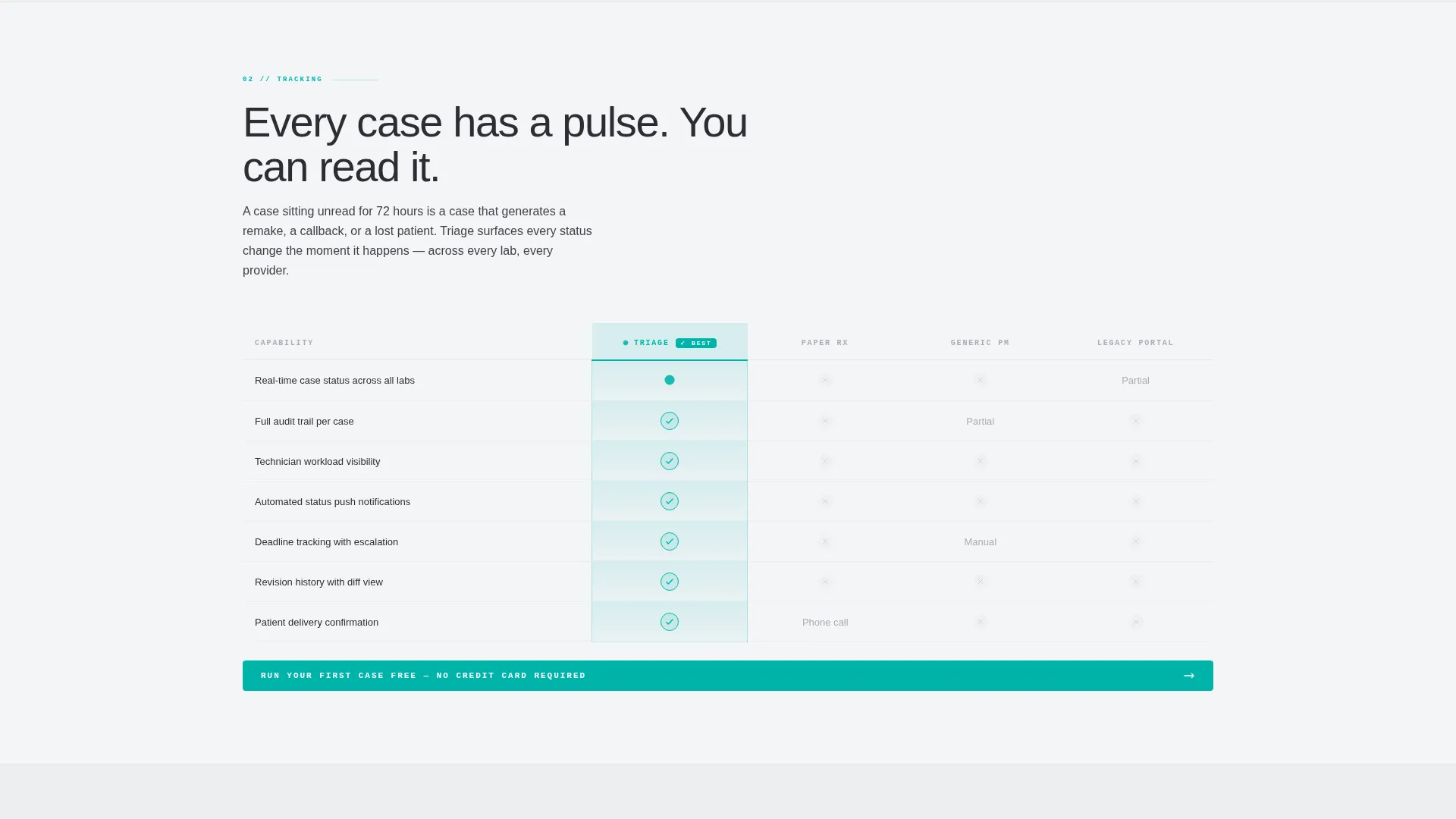
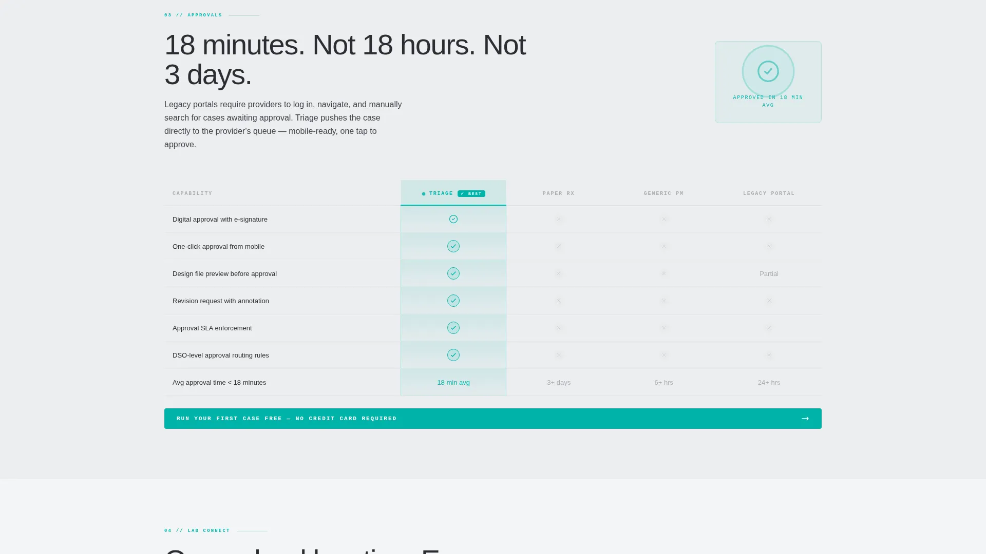
Each spoke section is a structured comparison grid. Rows animate in on scroll, checkmarks pulse teal on entry, and the platform's column glows with teal fills and micro-animated icons. Competitor columns labeled "Paper Rx," "Generic PM Tool," and "Legacy Lab Portal" stay in muted charcoal, making the contrast immediate and visual.
Logo Bar Header
A continuous horizontal scroll belt displays integration partner logos across the full viewport width. Each logo renders in monochrome steel by default and turns clinical teal on hover. A single headline above the belt anchors the brand message before the reader reaches the navigation.
Pinned Call-to-Action Bar
A slim teal bar reading "Run Your First Case Free" pins to the bottom of every spoke section. The reader never has to scroll back to find the primary action. Placement at each section ensures the invitation is always visible at the moment of decision.
Diagnostic Form Path
A secondary call-to-action labeled "See How You Compare" opens a short form. The reader inputs provider count, lab count, monthly case volume, and their biggest bottleneck from a dropdown. Completing the form generates a personalized inefficiency estimate before the demo booking screen appears.
Scroll-Driven Motion System
The Dynamic Motion theme governs the entire page. Rows animate in as they enter the viewport. Icons use targeted micro-animations: a spinning routing arrow, a pulsing tracking dot, and a stamp animation for approvals. Motion is purposeful and tied to content meaning, not decorative.
Page sections overview
| Section | Purpose |
|---|---|
| Logo Bar Header | Establishes integration credibility and sets the brand tone above the fold |
| Anchor Navigation Bar | Lets readers jump to any spoke section instantly from any scroll position |
| Routing Comparison Grid | Contrasts case routing capabilities against paper and legacy alternatives |
| Tracking Comparison Grid | Shows real-time case status tracking versus manual follow-up methods |
| Approvals Comparison Grid | Highlights digital approval workflows against email and phone sign-offs |
| Lab Connect Grid | Compares lab communication features with generic project management tools |
| Analytics Comparison Grid | Presents case volume and bottleneck data against tools with no reporting |
| Diagnostic Form Module | Captures provider and lab data to produce a personalized inefficiency estimate |
| Demo Booking Screen | Converts the diagnostic result into a scheduled demo request |
| Pinned call to action Bar | Reinforces the primary action at the base of every spoke section |
Design & branding system
The visual identity runs on a Monochrome Steel color system. The palette was designed to feel like a freshly sterilized instrument cassette under operating room lights: precise, clean, and completely functional.
- Four-color system: surgical-instrument charcoal (#2B2D33) for structure, autoclave stainless (#A8ADB5) for supporting text and borders, operatory white (#F4F5F7) for backgrounds, and clinical teal (#00B4AA) reserved exclusively for active states, toggle highlights, and all call-to-action surfaces
- Typography uses a medium-weight grotesque typeface set at a scale that reads comfortably on both desktop monitors and smaller screens
- The Dynamic Motion theme governs all scroll-triggered animations, keeping motion tied to content entry rather than running as background decoration
Mobile & speed optimization
The template is built to maintain its structured grid layout and scroll-triggered animations across screen sizes. The hub-and-spoke navigation adapts so anchor links remain usable on touch devices.
- The fixed anchor nav bar collapses gracefully on smaller viewports so it does not consume excessive screen real estate
- The Feature Matrix grids reflow to prioritize the platform's column on mobile, keeping the comparison readable without horizontal scrolling
- Logo belt, pinned call to action bar, and diagnostic form module are all designed to function on touch screens without layout breakage
How this template helps you convert
The entire page is structured around a Comparison/Versus conversion model. Every design and copy decision is made to move a cautious buyer from doubt to action.
- The Feature Matrix builds a visible, column-by-column evidence case. By the time the reader reaches the bottom of each spoke section, the weight of comparison has already done the persuasion work.
- The diagnostic form earns the click by quantifying the reader's specific pain before showing a demo option. A personalized inefficiency estimate makes the cost of inaction concrete and personal, not hypothetical.
Other information about this template
This template is categorized under Technology and Dental Software, with a niche focus on dental case management. It is well suited to any brand building in the dental practice operations or dental lab software space.
- The template style is Hub and Spoke with Anchor Navigation, making it easy to scale spoke sections as platform features grow
- The header integration logo belt is pre-configured to accommodate logos from practice management and intraoral scanning systems commonly used in dental offices
- The Comparison/Versus landing page direction makes this template a strong fit for product launches targeting buyers who are actively evaluating alternatives or migrating from paper-based systems
- The template theme is Dynamic Motion, which means all scroll animations are part of the template structure and do not require separate plugin setup
Theme
Dynamic Motion
Creative direction
Feature Matrix
Color system
Monochrome Steel
Style
Hub & Spoke (Anchor Nav)
Direction
Comparison/Versus
Page Sections
Hub-and-spoke Anchor Navigation
Scroll-animated Feature Matrix
Integration Logo Scroll Belt
Pinned Primary Call to Action Bar
Personalized Diagnostic Form
Dynamic Motion Animation System
Related questions
Who is the primary audience for this template?
Can I customize the spoke sections for different platform features?
What makes the diagnostic form different from a standard contact form?
Does the pinned call-to-action bar appear throughout the entire page?
Is this template suited for a new product launch or an established platform?



