Healthcare Digital Presence Booking Website Template
Triage is a healthcare scheduling landing page template built for medical groups, solo practitioners, and hospital networks. It pairs a real-time availability display with an interactive comparison table, motion-driven product demos, and a direct app-download call to action. Visitors explore plan tiers, drag and reschedule patient cards, and reach the download prompt already familiar with the product.
by Rocket studio
Quick summary
Triage is a single-page scheduling template designed for healthcare providers who need to turn online visitors into booked appointments. The layout opens with an animated product screenshot, guides users through an interactive comparison table, and closes with a frictionless app-download call to action. Every section builds confidence before asking for commitment.
Who this template is for
This template is built for healthcare organizations that lose patients to friction. If your current booking process relies on phone calls, voicemail, or front-desk availability, this page gives you a professional digital alternative that works around the clock.
- Mid-size medical groups managing multiple providers across several clinic locations
- Solo practitioners who want to compete with larger networks that already offer online booking
- Hospital network administrators dealing with rising no-show rates and unanswered confirmation calls
What problem this template solves
Patients abandon bookings when the process feels unclear or slow. Phone trees, double-booked slots, and outdated scheduling tools push them toward competitors. This template addresses those drop-off points directly by showing real-time availability and making the booking path obvious from the first scroll.
- Waiting rooms fill up and stay full because patients cannot see open slots or switch providers quickly
- No-show rates climb when confirmation relies entirely on phone calls that go unanswered
- Solo and group practices lose new patients to competitors who already offer one-tap online booking
What you get with this template
You get a full single-page layout that doubles as a live product demonstration. Visitors interact with the template before they commit, which removes the uncertainty that usually stops downloads.
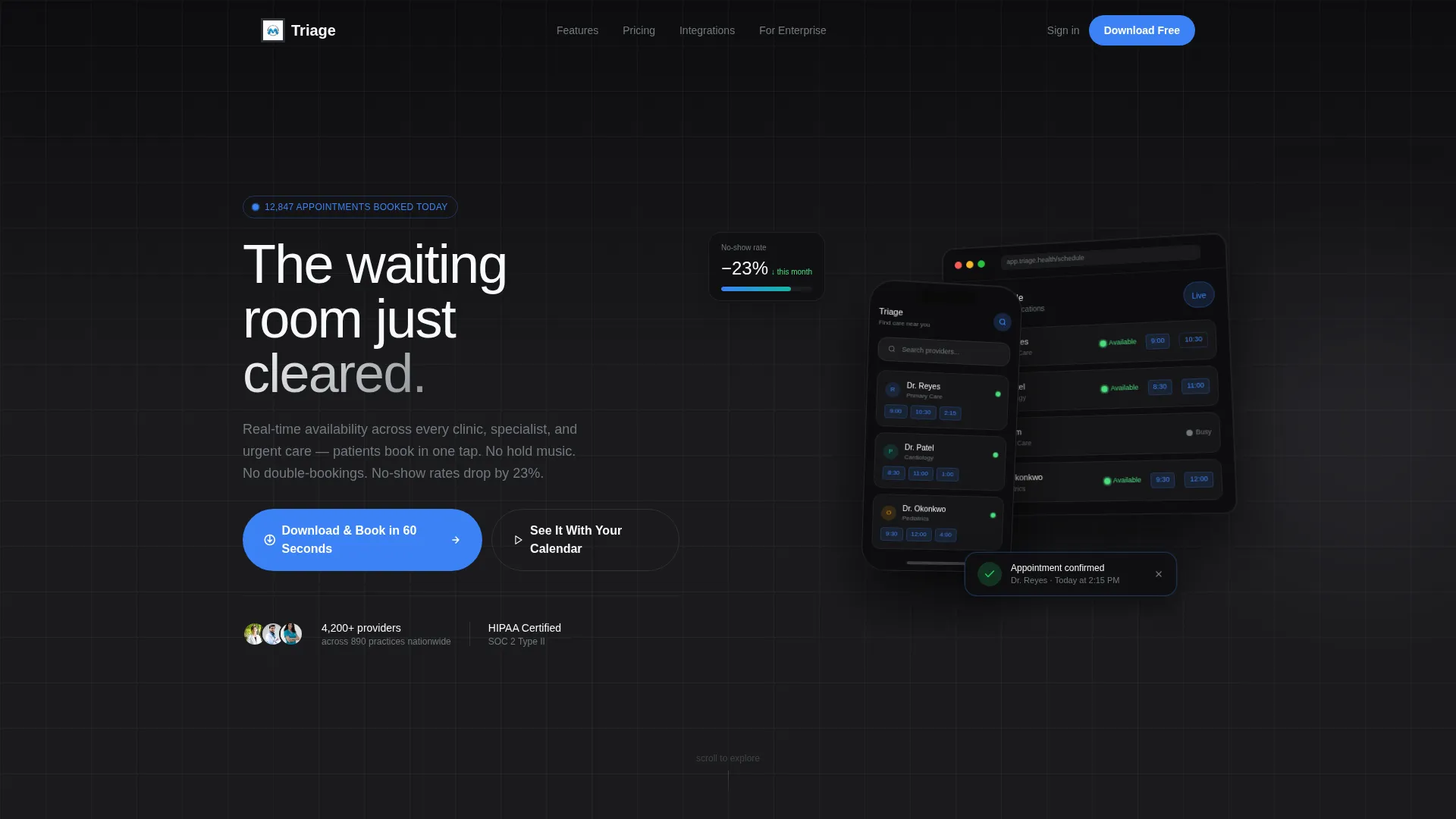
- An animated header with a floating phone and desktop frame showing a live scheduling grid
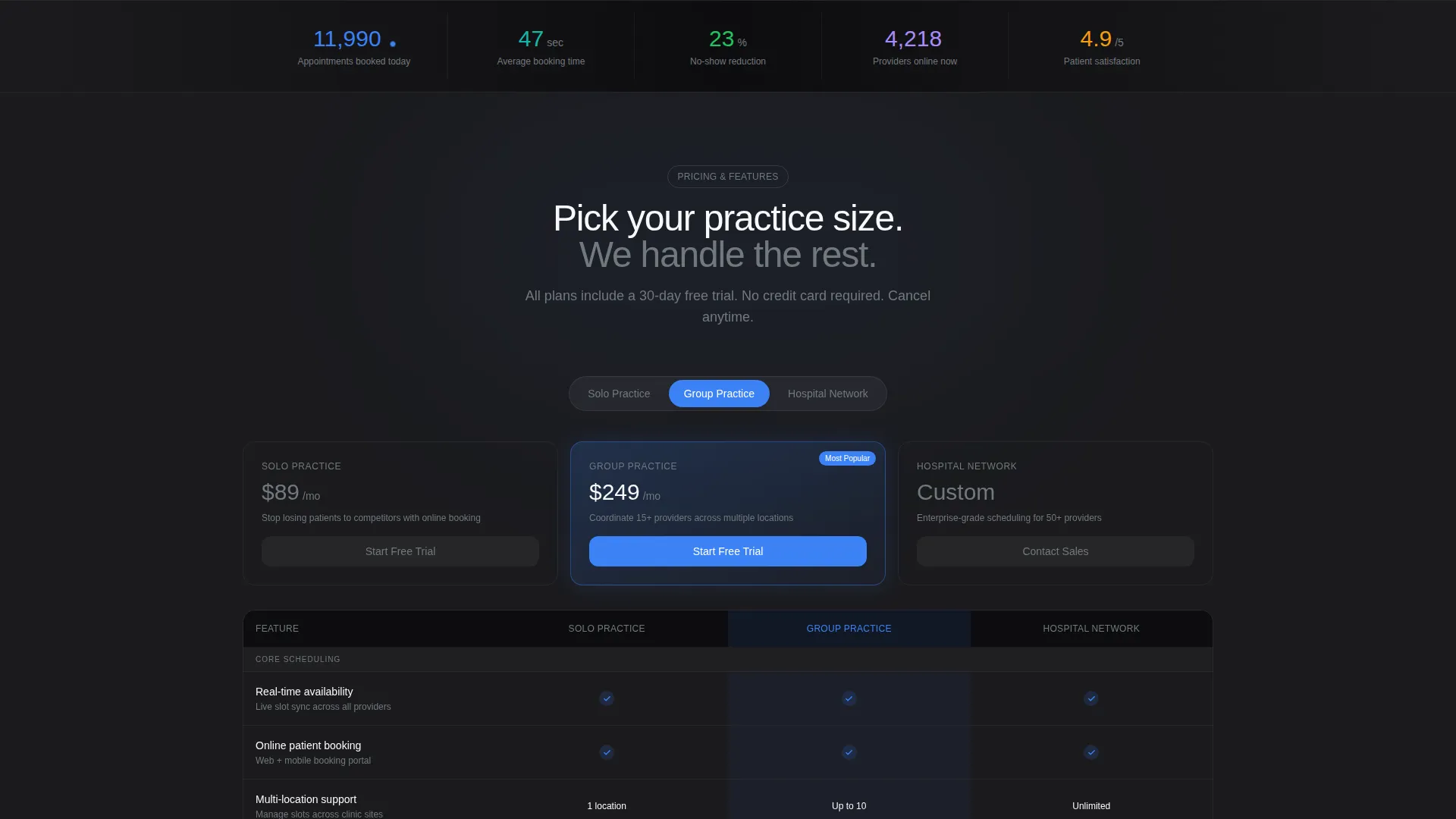
- A toggleable comparison table covering Solo Practice, Group, and Enterprise plan tiers
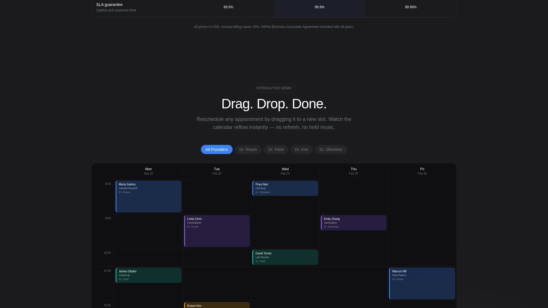
- Interactive product demos with drag-to-reschedule functionality and provider calendar views
- A primary app-download call to action with App Store and Google Play badges plus a phone-number input field for mobile link delivery
- A secondary path to a live interactive demo requiring no signup
Feature list
This section walks through the core capabilities built into the Triage template.
Animated Product Screenshot Header
The page opens with a floating phone and desktop frame displaying the app's real-time scheduling grid. Provider cards mid-scroll, a pulsing green "Available Now" dot, and a confirmation toast reading "Appointment confirmed: Dr. Reyes, 2:15 PM" fire on load. The frame sits on a slight z-axis rotation with a soft parallax shadow.
Interactive Comparison Table
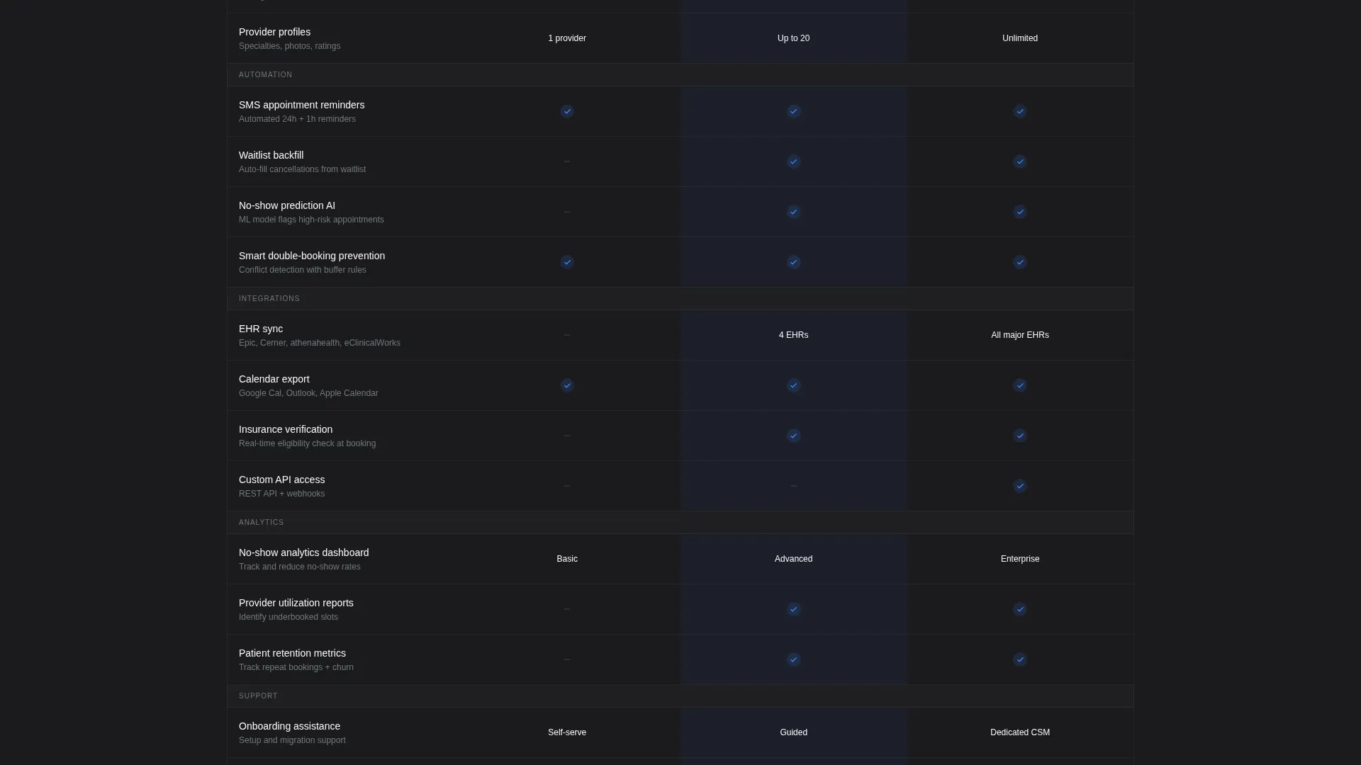
A mid-page table lets visitors toggle between Solo Practice, Group, and Enterprise plan tiers. Rows animate in with staggered reveals showing features including SMS reminders, waitlist backfill, EHR (Electronic Health Record) sync, and no-show prediction. The table makes plan differences scannable without requiring a sales call.
Drag-and-Drop Scheduling Demo
Visitors can drag a patient card to a new time slot and watch the calendar reflow in real time. Tapping a provider fills their week with color-coded appointment blocks. The interaction builds familiarity with the product before any download is requested.
Live Booking Counter
A visible counter displays "12,847 appointments booked today" and ticks upward during the session. This motion element signals active usage and reinforces trust at a glance.
Dual-Path App Download Section
The primary call to action reads "Download and Book in 60 Seconds" with paired App Store and Google Play badges. A phone-number input field labeled "Text me the link" provides a frictionless mobile handoff without requiring the visitor to search for the app manually.
Motion-Driven Data Visualizations
Morphing data visualizations show reduced wait times across the page. Sliding panels and live indicators respond to hover and click throughout the scroll, making each section feel connected to the product rather than static marketing copy.
Page sections overview
| Section | Purpose |
|---|---|
| Header Screenshot | Opens with animated product frames showing real-time scheduling grid |
| Availability Demo | Highlights live provider availability with pulsing status indicators |
| Comparison Table | Lets visitors toggle plan tiers and scan feature differences |
| Interactive Scheduling Demo | Drag-and-drop patient cards and provider calendar interactions |
| Wait Time Visualizations | Morphing data visuals show scheduling improvements in motion |
| Live Booking Counter | Ticking counter reinforces active product usage and social proof |
| App Download call to action | Primary download prompt with app badges and SMS link delivery |
| No-Signup Demo Link | Secondary path to a live interactive demo with no account required |
Design & branding system
The template uses a Monochrome Steel color system that feels clinical without being cold. Every surface reflects just enough contrast to stay readable and alive, while a single accent color keeps interactive elements immediately recognizable.
- Core palette: surgical steel (#71797E), deep charcoal (#1B1B1E), and sterile white (#F8F9FA) cover all structural surfaces
- Pulse-blue (#3B82F6) appears exclusively on interactive states, live indicators, and call-to-action buttons
- The Dynamic Motion theme drives micro-animations on load, staggered row reveals, and parallax shadow effects throughout the scroll
Mobile & speed optimization
The template is built with mobile handoff as a core user journey, not an afterthought. The phone-number input field exists specifically because most healthcare booking decisions happen on a mobile device.
- The floating device frames in the header include both phone and desktop viewports to signal cross-device readiness
- The "Text me the link" input field moves visitors directly from desktop discovery to mobile app download without friction
- Motion elements such as the live counter and pulsing availability dots are designed to work within a single-page scroll flow
How this template helps you convert
Every design decision in this template removes a reason to leave without booking. The page earns the download before it asks for it.
- The animated header puts the product in motion before visitors read a single word, creating immediate product recognition and reducing skepticism
- The interactive comparison table lets visitors self-select their plan tier, which filters out confusion and moves qualified users faster toward the download
- The dual-path call to action gives hesitant visitors a no-commitment option through the live demo link, keeping them engaged rather than bouncing
Other information about this template
This template is categorized under Technology with a Healthcare Digital Presence subcategory. It is purpose-built for the healthcare booking and scheduling niche and aligns with the needs of practices that are actively losing patients to digital-first competitors.
- The template style is a Comparison Table layout, making it well-suited for any scheduling platform that offers multiple service tiers
- The creative direction follows an Interactive Explorer model, meaning the page reveals more value the longer a visitor engages with it
- The header concept is a Product Screenshot, which grounds the experience in real product visuals rather than abstract marketing claims
- The landing-page direction targets App Download, making this template directly useful for any healthcare scheduling app seeking to grow its installed user base
Theme
Dynamic Motion
Creative direction
Interactive Explorer
Color system
Monochrome Steel
Style
Comparison Table
Direction
App Download
Page Sections
Animated Product Screenshot Header
Interactive Plan Comparison Table
Drag-and-drop Scheduling Demo
Live Appointment Booking Counter
Dual-path App Download Section
Motion-driven Data Visualizations
Related questions
Is this template suitable for a solo medical practice?
Can I customize the plan tiers in the comparison table?
What does the 'Text me the link' field do?
Do visitors need an account to try the interactive demo?
What types of animation does this template include?



