Complete Optometry Software Cost Estimator Website Template
Triage is a split-screen optometry help desk landing page template built for front-desk coordinators, opticians, and practice managers. It opens with an interactive Ticket Volume Estimator, flows through a live dashboard mockup and comparison sections, and drives visitors straight into a sandbox demo. The Slate and Sky color system keeps every panel clean, clinical, and ready to act on.
by Rocket studio
Quick summary
Triage is a single-page, click-through landing page template designed for optometry help desk and ticketing platforms. It opens with a self-relevant estimator, builds urgency through a fast-scrolling visual sequence, and ends every section nudging visitors into a live demo. The layout is a 50/50 split screen with a Dashboard Pro theme in deep charcoal, sky blue, and fog gray.
Who this template is for
This template is built for software teams and product marketers promoting optometry practice management tools. It speaks directly to the people sitting behind the front desk every day.
- Front-desk coordinators managing lens orders and insurance code rejections across multiple portals
- Practice managers tracking remake requests and ticket backlogs across several locations
- Opticians spending too much time chasing order statuses through long email threads
What problem this template solves
Optometry backrooms have a coordination problem. Lens orders stall, lab tickets pile up, and remake requests get lost in inboxes. There is no single place to show a skeptical buyer exactly how a ticketing platform fixes that in concrete, personal terms.
- Buyers cannot immediately connect software features to their own daily ticket volume or wasted hours
- A generic product page fails to show the real cost of unresolved orders and delayed remakes
- No clear path from awareness to a live demo means interested visitors leave without converting
What you get with this template
You get a fully structured, single-page layout that does the convincing before the visitor even reaches the call to action. Every section is designed to build trust incrementally and move quickly.
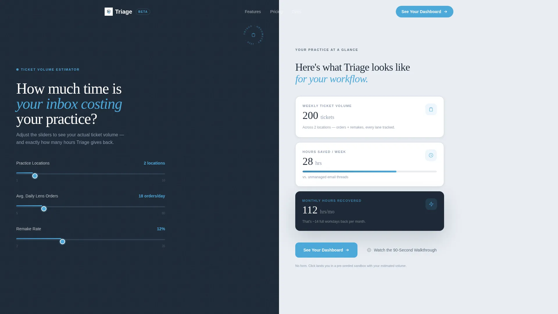
- An interactive Ticket Volume Estimator in the header that calculates weekly volume and hours saved in real time
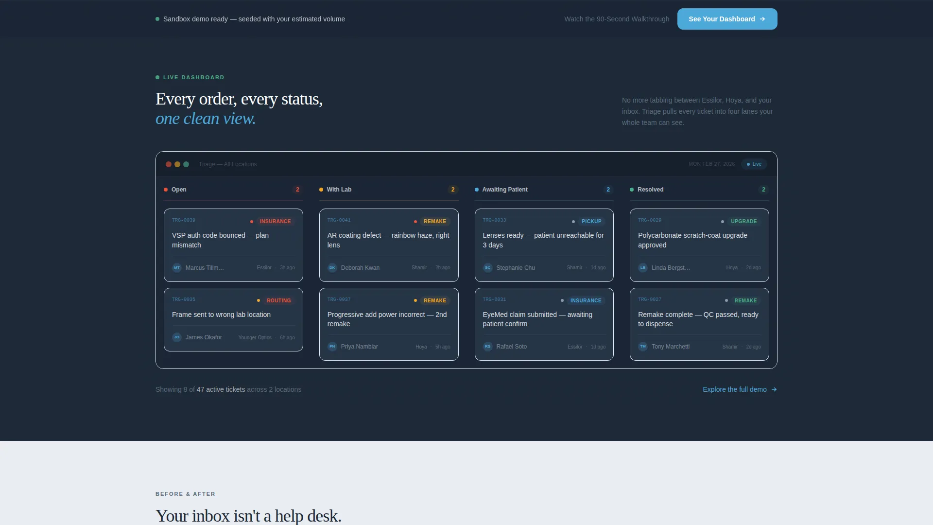
- A live dashboard mockup section with realistic ticket lane examples drawn from actual optometry workflows
- A persistent call-to-action bar and a secondary text link to keep all visitor types in-funnel
Feature list
This template includes purpose-built sections and interactive elements that work together as one coordinated conversion sequence.
Interactive Ticket Volume Estimator
The header splits into two halves. The left side holds three sliders: number of locations, average daily lens orders, and remake percentage. The right side instantly reflects the adjusted figures as projected weekly ticket volume, estimated resolution time saved, and monthly hours recovered. Numbers animate with subtle spring motion as sliders move, making the data feel personal before the visitor scrolls.
Live Dashboard Mockup Section
A full-width section displays a realistic ticket queue interface with four labeled lanes: Open, With Lab, Awaiting Patient, and Resolved. Sample tickets reference real optometry scenarios such as coating defect remakes and lab resubmissions, so visitors recognize their own workflow immediately.
Before-and-After Comparison Panel
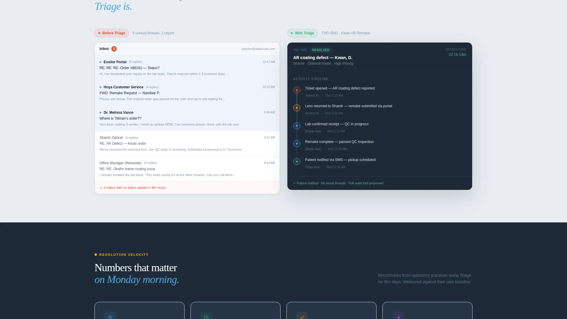
A split section shows a chaotic email thread on the left side dissolving visually into a clean, organized ticket timeline on the right. The contrast is immediate. It communicates the core value of the platform without a single word of explanation needed.
Velocity and Resolution Counter Section
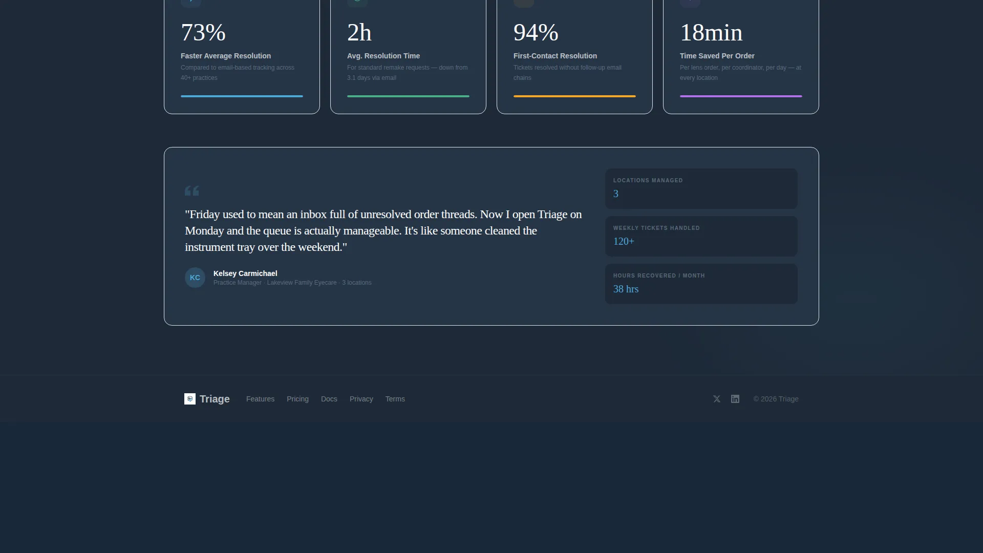
Animated counters display average resolution benchmarks as the visitor scrolls into the section. The numbers tick upward in real time, reinforcing the platform's speed story with motion rather than static claims.
Persistent Call-to-Action Bar
After the second scroll, a fixed bottom bar appears with the primary call to action: "See Your Dashboard." It stays visible throughout the remainder of the page so the next step is always one click away.
Secondary Retention Link
A text link reading "Watch the 90-Second Walkthrough" appears alongside the primary call to action. It captures visitors who are not ready to click through to the demo, keeping them engaged with lower-commitment video content.
Page sections overview
| Section | Purpose |
|---|---|
| Ticket Volume Estimator | Opens the page with a self-relevant, interactive header that calculates personal ticket data |
| Live Dashboard Mockup | Shows a realistic ticket lane view seeded with optometry-specific order scenarios |
| Email versus. Timeline Split | Contrasts disorganized email threads with a clean ticket timeline to illustrate core value |
| Resolution Velocity Counters | Reinforces speed and efficiency with animated benchmark numbers |
| Persistent Demo Bar | Keeps the primary call to action visible after the second scroll for frictionless access |
Design & branding system
The visual identity follows a Dashboard Pro theme using a Slate and Sky color system. The palette is designed to feel sterile, calm, and immediately trustworthy to anyone familiar with clinical software environments.
- Deep charcoal slate (#1E2A38) anchors left-side panels and navigation elements
- Clinical sky blue (#4DA8DA) highlights active states, slider tracks, progress indicators, and call-to-action elements
- Soft fog gray (#E8EDF2) washes right-side content backgrounds, and crisp white (#FFFFFF) gives data and text room to breathe
Mobile & speed optimization
The template is built with a Launch Energy creative direction that keeps the scroll fast and momentum high. Section transitions use slight upward burst animations, like cards being dealt onto a table, so the page never feels static or heavy.
- Spring animations on estimator counters and velocity numbers are subtle enough to stay smooth on most devices
- The persistent bottom bar is designed to stay unobtrusive on smaller screens while remaining fully tappable
- The 50/50 split screen layout adapts to a stacked single-column format on mobile viewports
How this template helps you convert
The entire page is structured as a click-through funnel. There is no form to fill out. Every element exists to lower resistance and move the visitor one step closer to the live sandbox demo.
- The estimator personalizes the value proposition before the visitor has scrolled, making the demo feel like the natural next step rather than a cold commitment
- The persistent "See Your Dashboard" bar ensures the call to action is always visible, removing the need for the visitor to scroll back up to act
- The secondary "Watch the 90-Second Walkthrough" text link retains visitors who are not yet ready to enter the demo, keeping them in the funnel without friction
Other information about this template
This template is categorized under Technology and the Optometry Software subcategory, targeting the Optometry Help Desk and Ticketing niche specifically. It is a strong fit for teams building or marketing ticketing tools that serve multi-location eye care practices.
- The template style is a 50/50 split screen, making it visually distinct from standard full-width product pages
- The click-through landing page direction means no lead capture form is required; the goal is a direct handoff to a live demo environment
- The sandbox demo is pre-populated with ticket volume data the visitor entered in the estimator, creating a seamless and personalized transition
- The Dashboard Pro theme is well-suited for software products where trust, clarity, and data visibility are central to the buying decision
Theme
Dashboard Pro
Creative direction
Launch Energy
Color system
Slate & Sky
Style
Split Screen (50/50)
Direction
Click-Through
Page Sections
Interactive Ticket Volume Estimator
Live Optometry Dashboard Mockup
Before-and-after Comparison Panel
Animated Resolution Velocity Counters
Persistent Click-through Call-to-action Bar
Secondary Retention Text Link
Related questions
Who is this landing page template designed for?
Does this template require a form or lead capture step?
What makes the estimator section effective?
Can this template work for a single-location practice, not just multi-location groups?
What is the secondary call to action and why is it included?



