SaaS Milestone Email Comparison Landing Page Template
Trigger is a precision milestone email landing page template built for product-led growth teams at B2B SaaS companies. It pairs a live dashboard preview header, a Problem-to-Solution scroll arc, and a head-to-head comparison table to show exactly why event-native email triggers outperform time-based drips and manual workarounds.
by Rocket studio
Quick summary
Trigger is a single-page comparison landing page template for a SaaS milestone email platform. It guides product-led growth managers from a painfully familiar "before" stack diagram through a decisive feature comparison table, then into a live return-on-investment calculator and a frictionless free-trial signup. The design runs on a dark Data Command visual identity built for focus and urgency.
Who this template is for
This template is built for product-led growth managers at B2B SaaS companies who need to communicate a clear platform advantage. If you are tired of stitching together event data workarounds, this page speaks directly to that frustration.
- Product-led growth managers at SaaS companies with tens of thousands to hundreds of thousands of monthly active users
- Marketing and lifecycle teams replacing fragile automation stacks with event-native email triggers
- SaaS founders and growth leads who want a high-conviction comparison page that lets the product sell itself
What problem this template solves
Most lifecycle email tools were not built for product event data. Teams end up routing behavioral signals through multiple tools, adding days of latency and points of failure before a single email goes out. This template frames that problem visually and immediately.
- No native way to trigger emails on real user behavior without cobbling together multiple third-party connectors
- Multi-day send delays caused by batch queues and manual CSV uploads eroding the timing that makes milestone emails effective
- Visitors arriving on a competitor comparison page who need a fast, credible reason to switch before they bounce
What you get with this template
You get a complete, single-page comparison landing page designed around the Trigger platform's core value proposition. Every section is purpose-built to move a skeptical product manager from "I recognize this problem" to "I want to try this today."
- A live dashboard preview header with a milestone rule builder screenshot, animated event counters, and a pulsing retention lift badge
- A before-and-after problem arc opening with a chaotic stack diagram and resolving into a structured comparison table
- A sticky bottom conversion bar with a single email field and a primary call-to-action, plus a secondary path to an interactive stack teardown
Feature list
This template is a purposefully assembled set of conversion-focused sections. Each component earns its place by moving the visitor one step closer to signing up.
Live Dashboard Preview Header
The header displays a pixel-perfect product screenshot mid-configuration, showing a real milestone rule: "When user.projects_created is 3 or more AND last_active is under 7 days, send Win-Back Sequence." Event counts animate upward, a spark fires on a sent email, and a "+18.4% retention" badge pulses to give the visitor immediate proof of value before they read a single word of copy.
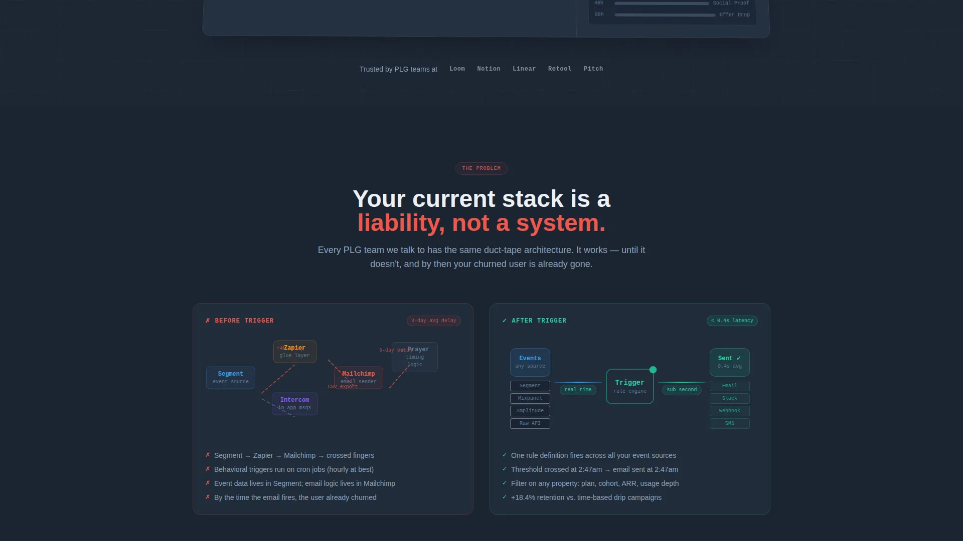
Problem Diagram with Latency Callouts
The page opens with a visual "before" diagram mapping the typical broken stack: event source to automation connector to email tool, with red latency warnings and a "3-day delay" callout. This section converts abstract pain into a concrete image that the target visitor immediately recognizes as their own situation.
Head-to-Head Comparison Table
The comparison table places Trigger against three incumbent tools across multiple rows: event-native triggers versus time-based drips, sub-second send latency versus batch queues, and native product-data filters versus CSV uploads. Every row Trigger wins, a sky-blue checkmark lands with micro-motion to keep the visitor reading down the table.
Live Return-on-Investment Calculator
Below the comparison table, a calculator seeded with the visitor's estimated monthly active users converts retained users into a dollar-value figure. This section closes the Problem-to-Solution arc by making the benefit feel personal and financially real.
Sticky Conversion Bar
Once the visitor scrolls past the comparison table, a bottom bar pins itself to the screen. It holds one email field, a "Start Triggering Free" call-to-action in stratosphere blue, and a secondary link to an interactive stack teardown. No password. No company name. Just the first step into a free sandbox.
Secondary Interactive Teardown Path
The "See It Beat Your Current Stack" link leads to an interactive teardown experience. This secondary conversion path serves visitors who are not yet ready to sign up but want a deeper, tool-specific comparison before committing.
Page sections overview
| Section | Purpose |
|---|---|
| Dashboard Preview Header | Hook visitor with live milestone rule and animated retention proof |
| Before Stack Diagram | Surface the broken automation pain point visually |
| Problem-to-Solution Arc | Bridge the gap between frustration and the platform answer |
| Comparison Table | Show feature-by-feature wins against three competing tools |
| Return-on-Investment Calculator | Personalize the value using visitor's own user volume |
| Sticky Conversion Bar | Capture email with one field once visitor passes the table |
| Secondary Teardown Link | Offer a deeper interactive path for undecided visitors |
Design & branding system
The template runs a Data Command visual identity. The palette feels like a mission-control monitor: dark backgrounds lit only by the data that matters, with every interactive element carrying the same bright signal color.
- Deep gunmetal (#1B2432) for primary backgrounds, mid-slate (#394B61) for card surfaces and table rows, stratosphere blue (#38A3F1) for every interactive element and winning checkmark, and chalk white (#EDF1F5) for body text
- The dashboard header floats on the gunmetal background with a subtle perspective tilt, as if the visitor leaned toward their own screen to read the numbers
- Micro-motion on checkmarks and spark animations on sent emails add purposeful feedback without distracting from the data
Mobile & speed optimization
The layout is designed to stay focused and functional across screen sizes. The dark palette and single-column flow keep cognitive load low on smaller displays.
- The comparison table is structured to remain readable on mobile without horizontal overflow
- The sticky conversion bar adapts to sit cleanly at the bottom of small screens with the email field and call-to-action remaining accessible
- Animated elements such as the spark and pulsing badge are scoped to the header section so they do not compete with readability further down the page
How this template helps you convert
Every design and copy decision in this template points toward a single low-friction action: entering one email address and starting a free sandbox trial.
- The dashboard preview and live event counters give the visitor a sense of the product in motion before they engage with any copy, lowering the barrier to curiosity and scroll depth.
- The comparison table builds conviction row by row, and the sky-blue checkmark micro-motion keeps the visitor engaged through the most persuasive section of the page.
- The sticky bar with a single email field removes every possible signup obstacle: no password, no company details, just one field that opens a free sandbox where milestone rules run against sample event data.
Other information about this template
This template is categorized under Technology and the SaaS Email Templates subcategory, with a specific niche focus on SaaS milestone email. It was designed to serve comparison and versus intent traffic, making it well suited for campaigns targeting visitors who are actively evaluating lifecycle email platforms.
- The template style is a Comparison Table layout, meaning the page is structured around a central feature-versus-feature grid that drives the narrative
- The creative direction follows a Problem-to-Solution Arc, a format that matches the mental state of a visitor who already knows they have a problem and is looking for confirmation that a better tool exists
- The header concept is a Dashboard Preview, which grounds the page in product reality rather than abstract marketing claims
- Teams building or launching a SaaS milestone email platform will find this template aligned with the specific expectations of a product-led growth audience that responds to data, not hype


Theme
Data Command
Creative direction
Problem→Solution Arc
Color system
Slate & Sky
Style
Comparison Table
Direction
Comparison/Versus
Page Sections
Live Dashboard Preview Header
Before Stack Problem Diagram
Feature-by-feature Comparison Table
Personalized ROI Calculator
Sticky Single-field Conversion Bar
Related questions
Who is this landing page template designed for?
What makes the comparison table section effective?
Can I use this template without animation or interactive elements?
What does the free-trial conversion flow look like?
Is the return-on-investment calculator pre-configured?


