Tuition - Automated Payment Landing Page Template
This tuition payment landing page template is built for bursar offices, K-12 business managers, and online program directors who need to replace manual billing chaos with a clear, automated process. A live cost estimator, problem-to-solution comparison tables, and a low-friction lead capture form work together to turn a CFO's frustration into a confident next step.
by Rocket studio
Quick summary
This single-page template gives education payment platforms a structured, data-led way to show institutional buyers exactly what manual tuition processing costs them. Starting with a live calculator and moving through detailed comparison tables, it builds a closing argument row by row, ending with a form that captures qualified leads without adding unnecessary friction.
Who this template is for
This template is designed for teams selling payment automation software to education finance decision-makers. It speaks directly to the people who feel the daily pain of manual billing cycles.
- Chief Financial Officers (CFOs) at mid-size private universities managing tuition installments, financial aid disbursements, and late-fee reconciliations manually
- K-12 business managers juggling district-mandated fee structures across multiple campuses
- Online program directors whose student populations span multiple time zones and payment currencies
What problem this template solves
Education finance teams lose significant time and money to processes that were never designed to scale. This template makes that cost visible and positions automated processing as the logical replacement.
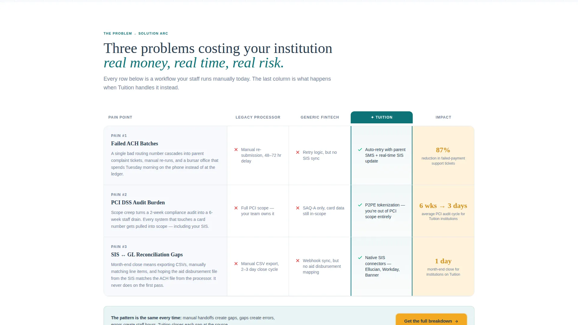
- Failed ACH (Automated Clearing House) batches that generate parent complaints and require staff intervention to resolve
- PCI (Payment Card Industry) compliance audits that consume staff weeks and divert attention from enrollment priorities
- Reconciliation gaps between the Student Information System (SIS) and the general ledger that create reporting errors and manual correction loops
What you get with this template
The template delivers a full single-page layout structured around a Problem-to-Solution Arc. Every section is designed to accumulate evidence until the case for switching is undeniable.
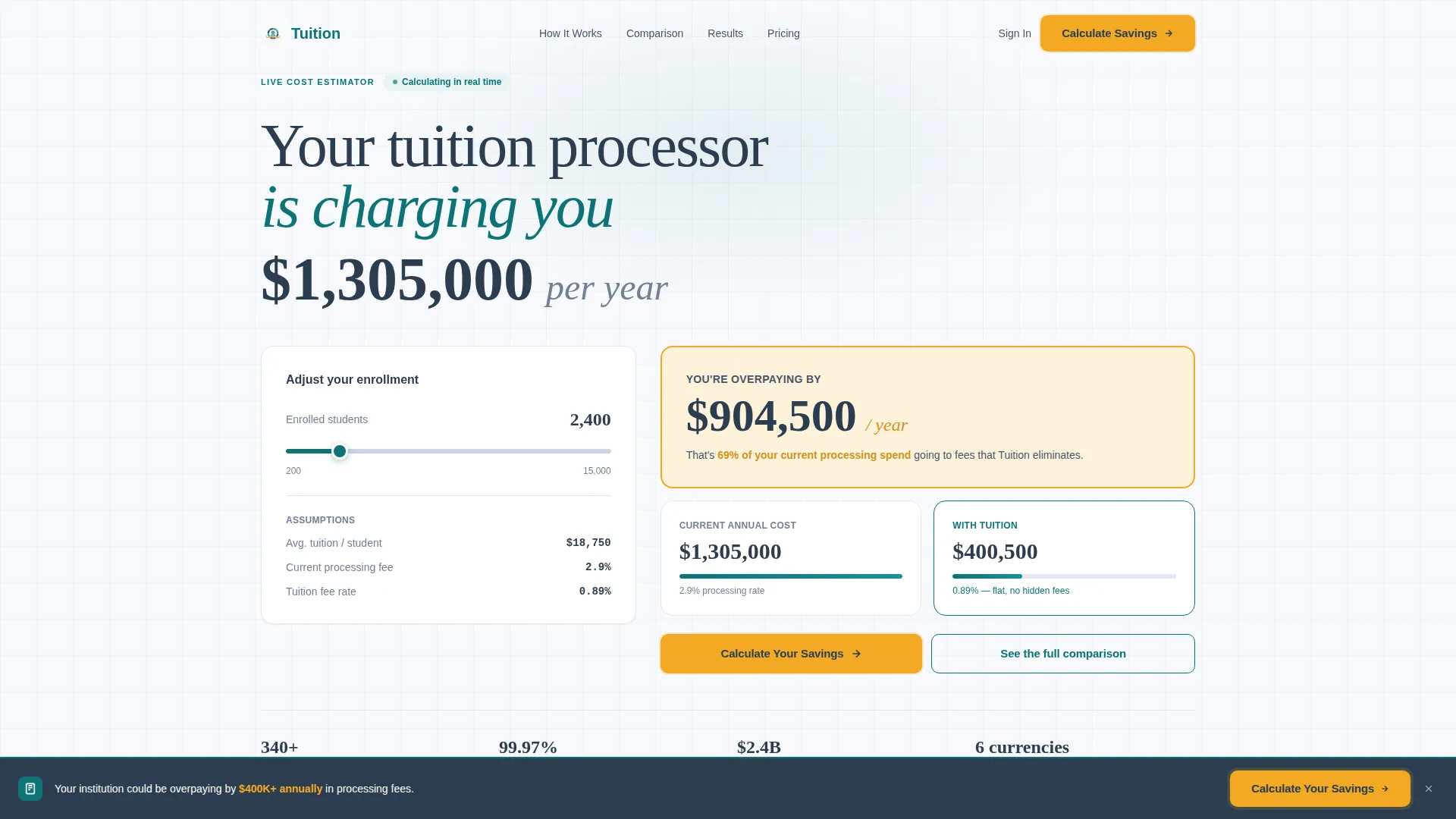
- A live, interactive cost estimator in the header pre-loaded with a realistic institutional scenario and an enrollment-size slider
- Three before-and-after comparison table sections, each ending with a real supporting metric such as an 87% reduction in failed payment tickets
- A progressively disclosed lead capture form and a secondary conversion path offering a downloadable PDF gated behind email-only capture
Feature list
This template packs a focused set of conversion-ready components, each serving a specific role in the buyer journey.
Live Cost Estimator Header
The page opens with an interactive calculator pre-loaded with 2,400 enrolled students, an average tuition of $18,750, and a 2.9% processing fee. Numbers animate on load to show annual processing costs in real time. A single enrollment-size slider lets visitors watch the overpayment figure climb in catalyst amber as they adjust their institution's numbers.
Problem-to-Solution Comparison Tables
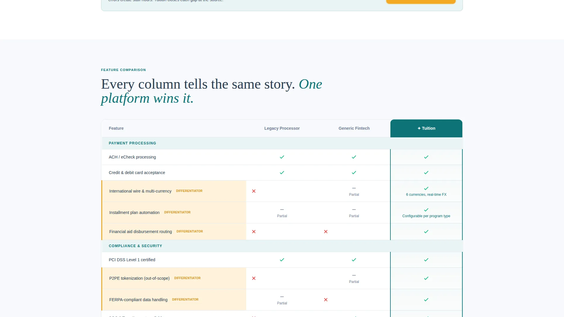
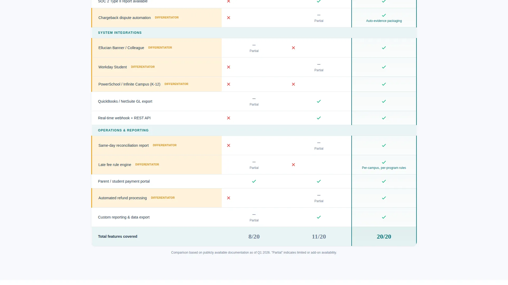
Three dedicated comparison table sections each address a named pain point: failed ACH batches, PCI compliance audits, and SIS-to-ledger reconciliation gaps. Each row shows the manual process versus the automated one across three competitor archetypes. Checkmarks, dash marks, and amber-highlighted differentiators make the winner clear without requiring the visitor to read every cell.
Evidence-Anchored Metric Callouts
Each comparison table section closes with a real supporting metric. These callouts accumulate as the visitor scrolls, building a data-backed argument that reinforces the sales case without additional copy.
Sticky Bottom Bar with Primary call to action
After the first comparison table, a sticky bottom bar appears carrying the primary call to action: "Calculate Your Savings." It stays visible as the visitor scrolls, maintaining conversion pressure without interrupting the reading flow.
Progressive Lead Capture Form
The lead form reveals fields in sequence to keep friction low. The first field asks for institution type (K-12, Higher Education, or Online Program), the second asks for annual enrollment count, and the third asks for a work email address. No phone number field is included.
Secondary PDF Conversion Path
Visitors who are not ready to speak with a team can enter only their work email to download "The True Cost of Manual Tuition Processing." This path captures buyers who are building an internal case and need supporting material before committing.
Page sections overview
| Section | Purpose |
|---|---|
| Header Estimator | Show real-time processing cost with an interactive enrollment slider |
| Pain Point Tables | Compare manual versus automated workflows across three named problems |
| Metric Callout Rows | Anchor each table section with a concrete supporting data point |
| Sticky call to action Bar | Keep the primary lead action visible after the first comparison section |
| Progressive Lead Form | Capture institution type, enrollment size, and work email with low friction |
| PDF Download Gate | Offer a secondary conversion path for visitors building an internal case |
Design & branding system
The visual identity follows a Directory and Discovery theme built on the Teal Catalyst color system. Every color choice has a clear functional role, making the layout feel as organized as the product it represents.
- Deep registrar teal (#0D7377) and ledger-line charcoal (#2C3E50) handle structure and typography, creating an atmosphere of institutional trust
- Clean transcript white (#F7F9FC) keeps the layout open and easy to scan under any lighting condition
- Catalyst amber (#F2A922) is reserved exclusively for calls to action, toggle switches, and savings callouts, ensuring the most important elements always draw the eye first
Mobile & speed optimization
The template is structured to deliver a clean, focused experience regardless of screen size. The interactive elements and comparison tables are laid out to remain readable and functional on smaller displays.
- The enrollment-size slider and animated cost estimator are designed to work within a compact header layout on mobile screens
- Comparison tables use a clear two-axis structure that translates to a scrollable format on narrow viewports without losing the visual logic of checkmarks and amber highlights
How this template helps you convert
Every section of this page is designed to move a skeptical finance professional closer to submitting their information. The structure mirrors the way an institutional buyer actually makes a purchase decision.
- The live cost estimator opens with a number that feels personal and specific, making the financial case before a single word of marketing copy is read
- Comparison tables replace abstract feature lists with a direct, visual argument that names real problems and shows real differences across processor types
- The dual conversion paths (the primary lead form and the PDF download gate) ensure that both ready buyers and early-stage researchers have a clear, low-friction next step
Other information about this template
This template is built specifically for the education payment processing niche, where the buying cycle is long and the decision-makers are financially literate and skeptical of vague claims. A few additional points are worth noting for teams evaluating this layout.
- The comparison table structure uses three competitor archetypes labeled "Legacy Processor," "Generic Fintech," and the product itself, so no real brand names need to appear in the template by default
- The downloadable PDF titled "The True Cost of Manual Tuition Processing" functions as a lead magnet for buyers who need to build an internal business case before approaching procurement
- The no-phone-number policy in the lead form is a deliberate friction-reduction choice, keeping the initial ask limited to institution context and a work email address
- The catalyst amber color is used exclusively for calls to action, toggle switches, and savings callouts, so the visual hierarchy reinforces the conversion goal at every scroll depth
Theme
Directory & Discovery
Creative direction
Problem→Solution Arc
Color system
Teal Catalyst
Style
Comparison Table
Direction
Lead Generation
Page Sections
Live Interactive Cost Estimator
Before-and-after Comparison Tables
Evidence-anchored Metric Callouts
Sticky Primary Call to Action Bar
Progressive Lead Capture Form
Email-gated PDF Download
Related questions
Who is this landing page template designed for?
Can I customize the numbers in the cost estimator?
What does the progressive lead form collect?
How does the secondary PDF conversion path work?
Do I need to replace the competitor archetype labels in the comparison tables?



