Insurance Project Management Landing Page Template
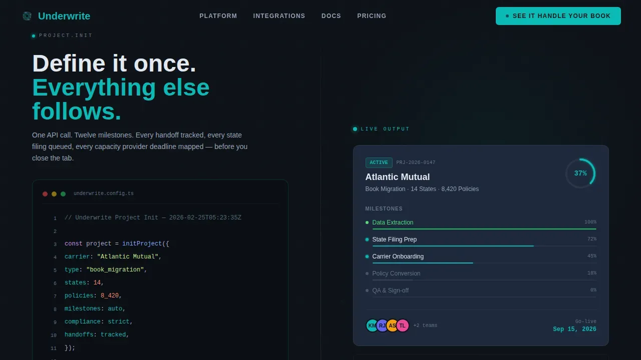
Underwrite is a mission-critical insurance project management landing page template built for program managers, TPA operations teams, and MGA directors who need to turn complex insurance workflows into tracked, staged, and measurable processes. The split-screen layout pairs a syntax-highlighted code snippet with a live dashboard card, giving visitors an immediate sense of what the platform delivers the moment they land on the page.
by Rocket studio
Quick summary
Underwrite is a split-screen insurance project management landing page template designed for mid-market carriers, third-party administrators, and managing general agents. It presents a dark ops dashboard aesthetic, pairs a code snippet hero with a live project card, and walks visitors through twelve capability panels in a Spec Sheet scroll cadence. The page focuses on a single action: routing qualified users to a guided demo.
Who this template is for
This template is built for operations professionals in the insurance industry who manage complex, multi-party projects and need to prove progress to stakeholders. It speaks directly to the people drowning in spreadsheets and tracking handoffs across states, teams, and deadlines.
- Program managers at mid-market carriers running book migrations or policy conversions
- TPA operations teams coordinating multi-state filings with small headcounts
- MGA operations directors who need to show implementation timelines to capacity providers
What problem this template solves
Most insurance project workflows live in spreadsheets, email threads, and memory. Nothing is staged. Nothing is color-coded. Handoffs slip, compliance checkpoints get missed, and carriers lose visibility right when stakeholders need it most. This landing page template exists to show visitors that a better process is possible and within reach.
- Eliminates the visual chaos of untracked insurance operations across carrier migrations and regulatory rollouts
- Replaces vague project status with color-coded milestones, progress rings, and team assignments visible at a glance
- Converts skeptical technical evaluators into demo-ready buyers by showing exact workflows before a form is ever filled
What you get with this template
You get a fully structured, single-page insurance landing page template ready for deployment. Every section is designed to accumulate evidence of platform capability, not to tell a story, but to build an undeniable case through dense, relevant detail.
- A 50/50 split-screen hero with a syntax-highlighted code snippet on the left and a live project dashboard card on the right
- Twelve Spec Sheet scroll sections, each pairing a technical specification panel with a visual proof panel such as a Gantt slice, notification feed, or compliance checklist
- A persistent bottom call-to-action bar that activates after the third section, plus a secondary text link under each section for technical evaluators
Feature list
This template packages together a set of focused, prompt-backed capabilities that serve the target audience from first scroll to final click.
Split-Screen Hero with Code Snippet Header
The hero occupies the full viewport in a 50/50 layout. The left panel renders a syntax-highlighted code block in monospaced type, reading like a real configuration call: initProject({ carrier: "Atlantic Mutual", type: "book_migration", states: 14, milestones: auto }). The right panel shows the immediate output: a compact dashboard card with a progress ring, a populated milestone timeline, and assigned team avatars. The implication is instant and clear.
Spec Sheet Scroll Cadence
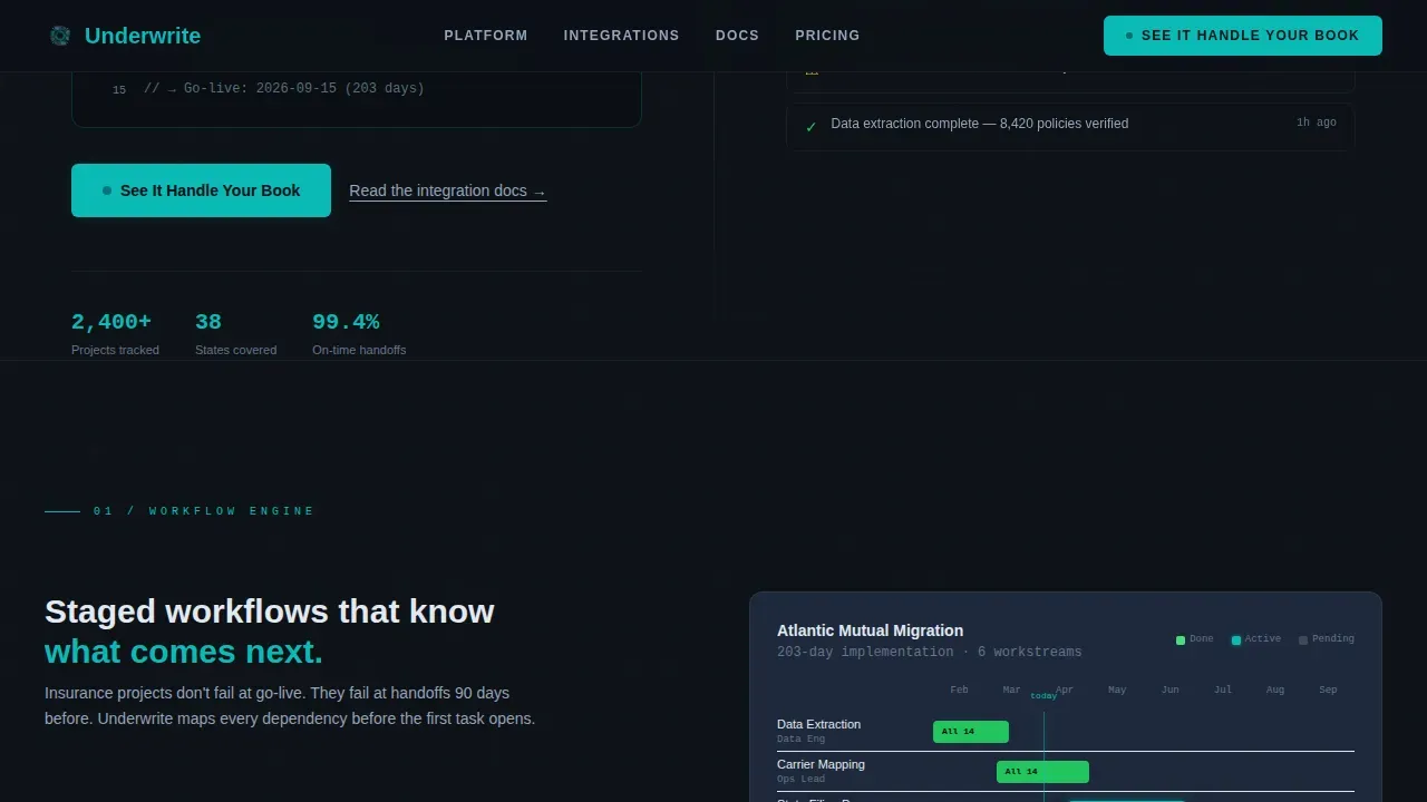
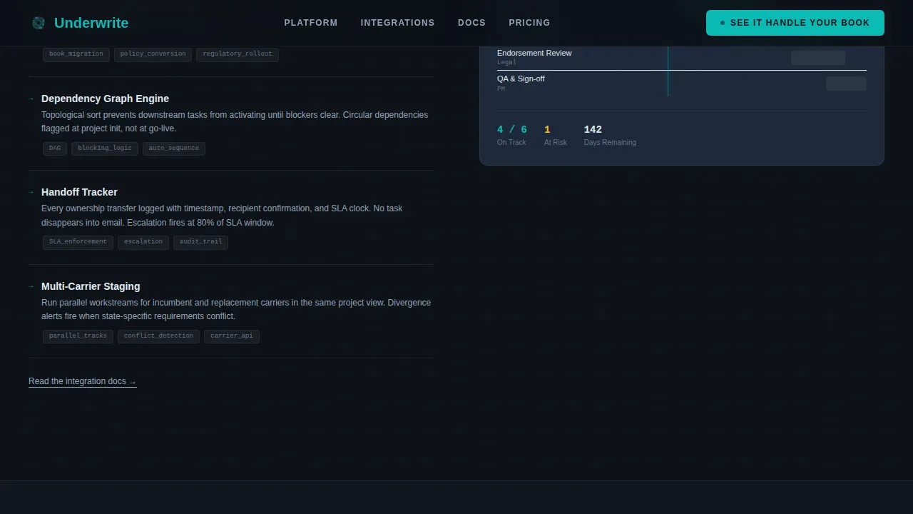
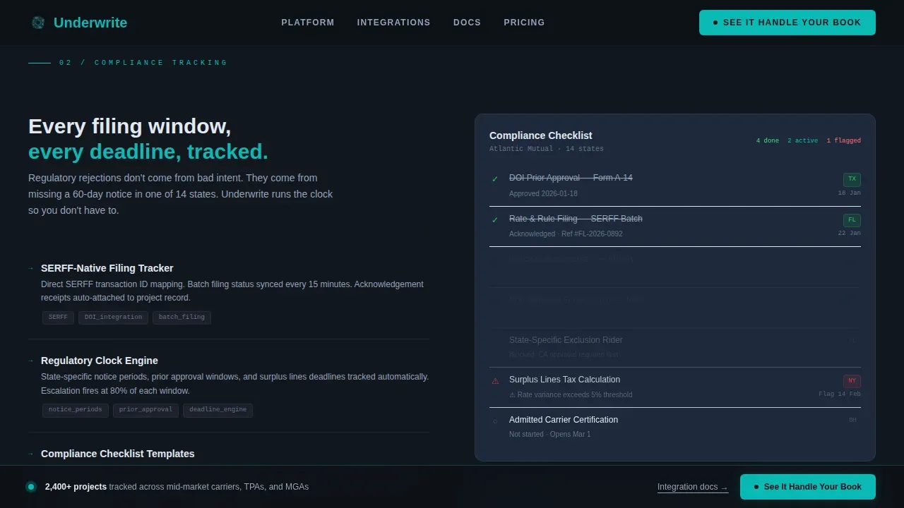
Each scroll section is a precise split between a technical specification on the left and a visual proof on the right. Sections cover the workflow engine with a Gantt slice, compliance tracking with a notification feed, and multi-state filings with a progress dashboard. There is no storytelling arc. There is accumulating evidence. Each panel adds another capability to the visitor's mental model until the weight of what the platform handles becomes undeniable.
Persistent Click-Through Call-to-Action Bar
The primary call-to-action, "See It Handle Your Book," appears below the hero and then locks as a persistent bottom bar after the third section. No form is present on this page. The click routes visitors to a guided demo pre-loaded with an insurance scenario. This design keeps the conversion rate focused on a single, high-intent action and avoids overwhelming visitors with premature data entry requirements.
Scroll-Linked Animation System
The template includes high-animation scroll reveals, staggered spec row entrances, and a teal pulse effect on active states. Progress rings animate on scroll entry. Notification feed items stagger in. Every motion is tied to a meaningful data point, reinforcing the dashboard aesthetic and keeping users engaged through the full page length.
Teal Catalyst Signal System
The color system uses teal strictly as a signal color: it only appears on active states, live progress indicators, and actionable interface elements. It never decorates. This discipline makes every teal element feel like a live data point, reinforcing trust signals for technical buyers who know the difference between a polished interface and a functional one.
Social Proof and Operational Metrics Section
Before the final call-to-action bar, the template includes a social proof section built around operational metrics: projects tracked, states covered, and handoffs prevented. Role-specific testimonials from program managers and operations directors accompany the metrics. This section functions as a trust signal block, translating platform performance into language the target audience recognizes from their own daily work.
Page sections overview
| Section | Purpose |
|---|---|
| Hero Split Screen | Introduce platform via code snippet and live dashboard card |
| Workflow Engine Spec | Show Gantt-based milestone tracking with technical detail |
| Compliance Tracking Spec | Pair checklist specification with notification feed proof |
| Multi-State Filings Spec | Display filing matrix spec alongside progress dashboard |
| Social Proof Bar | Deliver operational metrics and role-specific testimonials |
| Persistent call to action Bar | Lock "See It Handle Your Book" after third section scroll |
| Footer Row | Single-row linear footer with secondary navigation links |
Design & branding system
The visual identity follows a Dashboard Pro theme using the Teal Catalyst color system. The palette is built for operators who work late and need a screen that reduces fatigue without sacrificing clarity. Every color choice is functional, not decorative.
- Deep operations black (#0D1117) as the primary background, cool slate (#1E293B) for card surfaces, and crisp interface white (#E2E8F0) for all data values and body copy
- Signal teal (#0ABAB5) appears exclusively on active states, live progress indicators, and actionable elements, never as decoration
- JetBrains Mono handles all code and monospaced elements; Plus Jakarta Sans handles all body and heading typography, keeping white space clean and readable
Mobile & speed optimization
This template is built desktop-first, reflecting the reality that program managers and operations directors work on second monitors in command-center environments. The design prioritizes viewport density and panel clarity at large screen sizes. The landing page is structured with server components handling all static sections and client components managing animations, so the page loads fast and stays responsive under real-world conditions.
- Desktop-first layout optimized for mission-critical dashboard viewing on large displays
- Server components used for static content so the page loads fast even on first visit; client components isolated to animated elements only
- Scroll-linked reveals and staggered animations are designed to run smoothly without blocking the main thread or slowing the visual experience
How this template helps you convert
This landing page template is engineered for click-through conversion with a single, high-intent action. It does not try to capture leads on the page. Instead, it builds enough operational credibility through twelve spec panels that clicking the demo link feels inevitable.
- The hero section establishes immediate relevance by showing a real insurance project instantiation, so visitors recognize their own workflow before reading a single word of copy, which increases the likelihood they stay and explore.
- The Spec Sheet cadence stacks capability evidence panel by panel, focusing the visitor's attention on specific functions such as underwriting workflows, claims tracking, and multi-state filing management, until the cumulative weight of the platform becomes clear.
- The persistent call-to-action bar and secondary "Read the integration docs" text links guide visitors toward the next step based on their readiness level, serving both the fast-moving program manager and the cautious technical evaluator.
Other information about this template
This template is a great example of how a good insurance landing page can serve a highly specific target audience without relying on generic copy or stock visuals. The design philosophy rejects the common approach of overwhelming visitors with too many insurance options at once. Instead, it focuses on one conversion goal and earns that click through density and specificity.
- The landing page creation process is simplified for developers: the template uses a clear component structure that maps directly to the Spec Sheet sections, so teams can populate each panel with real insurance product data and go live quickly
- The template supports relevant use cases beyond carrier migrations, including auto insurance program rollouts, life insurance book transfers, and travel insurance regulatory filings, making it adaptable across insurance business contexts
- An insurance toolkit like this one is a collection of digital resources, templates, and software solutions. It helps professionals perform critical tasks such as claims handling, data analysis, and compliance reporting without building from scratch
- Insurance toolkits are essential in every department, from underwriting to policy renewal, and this template reflects that scope by covering workflow, compliance, filings, and social proof in a single scrolling page
- Most modern insurance solutions are hosted in the cloud, allowing employees to access data and tools from anywhere. This template is designed to represent that kind of always-on, cloud-ready insurance platform to customers visiting the page
- The rise of cloud computing, artificial intelligence, and automation has made insurance toolkits more powerful and accessible. A well-built insurance landing page examples set, like the pages this template can produce, helps insurers communicate those capabilities clearly to prospective customers
- For an insurance agency or insurance company evaluating this template, the Dashboard Pro theme and Teal Catalyst color system provide a professional, trust-forward visual identity that reflects industry standards without relying on industry awards or generic stock photography
- The template follows best practices for insurance landing pages: a catchy headline above the fold, trust signals built into the social proof section, and a clean layout that loads fast and keeps conversion rate high
- The underwrite mission critical insurance project management landing page template is purpose-built for B2B SaaS insurance operations platforms. It is not a general-purpose template and should be used by teams operating in the insurance industry with a specific project management or underwriting platform to promote
Theme
Dashboard Pro
Creative direction
Spec Sheet
Color system
Teal Catalyst
Style
Split Screen (50/50)
Direction
Click-Through
Page Sections
Split-screen Hero with Code Snippet
Spec Sheet Scroll Sections
Persistent Click-through Call to Action Bar
Scroll-linked Animation System
Teal Catalyst Signal Color System
Social Proof and Metrics Block
Related questions
Who is this landing page template designed for?
Does this template include a lead capture form?
Can I adapt this template for different insurance product types?
How does the persistent call-to-action bar work?
What makes this a good insurance landing page for technical buyers?



