Insurance AI Analytics Dashboard Landing Page
Underwrite is a single-page insurance AI analytics landing page template built for platforms that turn policy data, claims histories, and actuarial tables into machine learning insights. It combines a live interactive dashboard preview above the fold, modular industry-report card rows, and a progressive download conversion flow that lets analytics professionals experience real data before committing to a click.
by Rocket studio
Quick summary
Underwrite is a card grid landing page template designed for insurance AI analytics platforms. It opens with an interactive miniature dashboard preview populated with realistic anonymized data, then scrolls through self-contained insight cards that mirror the cadence of an analytics briefing. The page guides VP-level buyers from first impression to a confident download decision.
Who this template is for
This template speaks directly to teams building or selling insurance AI analytics products. It is designed for the analytical buyer who wants proof before they commit.
- VP-level analytics leads at mid-market carriers who need to evaluate a platform quickly and credibly
- Independent managing general agent (MGA) founders running lean teams who require enterprise-grade insight without large headcount overhead
- Reinsurance analysts tracking portfolio exposure ahead of treaty renewal cycles
What problem this template solves
Legacy insurance tools surface trends too slowly. Fraud clusters, pricing leakage, and churn signals get buried in spreadsheets until it is too late to act. A landing page that simply lists features will not earn trust from an analytics-literate audience.
- Buyers in this niche distrust marketing claims and respond only to evidence they can interact with
- Generic SaaS templates lack the data-dense, dashboard-native aesthetic that senior insurance analysts expect
- Standard call-to-action flows ask for commitment before demonstrating value, which kills conversion in this vertical
What you get with this template
You get a complete, ready-to-customize single-page layout structured around three conversion principles: show first, explain second, ask third. Every section earns the next.
- An interactive header preview section with a live-feel dashboard, hover tooltips, line toggles, and animated data visualizations
- A modular card grid body that alternates between industry pain-point rows and platform capability rows, followed by anonymized case study cards
- A dual conversion path featuring a primary "Download the Dashboard" call to action and a secondary "Get the Sample Report" gated PDF flow with progressive disclosure
Feature list
This template is built from the ground up for an audience that reads data for a living. Every component reflects that.
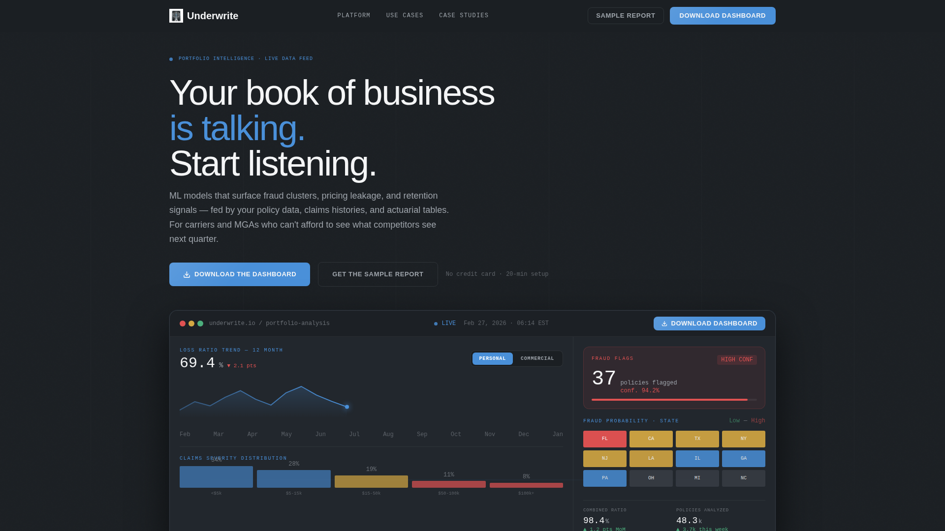
Interactive Dashboard Header Preview
The above-the-fold section embeds a functioning miniature of the analytics dashboard. It displays a loss ratio trend line across twelve months, a fraud probability heat map by state, and a flagged-policy card showing a confidence score. Visitors can hover cards to see tooltips, toggle between personal lines and commercial lines, and watch a claims severity distribution animate in real time.
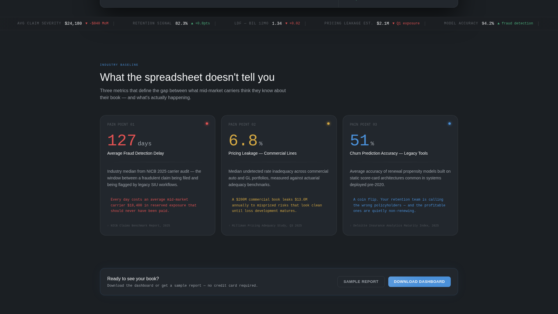
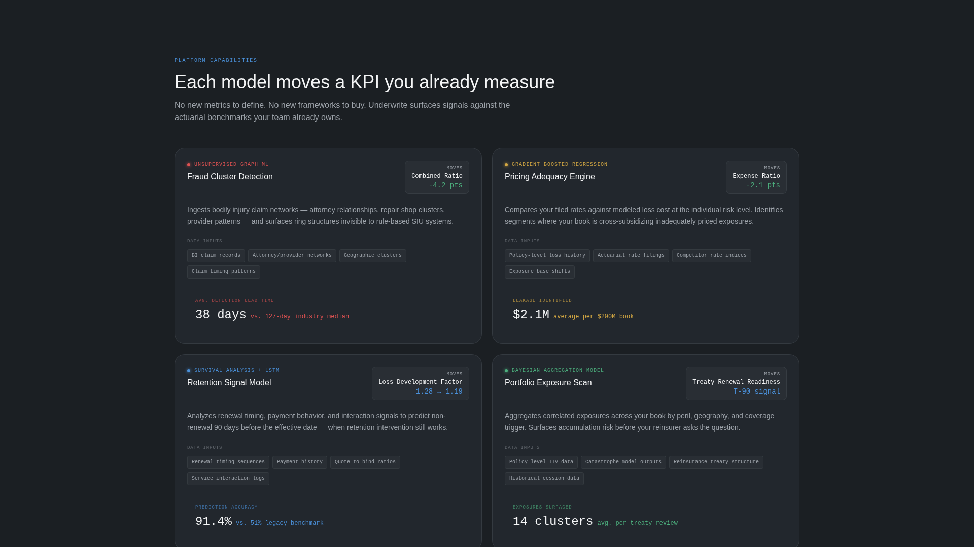
Modular Industry Report Card Grid
The scroll body is organized as self-contained insight cards arranged in rows. The first row presents three hard-statistic pain points covering fraud detection delay, pricing leakage, and churn prediction accuracy. The second row pairs each AI model directly with the insurance key performance indicator it moves, including combined ratio, expense ratio, and loss development factor.
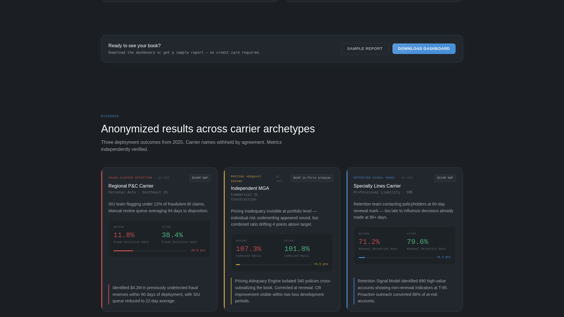
Anonymized Case Study Cards
A third card row presents carrier case studies styled as executive summary pages. Each card shows carrier type, a before metric, an after metric, and a single-sentence outcome. The format matches how analytics professionals already process evidence: problem, method, result.
Persistent and Repeating Call-to-Action Placement
The primary call-to-action button appears first inside the interactive header preview as a persistent pill button. It resurfaces automatically after every second card row, so the prompt to act stays visible without interrupting the reading flow.
Progressive Disclosure Download Flow
The conversion flow opens by asking only for a work email. Company name and role are collected on the confirmation screen via progressive disclosure. This reduces friction at the point of first commitment and lets the platform qualify leads in sequence.
Monochrome Steel Visual System
The color palette uses forge black for primary backgrounds, brushed gunmetal for card surfaces, cold-rolled silver for secondary text and divider lines, and signal white for headlines and data figures. Actuarial blue appears exclusively on live data points, active toggles, and call-to-action buttons, so every color in the layout carries a specific information function.
Page sections overview
| Section | Purpose |
|---|---|
| Interactive Header Preview | Embeds live dashboard with animated data and primary download call to action |
| Industry Pain Point Cards | Presents three hard-statistic problems facing insurance analytics teams |
| AI Capability Cards | Pairs each AI model with the insurance KPI it directly improves |
| Case Study Cards | Shows anonymized carrier outcomes in executive summary card format |
| Secondary call to action Row | Surfaces "Get the Sample Report" gated PDF conversion path |
| Repeating call to action Strip | Reintroduces primary download button after every second card row |
Design & branding system
The visual identity follows a Directory and Discovery theme built entirely on a Monochrome Steel color system. The palette is intentionally cold and information-first, designed to feel like a professional analytics environment rather than a marketing page.
- Core palette: forge black (#1B1F23) backgrounds, brushed gunmetal (#3A3F47) card surfaces, cold-rolled silver (#9EA4AB) for secondary text and dividers, signal white (#F4F5F6) for headlines and key figures
- Single accent: actuarial blue (#4A90D9) reserved strictly for live data indicators, interactive toggles, and call-to-action buttons to maintain visual hierarchy
- Typography and layout reflect a data-terminal aesthetic, skimmable column structures, and the modular card format of a quarterly analytics briefing
Mobile & speed optimization
The card grid layout is modular by design, which allows each row to reflow naturally across screen sizes. Interactive preview components and animated data cards are structured to work within a responsive single-page format.
- Card grid rows stack cleanly on smaller screens without losing the insight-card reading structure
- The persistent call-to-action pill button remains accessible throughout the scroll on mobile viewports
- Progressive disclosure on the download confirmation screen reduces form complexity on smaller displays
How this template helps you convert
This template is built around a specific conversion logic: let the visitor use the product before asking them to download it. Every structural decision reinforces that sequence.
- The interactive header preview gives analytics professionals immediate hands-on contact with realistic insurance data, building confidence before any ask is made
- The modular card grid delivers credibility in the exact format this audience already trusts, progressing from pain points through capabilities to proven outcomes
- The dual conversion path captures two types of intent: high-intent buyers who are ready to download, and research-stage prospects who prefer a sample report first
Other information about this template
This template is categorized under Technology, specifically the AI for Insurance subcategory. It is purpose-built for the insurance AI analytics dashboard niche and reflects an intersection of four matched context signals: Industry Report creative direction, Interactive Preview header concept, App Download landing page direction, and Card Grid modular template style.
- The template is suited for platforms positioning against legacy actuarial spreadsheet tools, where a data-native visual identity accelerates credibility with technical buyers
- The "Your book of business is talking. Start listening." headline is included in the template as a starting point for brand voice alignment
- The gated sample report flow supports lead qualification workflows where capturing work email, company name, and role matters for sales follow-up
- The template style follows a Directory and Discovery theme, making it adaptable for platforms that offer tiered data products, demo environments, or analyst portals alongside a primary download offer
Theme
Directory & Discovery
Creative direction
Industry Report
Color system
Monochrome Steel
Style
Card Grid (Modular)
Direction
App Download
Page Sections
Interactive Dashboard Header Preview
Modular Industry Report Card Grid
Anonymized Case Study Cards
Persistent Repeating Call to Action Button
Progressive Disclosure Download Flow
Monochrome Steel Color System
Related questions
Who is the primary audience for this landing page template?
What does the interactive header preview include?
How does the download conversion flow work?
Does this template include a secondary conversion path?
What makes this template suited for technical insurance buyers?