Insurance Software & SaaS Reviews Website Template
Underwrite is a dashboard-style insurance review management landing page built for operations leaders who need clarity fast. It features a three-tab interactive mockup, punchy capability stats, an ideal customer profile section, and a head-to-head comparison grid. The design uses a dark command-center aesthetic to convey the confidence of a platform that has every signal covered before renewal season hits.
by Rocket studio
Quick summary
Underwrite is a single-page landing page template for an insurance review management platform. It opens with a live-style Feature Tab Switcher showing three dashboard views, then accelerates through capability stats, audience use-case cards, and a competitive comparison grid. The entire page is built to earn a demo click-through before the visitor reaches the footer.
Who this template is for
This template is built for InsurTech and insurance software teams that need a high-converting landing page to reach operations-side buyers. It speaks directly to the professionals managing policyholder feedback at scale.
- Operations directors at regional carriers who track Net Promoter Score data across spreadsheets and need one consolidated view
- Independent agency owners who discover negative reviews weeks or months after they are posted
- Compliance officers at managing general agencies who need documented records of every client touchpoint for audit readiness
What problem this template solves
Insurance review management is fragmented. Feedback arrives from multiple channels, agent performance is tracked manually, and churn signals often go unnoticed until renewal season is already underway. This template gives a platform a page that immediately communicates the cost of that chaos.
- Scattered policyholder feedback makes sentiment trends invisible until damage is done
- Manual tracking tools cannot score agent performance or surface complaint patterns in time to act
- Generic review tools lack the audit-ready documentation that compliance-sensitive insurance operations require
What you get with this template
You get a fully structured, single-page layout designed around the insurance operations buyer journey. Every section is purposeful and sequenced to build confidence from the first scroll to the final call to action.
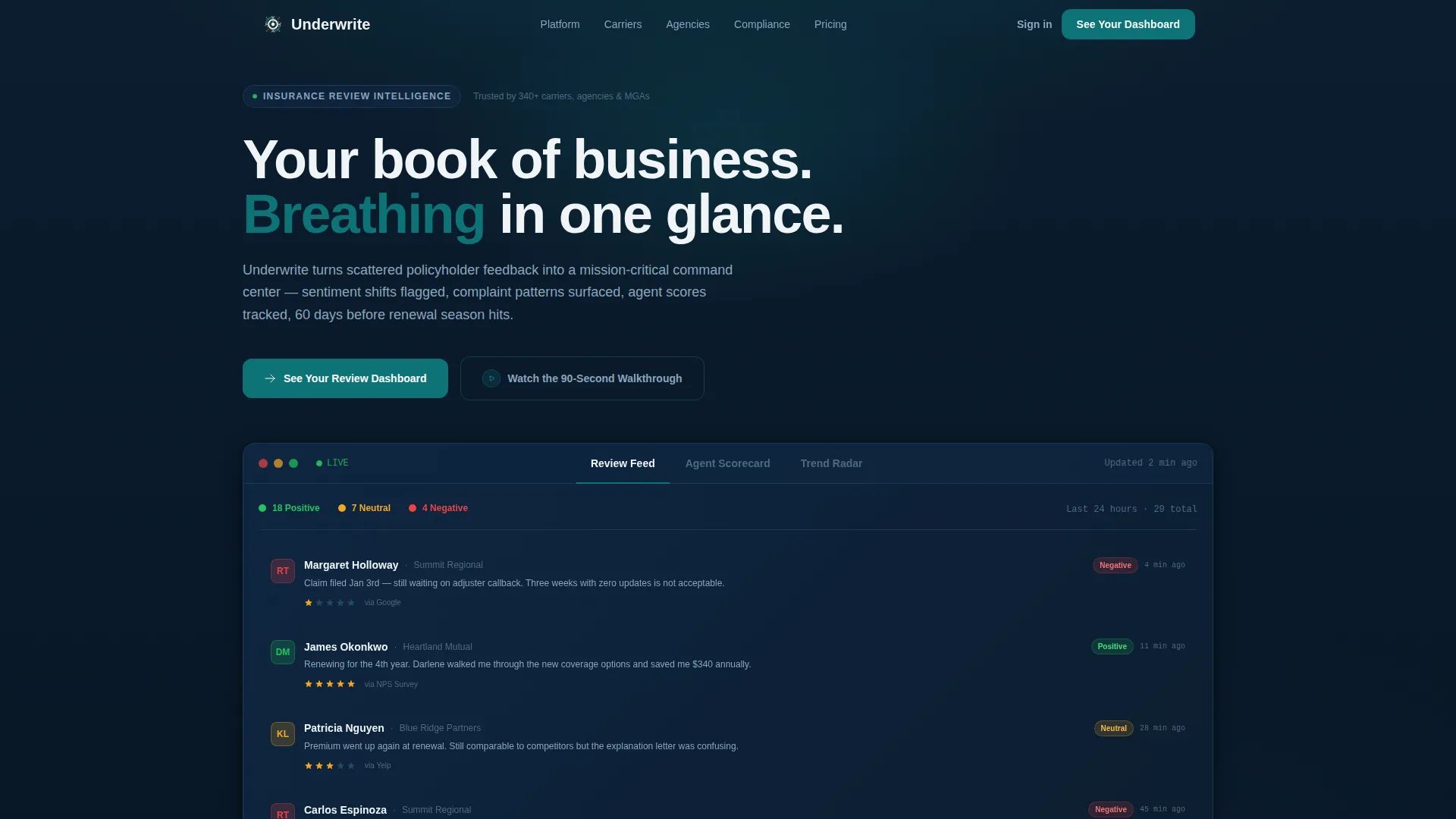
- A cinematic hero section with a Feature Tab Switcher that shows three interactive dashboard states: Review Feed, Agent Scorecard, and Trend Radar
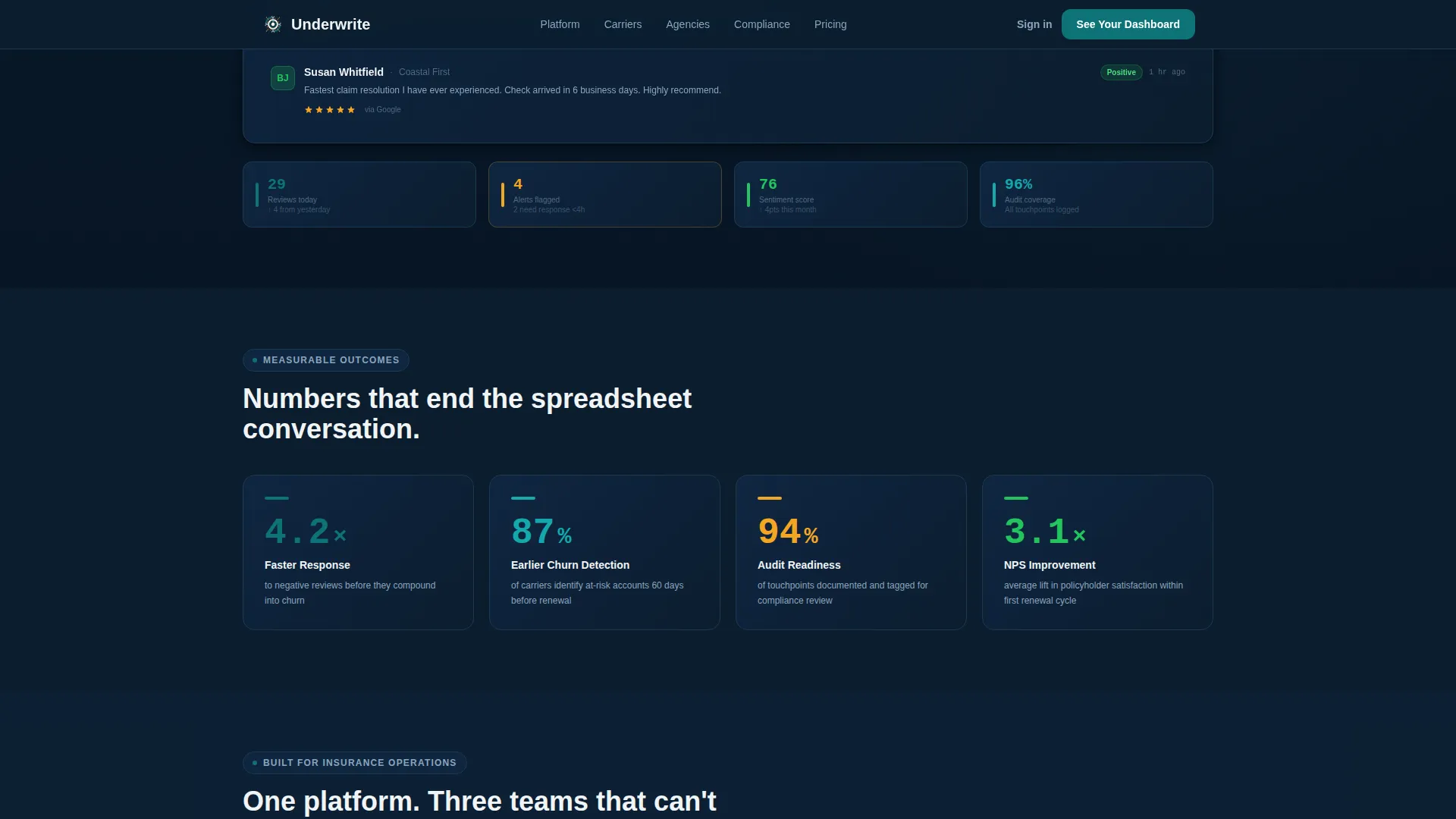
- Four punchy capability stat blocks with a bold figure, a supporting visual, and a one-sentence explanation each
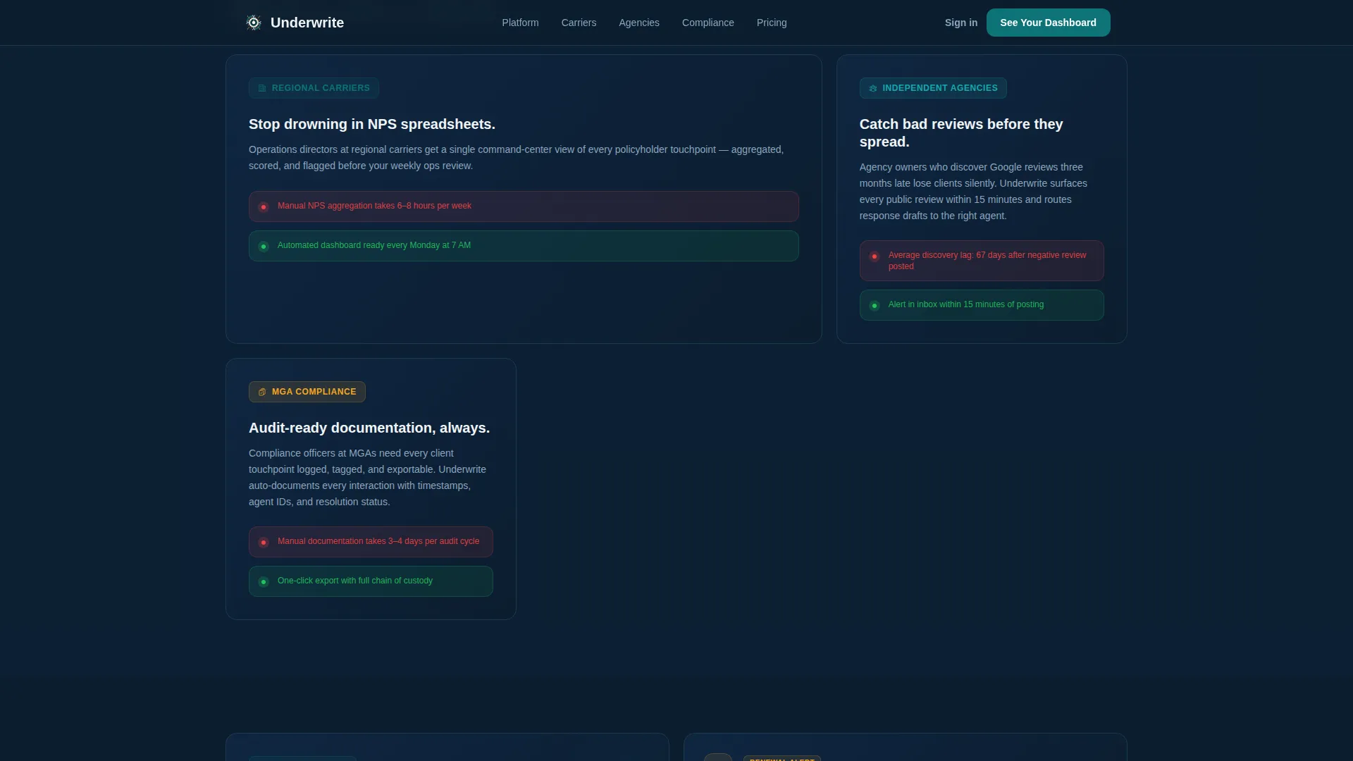
- Three ideal customer profile cards in a bento asymmetric layout, a head-to-head comparison data table, and a testimonial section with a repeat primary call to action
Feature list
This template delivers a precise set of interactive and visual components drawn directly from the Underwrite platform brief.
Feature Tab Switcher Hero
The header contains three clickable tabs set above a live-style dashboard mockup. Each tab transitions the entire data grid beneath it using a smooth horizontal slide. Data points animate on entry: numbers count up, bars fill in, and chart dots plot in sequence so the dashboard feels operational rather than decorative.
Three-View Dashboard Mockup
The Review Feed tab shows a scrollable stream of policyholder reviews with sentiment tags color-coded green, amber, and red. The Agent Scorecard tab reveals a leaderboard with star ratings, response times, and resolution rates per agent. The Trend Radar tab displays a 90-day sentiment line chart with an anomaly spike circled in catalyst amber.
Launch Energy Capability Stats
Four stat blocks fire down the page in a punchy rhythm: a bold headline stat, a supporting visual element, and a single explanatory sentence. The section references specific outcome figures such as 4.2 times faster response to negative reviews and 87 percent of carriers identifying churn risk 60 days earlier.
Ideal Customer Profile Cards
Three bento-layout cards present the three core buyer personas: the operations director, the independent agency owner, and the managing general agency compliance officer. Each card frames the specific pain that persona carries into the buying decision, making the page feel relevant to every qualified visitor.
Competitive Comparison Grid
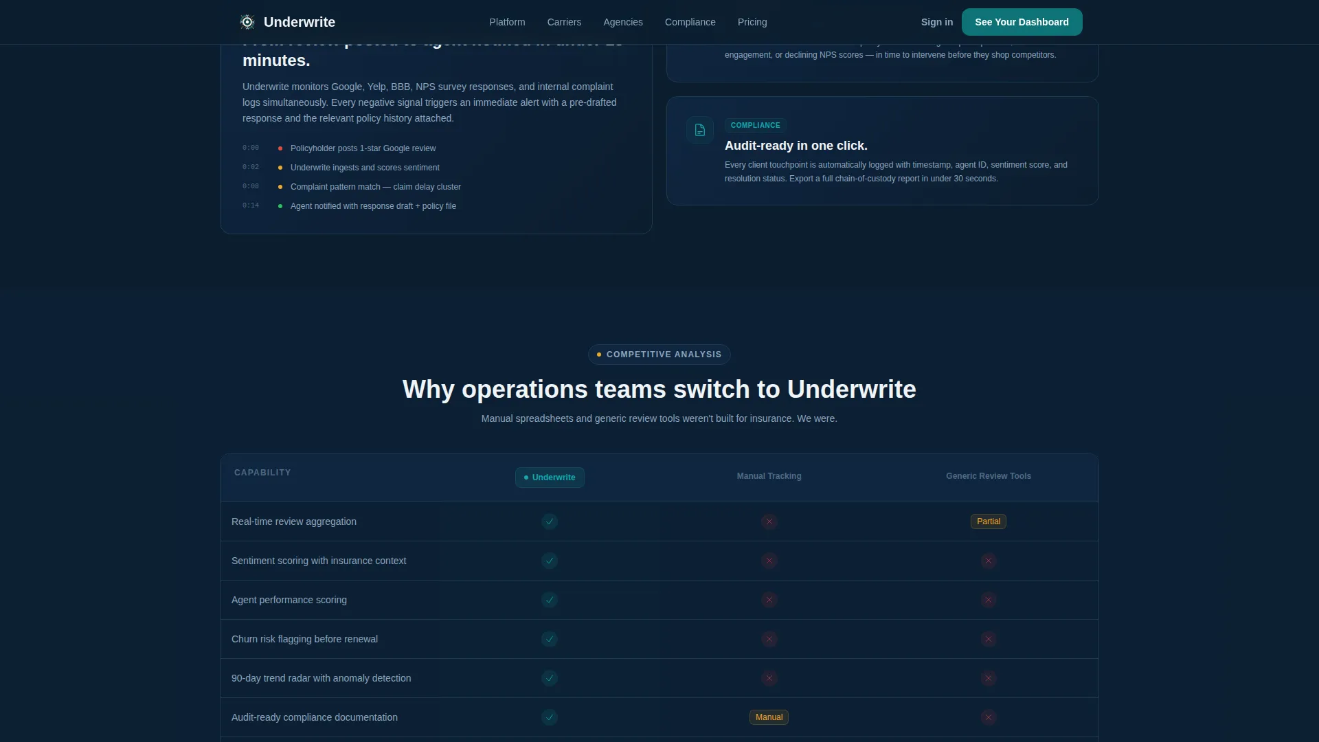
A clean data table positions the platform against manual tracking and generic review tools. Teal checkmarks stack up in the platform column across multiple capability rows, making the advantage visible at a glance without requiring the visitor to read dense copy.
Click-Through Call-to-Action System
The primary call to action, "See Your Review Dashboard," appears first as a floating button inside the header tab switcher and repeats after the comparison grid. A secondary call to action, "Watch the 90-Second Walkthrough," sits beneath the header and opens an inline video modal without routing the visitor away from the page.
Page sections overview
| Section | Purpose |
|---|---|
| Hero Tab Switcher | Launches the three-view interactive dashboard mockup with floating primary call to action |
| Capability Stats Row | Delivers four punchy outcome stats with visuals in Launch Energy rhythm |
| Ideal Customer Cards | Presents three buyer personas in a bento asymmetric card layout |
| Comparison Grid | Shows platform versus manual tracking versus generic tools in a data table |
| Social Proof Block | Displays metric-forward testimonials with carrier-specific outcomes |
| Repeat Call to Action | Closes with the primary "See Your Review Dashboard" call to action |
| Linear Footer | Single-row footer with navigation links and secondary brand elements |
Design & branding system
The visual identity follows a Dynamic Motion theme built around a Teal Catalyst color system. The overall feel is a mission-critical monitoring screen in a dim environment: calm and controlled until an alert demands attention.
- Color palette: midnight dashboard navy (#0B1D2E) for backgrounds and data panels, deep operations teal (#0D7377) as the primary action color, signal white (#F0F4F7) for card surfaces and readable typography, and catalyst amber (#F5A623) reserved strictly for alerts, badges, and hover states
- Typography: Plus Jakarta Sans in bold weights for all headings and data labels, DM Sans for body copy and supporting text, maintaining a clean contrast ratio between heavy headings and lighter body passages
- Animation system: tab transitions use horizontal slides, scroll-reveal sections arrive with upward motion, counter animations count up on entry, bar charts fill from left, and chart dots plot in sequence to keep the interface feeling alive throughout the scroll
Mobile & speed optimization
The template is designed desktop-first to match how operations directors and compliance professionals use workstations during their working day. Responsive behavior is included so the layout adapts correctly on smaller screens without losing the dashboard character.
- Desktop-priority layout ensures the tab switcher and data grid read clearly on large monitors at a full workstation viewport
- Responsive mobile adaptation preserves the core information hierarchy and call-to-action placement on smaller screens
- Interactive components such as the tab switcher and video modal are built with client-side rendering for interactivity, while static sections use server component patterns to keep load performance consistent
How this template helps you convert
This template is engineered around a single conversion goal: getting the qualified visitor to click through to the pre-built interactive demo. Every layout decision supports that outcome.
- The Feature Tab Switcher puts the visitor inside the product experience before they have read a single line of body copy, making the platform feel familiar and already populated with their kind of data
- The Launch Energy stat rhythm builds momentum through specific, credible outcome figures that frame the cost of not acting, pulling the visitor toward the comparison grid and the call to action with increasing urgency
- The no-form click-through design removes friction entirely: the visitor clicks "See Your Review Dashboard" and lands directly inside a pre-built demo populated with sample insurance data, letting the product close the sale
Other information about this template
This template sits within the Insurance Software and Software as a Service category under the broader Technology vertical. It is built specifically for the insurance review management niche, where the buyer is typically a senior operations professional rather than a marketing generalist.
- The template style is Dashboard and Data Grid, making it well suited for platforms that lead with data visualization rather than narrative storytelling
- The header concept is a Feature Tab Switcher, which is distinct from a standard hero banner and works best when the product has three or more clearly differentiated feature views to demonstrate
- The creative direction is Launch Energy, meaning the page is intentionally designed to feel like a product keynote that builds momentum section by section rather than settling into a static brochure rhythm
- The landing page direction is Click-Through, so no lead capture form appears on the page; the entire conversion path routes to an interactive demo
- Localization is set for English language, United States dollar pricing context, and United States date format, making it ready for domestic insurance market deployments without additional localization work
Theme
Dynamic Motion
Creative direction
Launch Energy
Color system
Teal Catalyst
Style
Dashboard/Data Grid
Direction
Click-Through
Page Sections
Feature Tab Switcher with Animated Dashboard
Three Distinct Dashboard View States
Launch Energy Capability Stats Section
Ideal Customer Profile Bento Cards
Head-to-head Competitive Comparison Grid
Dual Call-to-action System
Related questions
Who is the primary buyer this landing page targets?
Does this template include a lead capture form?
What does the Feature Tab Switcher show?
Can the comparison grid rows be customized?
Is this template suitable for a desktop-heavy audience?



