Insurance Contract Management Landing Page
Underwrite is a glassmorphic insurance contract management landing page built for risk managers, operations directors, and brokers. It leads with hard data, $2.4B in contracts managed, 99.7% renewal capture rate, then explains the features behind those numbers. The modular card grid, frosted-glass visuals, and persistent demo call-to-action make a compelling case before asking for a single click.
by Rocket studio
Quick summary
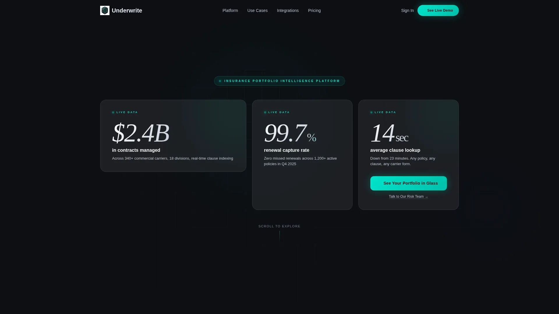
Underwrite is a stats-first, single-page template for an insurance contract management platform. It opens with three oversized glassmorphic metric cards and never lets the data stop. Every scroll depth delivers a hard number before the feature explanation follows. The result is a landing page that proves competence first and asks for attention second.
Who this template is for
This template is built for teams that manage complexity at scale. It speaks directly to the people who feel the pain of disorganized policy portfolios every day.
- Risk managers overseeing hundreds of commercial policies across multiple business divisions
- Operations directors at mid-market carriers replacing chaotic spreadsheet trackers with a live dashboard view
- Brokers who need to demonstrate clear portfolio health to retain accounts at renewal season
What problem this template solves
Insurance portfolios grow faster than the tools meant to manage them. Renewal dates slip, coverage gaps appear, and clause lookups eat hours. This template is designed to position a platform as the solution to that exact operational chaos.
- Scattered policy data buried in spreadsheets makes every renewal a risk
- Slow clause lookup and missed liability caps create costly errors under pressure
- Brokers and risk managers lose client confidence when portfolio health is hard to prove quickly
What you get with this template
You get a complete, conversion-focused landing page that leads entirely with evidence. Every section is structured to build trust through accumulated proof before a single feature explanation appears.
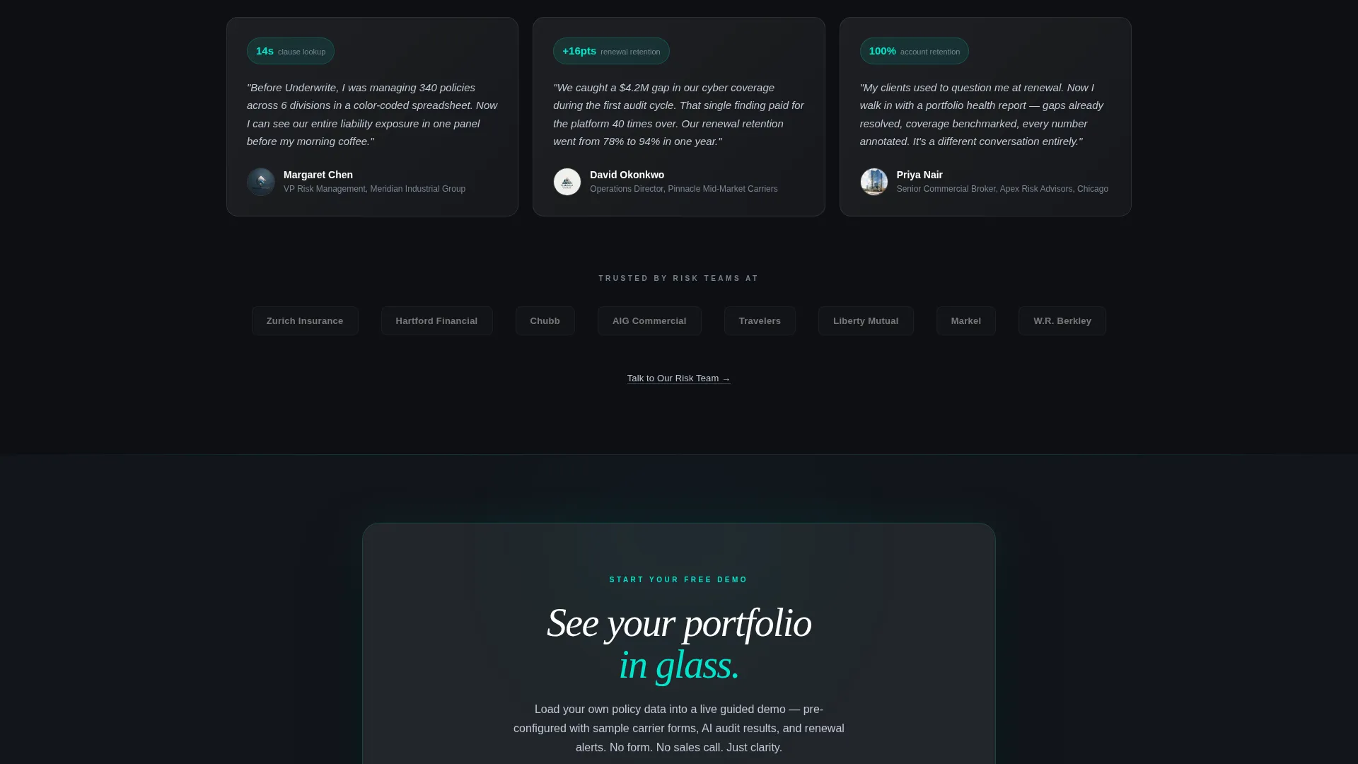
- A full modular card grid layout with glassmorphic frosted-panel cards, each acting as a self-contained proof point
- A stats-driven header section displaying three asymmetric metric cards with parallax scroll behavior and luminous thin typography
- A persistent floating call-to-action button and a secondary text link repeated beneath each section for visitors at different stages of intent
Feature list
This template packages its visual and structural capabilities into a tight, purposeful system. Each feature below maps directly to something present in the design brief.
Stats-First Header Wall
Three oversized glassmorphic cards fill the viewport asymmetrically. Each card displays one arresting metric in thin, luminous type against a frosted panel. Subtle parallax causes the cards to shift on scroll like instruments on a cockpit dashboard.
Modular Proof-Point Card Grid
Every card in the grid is self-contained. A stat sits on top, a one-line explanation sits beneath, and a micro-animation rewards the eye for landing there. Progress rings complete and counters tick to suggest live data activity.
Stats-First Scroll Rhythm
Each scroll depth opens with a hard metric before explaining the feature it represents. "340 carrier forms auto-parsed" leads into the ingestion engine. "67% fewer coverage gaps detected" introduces the audit module. The rhythm is evidence, then explanation, then evidence again.
Persistent Floating Call-to-Action
The primary call-to-action, "See Your Portfolio in Glass," appears first inside the header's third card. It then reappears as a floating button after the second scroll fold and stays visible as visitors continue scrolling.
Secondary Conversion Pathway
A text link reading "Talk to Our Risk Team" sits beneath each section. This gives high-intent visitors a direct route to bypass the demo and speak with someone immediately.
Tech Glass Visual System
Deep obsidian forms the base layer. Frosted translucent white card surfaces sit above it. Electric teal accents highlight live data elements and progress rings. Soft silver handles secondary text. The palette creates a sense of layered depth throughout the page.
Page sections overview
| Section | Purpose |
|---|---|
| Stats Header Wall | Opens with three metric cards and the primary call-to-action |
| Ingestion Engine Block | Leads with "340 carrier forms auto-parsed" stat before explaining the feature |
| AI Audit Module | Leads with "67% fewer coverage gaps detected" before feature description |
| Persistent Floating Button | Keeps the primary call-to-action visible after the second scroll fold |
| Secondary Text Links | Provides a direct "Talk to Our Risk Team" path beneath each section |
Design & branding system
The visual identity follows a Tech Glass theme built around a glassmorphic color system. The result is a page that feels less like a marketing site and more like a live instrument panel.
- Base layer in deep obsidian (#0D0F13), card surfaces in frosted translucent white (#FFFFFF at 8 to 12% opacity), electric teal (#00E5CC) for live data accents and progress rings, and soft silver (#C2C9D6) for secondary text
- Cards hover with blurred backdrops, borders catch light like beveled crystal, and teal accents pulse to suggest real-time data activity
- No hero image and no stock photography; the data itself serves as the visual centerpiece throughout the page
Mobile & speed optimization
The modular card grid layout is inherently flexible. Card stacking and responsive column behavior keep the stats-first experience intact on smaller screens without sacrificing the visual depth of the glassmorphic system.
- Glassmorphic cards reflow into single-column stacks on mobile while maintaining frosted depth and teal accent visibility
- Micro-animations are scoped to individual cards, so each one loads and performs independently without blocking the rest of the page
- The floating call-to-action button remains anchored and accessible at all scroll depths on both desktop and mobile viewports
How this template helps you convert
Every structural decision in this template pushes a visitor closer to clicking the demo link. The page earns trust before it asks for anything.
- The stats-first scroll rhythm builds an overwhelming case through accumulated evidence, so visitors arrive at the call-to-action already convinced rather than skeptical.
- The persistent floating "See Your Portfolio in Glass" button stays in view after the second scroll fold, removing the need for a visitor to scroll back up to act.
- The secondary "Talk to Our Risk Team" text link beneath each section captures high-intent visitors who are ready to skip the demo and speak directly with someone.
Other information about this template
This template is built for a single-page, click-through flow. There is no form on the page. The primary call-to-action routes visitors to a guided demo environment pre-loaded with sample policy data. The secondary link routes to a direct conversation with a risk specialist.
- The template is categorized under Technology and Insurance Software, making it relevant for platforms serving the insurance contract management niche
- The card grid structure supports easy content swaps, so teams can update metrics, card copy, and section stats without redesigning the layout
- This template is well-suited for platforms that want to position around insurance portfolio management, commercial policy tracking, or renewal workflow visibility


Theme
Tech Glass
Creative direction
Stats-First Impact
Color system
Glassmorphic
Style
Card Grid (Modular)
Direction
Click-Through
Page Sections
Stats-first Header with Parallax Cards
Modular Proof-point Card Grid
Stats-first Scroll Rhythm
Persistent Floating Call-to-action
Dual Conversion Pathways
Tech Glass Visual Identity
Related questions
Who is the primary audience for this landing page template?
Does this template include a contact form?
Can I update the metric numbers shown in the header cards?
What makes the glassmorphic design suitable for an insurance platform?
Is this a single-page or multi-page template?


