Insurance Appointment Scheduling Landing Page
Underwrite is a dashboard-style landing page template built for insurance appointment scheduling platforms. It pairs a glassmorphic visual system with a Problem→Solution Arc narrative, moving visitors from scheduling chaos to clean, coordinated control. The template targets independent agents, agency managers, and back-office teams who need a compelling, conversion-focused page fast.
by Rocket studio
Quick summary
Underwrite is a single-page template designed for insurance appointment scheduling software. It opens with a live-feeling dashboard preview, walks visitors through a before-and-after story of scheduling chaos resolved, and anchors conversion with a side-by-side comparison table and a self-referential demo booking form.
Who this template is for
This template is built for teams and individuals who manage complex insurance appointment workflows and need a landing page that speaks directly to their daily pain. If your product helps people coordinate, schedule, or recover missed appointments in the insurance industry, this layout was made for you.
- Independent insurance agents navigating high-volume Medicare Advantage enrollment seasons
- Agency managers coordinating multiple producers across several branch offices
- Back-office coordinators who spend significant time rescheduling policy reviews and handling no-shows
What problem this template solves
Insurance scheduling tools often struggle to communicate their value clearly on a landing page. Generic layouts fail to mirror the specific friction their buyers feel every day. Underwrite fixes that by making the problem visceral and the solution immediately visible.
- No compelling visual contrast between the chaos of legacy scheduling and the clarity of the product
- Comparison tables that do not reflect insurance-specific features like carrier appointment types or enrollment period handling
- Demo or trial calls-to-action that feel disconnected from the product itself
What you get with this template
You get a fully structured, single-page layout that carries a visitor from first impression through conversion without a single dead end. Every section serves a deliberate role in the Problem→Solution Arc.
- A perspective-rotated, animated dashboard header that shows the scheduling interface before a visitor reads a single word
- A sticky comparison table contrasting your platform against generic calendar tools and legacy insurance software across twelve feature rows
- Two conversion paths: a self-booking demo form powered by the product itself and a gated 90-second walkthrough video for softer leads
Feature list
This section covers the core functional blocks built into the template.
Animated Dashboard Header
The header renders a pixel-accurate week-view scheduling interface. Color-coded appointment blocks for initial consultations, policy reviews, and enrollment signings populate the calendar. Micro-animations show a new booking sliding into a slot, a no-show graying out with a rebooking suggestion, and a confirmation checkmark appearing on a completed block.
Before and After Scroll Transition
Below the header, a split comparison begins with a chaotic data grid of overlapping spreadsheets, missed-call logs, and conflict-heavy calendar cells. As the visitor scrolls, a frosted glass panel slides over the chaos and resolves it into the clean scheduling dashboard. The transition makes the product's value visible without a single line of text.
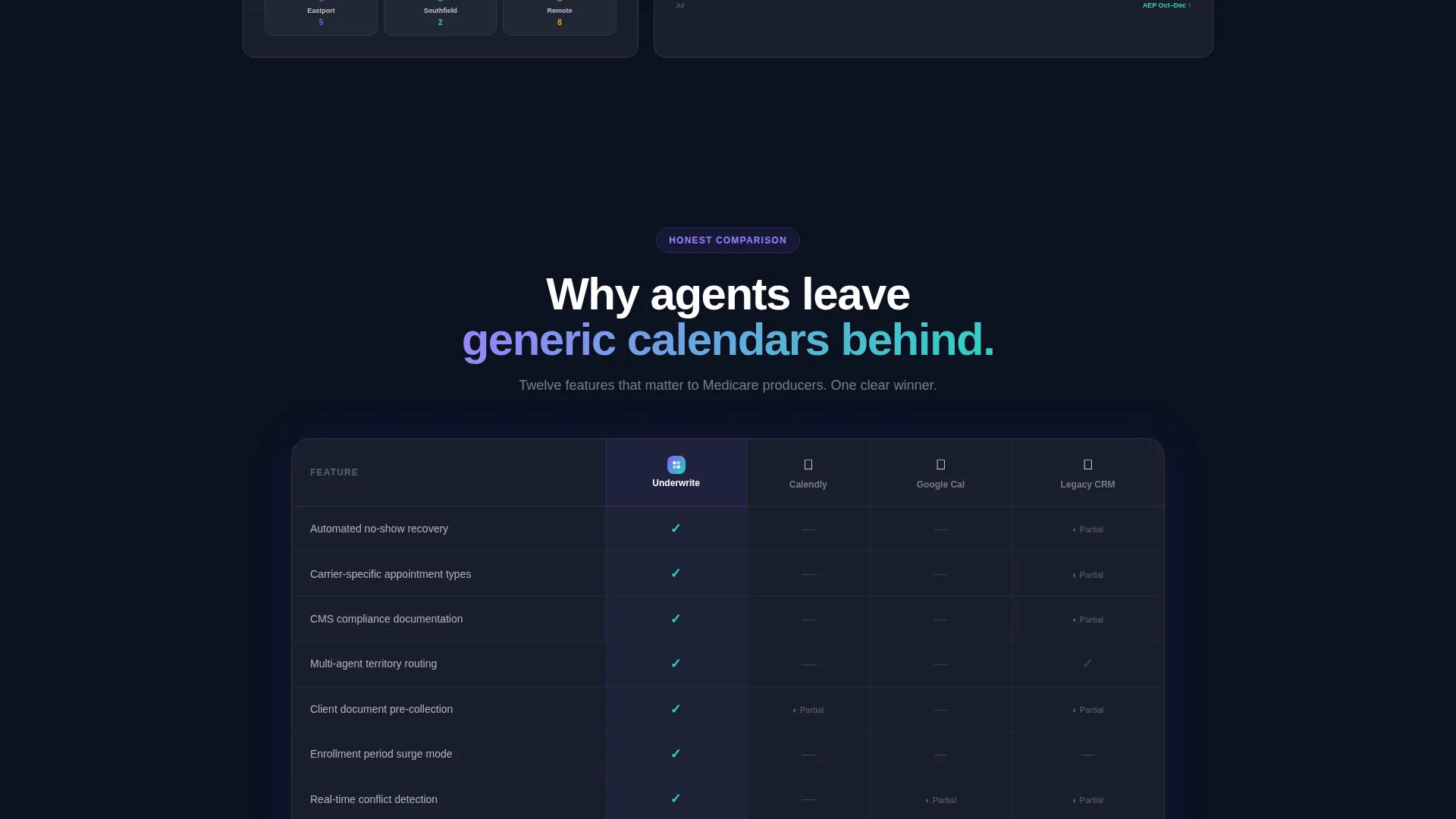
Sticky Feature Comparison Table
A fixed side-by-side table occupies the center of the page. It compares the platform against generic calendar tools and legacy insurance software across twelve rows covering features like automated no-show recovery, carrier-specific appointment types, Centers for Medicare and Medicaid Services compliance tracking, multi-agent territory routing, client document pre-collection, and enrollment period surge handling.
Self-Referential Demo Booking Form
The primary call-to-action invites visitors to book a live walkthrough. The form collects agency name, number of producing agents via a dropdown (1 to 5, 6 to 20, 21 to 50, or 50 plus), and primary line of business. The booking itself is completed using an embedded version of the scheduling tool, demonstrating the product in the act of using it.
Gated Video Secondary Path
Visitors who are not ready to book a demo can watch a 90-second product walkthrough. Playback requires an email address, creating a lightweight lead-capture path that does not pressure the visitor but still brings them into the funnel.
Dynamic Motion Visual System
Interactive elements use accent gradients that pulse gently between iris purple and signal teal. Cards hover with backdrop blur. Backgrounds stack in translucent planes. Motion is continuous but calm throughout, with elements gliding, fading, and morphing rather than jumping, reinforcing the theme that the product replaces panic with flow.
Page sections overview
| Section | Purpose |
|---|---|
| Dashboard Header | Opens with animated scheduling interface preview |
| Before versus. After | Visualizes scheduling chaos resolving into order |
| Drag-and-Drop Block | Shows simplified appointment management flow |
| SMS No-Show Recovery | Visualizes automated rebooking message sequences |
| Multi-Office Map View | Shows real-time agent coordination across locations |
| Comparison Table | Benchmarks platform against competing tools |
| Demo Booking Form | Primary conversion path via embedded scheduler |
| Video Walkthrough | Secondary lead-capture path for softer visitors |
Design & branding system
The visual identity follows a Dynamic Motion theme built on a glassmorphic color system. Every layer of the page feels like depth behind frosted glass, with panels floating above a deep navy field and borders catching light like condensation on a window.
- Color palette: frosted panel white at 40% opacity, deep underlay navy (#0B1120), translucent iris purple (#7C5CFC) for active states and data highlights, and soft signal teal (#2DD4BF) for confirmations and success indicators
- Cards use subtle backdrop-blur and translucent layering to create a sense of physical depth without heavy drop shadows
- Accent gradients pulse between iris purple and signal teal on interactive elements, reinforcing the Dynamic Motion theme throughout the page
Mobile & speed optimization
The template is designed to maintain its glassmorphic depth and motion character across screen sizes without sacrificing clarity on smaller displays. Animated sections are structured to reflow gracefully on mobile viewports.
- The dashboard header perspective rotation and card layering are sized to remain legible on tablet and mobile screen widths
- Comparison table rows are structured for horizontal scroll on smaller screens so no feature data is hidden from mobile visitors
- Motion elements are implemented to glide and fade rather than rely on heavy frame rates, keeping the experience smooth across devices
How this template helps you convert
The page is built around a single conversion thesis: let visitors feel the problem, watch it disappear, and then remove every barrier between them and the product.
- The before-and-after scroll arc creates an emotional moment early in the visit. Visitors recognize their current situation in the chaotic grid and feel the relief of seeing it resolve, before they have read a feature list or a pricing row.
- The comparison table does the competitive evaluation work for the visitor. Twelve rows of insurance-specific criteria, with teal checkmarks for the platform and gray indicators for alternatives, give a decision-maker everything they need to justify moving forward.
- The demo form proves the product by using it. Booking a live walkthrough inside an embedded version of the scheduler is a micro-experience of the actual tool, lowering hesitation and raising confidence at the exact moment of commitment.
Other information about this template
This template fits squarely within the insurance software category and is optimized for platforms serving the insurance appointment scheduling niche. It is built to present a technology product with the visual sophistication that modern buyers in this space expect.
- The template style is classified as a Dashboard and Data Grid layout, reflecting the data-forward nature of the scheduling product it promotes
- The header concept is a live Dashboard Preview, a format that works especially well when the product itself is visual and interface-driven
- The creative direction follows a Problem→Solution Arc, which research consistently supports as a high-performing narrative structure for software landing pages in regulated industries
- The comparison section is structured to reference the types of tools insurance professionals commonly evaluate, including general-purpose calendar applications and legacy insurance software platforms
- This template is built as a single-page layout and does not include multi-page navigation or a site-wide menu structure


Theme
Dynamic Motion
Creative direction
Problem→Solution Arc
Color system
Glassmorphic
Style
Dashboard/Data Grid
Direction
Comparison/Versus
Page Sections
Animated Week-view Dashboard Header
Scrolling Before and After Transition
Twelve-row Sticky Comparison Table
Self-referential Demo Booking Form
Gated 90-second Video Walkthrough
Glassmorphic Dynamic Motion Design
Related questions
Who is this template designed for?
Does the template include the comparison table content?
Can I replace the placeholder names and calendar data in the header?
Does the demo booking form require a third-party integration?
Is this template suitable for a solo agent or only for large agencies?


