Bold Brutalist Workwear Waitlist Landing Page Template
Uniform is a bold brutalist landing page template built for corporate workwear brands. It combines a masonry visual grid, a dramatic spotlight header, and a focused waitlist form to turn procurement managers and operations directors into founding partners. The Obsidian and Gold color system keeps every section sharp, unapologetic, and ready to convert.
by Rocket studio
Quick summary
Uniform is a single-page waitlist template designed for corporate workwear brands that mean business. The layout pairs a cinematic spotlight header with a masonry image grid to build visual conviction before asking for the commitment. Three form fields, a scarcity counter, and a sticky gold call-to-action bar make the path from curiosity to reservation short and clear.
Who this template is for
This template is built for workwear brands that sell to organizations, not individuals. If your buyers are weighing bulk orders, standardizing crews across multiple sites, or making the case internally for a new uniform supplier, this page speaks their language.
- Procurement managers outfitting warehouse floors and field crews
- Operations directors standardizing uniforms across multiple locations
- Startup founders who want their install technicians looking as polished as their pitch deck
What problem this template solves
Most coming-soon pages look forgettable. A workwear brand competing for corporate contracts cannot afford a generic countdown timer and a single email field. Buyers need to feel the quality before they commit, and the page needs to qualify serious leads from casual browsers at the same time.
- A weak visual presentation fails to justify premium contract pricing
- Generic waitlist forms collect emails without capturing useful procurement data
- No scarcity signal means visitors leave without urgency to act
What you get with this template
You get a complete coming-soon landing page built around three conversion goals: capture the committed buyer, engage the curious visitor, and establish founding-partner urgency before launch. Every section is purpose-built and ready to customize.
- A spotlight header section with hero typography and a tagline
- A masonry image grid that moves from product close-ups to field photography
- A sticky bottom waitlist bar with a three-field form and a live counter
- A secondary lookbook download path that captures email-only leads
Feature list
This template delivers focused, high-impact layout components drawn directly from the brief. Each feature serves the workwear brand's specific conversion context.
Cinematic Spotlight Header
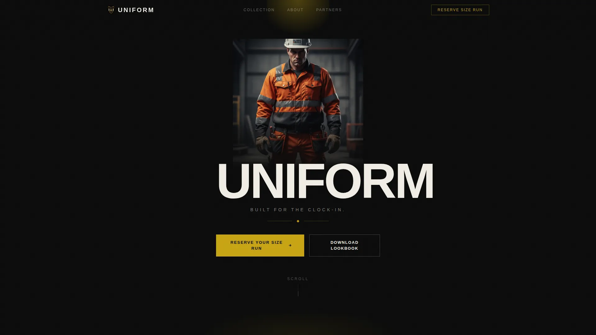
The header places a single figure center-frame against a full-black background, lit by a hard overhead cone of gold light. No face above the jaw, no background clutter. The word UNIFORM stamps across the chest in condensed brutalist type, and the tagline "Built for the clock-in." fades beneath it. The garment carries all the visual weight.
Masonry Visual Grid
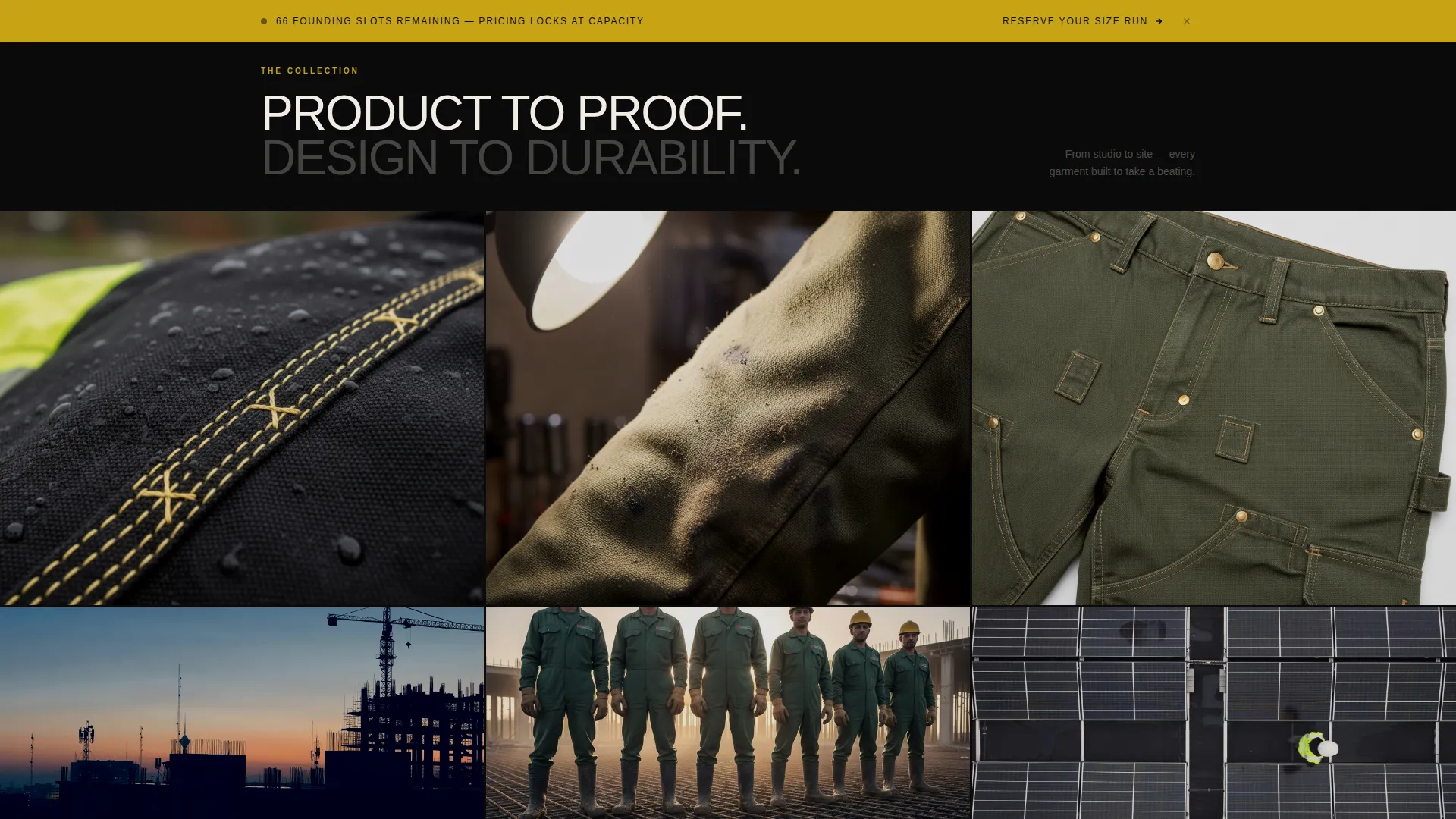
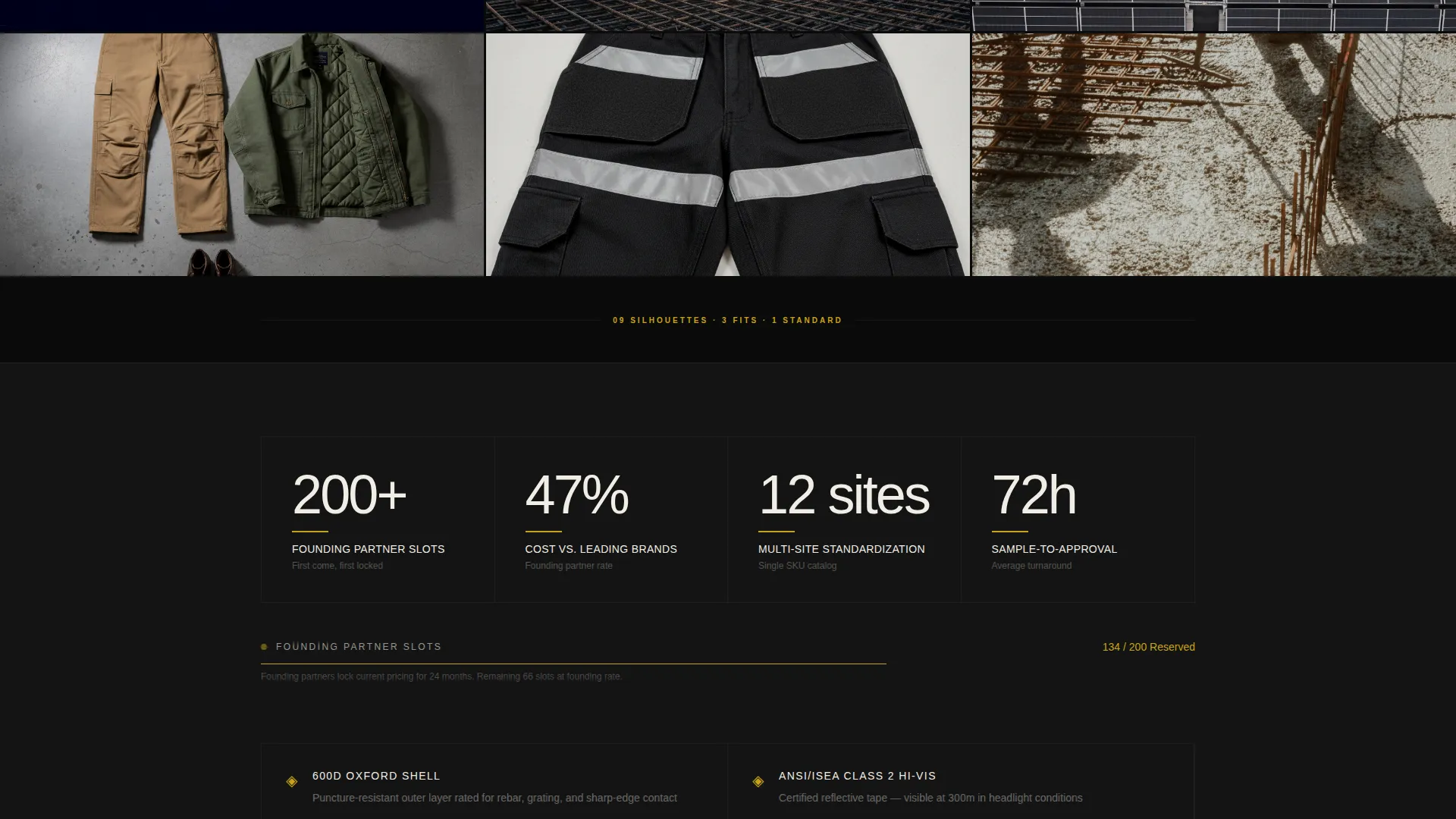
The page body uses a masonry grid layout with tiles at varied scales. Close-up stitch details sit beside full-body silhouettes and flat-lay pocket arrangements. Cards use brutal cropping with no rounded corners and no padding. As the visitor scrolls, the imagery shifts from studio shots to field photography, building a narrative from design to durability.
Sticky Waitlist Bar
A fixed gold bar anchors to the bottom of the viewport on all screen sizes. The primary call to action reads "Reserve Your Size Run." The embedded form collects company name, estimated headcount, and email in one step. This keeps the conversion path visible throughout the entire scroll.
Founding-Partner Scarcity Block
A live counter shows the visitor their waitlist position in real time. A founding-partner pricing lock is offered to the first 200 companies, creating a concrete and time-sensitive reason to act now rather than return later.
Lookbook Download Path
A secondary conversion option lets visitors download a digital lookbook PDF in exchange for their email address alone. This captures leads who are interested but not yet ready to commit to a full size-run reservation.
Bold Brutalist Typography System
Heavy, oversized type weights set in condensed brutalist styles carry the visual language across every section. White type breaks through the dark monolithic surface. Gold appears only on hover states, call-to-action elements, and accent borders, keeping the palette disciplined and impactful.
Page sections overview
| Section | Purpose |
|---|---|
| Spotlight Hero Header | Anchors brand identity with cinematic product focus |
| Hero Tagline Block | Delivers the brand promise beneath the hero figure |
| Masonry Product Grid | Builds visual conviction through layered product imagery |
| Field Photography Tiles | Shifts narrative from design to real-world durability |
| Waitlist Scarcity Block | Shows live counter and founding-partner pricing lock |
| Lookbook Download call to action | Captures email-only leads via PDF offer |
| Sticky Waitlist Bar | Keeps reservation call to action visible throughout the scroll |
Design & branding system
The Obsidian and Gold color system is intentional and disciplined. Deep slab black (#0B0B0B) forms the dominant surface. Poured-concrete gray (#3A3A3C) adds depth without breaking the monolithic feel. Molten gold (#C8A415) appears only on hover states, call-to-action buttons, and accent borders. Arc-flash white (#F0EDE5) carries all body typography.
- Heavy condensed brutalist typefaces in oversized weights for headlines
- Gold reserved exclusively for interactive and accent elements, never decorative fill
- No rounded corners, no soft padding, no visual softening of any card or container
Mobile & speed optimization
The layout is built to perform on the devices your buyers actually use. Procurement managers reviewing vendor options between meetings need the page to load and communicate quickly on a phone screen.
- The sticky waitlist bar remains anchored at viewport bottom on mobile viewports
- The masonry grid adapts to smaller screen widths without breaking the card proportions
- The three-field form is compact and thumb-friendly for on-the-go completion
How this template helps you convert
The page is structured to move a skeptical B2B buyer from first impression to form submission without friction. Every design decision supports that path.
- The spotlight header establishes immediate visual credibility, making the product feel premium before a single word is read.
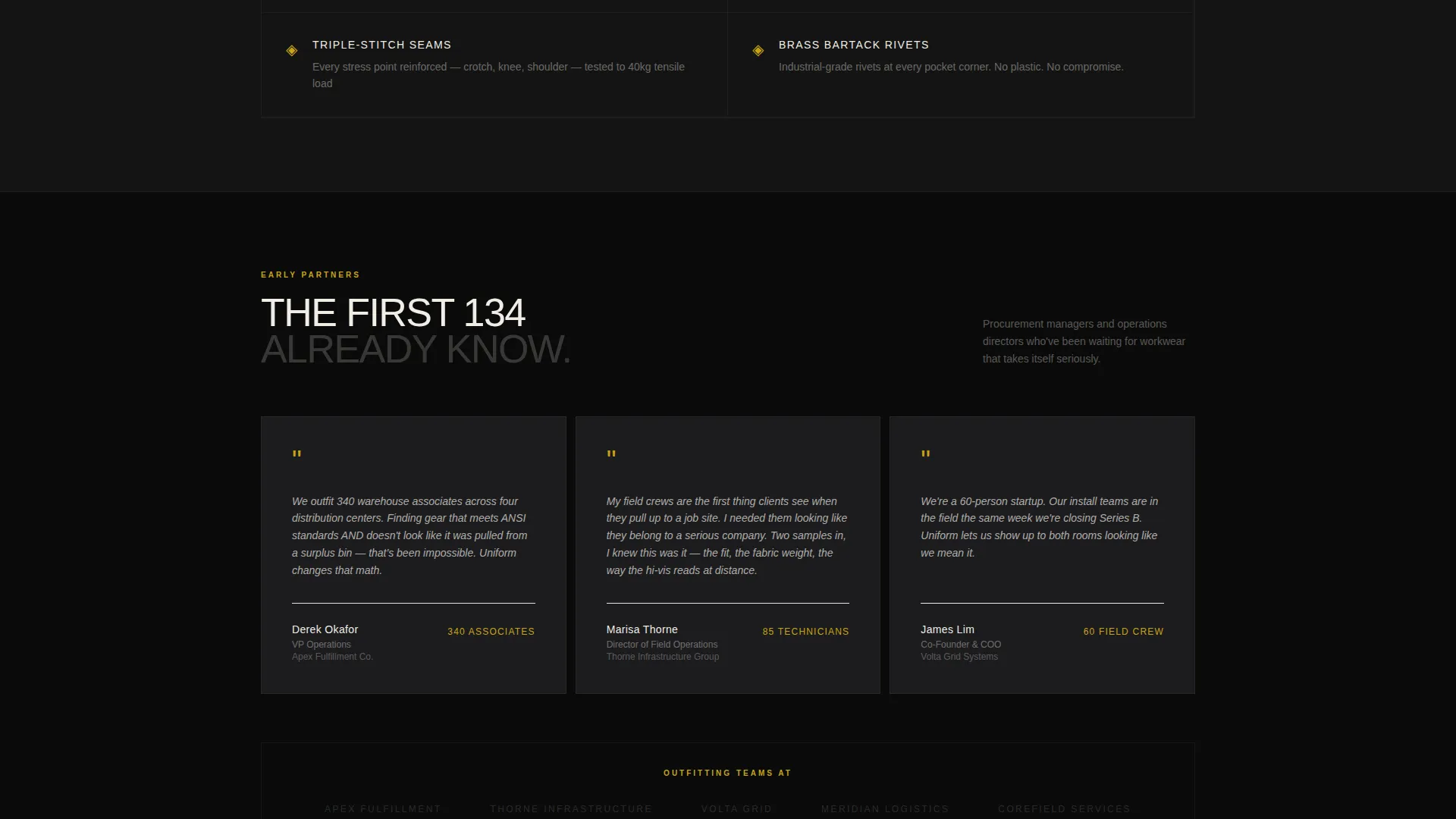
- The masonry grid builds conviction progressively, moving from craft details to field proof so the buyer's confidence grows with each scroll.
- The scarcity counter and founding-partner lock create a concrete deadline, turning a passive browser into an active reservation.
Other information about this template
This template fits within the Fashion and Lifestyle category under the Workwear and Uniform subcategory, with a niche focus on corporate workwear brands. It uses the Immersive Visual creative direction and the Masonry/Pinterest layout style. The Waitlist/Coming Soon landing-page direction makes it purpose-built for pre-launch campaigns.
- The Bold Brutalist theme and Obsidian and Gold color system are ready to apply without additional design work
- The Spotlight header concept is a defined layout component requiring only image and copy replacement
- The template is suited for brands targeting bulk procurement buyers across industries including logistics, construction, and field services
Theme
Bold Brutalist
Creative direction
Immersive Visual
Color system
Obsidian & Gold
Style
Masonry/Pinterest
Direction
Waitlist/Coming Soon
Page Sections
Cinematic Spotlight Header
Masonry Visual Grid
Sticky Waitlist Conversion Bar
Founding-partner Scarcity Block
Lookbook Download Lead Path
Bold Brutalist Typography System
Related questions
Who is the primary buyer this template is designed to attract?
Can I use this template to collect leads before my product is available?
How does the lookbook download differ from the main waitlist form?
What makes the masonry grid different from a standard image gallery?
Is the Obsidian and Gold color system easy to customize?



