Intelligent Federated Learning Landing Page Template
Federate is a scroll-reveal landing page template built for a federated learning newsletter and community. It opens with an interactive Federation Readiness Calculator, then progressively discloses curated research, an open-source framework directory, and community threads. The design uses an AI Iridescent color system against void black, engineered to convert technically sharp readers with zero friction.
by Rocket studio
Quick summary
Federate is a single-page, scroll-reveal landing page template for a federated learning newsletter and community. It leads with a functional calculator tool, unfolds curated content lane by lane, and drives subscriptions through a frictionless one-input call to action. The design feels like a live terminal, not a brochure.
Who this template is for
This template is built for technically sophisticated audiences in the machine learning and data privacy space. If you run a newsletter, community, or resource hub focused on federated learning, this page positions your offering with the credibility those readers expect.
- Machine learning engineers working with edge nodes, on-device model updates, and distributed training pipelines
- Privacy officers translating regulatory requirements into technical system design
- Research leads evaluating open-source federated learning frameworks and protocols
What problem this template solves
Finding trustworthy, high-signal resources in the federated learning space takes hours of hunting across research repositories, forums, and documentation. A generic newsletter landing page does not earn trust from readers who can spot shallow content instantly. This template solves both problems at once.
- It delivers immediate value through an interactive readiness calculator before asking for anything
- It removes subscription friction by requiring only an email address and one click
- It organizes curated research, framework rankings, and community threads in a scannable, progressive layout
What you get with this template
You get a fully structured scroll-reveal landing page layout designed around a tool-first conversion strategy. Every section is purpose-built to match the expectations of technically demanding readers.
- A Federation Readiness Calculator header with selectable data regimes, node count input, model parameter sizing, and privacy constraint toggles
- Progressive content lanes covering headline research papers, a filterable open-source framework directory, and community threads ranked by signal-to-noise ratio
- A persistent floating subscription pill and an anchored secondary call to action, both requiring only an email address
Feature list
This template is built around a clear set of functional and visual capabilities, each grounded in the source brief.
Federation Readiness Calculator
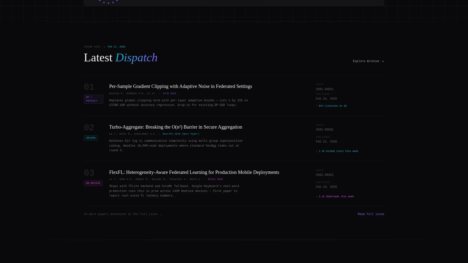
The page opens with an interactive tool, not a hero image. Visitors select their data regime (cross-device, cross-silo, or hybrid), input node count and model parameter size, and toggle privacy constraints. The calculator renders a readiness score with estimated communication rounds and privacy budget burn rate, displayed in iridescent-accented data visualizations against void black.
Scroll Reveal Progressive Disclosure
Each scroll tick progressively reveals a new content lane. Sections materialize with a diffraction shimmer effect, teal bleeding into violet at the edges. The reveal sequence moves from research papers to framework directory to community threads, giving visitors a guided discovery experience.
Filterable Framework Directory
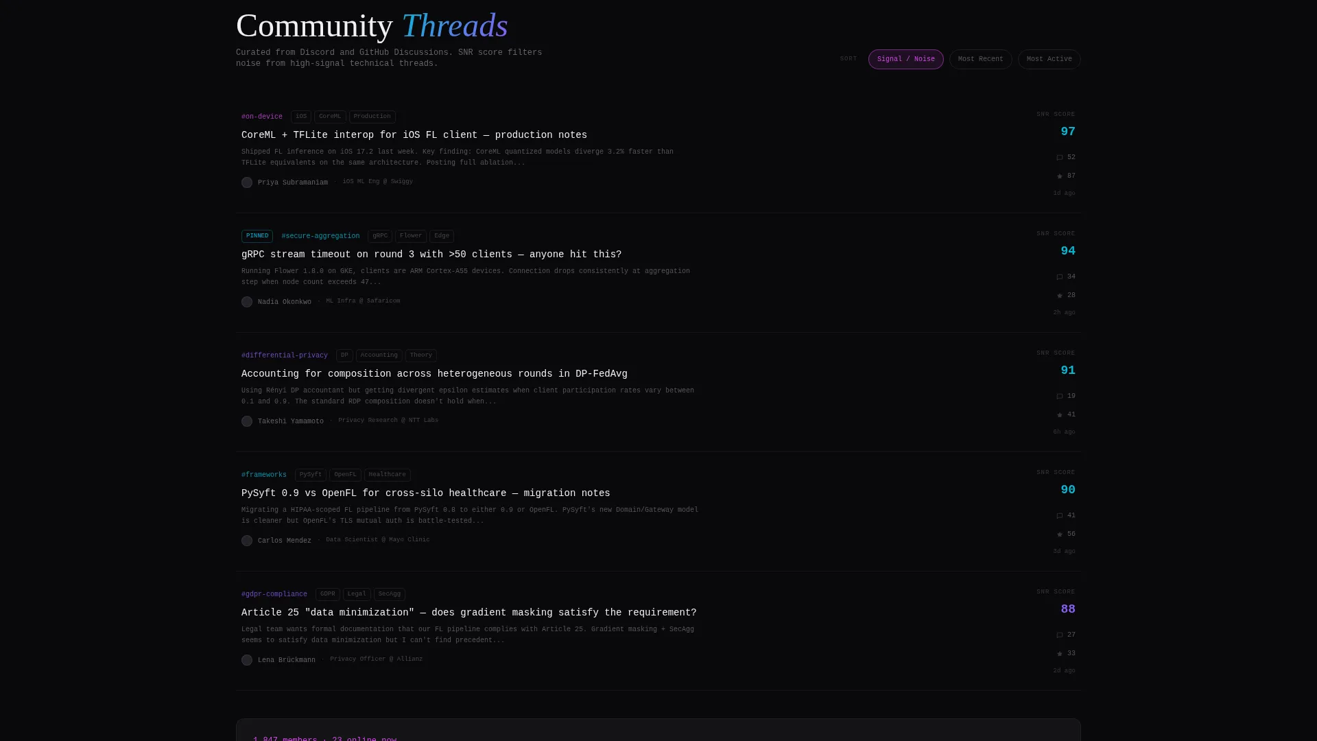
A ranked directory of open-source federated learning frameworks is built into the layout. Frameworks are ordered by GitHub momentum and are filterable, letting visitors quickly locate tools relevant to their stack without leaving the page.
Frictionless Subscription Flow
The primary call to action reads "Join the Federation" and appears first as a persistent floating pill after the calculator interaction, then again anchored below the directory section. No form fields beyond email. One click, one input, zero friction.
Archive Preview Path
A secondary conversion path labeled "Explore the Archive" gives skeptical visitors access to three unlocked past issues. This lets readers assess content quality before committing to a subscription, reducing abandonment from high-discernment audiences.
AI Iridescent Visual System
The color palette uses void black, holographic violet, diffraction teal, shimmer white, and signal magenta reserved for interactive states and hover trails. The result feels like light refracting through a prism onto a dark lab bench, with each color shift suggesting active computation.
Page sections overview
| Section | Purpose |
|---|---|
| Readiness Calculator Header | Interactive tool that scores federation readiness and earns the first call to action click |
| Headline Research Papers | Displays the latest issue's three top papers with one-line annotations |
| Framework Directory | Filterable, GitHub-momentum-ranked list of open-source federated learning tools |
| Community Threads | Curated discussions sorted by signal-to-noise ratio for high-value discovery |
| Floating Subscription Pill | Persistent "Join the Federation" call to action appearing after calculator interaction |
| Anchored Subscribe Section | Secondary subscription prompt anchored below the directory section |
| Archive Preview Access | Unlocked past issues accessible via "Explore the Archive" secondary call to action |
Design & branding system
The visual identity follows a Directory and Discovery theme using the AI Iridescent color system. Every color choice reinforces the feeling of live computation and distributed data movement rather than static marketing.
- Core palette: void black (#09090B) as the base, holographic violet (#8B5CF6) and diffraction teal (#06B6D4) for structural accents, shimmer white (#F0F0F3) for readable text, and signal magenta (#D946EF) reserved strictly for interactive states and hover trails
- Diffraction shimmer transitions activate as each content lane enters the viewport, with teal bleeding into violet at section edges to suggest data flowing between nodes
- The overall aesthetic references a dark-mode terminal environment, intentionally functional before it is decorative
Mobile & speed optimization
The scroll-reveal architecture is designed to feel responsive and intentional on any screen size. Progressive disclosure reduces cognitive load on smaller viewports by surfacing one content lane at a time.
- The floating subscription pill adapts its position for mobile viewports so the primary call to action stays accessible during scroll
- The calculator interface is laid out to remain usable on touch screens, with toggle inputs and selection controls sized for thumb interaction
- Data visualizations inside the calculator use the iridescent color system in ways that remain readable at reduced screen widths
How this template helps you convert
This template is built around a calculator-first strategy that earns trust before it asks for anything. Conversion is a by-product of genuine utility delivered upfront.
- The Federation Readiness Calculator gives visitors a personalized, actionable output immediately, so the page feels like a tool worth bookmarking before the subscription prompt ever appears
- The "Join the Federation" call to action appears at the precise moment a visitor has received value, floating into view after calculator interaction and anchored again after the framework directory
- The "Explore the Archive" path keeps skeptical, high-discernment readers engaged by letting them verify content quality through three unlocked past issues before committing
Other information about this template
This template is purpose-built for the federated learning niche and reflects the technical depth that community expects. It is not a general-purpose newsletter template adapted with different copy.
- The scroll-reveal interaction style matches the exploratory behavior of readers navigating research-heavy content, making the layout feel native rather than imposed
- The template supports the full federated learning content stack: differential privacy concepts, secure aggregation protocol summaries, on-device model update announcements, and cross-silo versus cross-device use case framing
- Builders using frameworks and tools common in the federated learning ecosystem, such as those evaluating PySyft or similar open-source options, will find the directory section layout immediately familiar and useful
- The template is designed as a standalone landing page and does not require a multi-page site structure to deliver its full conversion flow


Theme
Directory & Discovery
Creative direction
Calculator/Tool First
Color system
AI Iridescent
Style
Scroll Reveal (Progressive)
Direction
Click-Through
Page Sections
Federation Readiness Calculator
Scroll Reveal Progressive Disclosure
Filterable Framework Directory
Frictionless One-input Subscription
Archive Preview Access Path
AI Iridescent Visual Identity
Related questions
Who is this landing page template designed for?
Does the template include the calculator functionality pre-built?
How does the subscription flow work?
Can visitors access content before subscribing?
What makes this template different from a generic newsletter landing page?


