Unite — Membership Platform Landing Page Template
Ledger is a modular card-grid landing page built for financial services membership platforms. It targets credit unions, advisory firms, and fintech founders who need to onboard, tier, and retain paying members from a single, organized interface. With an interactive comparison engine, a real-time savings calculator, and a Dynamic Motion visual identity, Ledger turns visitor curiosity into confident action.
by Rocket studio
Quick summary
Ledger is a single-page membership management landing page template designed for financial services platforms. It uses an interactive card-grid layout where visitors explore and compare membership approaches at their own pace. A persistent floating comparison table, a two-field savings calculator, and a logo-bar header combine to build trust and drive qualified leads.
Who this template is for
This template is built for teams that manage complex, tiered membership programs in regulated industries. It speaks directly to people who have outgrown patchwork tool stacks and need to demonstrate clear platform value to stakeholders.
- Operations directors at mid-size credit unions managing tens of thousands of member accounts across legacy systems
- Compliance officers at wealth management firms who need audit-ready records and organized workflows
- Fintech founders scaling a subscription tier from early beta up to thousands of active seats
What problem this template solves
Most membership platforms struggle to communicate their value clearly. Prospects arrive skeptical, compare mentally against spreadsheets or legacy tools, and leave before converting. This template removes that friction by making the comparison explicit and visitor-driven.
- Replaces the need to stitch together multiple disconnected tools just to present a membership offer
- Removes the cold pitch by letting visitors explore comparison data and build their own case for switching
- Captures leads through a value-first calculator before ever asking for contact details
What you get with this template
You get a fully structured, single-page layout with every section pre-built and ready to customize. The design, interactions, and conversion flow are already in place so your team focuses on content, not construction.
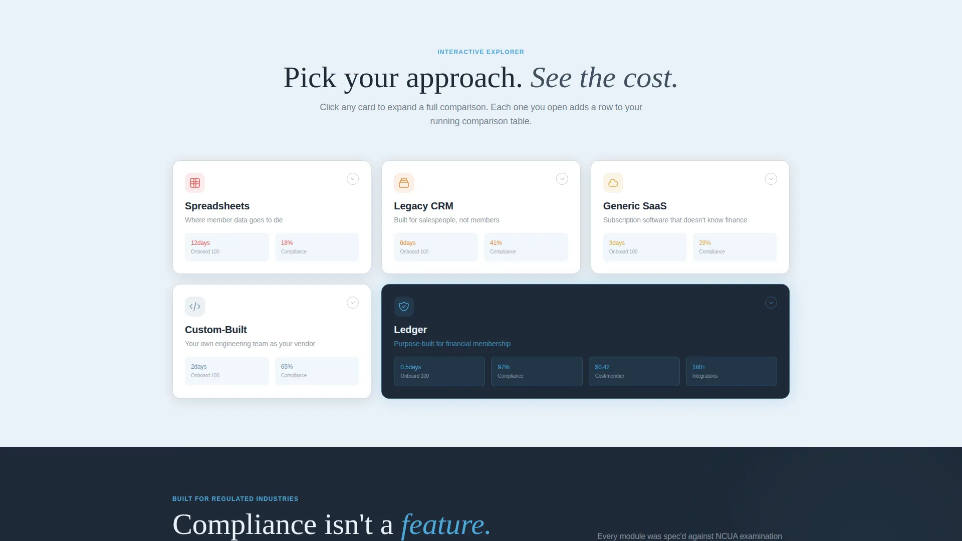
- A modular card grid with five expandable comparison cards covering spreadsheets, legacy CRM, generic software as a service, custom-built solutions, and your platform
- A sticky floating comparison table that accumulates checked rows as visitors explore, following them down the page
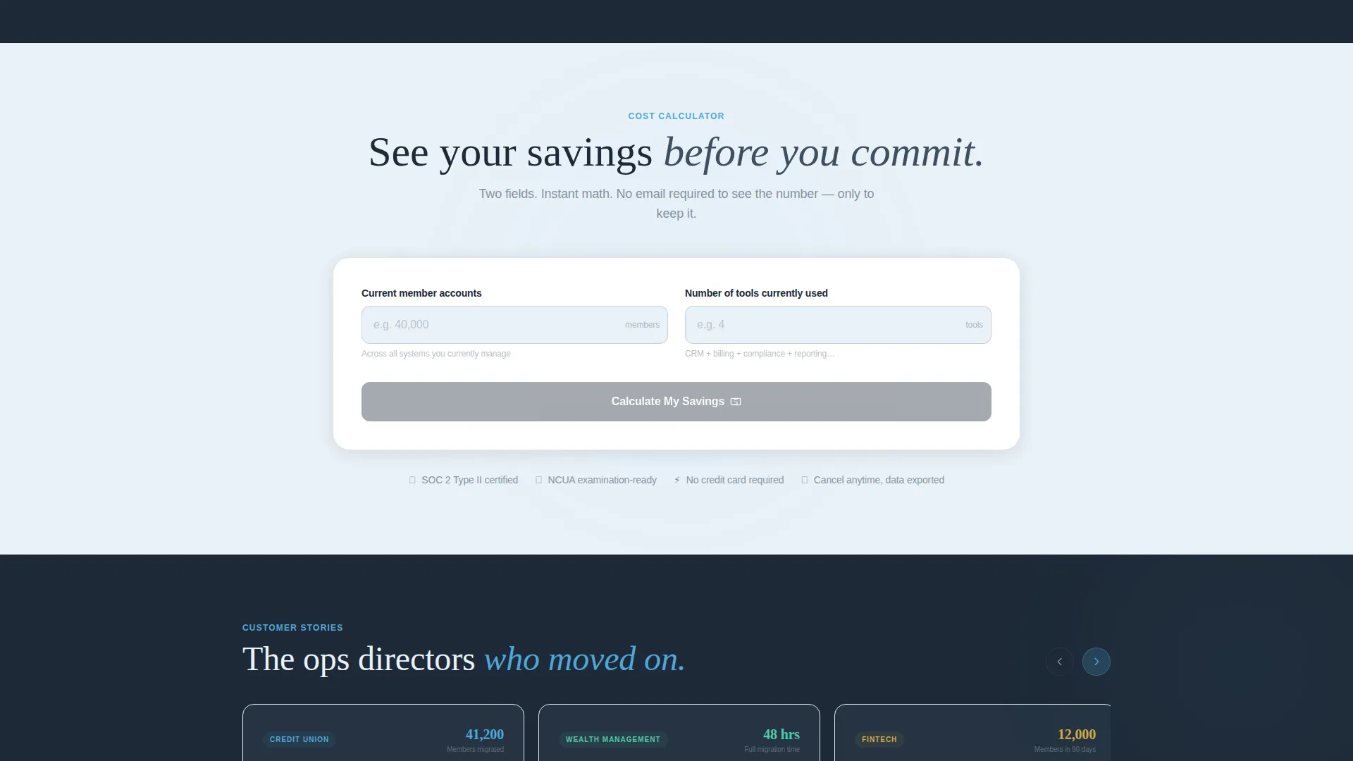
- A two-field savings calculator that renders a projected figure before requesting an email, plus a secondary PDF download path for internal sharing
Feature list
This section covers the core functional and design components built into the Ledger template.
Interactive Comparison Card Grid
Each card in the grid represents a competing membership approach. Visitors click to expand a detailed panel that slides up with spring-eased motion. Inside each card, animated micro-charts render comparisons across onboarding speed, compliance coverage, cost per member, and integration count.
Persistent Floating Comparison Table
A comparison table floats alongside the page as visitors scroll. Each card a visitor opens adds a checked row to this table automatically. The primary call to action, "See Your Cost Savings," is embedded directly inside this table for constant visibility.
Real-Time Savings Calculator
A two-field calculator asks for current member count and number of tools currently in use. It instantly renders a projected savings figure. The email capture only appears after the visitor has already seen their result, earning the conversion rather than demanding it.
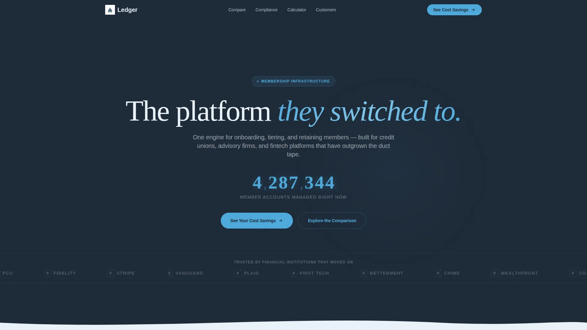
Logo Bar Header with Live Counter
The header opens with a slow-scrolling horizontal ribbon of financial institution and fintech logos rendered in monochrome. Each logo blooms into sky blue on hover. Above the ribbon, a single headline and an animated counter display a climbing seven-digit figure of member accounts managed.
Dynamic Motion Visual Theme
The template uses spring-eased card expansions, real-time micro-chart animations, and hover-state color transitions throughout. Motion is purposeful and tied to user actions, making the page feel responsive rather than decorative.
Dual Lead Capture Paths
The primary path routes visitors through the savings calculator to an email capture. The secondary path offers a downloadable comparison PDF for prospects who need to share findings with a wider team. Both paths are built into the page structure.
Page sections overview
| Section | Purpose |
|---|---|
| Logo Bar Header | Establish trust with recognizable financial institution logos and a live member count |
| Comparison Card Grid | Let visitors explore and compare five membership approaches interactively |
| Expanded Comparison Panels | Show animated micro-charts for onboarding speed, compliance, cost, and integrations |
| Floating Comparison Table | Accumulate visitor-selected cards into a persistent, scrolling summary |
| Savings Calculator | Render a projected cost savings figure based on member count and tool count |
| Email Capture Gate | Collect contact details after the visitor has already seen their savings result |
| PDF Download call to action | Offer a secondary lead path for internal sharing and team decision-making |
| Page Bottom call to action | Reinforce the primary "See Your Cost Savings" action at scroll completion |
Design & branding system
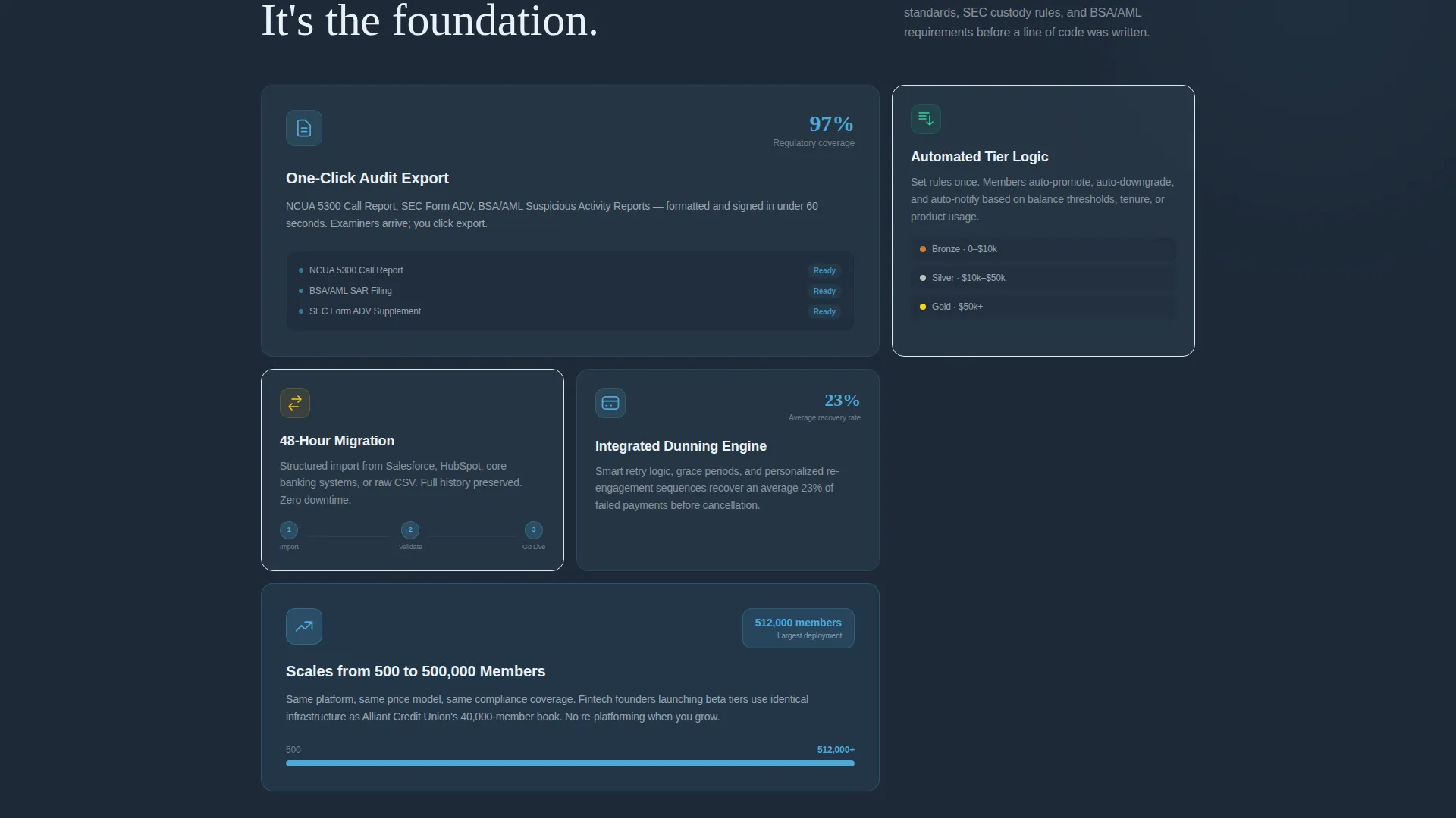
The Slate and Sky color system gives the template a grounded, professional tone with a forward-looking edge. Every color choice is intentional and tied to the emotional message of organized confidence.
- Deep charcoal slate (#1E2A38) for primary backgrounds, mid-tone graphite (#3D4F5F) for card surfaces, open-sky blue (#4DA8DA) for interactive accents, and pale cirrus white (#EAF2F8) for spacing between modules
- Cards float on cirrus white with graphite borders and sky-blue hover states, making each module feel tactile and clickable
- Typography uses a clean geometric sans-serif that reinforces clarity and precision without sacrificing warmth
Mobile & speed optimization
The card-grid layout is built to remain usable and scannable across screen sizes. Modular structure means sections reflow cleanly without losing the comparison logic.
- Each comparison card stacks vertically on smaller screens so the expand-and-explore interaction remains accessible
- The floating comparison table adapts its position on mobile to avoid obscuring key content
- The savings calculator is a two-field form designed to be fast and friction-free on any device
How this template helps you convert
The conversion strategy is built on a principle of earned trust. Visitors prove the value to themselves before you ask for anything in return.
- The interactive card grid and micro-charts give visitors a self-directed discovery experience, building confidence in the platform's value before any form appears.
- The floating comparison table and calculator create a moment of personal relevance, showing each visitor a savings figure tied to their own numbers, which makes the email capture feel like a natural next step rather than a gate.
Other information about this template
Ledger is positioned within the Financial Services Software subcategory under the broader Technology category, targeting the Financial Services Membership Management niche. It is designed as a standalone landing page rather than a multi-page site, making it suitable for focused campaign traffic and direct outreach.
- The template style is Card Grid (Modular), which allows content owners to rearrange, add, or remove cards without disrupting the overall layout
- The Interactive Explorer creative direction is a deliberate choice for audiences who are analytical, comparison-driven, and skeptical of traditional sales pages
- The Comparison and Versus landing page direction makes this template well suited for competitive displacement campaigns where prospects are actively evaluating alternatives
- The Dynamic Motion theme is applied with restraint, using animation only where it adds meaning to the exploration experience
Theme
Dynamic Motion
Creative direction
Interactive Explorer
Color system
Slate & Sky
Style
Card Grid (Modular)
Direction
Comparison/Versus
Page Sections
Interactive Comparison Card Grid
Persistent Floating Comparison Table
Real-time Savings Calculator
Logo Bar Header with Live Counter
Dual Lead Capture Paths
Related questions
Can I customize the comparison cards for my specific competitors?
Is the savings calculator connected to a live data source?
Who handles the leads collected through the email form and PDF download?
Does this template suit both early-stage fintechs and established credit unions?
Can sections be rearranged or removed during customization?



