Democratic Free School Landing Page Template
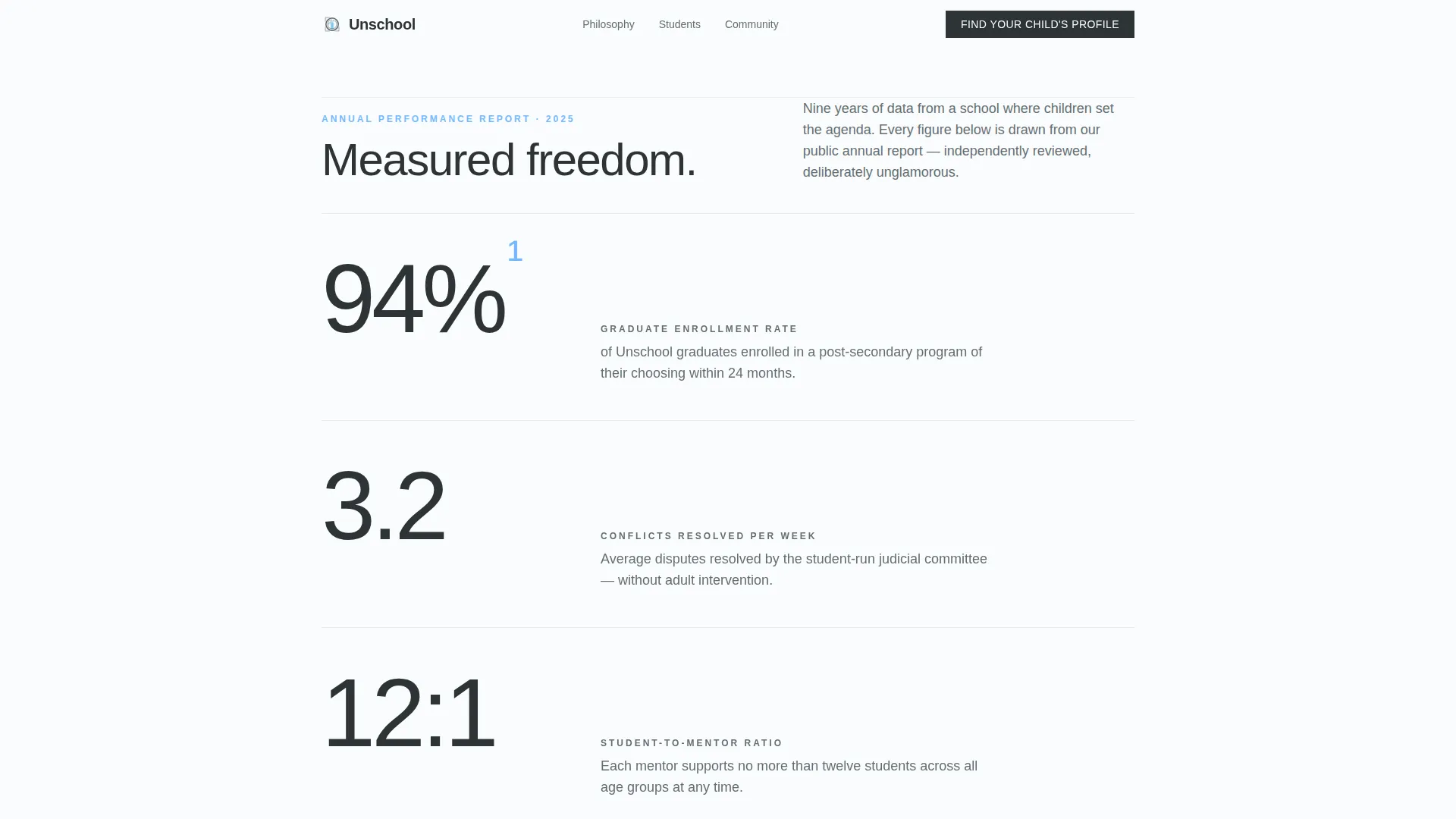
Unschool is a single-column landing page template built for democratic free schools. It leads with a bold stats wall, moves through three emotionally grounded case study narratives, and converts visitors with a seven-question interactive learning profile assessment. The design follows a Corporate Precision aesthetic: clean whitespace, precise typography, and a restrained Slate and Sky color palette that earns trust from skeptical parents.
by Rocket studio
Quick summary
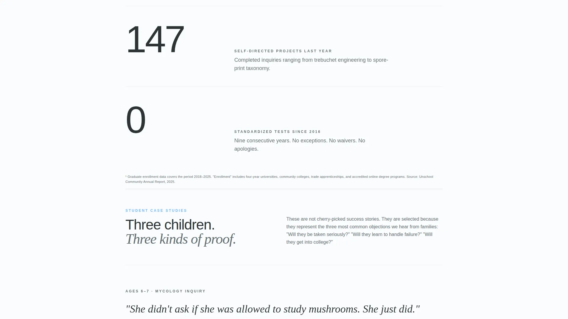
Unschool is a single-column landing page template designed for democratic free schools. It opens with five oversized metrics, builds credibility through three student case studies, and closes with an interactive quiz that promises a personalized child learning profile. The result feels like a beautifully typeset whitepaper that also moves people to act.
Who this template is for
This template is built for democratic free schools, self-directed learning communities, and alternative education programs that need to earn trust before they earn enrollment. It speaks to an audience that has already done serious research and needs proof, not persuasion.
- Former Montessori families who feel their child has outgrown structured alternatives
- Public school teachers enrolling their own children and demanding rigorous evidence
- Homeschool co-op organizers ready to move beyond informal arrangements
What problem this template solves
Most alternative education landing pages look either too radical or too vague. They either preach to the converted or fail to satisfy a skeptical grandparent clicking through a shared link. This template solves both problems at once.
- It grounds emotional storytelling in hard, specific numbers that skeptical readers respect
- It replaces generic calls to action with a personalized assessment that feels genuinely useful
- It structures the page so trust builds progressively, section by section, before any commitment is asked
What you get with this template
You get a complete single-column landing page layout built around three distinct content zones: a metrics header, a narrative case study section, and a conversion-focused quiz flow. Every section is purposeful and sequenced to move a cautious reader forward.
- A stats wall header with five animated figures and a single anchoring subhead
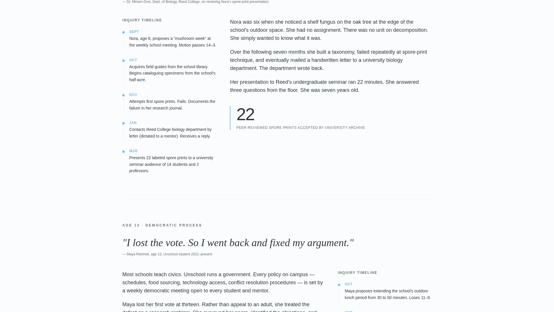
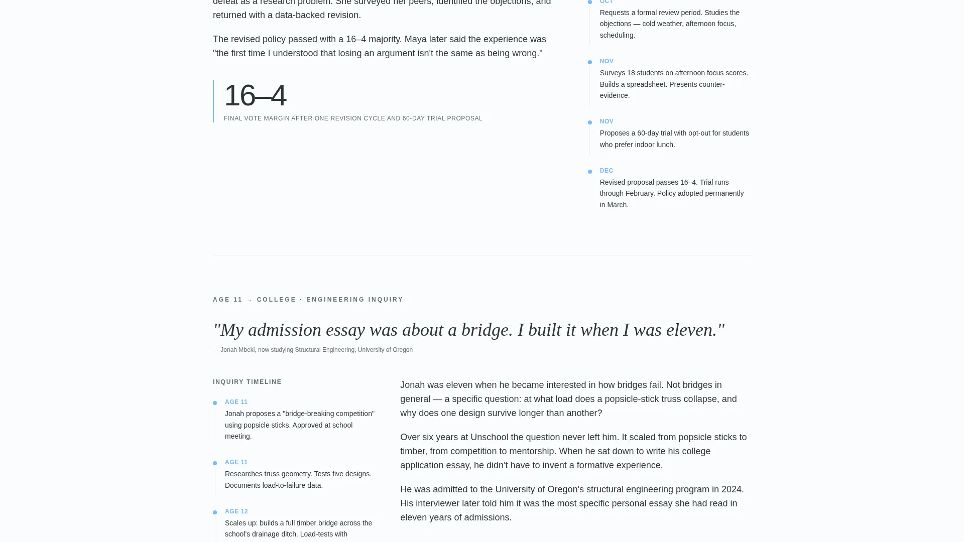
- Three fully structured case study blocks, each with a pull quote, a left-margin timeline, and a closing outcome metric
- A seven-question interactive assessment with a sky-blue progress bar and a personalized PDF results delivery
Feature list
A paragraph introducing the features: this template packages every component a democratic free school needs to convert informed, skeptical families into enrolled visitors. Each feature below is built directly into the page layout and interaction design.
Animated Stats Wall Header
Five oversized figures animate upward from zero on page load, styled in thin sans-serif type against bright white. The effect mirrors a financial data terminal coming alive. A single subhead, "Measured freedom," anchors the section beneath the numbers.
Three-Part Case Study Narrative
Each case study opens with a pull quote, unfolds with timeline milestones placed in the left margin, and closes with one hard outcome metric. The rhythm alternates between emotional story and concrete evidence, building trust through contrast rather than repetition.
Seven-Question Interactive Assessment
The quiz asks about the child's age, current school satisfaction, how they use unstructured time, key frustrations, and prior exposure to alternative education. Each question appears alone on screen for focus. A sky-blue progress bar advances across the top as the visitor moves through each step.
Personalized PDF Results Delivery
Assessment results generate a one-page PDF comparing the child's profile against thriving students at the school. The results email embeds a secondary call to action to book a visit day. The specificity of the output earns the click far more effectively than a generic contact form.
Corporate Precision Design System
The layout uses deep charcoal slate for body text, administrative gray for data labels and secondary copy, and open-sky blue exclusively for interactive elements and links. Bright white backgrounds give every section room to breathe like a well-kerned institutional report.
Page sections overview
| Section | Purpose |
|---|---|
| Stats Wall Header | Opens with five animated metrics to establish credibility immediately |
| Case Study One | Follows a 7-year-old's semester-long mycology project to university presentation |
| Case Study Two | Tracks a 13-year-old through a failed campus policy vote and a successful redesign |
| Case Study Three | Profiles a graduate who traces her engineering admission essay to an age-11 bridge project |
| Quiz Assessment call to action | Invites visitors to find their child's learning profile via a seven-question flow |
| PDF Results Delivery | Delivers a personalized profile comparison with a visit-day booking prompt |
Design & branding system
The visual identity follows a Corporate Precision theme that looks credible enough for a skeptical grandparent and clean enough to frame on a wall. Every design decision reinforces institutional trust without sacrificing warmth.
- Deep charcoal slate (#2D3436) for body text and section dividers; administrative gray (#636E72) for secondary copy and data labels
- Open-sky blue (#74B9FF) used exclusively on links, progress bars, and interactive elements to guide the eye without cluttering the palette
- Bright white (#FAFCFD) backgrounds with generous whitespace that give each section the breathing room of a well-typeset annual report
Mobile & speed optimization
The single-column layout is inherently well-suited to mobile reading. The stacked section flow translates cleanly from a wide desktop screen to a narrow phone display without requiring structural changes.
- Each quiz question appears alone on screen, keeping the mobile experience focused and uncluttered
- The left-margin timeline in each case study section adapts naturally to narrower viewports
- The animated stats wall is designed to render legibly at any screen size, with figures scaled for impact on both desktop and mobile
How this template helps you convert
This template is built to convert cautious, research-driven families who need a reason to take the next step. Conversion is earned through specificity and sequence, not urgency or pressure.
- The animated metrics header stops the scroll immediately by leading with hard numbers, setting a tone of institutional accountability that keeps skeptical readers engaged
- The alternating case study rhythm builds emotional resonance and factual confidence at the same time, so the visitor arrives at the quiz already invested in the outcome
- The assessment converts because it promises something genuinely specific: not a generic brochure but a one-page comparison showing exactly how a child like theirs has thrived at this school before
Other information about this template
This template is designed specifically for the democratic free school niche, where families arrive pre-researched and conversion depends on depth of evidence rather than surface-level appeal. The layout draws on the visual language of institutional reporting to position the school as rigorous and accountable.
- The page style is intentionally reminiscent of the annual reports and whitepapers that serious educational institutions publish, making it a strong fit for schools inspired by the self-directed learning movement
- The quiz-first conversion strategy is well-matched to parents who have already explored alternative education options and need a personalized signal before they commit to a visit
- This template suits any democratic free school or self-directed learning program that can populate the three case study slots with real student stories and honest outcome metrics
Theme
Corporate Precision
Creative direction
Case Study Narrative
Color system
Slate & Sky
Style
Single Column Flow
Direction
Quiz/Assessment
Page Sections
Animated Stats Wall Header
Three-part Case Study Narrative
Seven-question Interactive Quiz
Personalized PDF Results Delivery
Corporate Precision Design System
Related questions
What kind of school is this template designed for?
Can I replace the three case studies with my own student stories?
How does the quiz assessment work for visitors?
What is the primary call to action on this landing page?
Is this template suitable if my school does not use standardized tests?



