Nonprofit Software & SaaS Directory Website Template
Uplift is a split-screen nonprofit ERP landing page template built for platforms that unify grants, donor pipelines, volunteer rosters, and program budgets into one living dashboard. Designed with a dark glassmorphic visual system and a launch-sequence scroll experience, the template guides operations directors, CFOs, and program managers from chaos to clarity with a freemium conversion flow.
by Rocket studio
Quick summary
Uplift is a single-page landing page template for nonprofit ERP platforms. It uses a 50/50 split-screen layout, a dark Tech Glass visual identity, and a scroll-driven "system coming online" narrative. Each section pairs the raw pain of spreadsheet chaos with a clean glassmorphic module reveal, building toward a full connected dashboard and a clear call to action.
Who this template is for
This template is built for SaaS founders and product teams launching nonprofit operations software. It speaks directly to the people who buy that software.
- Operations directors at mid-size nonprofits managing restricted and unrestricted funds simultaneously
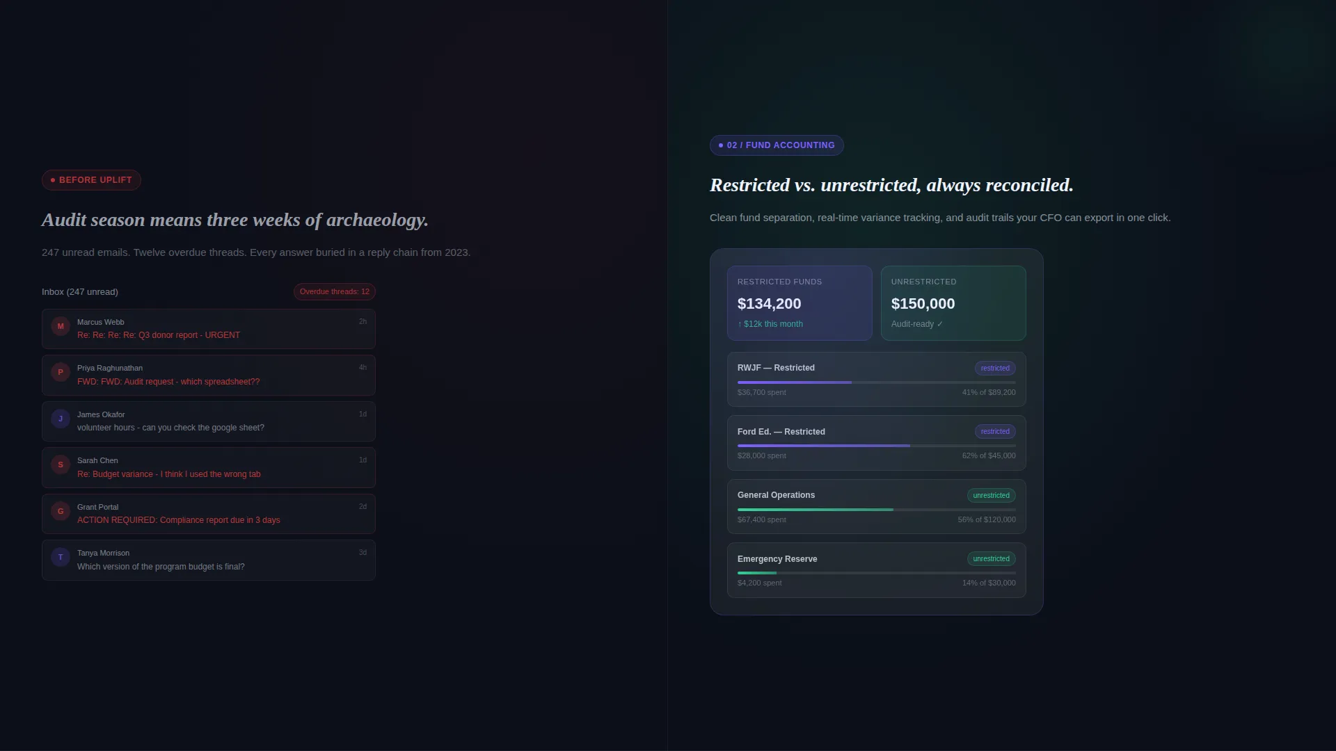
- Chief Financial Officers at community health organizations who face difficult audit seasons
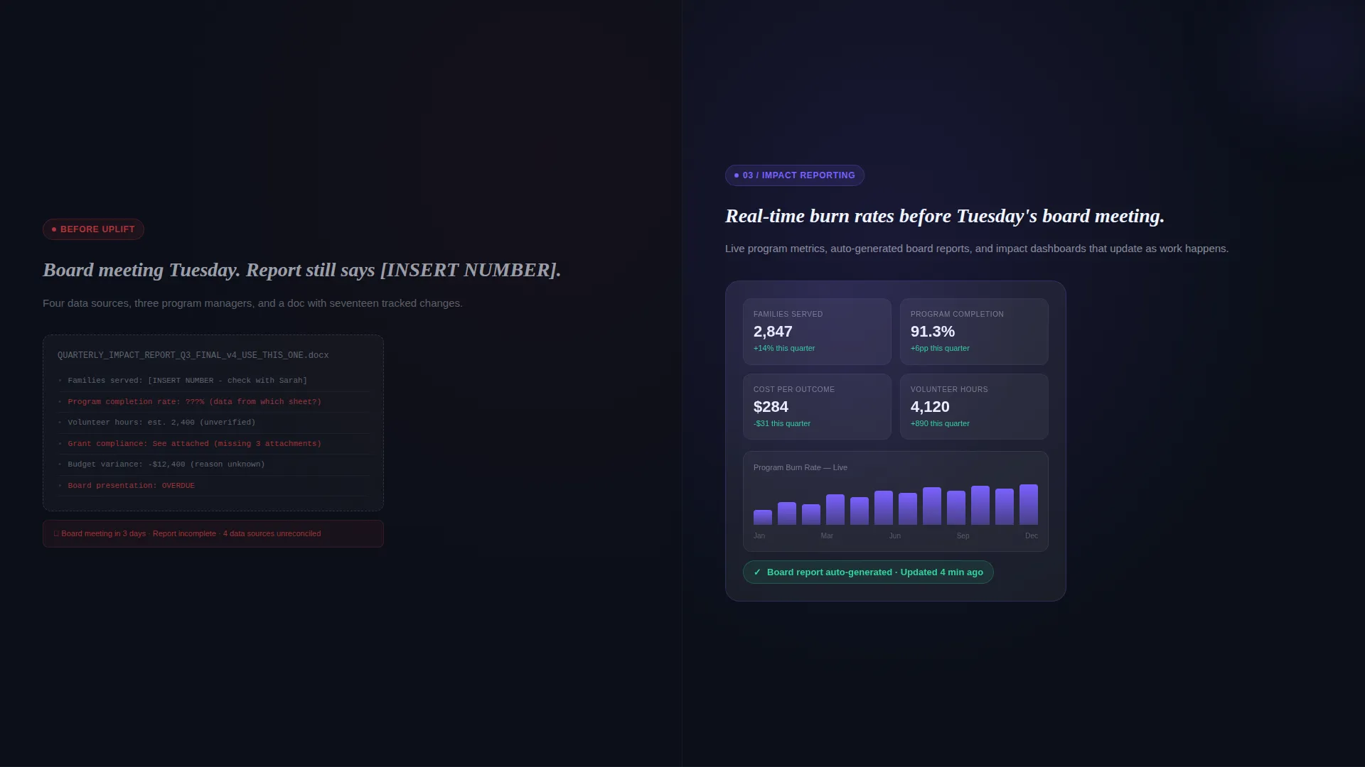
- Program managers at education foundations who need real-time budget burn rates before board meetings
What problem this template solves
Most nonprofit teams are running their entire organization across disconnected spreadsheets, email threads, and paper grant reports. There is no single place where grants, donors, volunteers, and program budgets are visible at once. This template solves that communication problem at the marketing layer first.
- Visitors arrive overwhelmed and unsure whether the product is really built for them
- Generic feature lists fail to show the emotional relief of moving from chaos to a unified dashboard
- Conversion stalls when buyers cannot picture what "organized" actually looks like for their organization
What you get with this template
You get a fully structured, single-page landing page template that stages a product launch narrative from first scroll to final call to action. Every section is purposefully sequenced.
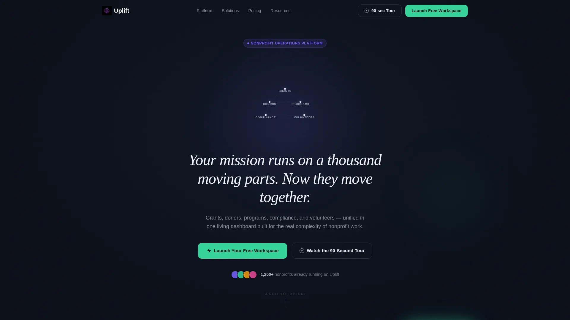
- A full-bleed animated header with a node-by-node dashboard constellation, a self-typing headline, and the primary "Launch Your Free Workspace" call-to-action button
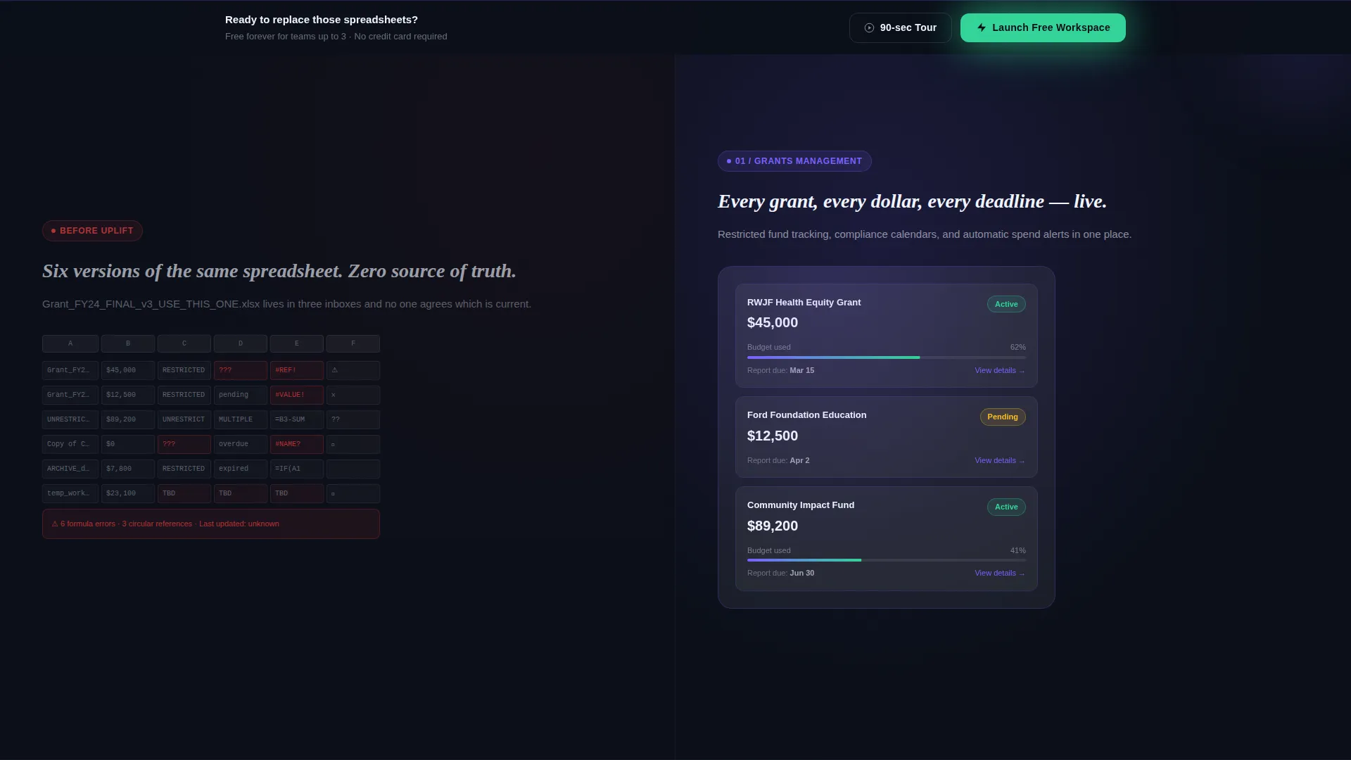
- A scroll-driven split-screen layout pairing chaos visuals on the left with glowing glassmorphic module cards on the right, covering back-office operations, fund accounting, and impact reporting
- A two-step glassmorphic sign-up modal and a secondary "Watch the 90-Second Tour" path that captures email before the video plays
Feature list
This template includes carefully designed components that serve one goal: turning a skeptical nonprofit professional into a confident product trialist.
Animated Full-Bleed Header
The header opens on pure obsidian. A wireframe dashboard constellation materializes from the center, with nodes labeled Grants, Donors, Programs, Compliance, and Volunteers lighting up one by one in phosphor purple before settling to frost-white. The headline types itself in after the final node fires, creating an unmistakable "system boot" moment.
Split-Screen Scroll Narrative
Each content section uses a strict 50/50 layout. The left panel shows raw nonprofit chaos such as tangled spreadsheets, an overflowing inbox, or a paper grant report. The right panel reveals the corresponding platform module inside a glowing glassmorphic card. This direct visual contrast makes the product's value immediately tangible.
Glow-Pulse Section Transitions
As visitors scroll between sections, a subtle glow pulse ripples across the frosted panels. This transition device reinforces the "launch sequence" metaphor and keeps momentum building from back-office operations through fund accounting to impact reporting.
Two-Step Conversion Modal
The primary call-to-action opens a two-step glassmorphic modal. Step one collects organization name, nonprofit category from a dropdown, and work email. Step two asks for team size and preferred first module. This staged approach reduces form friction while gathering meaningful qualification data.
Persistent Bottom-Bar Call to Action
After the visitor passes the second scroll section, a persistent bottom bar appears with the primary "Launch Your Free Workspace" button in mission-green. It stays visible without blocking content, ensuring the conversion path is never more than one tap away.
Secondary Video Capture Path
Every primary call-to-action is paired with a "Watch the 90-Second Tour" link. This secondary path captures the visitor's email before the video plays, giving the platform a way to follow up with visitors who are not yet ready to start a free workspace.
Page sections overview
| Section | Purpose |
|---|---|
| Animated header hero | Launches the dashboard constellation animation and delivers the headline with the primary call to action |
| Grants module reveal | Pairs a spreadsheet chaos visual with the grants management module card |
| Donor pipeline reveal | Contrasts an overflowing inbox with the donor pipeline module card |
| Fund accounting reveal | Shows paper grant reports alongside the fund accounting module card |
| Impact reporting reveal | Presents disconnected data against the impact reporting module card |
| Full dashboard assembly | Displays the complete connected dashboard with all modules live and all metrics visible |
| Persistent bottom bar | Keeps the primary call-to-action button visible after the second section |
| Sign-up modal | Collects organization details across two low-friction steps |
Design & branding system
The visual identity follows a Tech Glass theme built entirely on a glassmorphic color system. The palette is intentionally narrow and disciplined so every color carries meaning.
- Deep obsidian (#0B0F19) forms all backgrounds, keeping the page in a consistent near-black environment that makes frosted panels and glowing accents pop
- Translucent panel frost (white at 8% opacity with backdrop blur) and 1-pixel luminous borders give every card and container a floating, layered quality
- Soft phosphor glow (#7B61FF) sits behind key data visualizations as light leaking through seams, while mission-green (#34D399) appears exclusively on confirmation states and call-to-action buttons
Mobile & speed optimization
The template is structured for clean rendering across screen sizes. The split-screen layout adapts so the chaos and module-reveal panels stack vertically on smaller viewports without losing the narrative sequence.
- Each glassmorphic card and frosted panel is built with layout constraints that prevent overflow on narrow screens
- The persistent bottom bar and modal are designed to function cleanly on touch devices, keeping the conversion path accessible at every viewport size
How this template helps you convert
The page is designed around a freemium and free-trial conversion model. Every structural decision moves a hesitant visitor toward starting a free workspace.
- The header animation earns attention immediately by staging a product "boot-up" that feels earned, not decorative, so the visitor is already invested before reading a single word of copy
- The split-screen scroll narrative validates the visitor's real pain by showing their exact chaos reflected on screen, then resolves it with the product module, making the call to action feel like a logical next step rather than a sales push
- The two-path conversion system captures both ready buyers through the primary modal and undecided visitors through the email-gated video tour, so no warm lead leaves the page without a follow-up opportunity
Other information about this template
This template is built for a specific intersection of technology, nonprofit software, and SaaS go-to-market. A few additional details are worth noting for teams evaluating fit.
- The template style is a 50/50 split screen, which works especially well for platforms that have a strong before-and-after product story
- The creative direction is classified as Launch Energy, meaning the scroll experience is intentionally sequenced like a countdown, not a static feature list
- The header concept is Dark Full-Bleed with Glow, a production-ready motion scene rather than a static hero image
- The landing page is optimized for freemium and free-trial conversion flows, with the modal and persistent bar working together as a dual-path capture system
- The niche is nonprofit enterprise resource planning software, and every section of copy and layout reflects that audience's specific operational pain points
Theme
Tech Glass
Creative direction
Launch Energy
Color system
Glassmorphic
Style
Split Screen (50/50)
Direction
Freemium/Trial
Page Sections
Animated Full-bleed Header
Split-screen Scroll Narrative
Glow-pulse Section Transitions
Two-step Conversion Modal
Persistent Bottom-bar Call to Action
Email-gated Video Tour Path
Related questions
Who is the target visitor for this landing page?
Can I adapt this template for a nonprofit software product in a different category?
What does the two-step sign-up modal collect?
Does the template include the video tour content?
Is this template suitable for a demo-request or paid-plan conversion flow?



