Software & SaaS Cost Estimator Website Template
Uplink is a hub-and-spoke landing page template built for video conferencing platforms competing on value and consolidation. It leads with an interactive cost calculator, delivers honest head-to-head comparisons across five spoke sections, and closes with a low-friction email gate. The Data Command visual theme signals precision and control from the first scroll.
by Rocket studio
Quick summary
Uplink is a single-page, anchor-navigated landing page template designed for video conferencing platforms. It opens with a logo bar, moves immediately into a live cost calculator, and builds the business case through expanding spec comparisons across Security, Integrations, Recording and Search, and Admin Controls spokes. Every design decision serves procurement-minded buyers.
Who this template is for
This template is built for teams selling a unified communication or video conferencing platform to technical and operational decision-makers inside mid-to-large organizations.
- IT directors managing software-as-a-service consolidation across 200-seat or larger organizations
- Remote-first chief technology officers tracking productivity losses across fragmented tool stacks
- Operations leads who need meeting records to be searchable and auditable on short timelines
What problem this template solves
Most video conferencing landing pages bury the business case inside marketing copy. Buyers who control budgets and evaluate platforms need evidence, not enthusiasm. This template flips that structure entirely.
- Visitors encounter the cost calculator before reading a single feature paragraph, so they build their own business case immediately
- Head-to-head comparison rows replace narrative claims, showing honest data including parity gaps instead of hiding them
- The anchor navigation keeps the primary call to action one click away from any spoke, removing the need to scroll back manually
What you get with this template
You get a fully structured, single-page hub-and-spoke layout with five named spokes, a working calculator section, and a bottom email gate. Every section is designed to deepen procurement confidence without repeating itself.
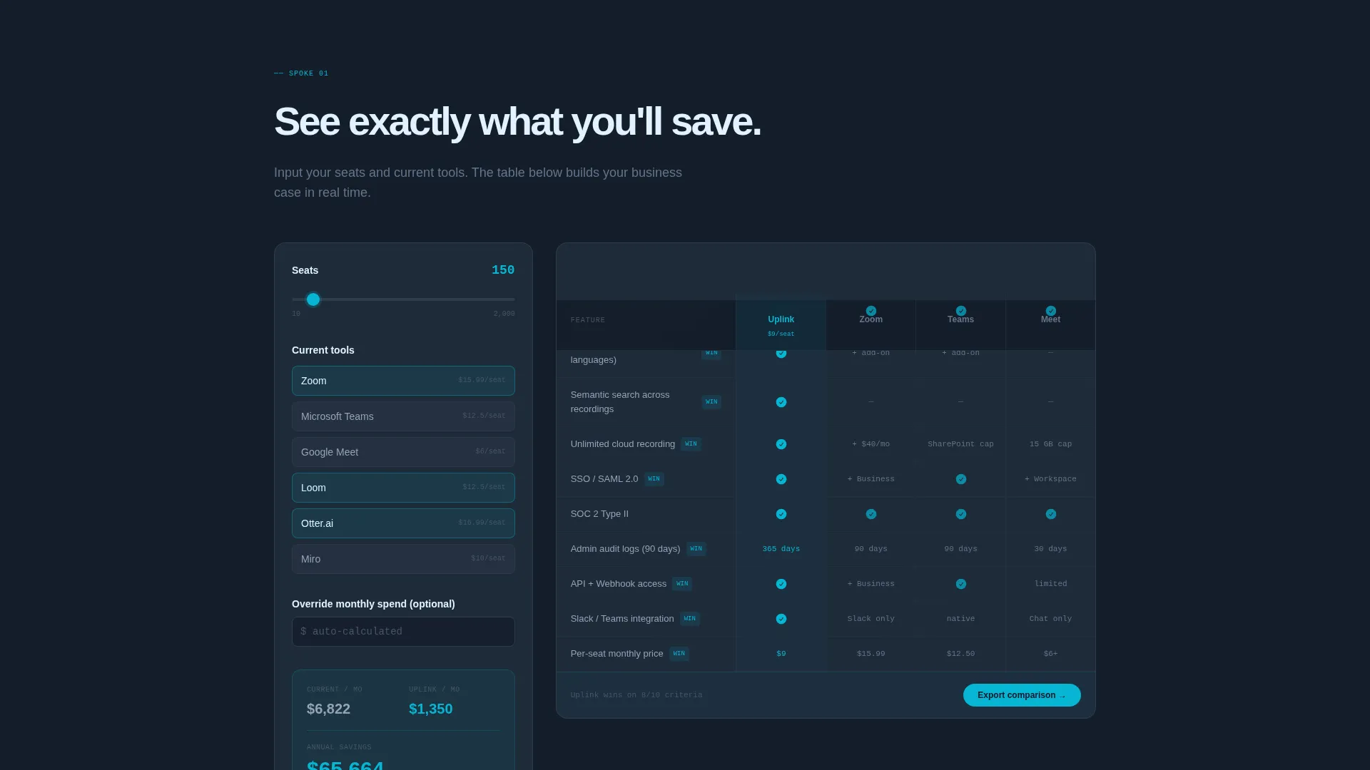
- An interactive cost calculator block with side-by-side output showing per-seat savings and feature comparison winners
- Five spoke sections (Cost Calculator, Security, Integrations, Recording and Search, Admin Controls) each led by expandable spec rows
- A sticky anchor navigation bar with a pinned "Run Your Comparison" call to action and a bottom-page email gate requiring only a work email address
Feature list
This template includes the following built-in structural and design capabilities grounded in the source brief.
Interactive Cost Calculator Block
Visitors input seat count, current tools, and monthly spend. The calculator instantly renders a side-by-side cost and feature comparison table. Electric cyan check marks highlight wins; honest gray dashes mark parity. No claims are made that the math cannot back up.
Hub and Spoke Anchor Navigation
A sticky navigation bar sits at the top of the page. Each spoke, Cost Calculator, Security, Integrations, Recording and Search, Admin Controls, is an anchor link. The pinned "Run Your Comparison" button returns any visitor to the calculator from any point on the page.
Logo Bar Header
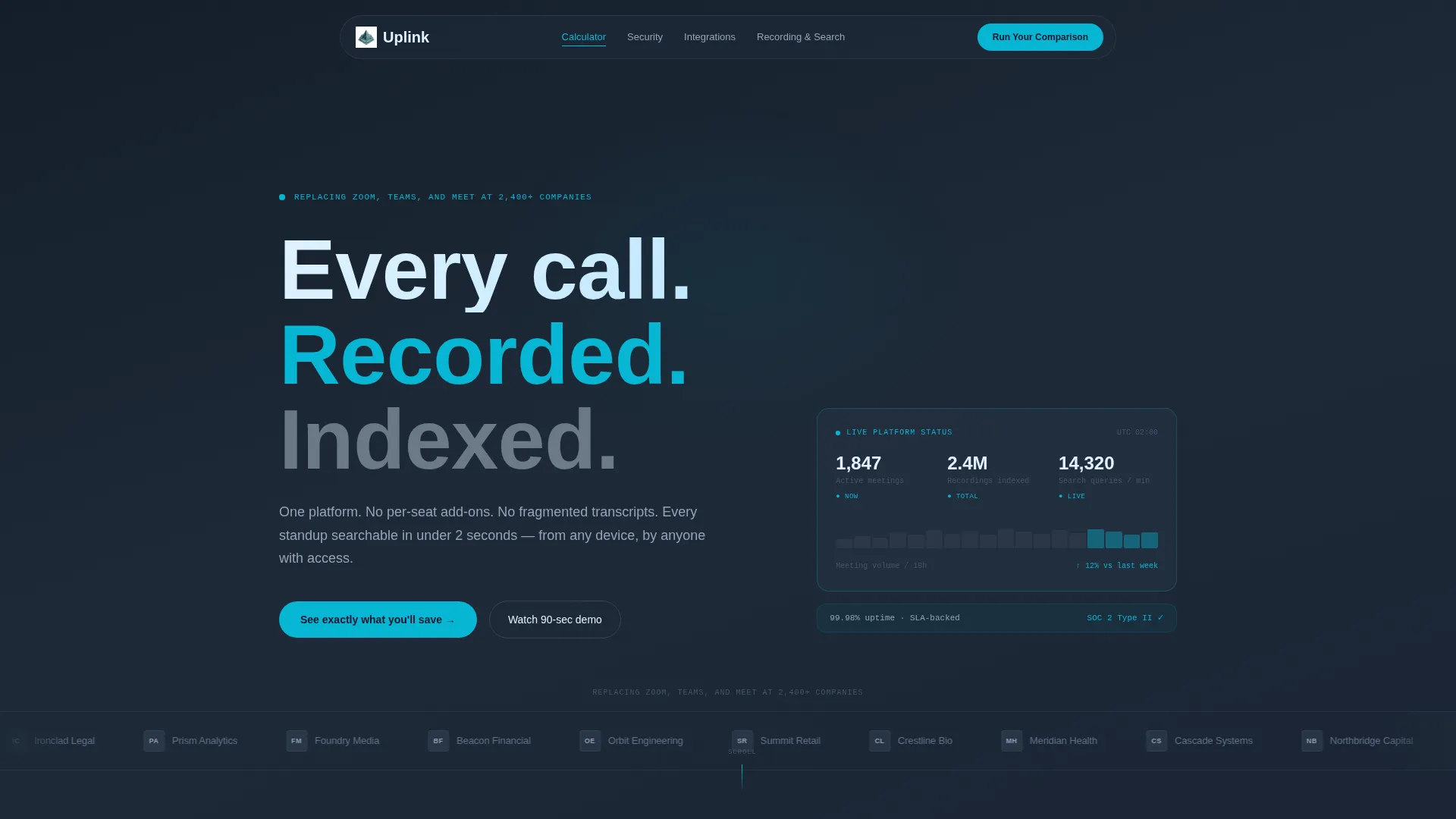
The header is a clean horizontal strip of company logos scrolling at a deliberate pace. A single proof line reads above the scroll. Below the logos, a bold pale sky headline on graphite reads "See exactly what you'll save." There is no hero image and no illustration.
Expandable Spec Comparison Rows
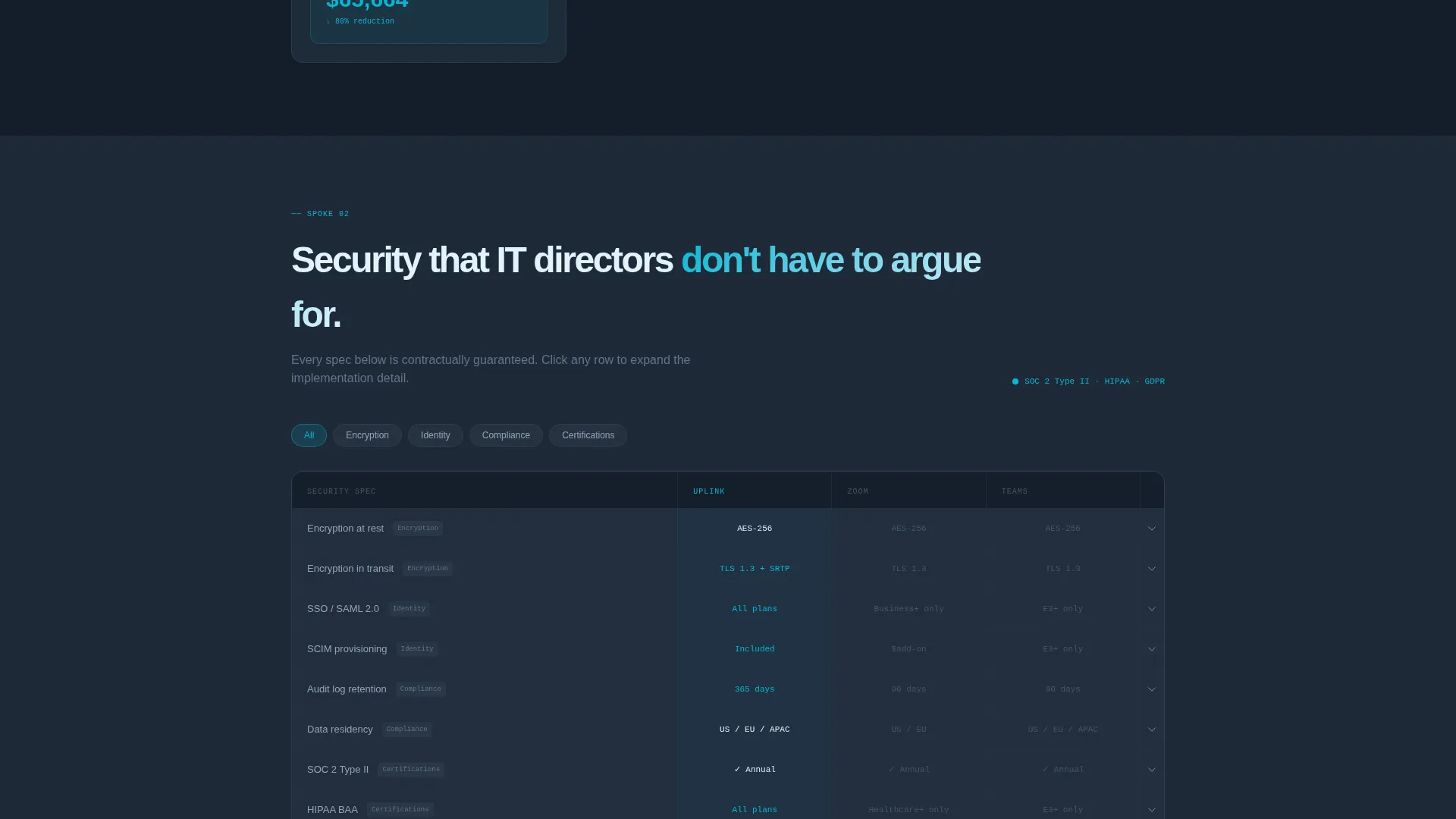
Each spoke section is led by a head-to-head spec row. Rows expand on click to reveal deeper detail. The layout mimics a procurement spreadsheet, letting the data argue for itself without additional marketing copy.
Low-Friction Email Gate
The page closes with a single-field email form gating a "Get the Migration Playbook" secondary call to action. Only a work email address is required. The calculator earns trust before the form asks for anything.
Data Command Visual Theme
The full page uses deep graphite as the primary background, cool slate for card surfaces, pale sky for data highlights, and electric cyan for calls to action and comparison winners. The palette reads like a cockpit instrument panel: dark, calm, and information-dense.
Page sections overview
| Section | Purpose |
|---|---|
| Logo Bar Header | Opens with social proof via scrolling company logos and a bold cost-focused headline |
| Cost Calculator Spoke | Lets visitors input seat count and spend to generate an instant side-by-side comparison |
| Security Spoke | Presents head-to-head security spec rows that expand on click |
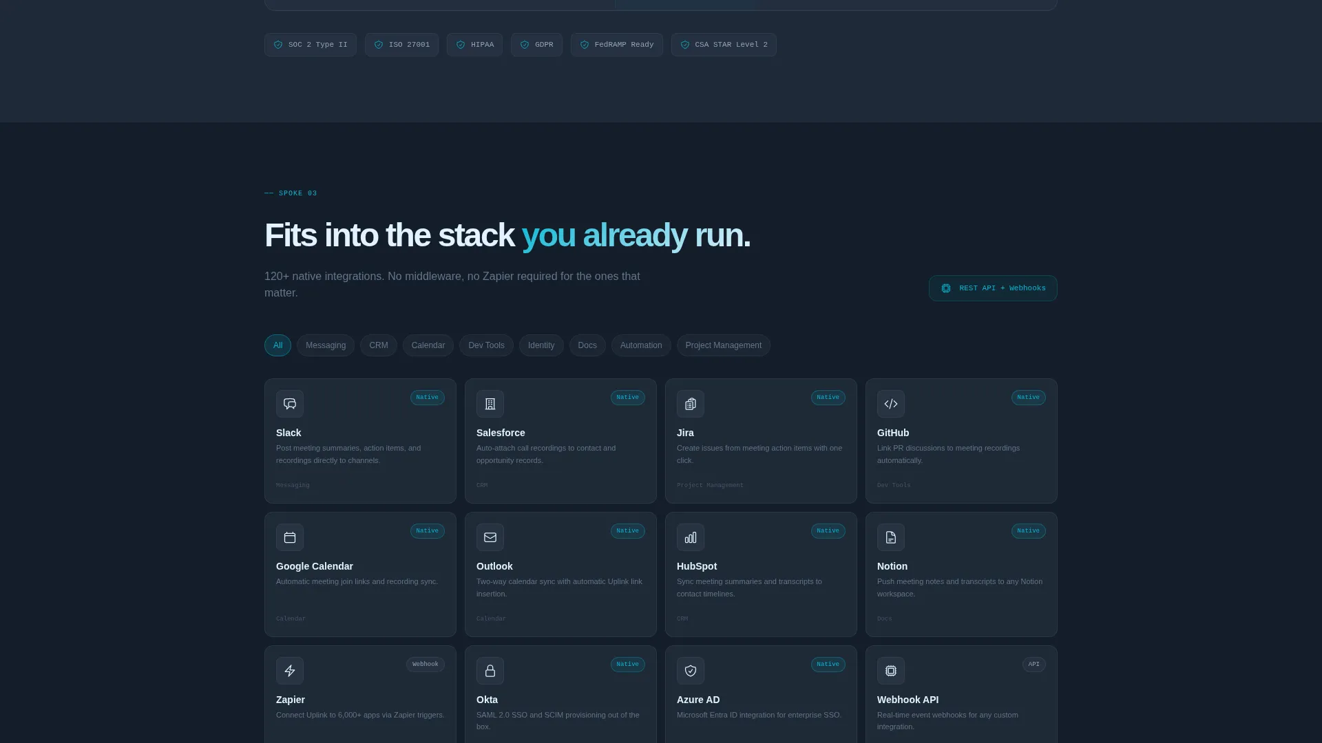
| Integrations Spoke | Shows integration parity and wins through expanding comparison rows |
| Recording and Search Spoke | Compares meeting recording and index capabilities against competing tools |
| Admin Controls Spoke | Details platform administration features in spec-row format |
| Email Gate Footer | Collects work email addresses in exchange for a migration playbook download |
Design & branding system
The visual identity follows a Data Command theme built on a Slate and Sky color system. Every color in the palette carries a specific functional meaning, so nothing decorative distracts from the data.
- Deep graphite (#1E2A38) as the primary background, cool slate (#475569) for card surfaces, pale sky (#E0F2FE) for active states and data highlights
- Electric cyan (#06B6D4) reserved exclusively for calls to action, toggle switches, and comparison winner indicators, making every bright element feel intentional
- The overall palette reads like a server room at midnight or a cockpit instrument panel at cruising altitude: dark, calm, and information-dense by design
Mobile & speed optimization
The template is structured to present dense comparison data clearly on smaller screens. The hub-and-spoke layout and sticky navigation are especially relevant for mobile visitors who may arrive mid-funnel.
- Anchor navigation keeps the primary call to action reachable without excessive scrolling on any screen size
- Expandable spec rows keep each spoke section compact by default, preventing information overload on narrow viewports
- The single-field email gate at the bottom minimizes friction for mobile users completing a conversion action
How this template helps you convert
The entire page is engineered around a single insight: procurement buyers trust data they helped generate more than claims a vendor wrote. The template builds that trust before asking for anything.
- The cost calculator appears before any feature copy, so visitors produce their own business case in the first minutes on the page
- Honest comparison tables that show gray parity dashes alongside cyan winner marks build credibility with skeptical technical buyers
- The pinned "Run Your Comparison" call to action in the anchor nav keeps the highest-intent action one click away from every spoke, reducing drop-off between sections
Other information about this template
This template is part of a broader set of Software and Software-as-a-Service landing page templates in the Technology category. It is particularly suited to platforms positioning against established video conferencing tools where a structured, evidence-led page can replace lengthy sales cycles.
- The template style is Hub and Spoke with Anchor Navigation, making it straightforward to adapt spoke content for different competitive sets or product tiers
- The creative direction is Calculator and Tool First, meaning the interactive block is the centerpiece and all spoke sections support the comparison already started there
- The Comparison and Versus landing page direction means the layout is optimized for buyers evaluating this platform against Zoom, Microsoft Teams, and Google Meet as named alternatives in the proof line
- The template ships as a single-page layout; multiple pages or a broader site structure are not part of this template scope
Theme
Data Command
Creative direction
Calculator/Tool First
Color system
Slate & Sky
Style
Hub & Spoke (Anchor Nav)
Direction
Comparison/Versus
Page Sections
Interactive Cost Calculator Block
Hub and Spoke Anchor Navigation
Expandable Spec Comparison Rows
Scrolling Logo Bar Header
Low-friction Email Gate
Data Command Visual System
Related questions
Can I customize the calculator inputs for my specific pricing model?
Does the template include real logo assets for the logo bar header?
How many spoke sections does the template include?
Is the email gate connected to a specific email marketing platform?
Who is the primary target audience for this template?



