Bento Grid Landing Page for IT Networking Teams
Uplink is a bento grid landing page template built for IT infrastructure and networking companies. It uses a Tech Glass visual identity with a Monochrome Steel palette to project technical precision and reliability. Stats-first bento tiles, a dashboard header preview, and two clear conversion paths make it easy for visitors to trust the team and take action.
by Rocket studio
Quick summary
Uplink is a single-page bento grid template designed for IT infrastructure and networking teams. It leads with a live-style dashboard header, fills every tile with hard proof metrics, and drives visitors toward either downloading the companion monitoring app or requesting a professional site survey. The visual language is dark, precise, and hardware-inspired.
Who this template is for
This template suits technical service businesses that need to show credibility fast. The layout speaks directly to buyers who respect data over decoration.
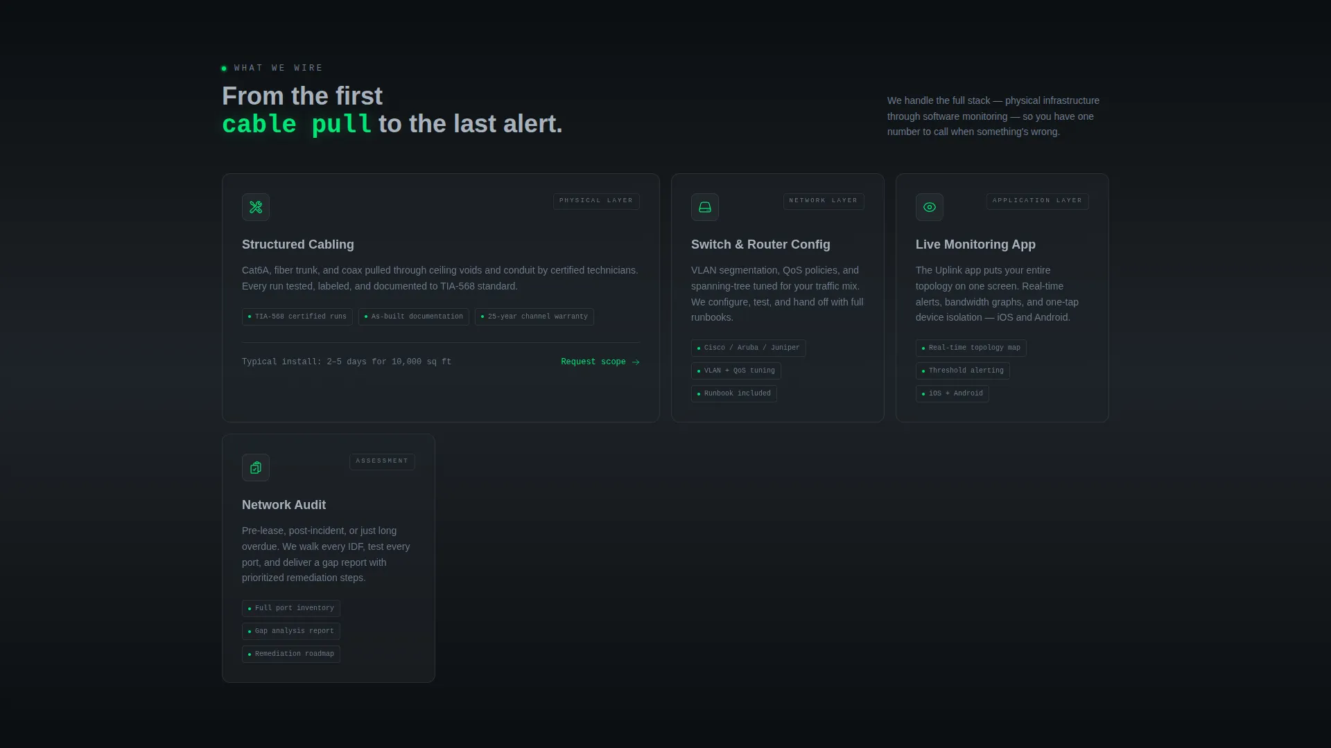
- IT infrastructure and networking companies offering managed services or on-site cabling and configuration work
- Managed service providers or consulting teams whose clients include office managers, CTOs, and facilities directors
- Technology service brands launching or promoting a companion network monitoring app alongside their field services
What problem this template solves
Most IT service pages look generic. They rely on stock images and vague promises while their ideal clients need evidence of capability. This template replaces that gap with structured proof.
- Visitors with no existing infrastructure to monitor need a low-friction path to request a site survey before they commit
- Businesses selling a monitoring app struggle to show its value without a live product demo, and this header concept does that visually
- Teams that handle complex deployments, from single-rack offices to fourteen-floor enterprise buildings, need a layout that communicates scale without a long sales pitch
What you get with this template
You get a fully structured, single-page bento grid layout ready to present your IT infrastructure services with authority. Every section has a defined role, and nothing needs to be invented from scratch.
- A dashboard preview header with rendered real-time metrics including throughput, connected devices, threat alerts, and uptime figures
- A stats-first bento grid with varied tile sizes carrying oversized metrics, before-and-after topology snapshots, and feature icon tiles
- Two conversion paths: a floating pill primary call to action for the app download and a secondary form capturing company name, building square footage, and number of floors for site survey requests
Feature list
This template is built around a focused set of components, each doing specific work on the page.
Stats-First Bento Grid Layout
Every bento tile opens with a single oversized metric before revealing its context. Tiles vary in size, from large hero stats to medium case-study snapshots to small icon feature tiles. The rhythm mimics scanning a control room, where every glance returns useful data.
Dashboard Preview Header
The header renders a pixel-perfect isometric view of the companion app's live monitoring screen. Visible data points include real-time throughput, connected devices, threat alerts, and uptime percentage. Subtle animated pulses radiate from node icons on a network topology map, making the product itself the visual centrepiece.
Dual Conversion Path Design
The primary call to action, "Monitor Your Network Free," appears first as a floating pill after the header and again inside the final bento tile alongside device-store badges for iOS and Android. The secondary path offers a "Request a Site Survey" form with three specific fields, giving non-app-ready visitors a clear next step.
Tech Glass Visual Identity
Glass-morphism panels with frosted borders give each grid tile the look of a translucent heads-up display floating over dark hardware. Backgrounds alternate between terminal black and panel-gap charcoal to create depth between cells. Signal green is used only for live-state indicators and calls to action.
Topology Case Study Tiles
Medium-sized bento tiles display before-and-after network topology snapshots from real deployment scenarios. These tiles give prospective clients a concrete reference point for the team's technical scope, from small office setups to multi-floor enterprise rollouts.
Terminal Headline Animation
The page headline types in like a terminal command, reinforcing the product's identity as a technical tool rather than a marketing surface. This detail sets the tone immediately and signals to technical buyers that the page was made for them.
Page sections overview
| Section | Purpose |
|---|---|
| Dashboard Preview Header | Anchors the page with a rendered monitoring screen and animated network topology map |
| Terminal Headline Block | Delivers the headline as a typed terminal command to set technical tone immediately |
| Floating call to action Pill | Places the primary app download action directly after the header for early conversion |
| Hero Stats Tiles | Opens large bento cells with oversized metrics to establish proof at first glance |
| Feature Icon Tiles | Highlights specific capabilities like automated failover and zero-touch provisioning |
| Case Study Snapshots | Shows before-and-after network topology for real deployment contexts |
| Site Survey Form | Captures company name, square footage, and floor count for non-app-ready visitors |
| Final call to action Tile | Repeats the app download call to action with iOS and Android store badges |
Design & branding system
The Monochrome Steel palette is built around four precise values. Every color choice has a defined role, and nothing is decorative for its own sake.
- Core colors: deep terminal black (#0B0E11) for base backgrounds, panel-gap charcoal (#1E2328) for alternating bento cells, brushed aluminum (#A8B2BD) for body text, and signal green (#00E676) reserved exclusively for live-state indicators and calls to action
- Typography and metric styling: general text lives in aluminum gray to stay readable against dark backgrounds, while numeric metrics pulse in signal green to draw the eye immediately
- Glass-morphism panel treatment: each bento tile uses frosted borders and translucent surface styling to create a heads-up display effect layered over the dark hardware-inspired background
Mobile & speed optimization
The bento grid structure is designed to reflow cleanly across screen sizes without losing its visual hierarchy. Tile sizing and spacing are intentional, so the layout does not collapse into an unreadable stack on smaller devices.
- Varied tile proportions allow the grid to adapt across breakpoints while preserving the stats-first reading order
- No stock photography or human imagery means the page relies on rendered user interface and typography, keeping the visual load lean and focused
- The floating call to action pill is positioned to remain accessible during scroll on both desktop and mobile viewports
How this template helps you convert
The page is structured so that proof arrives before the ask. By the time a visitor reaches either call to action, the template has already demonstrated capability through data.
- The stats-first bento grid builds trust incrementally. Each tile reveals a metric first and context second, so visitors absorb evidence naturally as they scroll rather than reading through a long pitch.
- The dual conversion paths remove friction for two distinct buyer types. App-ready visitors can download immediately from the floating pill or the final tile. Visitors who need infrastructure work first can submit the site survey form with three simple fields.
Other information about this template
This template is purpose-built for the IT infrastructure and networking niche and reflects the specific visual and structural conventions that resonate with technically literate buyers.
- The template style is a bento grid, which suits data-dense IT service presentations where multiple proof points need to coexist on one screen without overwhelming the visitor
- The header concept, a dashboard preview rendered at a shallow isometric angle, is a deliberate product-forward choice that positions the companion monitoring app as the hero rather than using lifestyle or team photography
- Creative direction is Stats-First Impact, meaning the design hierarchy always leads with numbers and resolves to narrative, reversing the typical marketing page pattern
- The theme is Tech Glass and the color system is Monochrome Steel, both of which are intentional signals to a technical audience that the brand operates with precision and discipline
- This template is well suited for IT consulting teams, managed network service providers, and technology service brands building a first impression for enterprise or mid-market procurement contacts


Theme
Tech Glass
Creative direction
Stats-First Impact
Color system
Monochrome Steel
Style
Bento Grid
Direction
App Download
Page Sections
Stats-first Bento Grid Layout
Dashboard Preview Header
Dual Conversion Path Design
Tech Glass Panel Treatment
Topology Case Study Tiles
Terminal Headline Animation
Related questions
Who is the Uplink template designed for?
Can I use this template without a companion monitoring app?
What conversion paths does the template include?
Does the template use stock photography?
Is the bento grid layout suitable for mobile screens?


