Uplink - Powerful Telecom Landing Page Template
Uplink is a single-page comparison landing page built for telecom tower analytics software. It pairs a dark Tech Glass visual identity with an animated feature matrix, letting network operations teams, carrier engineers, and capacity planners see at a glance where competing platforms fall short. The result is a high-pressure, data-forward page that earns the demo click before the visitor reaches the bottom.
by Rocket studio
Quick summary
Uplink is a Comparison Table landing page designed for a telecom tower analytics dashboard. It uses a Tech Glass visual theme, a Slate and Sky color system, and a row-by-row Feature Matrix to make one argument clearly: no competing platform covers as much ground. Every design decision, from frosted glass header panels to a cyan-highlighted center column, reinforces that conclusion.
Who this template is for
This template is built for vertical software-as-a-service (SaaS) teams selling into the telecom infrastructure space. If your buyers need data before they trust a vendor, this page speaks their language.
- Regional carrier engineers who monitor large tower clusters and need proof that a tool handles signal attenuation, handoff failures, and load imbalances in real time
- Towerco asset managers benchmarking lease profitability across portfolios and comparing platform depth before a procurement decision
- Mobile network operator (MNO) capacity planners deciding which sectors receive multiple-input multiple-output (MIMO) upgrades this quarter
What problem this template solves
Telecom infrastructure buyers are technical, skeptical, and often evaluating multiple tools at once. A generic product page does not hold their attention. This template gives them a structured, visual argument they can follow row by row.
- Competing tools are hard to compare without a side-by-side format, so deals stall in committee stages
- Prospects leave pages early when they cannot see specific capability gaps quickly and clearly
- Sales teams lose credibility when their comparison lives in a static PDF rather than an interactive, on-brand experience
What you get with this template
You get a fully designed, section-led landing page built around a Feature Matrix creative direction. Every component has a clear job, and nothing is decorative without a purpose.
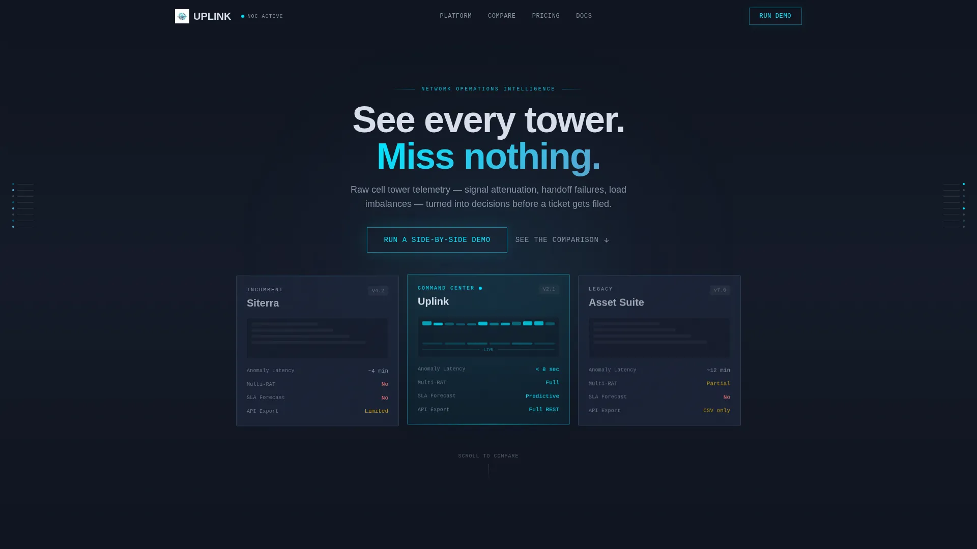
- A frosted Dark Glass Panels header with three translucent competitor cards, a taller cyan-edged center panel for your platform, and a fade-in headline reading "See every tower. Miss nothing."
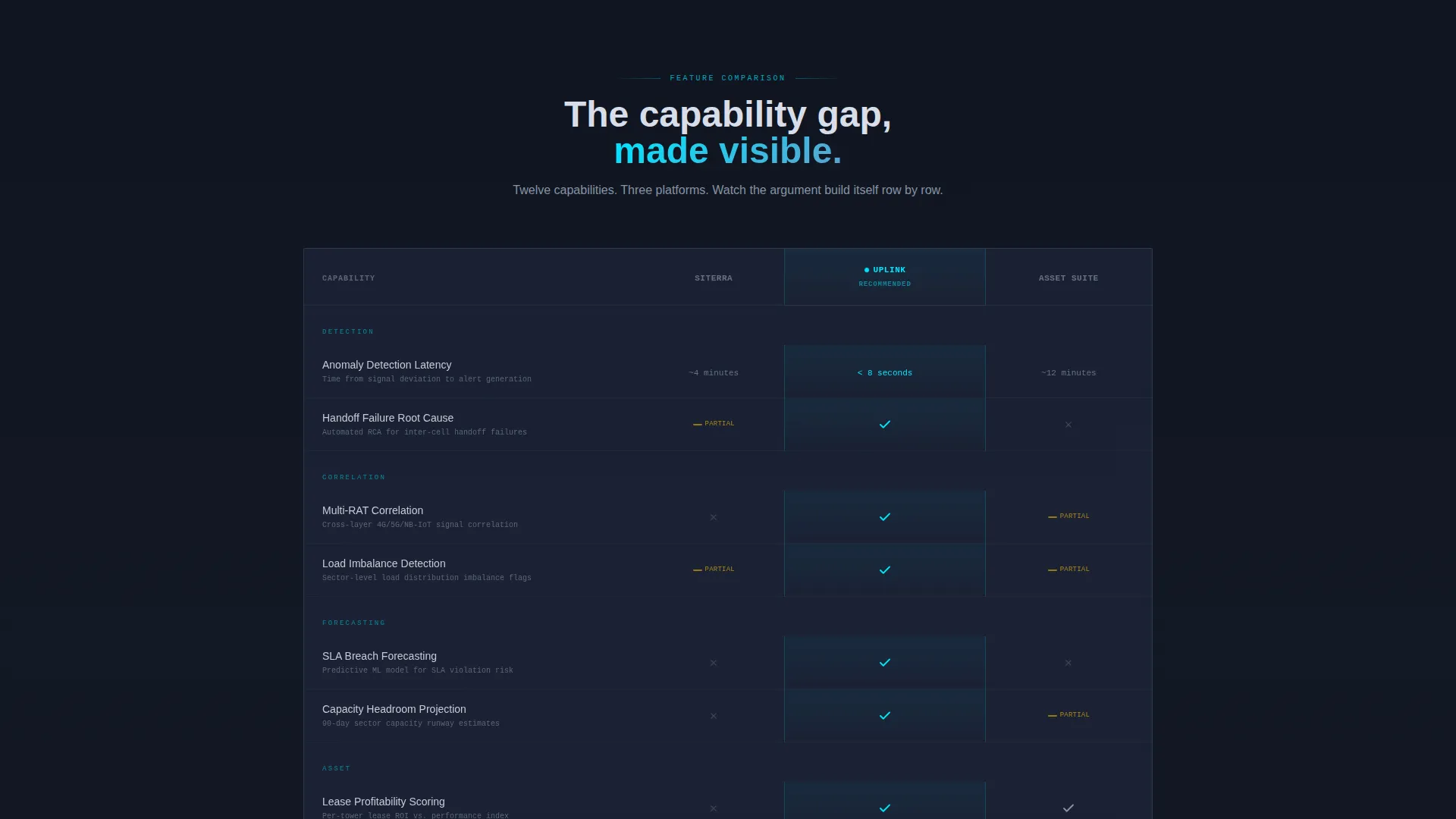
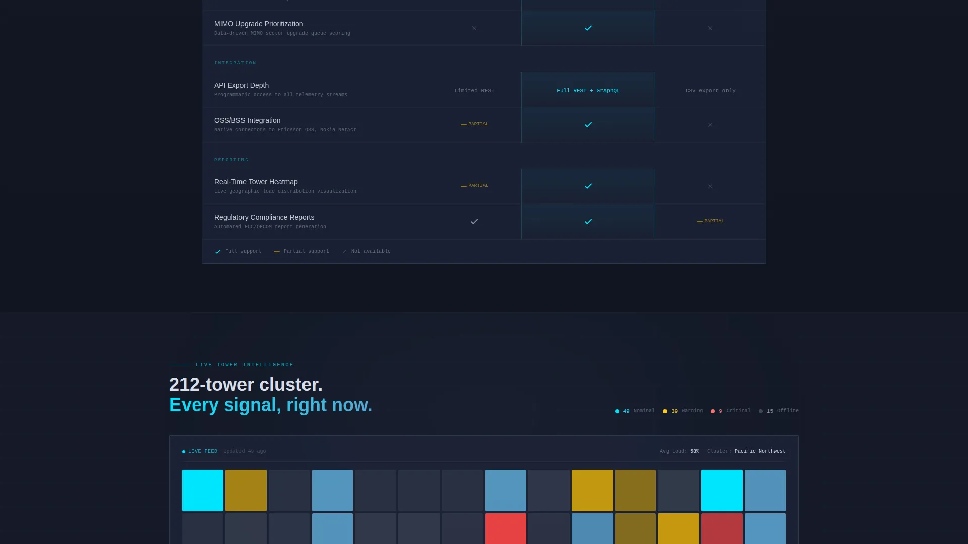
- A scrollable, animated Feature Matrix comparing capabilities row by row, including anomaly detection latency, multi-RAT (Radio Access Technology) correlation, SLA (Service Level Agreement) breach forecasting, and API export depth
- A sticky bottom bar with a primary call to action, a mid-matrix live-style tower load heatmap breakout, and a secondary PDF download path for committee-stage prospects
Feature list
This section walks through the core built-in components and what each one does for your conversion goal.
Dark Glass Panels Header
Three translucent, frosted-glass cards float against a near-black gradient background. Each card represents a competing platform. Ghosted wireframes of dashboard interfaces are faintly visible inside each panel, like screens seen through smoked glass. The center panel is subtly taller and carries a cyan edge glow, asserting visual dominance before the visitor reads a single word.
Animated Feature Matrix
The comparison table is the page's main argument. Each row introduces a specific capability, and as the row enters the viewport, checkmarks, partial-support icons, and empty cells animate in simultaneously across all three columns. The eye triangulates instantly. By the bottom row, the cumulative visual weight of the Uplink column makes the conclusion feel self-evident.
Live-Style Heatmap Breakout
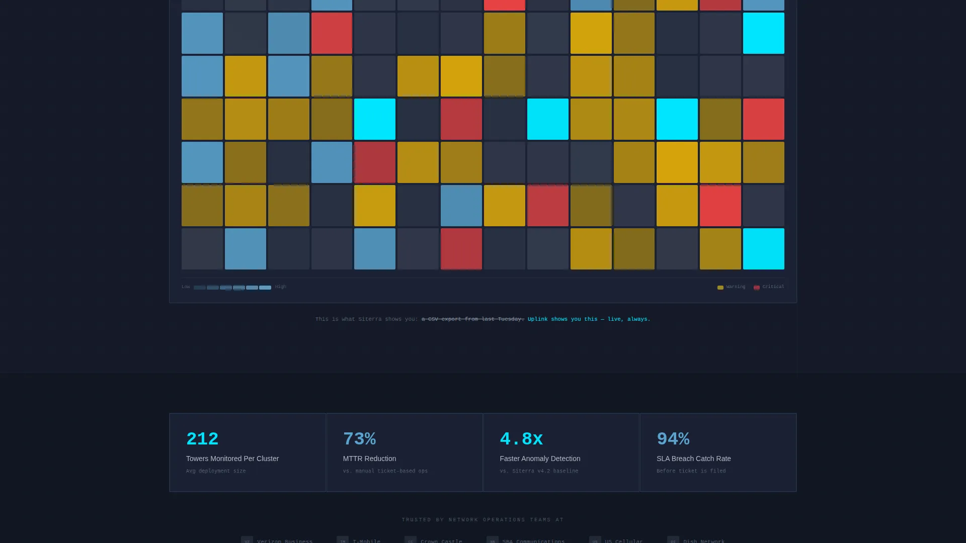
Midway through the matrix, the page pauses for a full-width breakout section. It displays a live-style heatmap of tower load distribution, grounding all the feature comparisons in a tangible operational output. It reminds the visitor what these capabilities actually produce in a real network operations center (NOC) environment.
Sticky Demo call to action Bar
Once the visitor scrolls past the header, a slim glass-finish bar docks to the bottom of the viewport. It carries the primary call to action: "Run a Side-by-Side Demo." Clicking opens a two-field overlay asking for a work email and the prospect's current platform from a dropdown list.
Secondary PDF Download Path
At the final row of the matrix, a secondary conversion path invites prospects to download the full comparison as a PDF. It requires only an email address. This path is designed for buyers still in a committee-stage evaluation who need shareable proof before committing to a demo.
Page sections overview
| Section | Purpose |
|---|---|
| Dark Glass Header | Introduces three competitor panels with Uplink centered and visually dominant |
| Fade-In Headline | Delivers the core brand promise before the visitor reads any detail |
| Feature Matrix Rows | Builds a row-by-row capability comparison with viewport-triggered animations |
| Heatmap Breakout | Anchors abstract features in a real-world tower load visualization |
| Matrix Final Row | Closes the comparison argument and surfaces the PDF download path |
| Sticky call to action Bar | Keeps the demo call to action visible throughout the entire scroll journey |
| Demo Request Overlay | Captures work email and current platform with minimal friction |
Design & branding system
The visual identity follows a Tech Glass theme built on the Slate and Sky color system. Every color has a defined role, and the palette never drifts into decoration.
- Background layers stay in the charcoal-to-steel range: deep operations-room charcoal (#1B2131) for primary backgrounds and brushed-steel panel gray (#3D4555) for card surfaces and row dividers
- Body text renders in a desaturated white (#D8DEE9), and clear-atmosphere blue (#5BA4CF) carries secondary structural elements like inactive column headers
- Alert-state cyan (#00E5FF) is reserved strictly for interactive and high-priority elements: toggle states, winning-column indicators, call-to-action borders, and hover states, so it reads like a live signal rather than a style choice
Mobile & speed optimization
The layout is designed to stay readable and functional as viewport width decreases. The comparison table is the most complex element, and it is structured to remain navigable on smaller screens.
- The three-column Feature Matrix collapses into a scrollable format on narrow viewports so mobile visitors can still follow the row-by-row comparison without horizontal overflow
- The sticky call to action bar is sized to avoid covering critical content on smaller screens, keeping the demo prompt accessible without blocking the matrix
How this template helps you convert
The page is engineered around a Comparison/Versus conversion goal. Every section earns the next click rather than demanding it.
- The animated matrix does the persuading passively. By the time a visitor reaches the bottom, they have counted the gaps in their current tool without being told what to think, which lowers resistance to the primary call to action.
- The two-path conversion structure covers both ready-to-act prospects and committee-stage evaluators. The sticky demo bar captures immediate intent, while the PDF download path gives hesitant buyers a low-friction way to stay engaged and bring the comparison into their internal review process.
Other information about this template
This template is built specifically for the telecom tower analytics dashboard vertical within the broader SaaS and technology category. A few additional details are worth noting for teams evaluating it.
- The dropdown in the demo overlay lists Siterra, Asset Suite, and Tarantula as named competitor options alongside an "Other" entry, giving sales teams immediate context on which platform a prospect is currently using
- The template style is a Comparison Table page, meaning its primary value is the structured, visual argument it builds rather than narrative storytelling or feature showcasing alone
- The header concept (Dark Glass Panels) and the Feature Matrix creative direction are designed as a matched pair: the header sets a NOC-grade atmosphere, and the matrix sustains it through the full scroll journey
- This is a single landing page, not a multi-page website, so all conversion paths resolve on one scrollable surface
Theme
Tech Glass
Creative direction
Feature Matrix
Color system
Slate & Sky
Style
Comparison Table
Direction
Comparison/Versus
Page Sections
Dark Glass Panels Header
Viewport-triggered Feature Matrix
Full-width Heatmap Breakout
Sticky Demo Call to Action Bar
Secondary PDF Download Path
Related questions
Who is this landing page template built for?
Can I update the competitor names in the comparison columns?
What are the two conversion paths included in this template?
What does the heatmap breakout section display?
Is this template suitable for longer B2B sales cycles?



