Uplink - Powerful Telecommunications Landing Page Template
Uplink is a scroll-reveal landing page template built for telecommunications ERP platforms. It opens with a full-viewport dashboard preview, then progressively powers on each core module, billing, tower provisioning, spectrum allocation, and subscriber lifecycle, as the visitor scrolls. The design uses a dark, phosphorescent color system built to match the intensity of a live network operations center.
by Rocket studio
Quick summary
Uplink is a single-page landing page template designed for enterprise telecommunications software. It uses a progressive scroll-reveal structure so each platform module powers on in sequence. By the final section, every module the visitor has seen individually comes together in one unified dashboard view. The result is a landing page that earns every click through demonstration rather than description.
Who this template is for
This template is built for teams selling complex, enterprise-grade telecom software to operations and finance leaders. It speaks directly to the people who live inside network dashboards and quarter-end reconciliation reports.
- Chief Technology Officers at regional carriers managing churn and infrastructure at scale
- Network operations managers overseeing fiber rollouts across multi-state territories
- CFO teams and finance leads reconciling interconnect settlements at period close
What problem this template solves
Telecom ERP platforms are hard to sell because the product is genuinely complex. A flat marketing page cannot show how six legacy workflows collapse into one system. This template solves that by making the product legible through progressive visual storytelling.
- Visitors cannot picture a unified platform from a static screenshot or a bullet list of features
- Sales teams struggle to convey live-system energy through conventional landing page layouts
- The download or demo call to action feels like a leap of faith when the product has not been demonstrated first
What you get with this template
You get a fully structured, single-page landing page built around a cinematic reveal sequence. Every design decision, from the header down to the final call to action, is engineered to make the product feel operational before the visitor ever clicks.
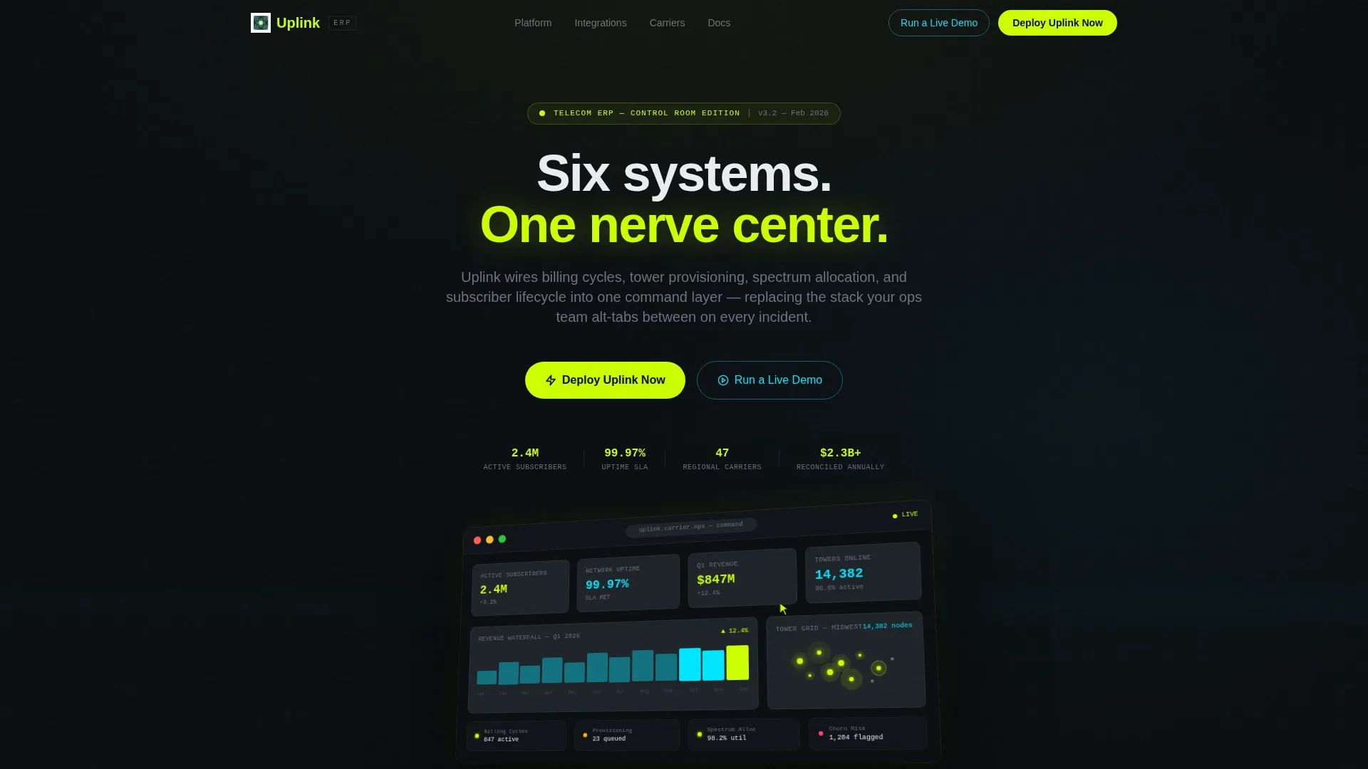
- A full-viewport isometric dashboard header showing live-looking KPIs including 2.4 million active subscribers and 99.97 percent network uptime
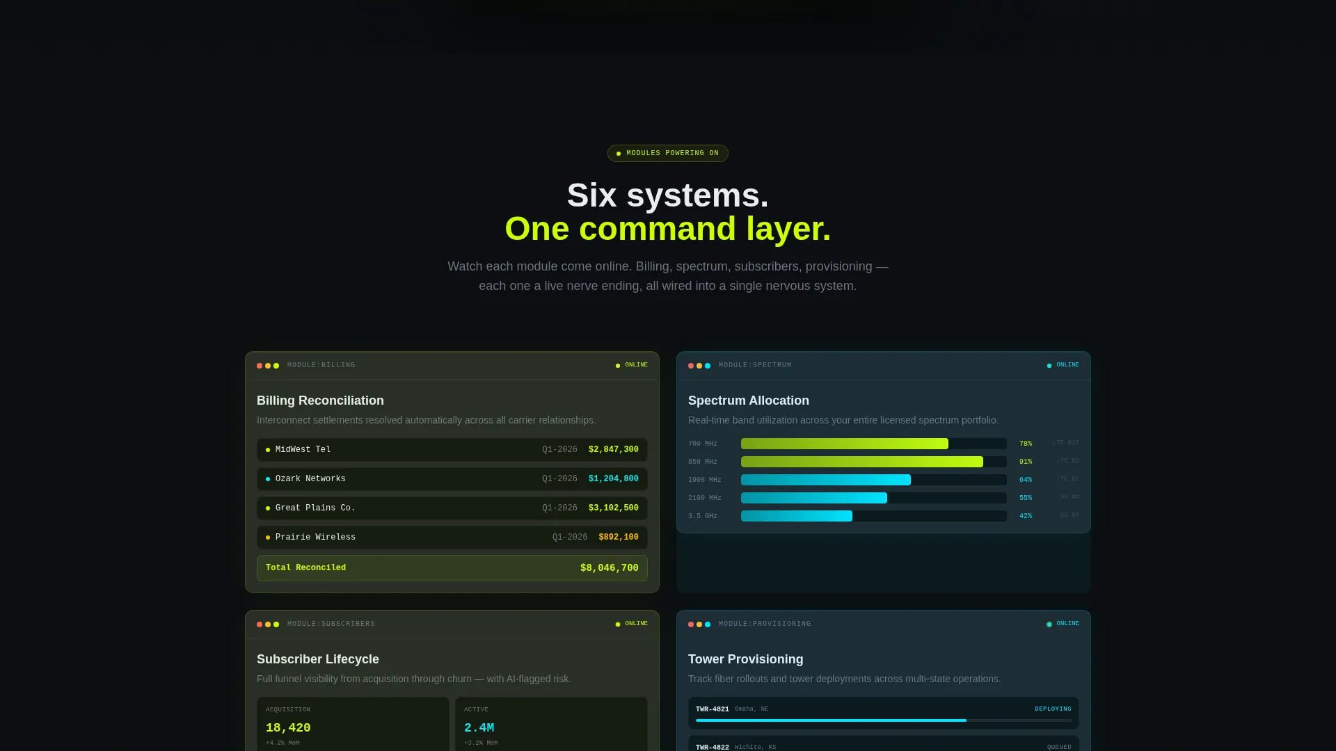
- A scroll-driven module sequence where billing reconciliation, spectrum mapping, and provisioning panels each animate from wireframe to full render
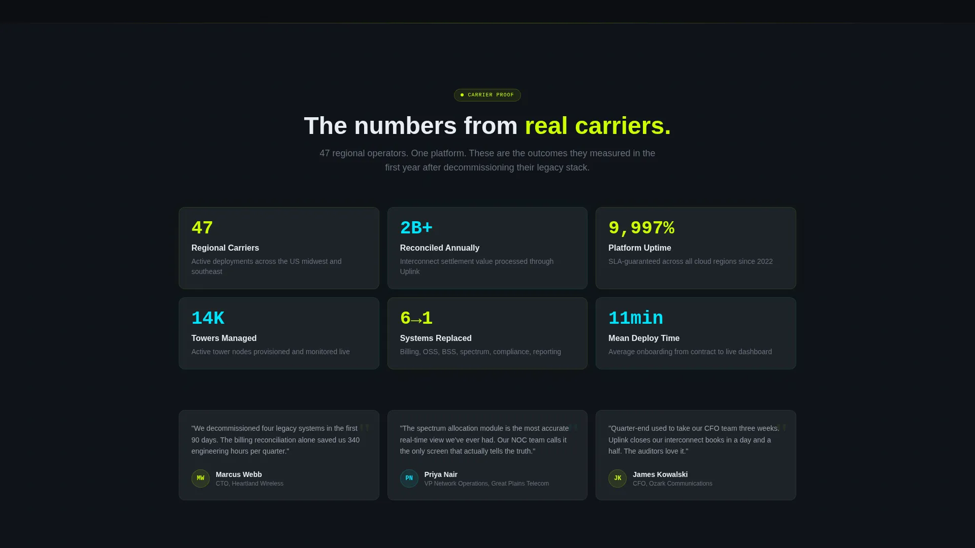
- A final unified dashboard view where every previously revealed module appears simultaneously, fully lit and connected
Feature list
This section covers the core structural and experiential capabilities built into the Uplink landing page template.
Full-Viewport Dashboard Header
The header renders the Uplink command screen at full viewport width in a slightly angled isometric perspective. It displays real-looking KPIs, a revenue waterfall chart, and a tower map with pulsing nodes. A cursor animation moves across the screen and clicks into a churn-prediction module, making the interface feel inhabited rather than static.
Progressive Scroll-Reveal Module Sequence
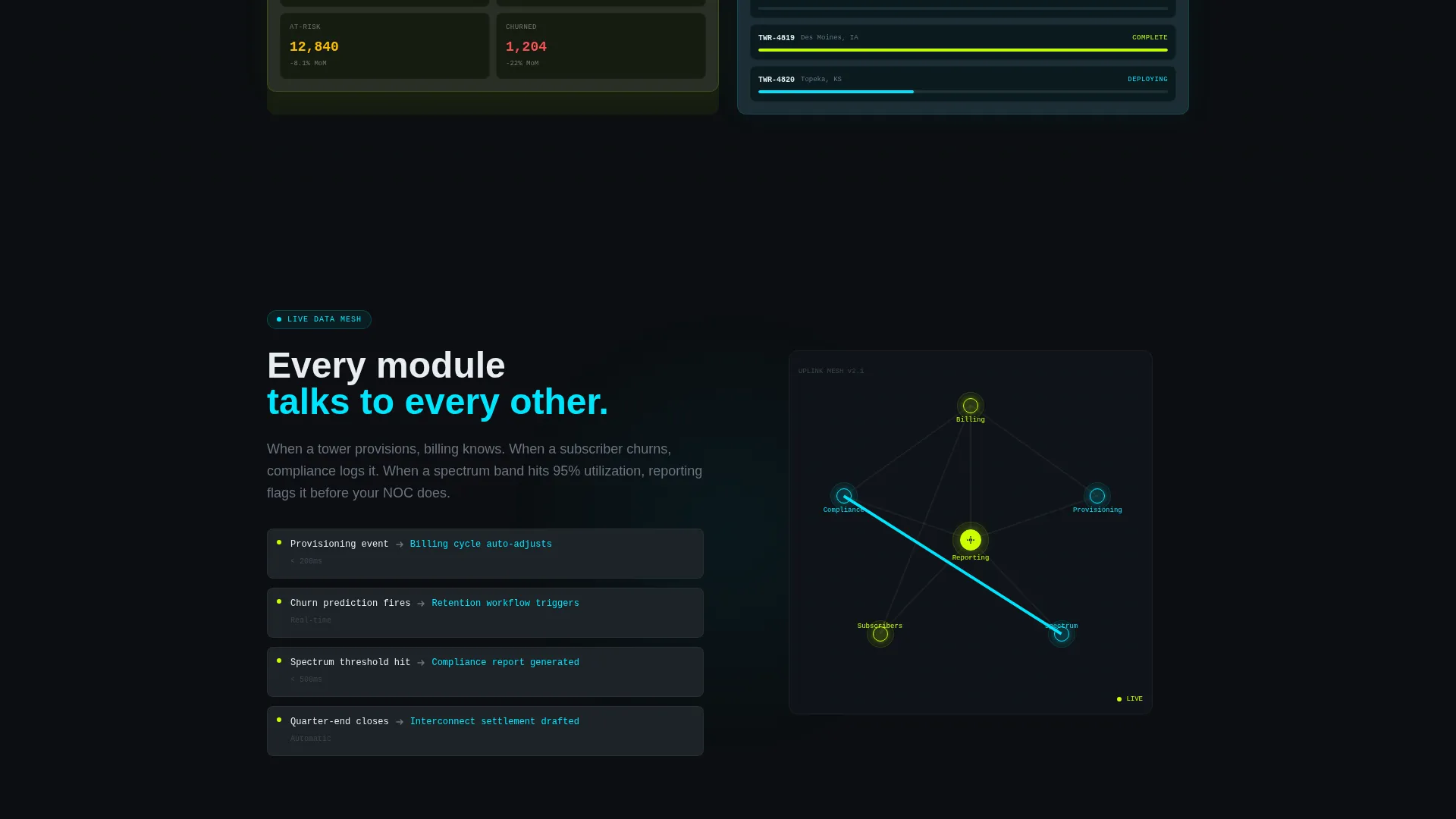
Each platform module reveals itself as the visitor scrolls. Panels assemble from wireframe to full render, a spectrum coverage map draws its zones in real time, and animated data lines connect modules to show how provisioning triggers billing triggers compliance triggers reporting. The energy escalates deliberately section by section.
Unified Final Dashboard View
The closing section brings every individually revealed module into one fully lit dashboard view. This is the visual payoff of the entire scroll journey. By the time the visitor reaches the primary call to action, they have already watched the whole system breathe as one connected unit.
Dual Conversion Path call to action
The primary call to action reads "Deploy Uplink Now" with platform toggle buttons for cloud instance, iOS, and Android. A secondary path offers "Run a Live Demo" linking to a sandbox environment pre-loaded with dummy carrier data. Both paths serve different buyer readiness levels without competing for attention.
Acid Digital Color System
The void-black background, electric chartreuse accents, signal cyan hover states, and terminal gray card surfaces create a palette that feels like a live network operations center at 2 AM. Every bright element signals that something is active and meaningful, which reinforces the product's real-time data positioning.
Page sections overview
| Section | Purpose |
|---|---|
| Dashboard Preview Header | Opens with a full-viewport isometric command screen showing live-looking KPIs and a cursor animation |
| Billing Module Reveal | Assembles a billing reconciliation panel from wireframe to full render on scroll |
| Spectrum Map Section | Draws spectrum coverage zones in real time as the visitor scrolls into view |
| Module Connection Sequence | Animated data lines connect provisioning, billing, compliance, and reporting modules |
| Unified Dashboard View | Presents every module simultaneously in one fully lit, connected dashboard layout |
| Primary call to action Section | Drives app download with platform toggles and a secondary live demo conversion path |
Design & branding system
The visual identity follows a Dashboard Pro theme built around the Acid Digital color system. Every color choice is functional, not decorative, each shade maps to a specific signal state within the simulated platform interface.
- Void black (#0B0E11) as the primary background, terminal gray (#1E2328) for card surfaces and navigation elements
- Electric chartreuse (#CCFF00) for live-data accents and primary call-to-action elements, signal cyan (#00E5FF) for secondary indicators and hover states
- The overall palette evokes a phosphorescent network operations center display, where brightness indicates activity and meaning
Mobile & speed optimization
The template is built with a scroll-reveal progressive structure that layers content as the visitor moves down the page. This approach keeps the initial load focused on the header while subsequent modules render in sequence.
- Module reveal animations are triggered by scroll position, so earlier sections do not compete with later ones for rendering priority
- The isometric dashboard header and animated data lines are designed as visual layers that load progressively rather than all at once
- Platform toggle buttons in the call to action section adapt cleanly across cloud, iOS, and Android contexts without layout shifts
How this template helps you convert
The Uplink landing page is structured so that by the time a visitor reaches the download call to action, they have already experienced the product in motion. The conversion is the logical conclusion of the scroll journey, not a cold ask.
- The isometric header establishes immediate credibility by showing a populated, live-looking command screen with real-feeling KPIs before the visitor reads a single line of body copy.
- The progressive module reveal builds familiarity section by section, so the visitor understands billing, provisioning, spectrum, and reporting as individual capabilities before seeing them unified.
- The dual call to action structure matches buyer readiness: "Deploy Uplink Now" serves teams ready to act, while "Run a Live Demo" gives evaluating stakeholders a low-commitment next step with dummy carrier data already loaded.
Other information about this template
This template is built for the telecommunications software and SaaS category, specifically targeting the telecom ERP niche. It is positioned at the intersection of enterprise software sales and high-stakes infrastructure buying decisions.
- Template style: Scroll Reveal (Progressive), meaning sections power on in sequence rather than loading all at once
- Creative direction: Launch Energy, designed to feel like a control room countdown sequence where every module going live escalates the energy toward the final call to action
- Header concept: Dashboard Preview, a full-width interactive-feeling mock of the platform's command screen
- Landing page direction: App Download, with cloud, iOS, and Android platform toggle buttons alongside a sandbox demo path
- Theme: Dashboard Pro, a dark-interface visual system suited to data-heavy enterprise software presentations
- Color system: Acid Digital, using void black, electric chartreuse, signal cyan, and terminal gray as a four-color functional palette
Theme
Dashboard Pro
Creative direction
Launch Energy
Color system
Acid Digital
Style
Scroll Reveal (Progressive)
Direction
App Download
Page Sections
Full-viewport Isometric Dashboard Header
Progressive Scroll-reveal Module Sequence
Unified Final Dashboard View
Dual Conversion Path Call to Action Section
Acid Digital Color System
Related questions
Who is the primary audience for this landing page template?
Can I adapt the dummy KPIs and module content shown in the template?
What does the scroll-reveal structure mean in practice?
Does this template support both a download call to action and a demo request path?
What color system does this template use?



