Uplink - Precision Telecom Landing Page Template
Uplink is a card-grid landing page template built for telecommunications scheduling and dispatch operations. It pairs a live dashboard preview header with a spec-sheet scroll layout, Carbon Fiber color system, and a freemium trial conversion path. The design gives telecom contractors, network ops managers, and managed service provider dispatchers an instant read on every active work order.
by Rocket studio
Quick summary
Uplink is a single-page scheduling template designed for telecom field dispatch. The Data Command theme combines deep cockpit blacks, woven graphite, and signal-trace cyan to mirror the feel of professional operations software. Every card in the modular grid isolates one capability and backs it with hard numbers, turning the page itself into operational proof.
Who this template is for
This template is built for the people who keep telecom infrastructure moving on the ground. If your workday involves routing technicians before jobs pile up, this layout was designed with your screen in mind.
- Regional telecom contractors managing fifty or more open work orders at a time
- Enterprise network operations managers coordinating multi-site infrastructure rollouts
- Managed service provider dispatchers who lose billable hours when a technician arrives at the wrong location
What problem this template solves
Dispatch bottlenecks cost time and money. When work orders pile up faster than they can be assigned, technicians idle, jobs slip, and clients notice. This template frames the scheduling product as the direct solution to that exact pressure.
- Overcrowded dispatch boards with no clear job prioritization or crew visibility
- Double-booked technicians and missed assignments caused by manual scheduling gaps
- Slow trial signups that add friction before a prospective user sees any product value
What you get with this template
The template delivers a complete, conversion-ready landing page structure with every section pre-built and logically sequenced. The layout reads like a technical data sheet, unfolding module by module as the visitor scrolls.
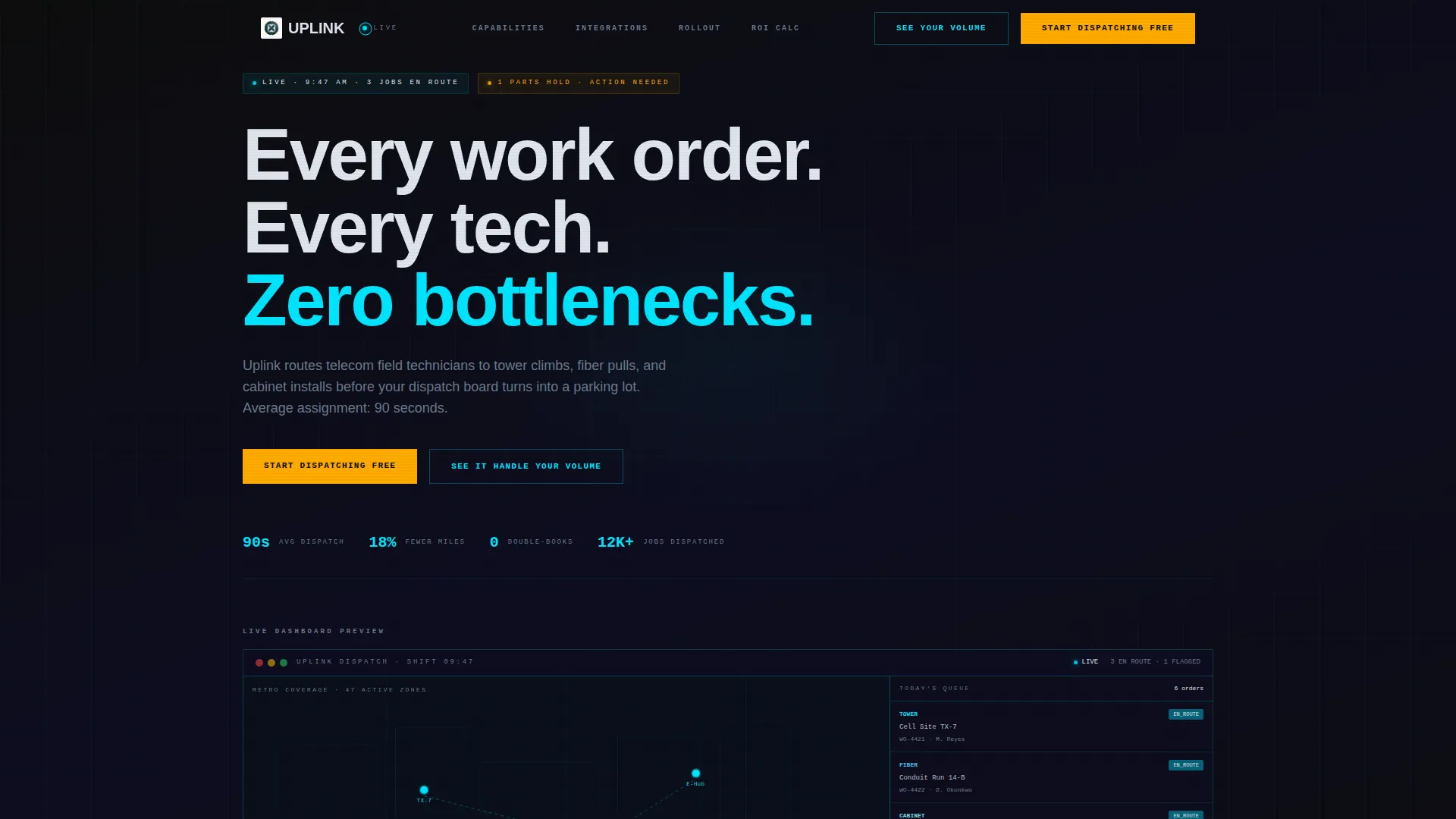
- A live dashboard preview header showing a mid-shift scheduling interface with technician pins, color-coded work orders, and a real-time crew capacity bar
- Three rows of modular capability cards covering dispatch speed, route optimization, conflict detection, integration connectors, and a week-view Gantt timeline
- A freemium trial signup flow requiring only a work email and crew size, landing the user in a sandbox workspace pre-loaded with sample work orders
Feature list
This section outlines the key functional and design capabilities delivered inside the Uplink template.
Live Dashboard Preview Header
The header renders a pixel-accurate scheduling interface caught mid-shift. It shows a metro-area map with pulsing technician location pins, a sidebar stack of today's work orders color-coded by job type (tower climb, fiber pull, cabinet install), and a real-time availability bar charting crew capacity against incoming tickets. The clock reads 9:47 AM, three jobs are en route, and one is flagged amber for a parts hold.
Modular Capability Card Grid
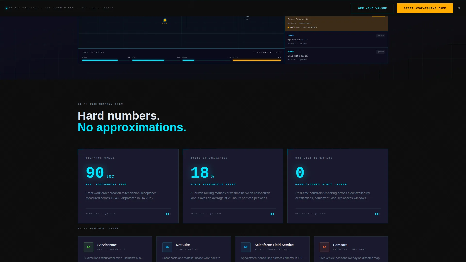
The page body is organized as a structured three-row card grid. Each card isolates a single capability and pins a hard number to it: 90-second average job assignment for dispatch speed, 18% fewer windshield miles through route optimization, and zero double-books since launch for conflict detection. The grid builds a compounding argument as the visitor scrolls deeper.
Integration Connector Cards
The second card row displays integration connector cards, each showing a real connector logo alongside a one-line protocol note. This gives prospective users an immediate read on how the platform connects to the tools their teams already use.
Week-View Gantt Timeline Card
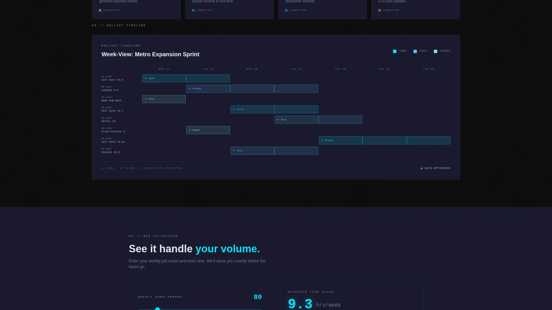
The third row features a wider card displaying a week-view Gantt chart of a real rollout timeline, with jobs snapping into slots visually. This gives operations managers a concrete sense of how multi-site scheduling looks inside the product before they sign up.
Freemium Trial Conversion Path
The primary call to action reads "Start Dispatching Free" in fault-alert amber, placed in the header and repeated as a sticky bottom bar after the second card row. The trial form asks only for a work email and crew size (dropdown options: 1 to 10, 11 to 50, or 51 and above), then drops the user directly into a pre-loaded sandbox workspace.
Interactive Volume Calculator
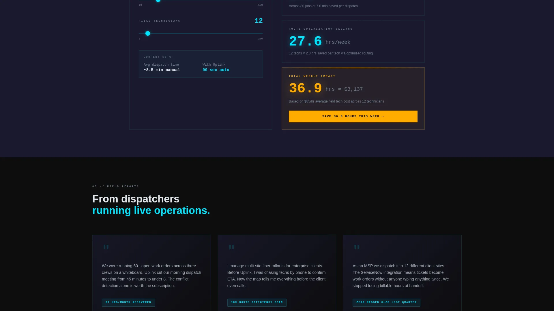
A secondary conversion path labeled "See It Handle Your Volume" opens an inline calculator. Dispatchers enter their weekly job count and technician headcount to see projected time savings. The calculator ends with a contextual call to action that reflects the user's own inputs, for example: "Save X hours this week."
Page sections overview
| Section | Purpose |
|---|---|
| Dashboard Preview Header | Show the live scheduling interface as the product hero |
| Dispatch Speed Card | Quantify assignment time with a 90-second benchmark |
| Route Optimization Card | Illustrate 18% reduction in field technician travel miles |
| Conflict Detection Card | Confirm zero double-books as a core reliability proof point |
| Integration Connector Row | Display real connector logos with one-line protocol notes |
| Gantt Timeline Card | Visualize a full week-view rollout schedule mid-execution |
| Sticky Trial Bar | Repeat the primary call to action after the second card row |
| Volume Calculator | Let dispatchers calculate projected time savings from their own inputs |
| Trial Signup Form | Collect work email and crew size to unlock the sandbox workspace |
Design & branding system
The visual identity follows a Data Command theme built on the Carbon Fiber color system. The palette feels technical and tactile, like a matte-black equipment case, without relying on stock imagery or lifestyle photography.
- Background layers sit in deep cockpit black (#0D0D0D) and woven graphite (#1A1A2E), with signal-trace cyan (#00E5FF) reserved for active states and data paths
- Fault-alert amber (#FFAB00) appears only on notifications, flagged job states, and calls to action, keeping it visually weighted with decision urgency
- Body text uses cool white (#E0E6ED) for clean legibility against dark backgrounds without visual vibration
Mobile & speed optimization
The modular card grid layout is structurally suited to responsive reflow across screen sizes. Each card is self-contained, which supports clean stacking on smaller viewports without losing the data-dense readability the design depends on.
- Card-grid structure allows individual modules to restack vertically on narrow screens while retaining their standalone readability
- The sticky bottom bar conversion element keeps the primary call to action reachable on mobile without disrupting the scroll flow
- No stock photography or heavy lifestyle imagery is used, keeping visual assets lightweight by design
How this template helps you convert
The conversion architecture is deliberate and layered. Every design and copy decision moves the visitor from passive reading toward an active trial signup.
- The dashboard preview header puts the actual product interface front and center, replacing abstract claims with a concrete operational moment that builds immediate credibility.
- The card grid converts scroll depth into accumulating evidence, with each row adding a new proof point until the case for signing up feels obvious.
- The inline volume calculator personalizes the value proposition by reflecting the visitor's own numbers back at them, making the contextual call to action feel earned rather than generic.
Other information about this template
This template is categorized under Technology, specifically the Telecommunications Digital Presence subcategory, with a niche focus on telecommunications booking and scheduling. The intersection match score for this template configuration is 13, reflecting a tight alignment between the design system, conversion model, and audience.
- The template is suited for pairing with field service management platforms and ticketing systems, including workflow tools in the category of solutions like ServiceNow, NetSuite, and Salesforce Field Service, as referenced in the integration connector card row
- The Freemium/Trial landing page direction means the conversion goal is a low-friction first touch, not a direct purchase, making the minimal signup form a deliberate strategic choice
- The Data Command theme and Carbon Fiber color system are specific to the Uplink template configuration and reflect the operational software aesthetic of professional dispatch environments
Theme
Data Command
Creative direction
Spec Sheet
Color system
Carbon Fiber
Style
Card Grid (Modular)
Direction
Freemium/Trial
Page Sections
Live Dashboard Preview Header
Modular Capability Card Grid
Integration Connector Cards
Week-view Gantt Timeline Card
Sticky Trial Conversion Bar
Inline Volume Calculator
Related questions
Who is this template designed for?
What conversion model does this template use?
Can I customize the integration connector cards?
What does the inline volume calculator do?
Does the template include the actual scheduling software?



