Coworking Digital Presence Comparison Website Template
Upskill is a stats-first coworking course landing page built for digital academies that train operators to launch, fill, and scale flex spaces. The modular card grid leads with live-rolling metrics, head-to-head comparison panels, and an inline occupancy gap diagnostic, all designed to make a visitor's own numbers feel like the strongest argument for enrolling.
by Rocket studio
Quick summary
Upskill is a single-page coworking training platform template built on a Dynamic Motion, Stats-First design system. It opens with animated counters, builds a case through a modular card grid, and closes with a personalized occupancy gap diagnostic. Every layout decision turns real performance numbers into the primary persuasion tool.
Who this template is for
This template is built for operators and educators who need a landing page that sells with data, not just copy. It fits a specific kind of audience: people who respect numbers and respond to proof.
- First-time founders converting vacant retail space into flexible offices
- Corporate real estate teams piloting hybrid workspace programs
- Existing coworking operators whose occupancy has plateaued around 60%
What problem this template solves
Most coworking course pages rely on testimonials and vague promises. This template solves a sharper problem: it makes the performance gap between trained and untrained operators impossible to ignore.
- Visitors arrive skeptical; rolling stat counters open with hard numbers before a single word of body copy
- The versus grid forces a direct comparison, so the value of training becomes self-evident
- The inline diagnostic uses the visitor's own desk count and occupancy figures to generate a personalized revenue gap card
What you get with this template
This is a fully structured, single-page layout built around three content tiers that work together in sequence. Each tier adds evidence before the next conversion ask appears.
- A full-width animated stats wall header with mechanical-easing number counters
- A three-row modular card grid covering outcomes, course modules, and head-to-head comparisons
- An inline four-field diagnostic tool that generates a personalized occupancy gap analysis card with a secondary call-to-action
Feature list
This template is engineered around a single idea: data earns the click. Every feature exists to deepen that case.
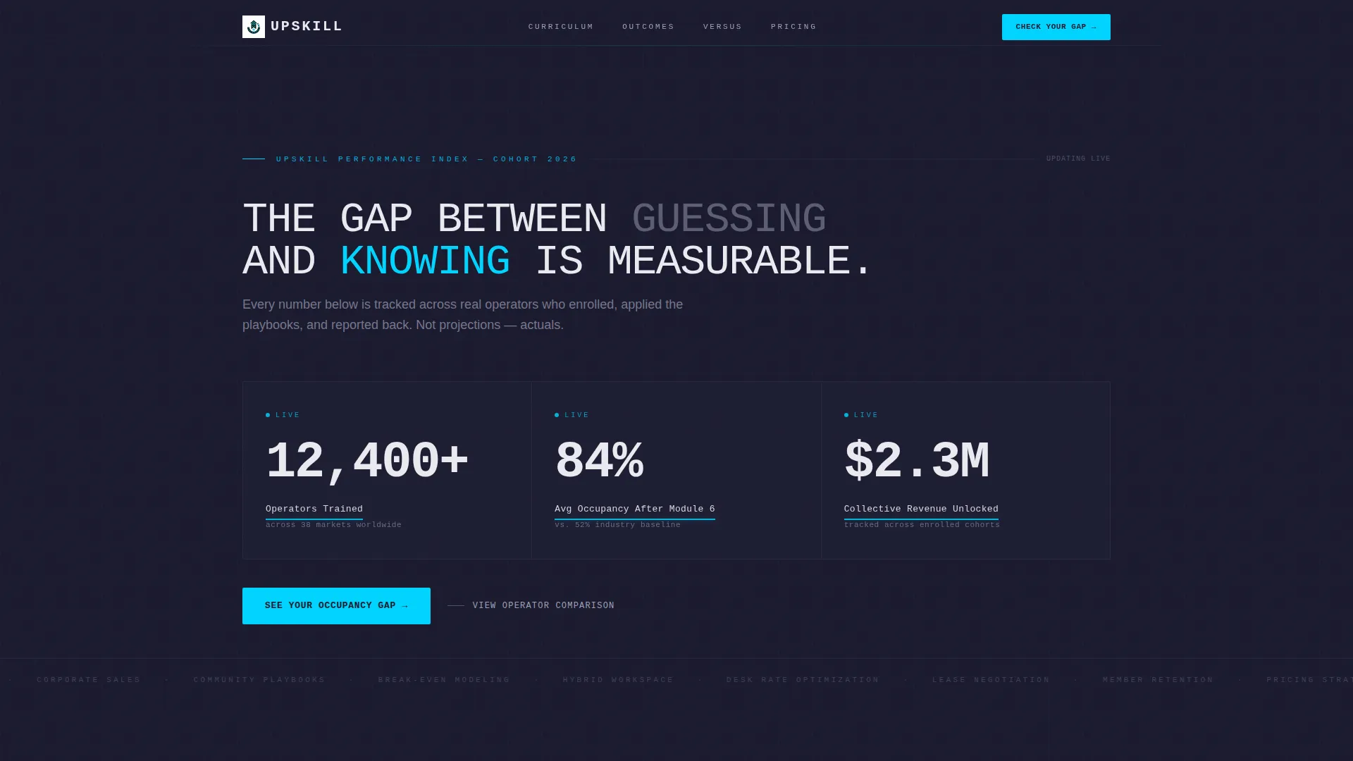
Animated Stats Header
The header is a full-width metrics wall. Oversized monospaced numerals count upward in real time using a mechanical easing curve. Stats shown include operators trained, average occupancy after Module 6, and collective revenue unlocked. Signal cyan underlines pulse beneath each active figure.
Staggered Card Grid Assembly
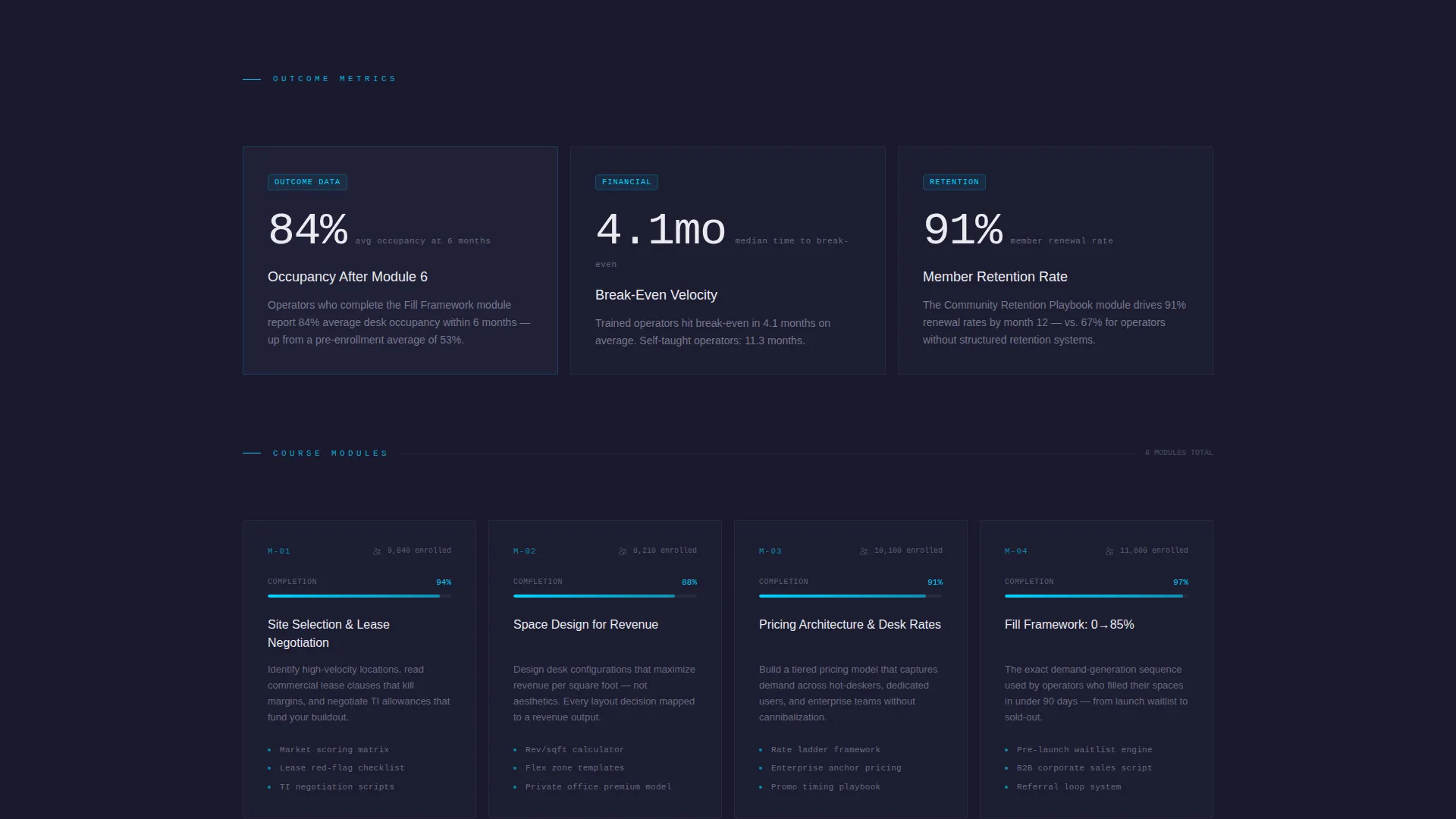
As the visitor scrolls, cards slide into position with staggered motion. The grid assembles in three distinct rows: outcome stats, course module cards with completion percentages and learner counts, and side-by-side comparison panels. Each card leads with a bold metric before revealing the module or data set beneath.
Head-to-Head Comparison Panels
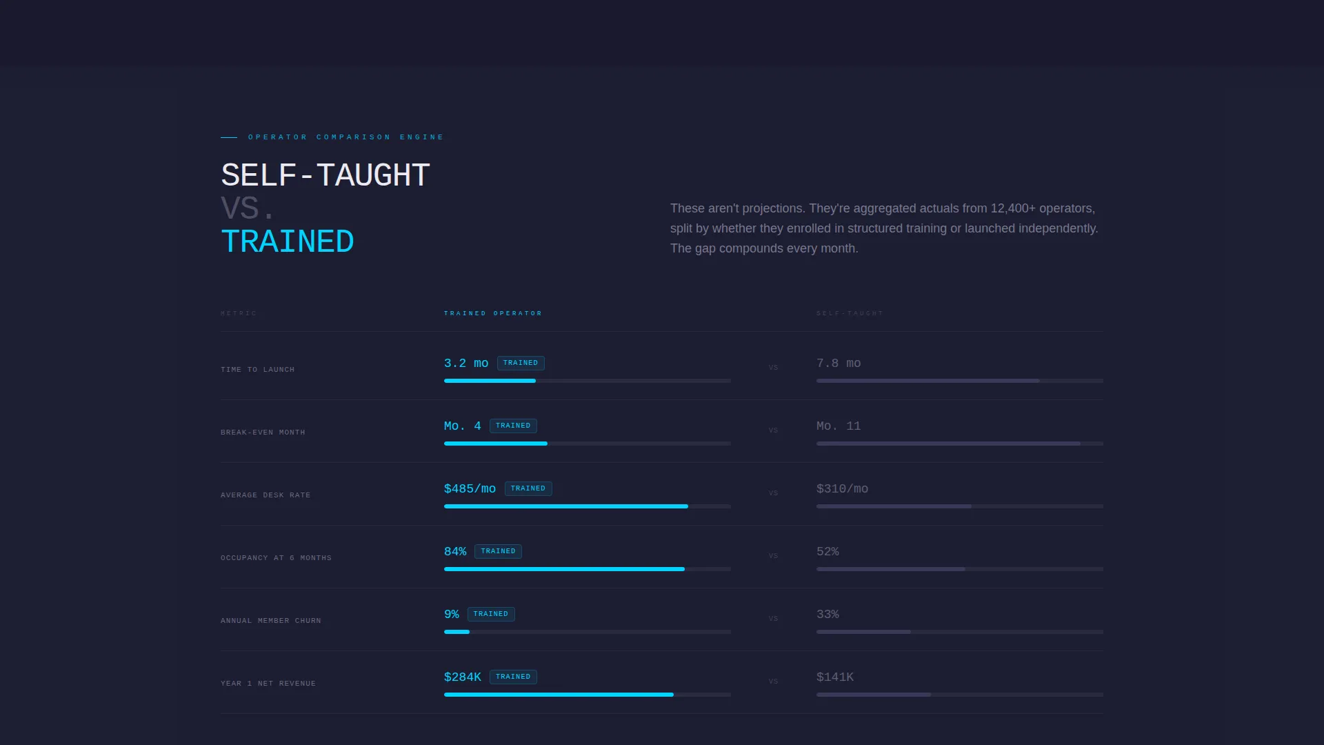
The third card row runs a direct "Self-Taught versus. Trained Operator" comparison. Side-by-side stat lines cover time-to-launch, break-even month, average desk rate, and member churn. This panel is the sharpest conversion moment on the page.
Inline Occupancy Gap Diagnostic
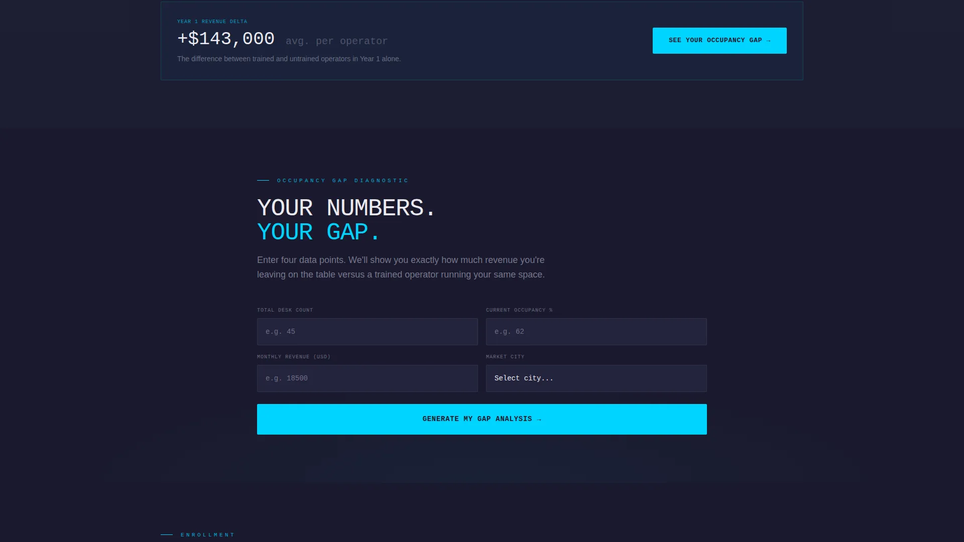
Placed immediately after the comparison grid, the diagnostic collects four inputs: current desk count, current occupancy percentage, monthly revenue, and market city. No scrolling required. The result is an instant personalized gap analysis card projecting revenue at 85% occupancy versus the visitor's entered figure.
Dual Call-to-Action Flow
The primary call-to-action button reads "See Your Occupancy Gap" and opens the inline diagnostic. Once the gap card appears, a secondary call-to-action reads "Unlock the Full Playbook." The two-step flow earns commitment by making the visitor's own numbers visible first.
Monochrome Steel Visual System
The entire page uses a controlled four-color palette: forge black, brushed gunmetal, cool titanium, and polished chrome white. Signal cyan appears exclusively on live data points, progress indicators, and call-to-action surfaces. Nothing glows unless it is active.
Page sections overview
| Section | Purpose |
|---|---|
| Animated Stats Header | Opens with rolling counters showing platform-wide performance metrics |
| Outcome Stats Row | First card row displaying revenue, occupancy, and retention results |
| Course Modules Row | Second card row showing each module with completion rate and learner count |
| Comparison Panels Row | Third card row running trained versus. untrained operator stat comparisons |
| Occupancy Gap Diagnostic | Four-field inline tool generating a personalized revenue gap analysis card |
| Primary call to action Block | "See Your Occupancy Gap" button anchoring the main conversion moment |
| Gap Analysis Result Card | Instant output card showing projected revenue at 85% occupancy |
| Secondary call to action Block | "Unlock the Full Playbook" prompt following the gap result display |
Design & branding system
The visual identity follows a Dynamic Motion theme built entirely around the Monochrome Steel color system. The design reads like a precision control panel: no decorative warmth, just engineered contrast where every lit element signals activity.
- Forge black (#1A1A2E) and brushed gunmetal (#3D3D5C) form the structural background layers, with cool titanium (#A0A0B8) and polished chrome white (#EAEAF0) handling text and card surfaces
- Signal cyan (#00D4FF) is reserved exclusively for live data indicators, progress elements, and call-to-action surfaces, so every cyan element carries active meaning
- Typography uses oversized monospaced numerals for all stat displays, reinforcing the dashboard aesthetic throughout the page
Mobile & speed optimization
The modular card grid is structured to reflow cleanly across screen sizes. Staggered motion and rolling counter animations are designed to maintain visual clarity without overloading smaller viewports.
- Card columns collapse into a readable single-column stack on mobile without losing the metric-first hierarchy
- The four-field diagnostic form is compact by design, fitting within a single viewport on most devices without scrolling
- Animation timing is calibrated to feel purposeful on both desktop and mobile, not decorative
How this template helps you convert
This template is built as a Comparison/Versus conversion engine. The page does not ask for commitment until it has already shown the visitor their own performance gap.
- The stats header establishes platform credibility in the first three seconds, before any copy is read, setting a high proof standard that the rest of the page sustains.
- The versus grid forces a direct, data-driven comparison between trained and untrained operators, removing ambiguity about the value of the course before the call-to-action appears.
- The inline diagnostic converts abstract statistics into a personal number, making the visitor's own occupancy shortfall the final argument for clicking "Unlock the Full Playbook."
Other information about this template
This template is purpose-built for the coworking education niche and is well-suited to any digital academy, cohort program, or online course platform targeting real estate operators and community managers. It can support content for topics ranging from lease negotiation and pricing strategy to member retention playbooks and hybrid workspace design.
- The layout works equally well for launching a new coworking training program or relaunching an existing course with stronger conversion mechanics
- Instructors and platform teams can adapt the module card row to reflect their own curriculum structure, learner stats, and completion milestones
- The diagnostic section is designed to function as a lead-qualification tool, capturing workspace context from prospective students before any sales conversation begins
Theme
Dynamic Motion
Creative direction
Stats-First Impact
Color system
Monochrome Steel
Style
Card Grid (Modular)
Direction
Comparison/Versus
Page Sections
Animated Stats Header Wall
Staggered Modular Card Grid
Head-to-head Comparison Panels
Inline Occupancy Gap Diagnostic
Two-step Call to Action Conversion Flow
Monochrome Steel Color Discipline
Related questions
Who is the Upskill template designed for?
Can I adapt the course module cards to match my own curriculum?
What makes the inline diagnostic different from a standard sign-up form?
Does the template work on mobile devices?
What does the signal cyan color rule mean in practice?



