Corporate Training & L&D Specialist FAQ Website Template
Upskill is a zigzag landing page template built for technical skills training programs. It pairs a split photo-text header with FAQ-driven scroll sections, free accordion sample lessons, and a gated syllabus download form. The Forest Trust color system and Community Hearth visual tone make the page feel warm, credible, and impossible to leave before reading one more section.
by Rocket studio
Quick summary
Upskill is a single-page landing page template designed for hands-on technical training programs. It uses an alternating zigzag layout driven by real learner questions, free preview lessons in expandable accordion modules, and a two-field syllabus download form. The design language is warm and grounded, built to earn trust before it asks for anything.
Who this template is for
This template is built for training program creators who need to convert skeptical, busy professionals. It speaks directly to the people running cohort-based technical workshops, corporate learning and development programs, or intensive upskilling courses for working engineers and developers.
- Mid-career technical professionals running or marketing hands-on training cohorts
- Corporate learning and development teams building credibility with engineer audiences
- Independent educators offering structured technical skills training to working professionals
What problem this template solves
Most training program pages fail because they lead with features and hide proof. A mid-career engineer visiting at 11pm is not looking for a course catalog. They are looking for evidence that someone understands their exact frustration and has already solved it.
- Visitors leave before converting because the page never dissolves their specific doubts
- Generic course pages bury social proof and give no free teaching before asking for a sign-up
- FAQ-style content is scattered across separate blog posts instead of anchoring the scroll experience
What you get with this template
This template gives you a complete, structured landing page that leads with empathy and earns the conversion through real content. Every section is designed to answer a doubt before it becomes a reason to leave.
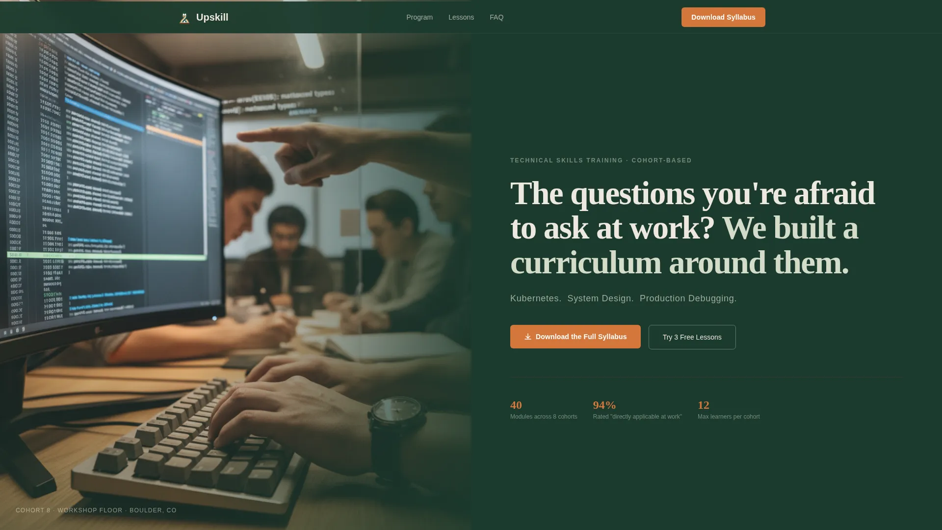
- A half-page photo-text hero header with a headline, three-skill subhead, and a primary call-to-action button
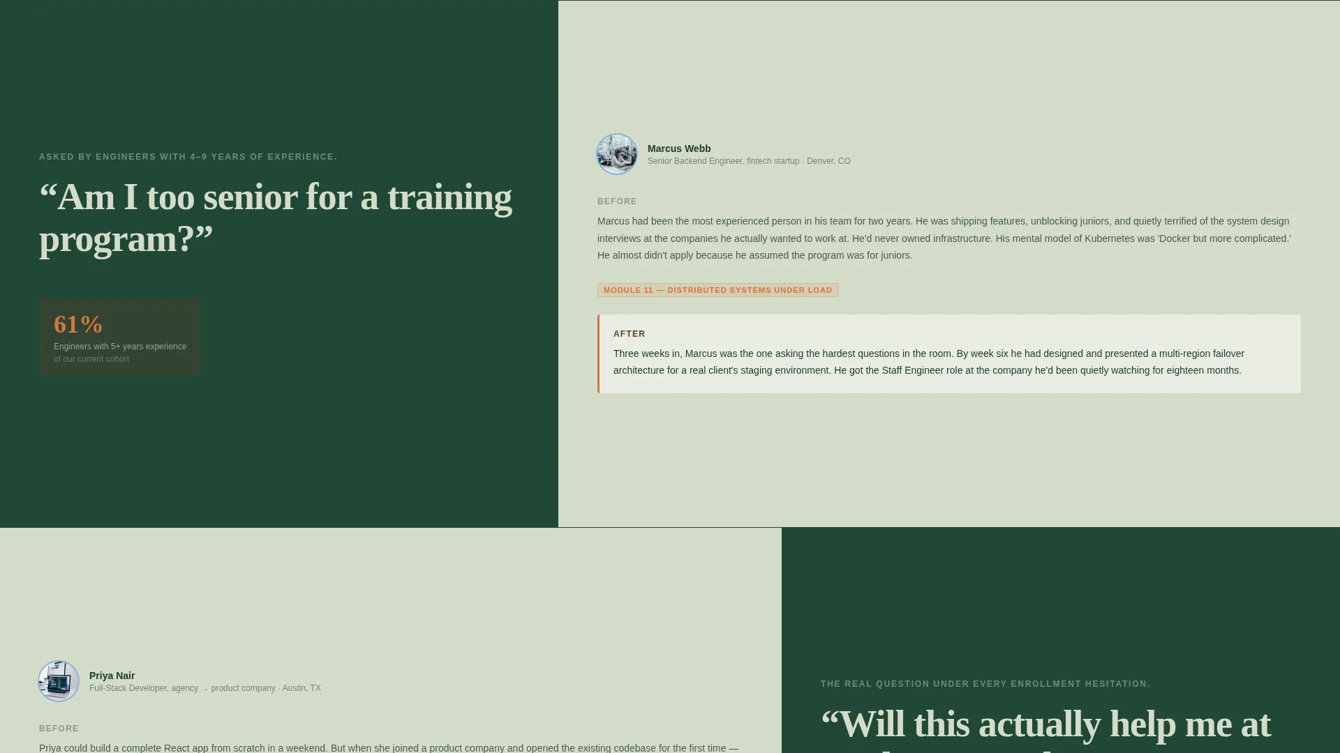
- Three FAQ-anchored zigzag sections, each pairing a real learner question with a named before-and-after story
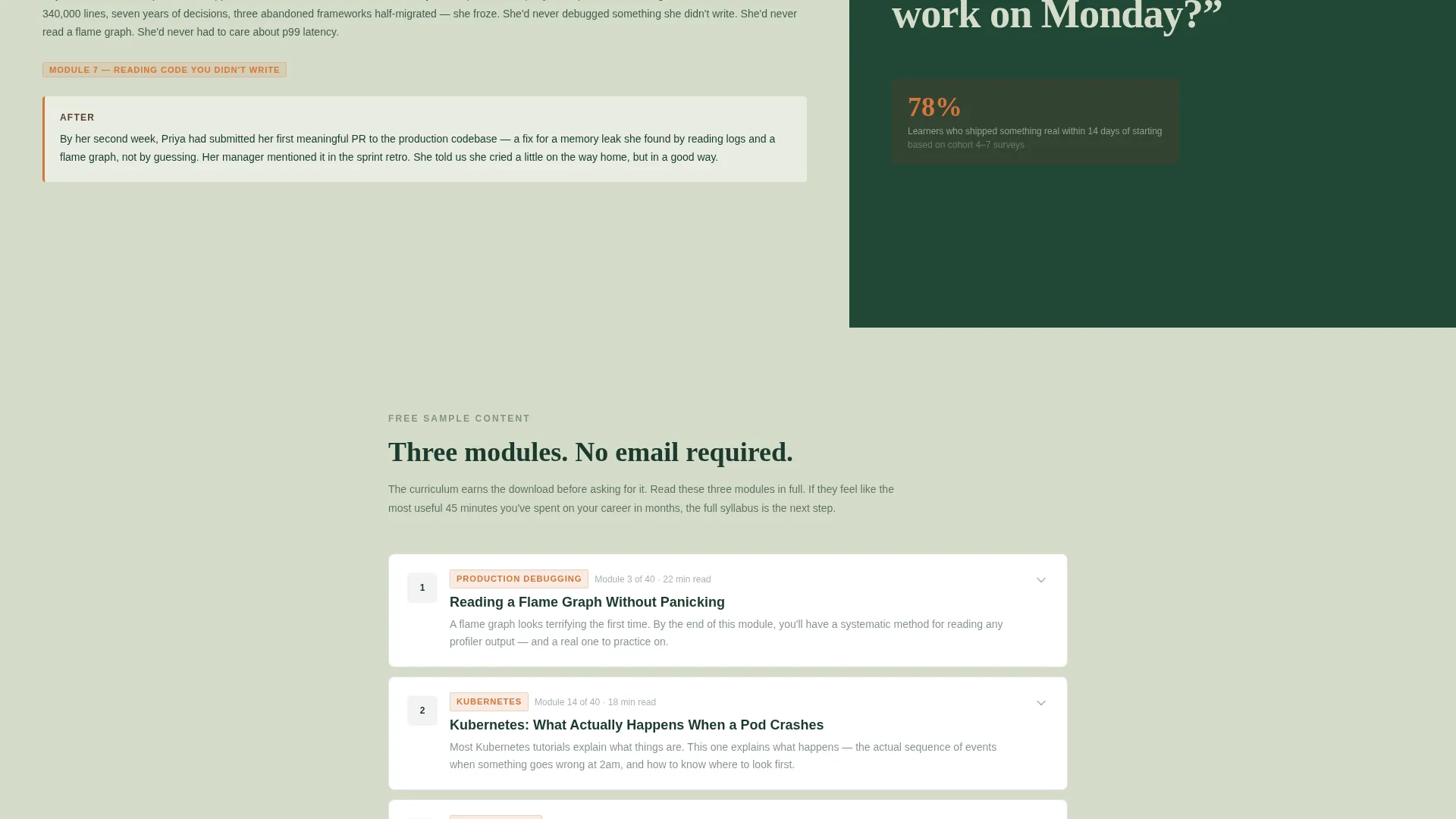
- Three free sample lesson accordion modules embedded on the page, each ending with a soft secondary call-to-action
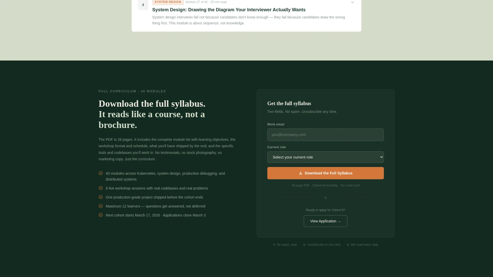
- A gated two-field form collecting work email and current role title to deliver the full syllabus PDF
Feature list
This template is built around a set of deliberately chosen layout and content components that work together to create a high-trust, conversion-ready landing page.
FAQ-Driven Zigzag Scroll Layout
Each scroll section opens with a real learner question set in large serif type. The alternating side reveals a named mini-story with a before situation, a specific module reference, and a concrete outcome. The rhythm builds gravitational pull downward through the page.
Half-Page Photo-Text Hero Header
The header splits the viewport into two halves. The left side carries an over-the-shoulder photograph showing a real terminal mid-compile and an instructor pointing at a specific line of code. The right side holds a heavy serif headline, a lichen-colored skill subhead, and the first ember-orange call-to-action button.
Embedded Free Sample Lesson Accordions
Three expandable accordion modules sit directly on the page, each containing a real free lesson preview. Every accordion closes with a soft secondary call-to-action: "This is Module 3 of 40. Get the rest." This gives visitors genuine value before they reach the form.
Gated Syllabus Download Form
A clean two-field form collects work email and current role title via a dropdown. Role options include junior developer, mid-level engineer, team lead, career switcher, and other. The form gates the full syllabus PDF and sits after the free content has already built trust.
Community Hearth Visual Identity System
The Forest Trust color palette uses deep evergreen as the primary background, warm bark brown for section dividers, soft lichen for text-heavy areas and card backgrounds, and ember orange exclusively on calls-to-action and interactive highlights. The result is a cabin-library atmosphere that feels generous and unhurried.
Named Learner Proof Stories
Each FAQ section includes a structured mini-story format: a named learner, their before situation, the module that changed things, and a specific after. These are not generic testimonials. They are narrative proof units that dissolve a specific anxiety and replace it with a concrete image of success.
Page sections overview
| Section | Purpose |
|---|---|
| Hero Header Split | Introduce the program with a striking over-the-shoulder photograph and headline that names the learner's real problem |
| FAQ Anchor One | Address "Am I too senior for a training program?" with a named learner story |
| FAQ Anchor Two | Address "Will this actually help me at work Monday?" with a module-specific outcome story |
| FAQ Anchor Three | Address "What if I fall behind?" with a reassurance-first narrative proof unit |
| Free Sample Lessons | Deliver real teaching value through three embedded accordion lesson previews |
| Syllabus Download Form | Gate the full syllabus PDF behind a two-field work email and role title form |
Design & branding system
The visual identity follows a Community Hearth theme using the Forest Trust color system. The palette is built for technical audiences who distrust over-designed pages. Every color choice has a specific structural role.
- Deep evergreen (#1B3A2D) dominates the top and bottom thirds as the primary background, giving the page a grounded, authoritative tone
- Soft lichen (#D4DCCA) opens breathing room in middle teaching sections, used for text-heavy areas and card backgrounds to aid readability
- Warm bark brown (#5C3D2E) anchors section dividers, borders, and the footer, while ember orange (#D4763A) appears exclusively on calls-to-action so every button feels like a lit match
Mobile & speed optimization
The template is built with a single-page, section-led structure that keeps the layout clean and easy to reflow at smaller screen sizes. The zigzag sections stack gracefully on mobile so the question-then-proof rhythm stays intact.
- Alternating two-column zigzag sections are designed to reflow into a single-column stack on smaller screens without losing narrative order
- Accordion modules are touch-friendly by design, allowing mobile visitors to expand and collapse lesson previews without friction
- The two-field syllabus form is minimal by intention, reducing friction for visitors filling it out on a phone or tablet
How this template helps you convert
This template earns the conversion instead of demanding it. The page gives real teaching away first, so by the time a visitor reaches the form, the syllabus feels like the next chapter of something they are already reading.
- The FAQ-anchored scroll structure anticipates and dissolves specific doubts in sequence, keeping visitors moving down the page instead of bouncing after the hero section
- Free accordion lesson previews deliver immediate, ungated value that builds credibility and makes the gated syllabus feel like a natural continuation rather than a sales barrier
- The ember-orange call-to-action system is used sparingly enough that each button registers as a meaningful moment, not visual noise, which increases the likelihood that visitors act when they see one
Other information about this template
This template is well-suited for technical skills training programs operating in the corporate learning and development space. It is particularly effective for programs targeting engineers and developers who are skeptical of traditional course marketing.
- The template style is Zigzag/Alternating, which supports the FAQ-driven creative direction natively
- The Content/Resource landing page direction means the primary conversion goal is a syllabus PDF download, not a direct purchase or booking
- The header concept is a Half-Page Photo/Text split, which requires a high-quality over-the-shoulder photograph to achieve the intended depth-of-field effect
- The Community Hearth theme and Forest Trust color system are built to feel like a cabin library at dusk, not a SaaS dashboard or a corporate intranet
Theme
Community Hearth
Creative direction
FAQ-Driven
Color system
Forest Trust
Style
Zigzag/Alternating
Direction
Content/Resource
Page Sections
Faq-driven Zigzag Scroll Layout
Half-page Photo-text Hero Header
Embedded Free Sample Lesson Accordions
Gated Syllabus Download Form
Named Learner Proof Story Format
Forest Trust Color System
Related questions
Can I replace the learner questions in the zigzag sections with my own?
How many free lesson accordion modules are included in the template?
What fields does the syllabus download form collect?
Is the zigzag layout suitable for non-technical training programs?
Can I update the Forest Trust color palette to match my brand?



