Upskill - Powerful Franchise Landing Page Template
Upskill is a franchise learning management system landing page template built for operators who need to push compliance training, brand-standard modules, and onboarding playbooks across hundreds of locations at once. With a hub-and-spoke anchor navigation, live-metric header panels, and scroll-driven animations, this template makes the product feel operational before a visitor ever clicks through.
by Rocket studio
Quick summary
Upskill is a single-page, hub-and-spoke landing page template designed for franchise learning management platforms. It visualizes total training orchestration across hundreds of locations through animated dashboards, scroll-triggered counters, and dark glass panel metrics. The page is built to earn a demo click by making visitors feel the product working before they ever log in.
Who this template is for
This template is built for teams selling or presenting franchise training software at scale. It speaks directly to the people who feel the daily pressure of keeping every location aligned, compliant, and store-ready.
- Multi-unit franchise owners managing a dozen or more locations across multiple states
- Corporate learning and development directors at emerging fast-casual or service chains crossing the fifty-unit threshold
- Franchise development vice presidents who need new licensees fully trained and operational within fourteen days
What problem this template solves
Franchise training platforms face a specific credibility problem. The product is invisible until a visitor trusts that it actually works at scale. A static page with screenshots and bullet points cannot communicate real-time orchestration across five hundred locations.
- Visitors cannot feel the speed or coverage of the platform from a passive page
- Proof points like turnover reduction and audit pass rates get buried in text instead of landing with impact
- Multi-unit operators and corporate directors need to see the system in motion, not just described
What you get with this template
You get a fully structured, single-page landing page that places live-feeling interaction at the center of every section. The template is built to convert visitors into demo bookings without requiring a form fill on the page itself.
- A fixed left-side anchor navigation with five labeled spokes: Deploy, Track, Certify, Scale, and Prove
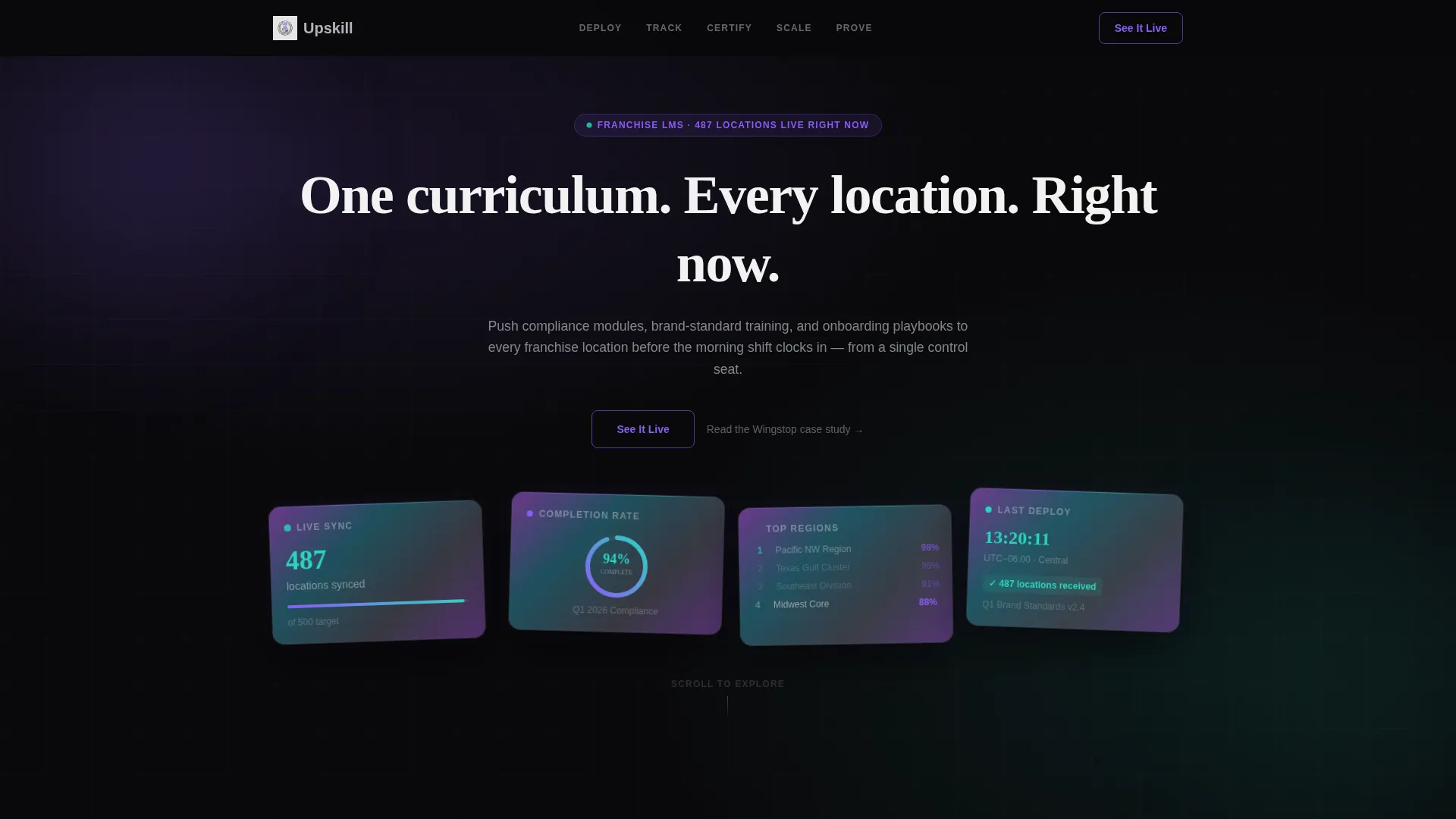
- A dark glass panel header displaying four pulsing live metrics with parallax drift and no stock photography
- A sequential, scroll-driven content flow that builds confidence section by section until the primary call to action appears
Feature list
This template includes prompt-defined components that work together to simulate the platform experience for every visitor who lands on the page.
Dark Glass Panel Header
Four translucent, frosted-glass cards float against a void black background, each tilted at a slightly different angle. Each panel displays a different live metric: locations synced, a completion-rate ring, a leaderboard of franchise names, and a module-deployment timestamp counting forward in real time. No hero image is used. The product is the visual.
Typing Headline Animation
A single headline types itself letter by letter across the top of the header. The phrase "One curriculum. Every location. Right now." communicates the platform's core value in the first moment of the visit. The animation creates immediate engagement without relying on imagery.
Hub and Spoke Anchor Navigation
A fixed left-side navigation contains five spokes labeled Deploy, Track, Certify, Scale, and Prove. Clicking any spoke smooth-scrolls to its corresponding section. The active spoke illuminates in holographic violet, giving visitors a clear sense of where they are in the page flow at all times.
Scroll-Triggered Section Animations
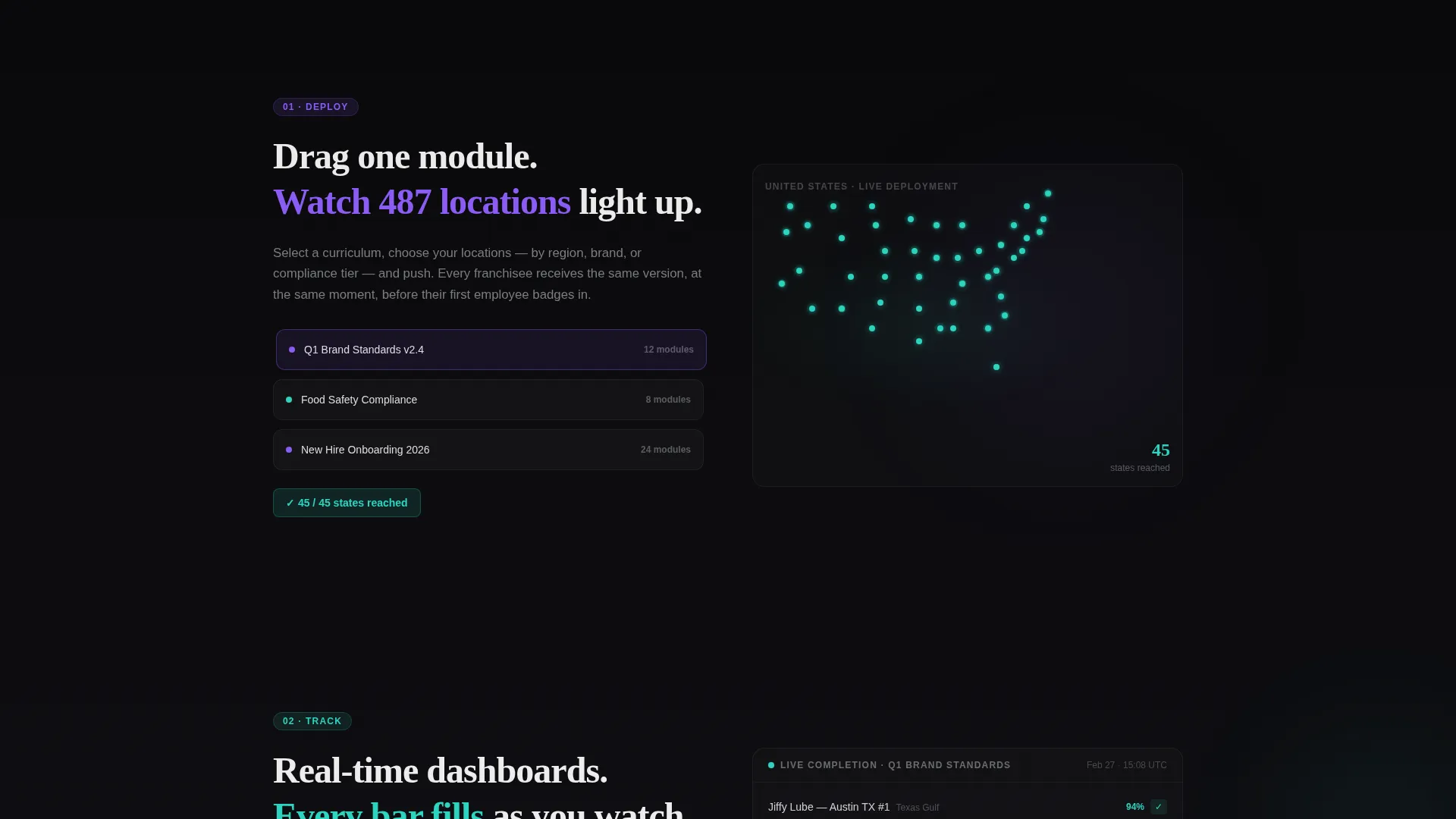
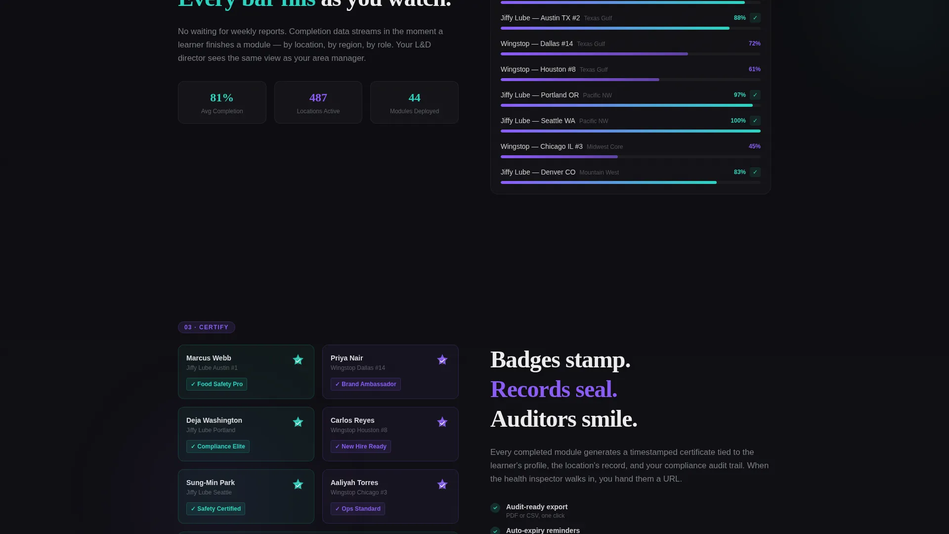
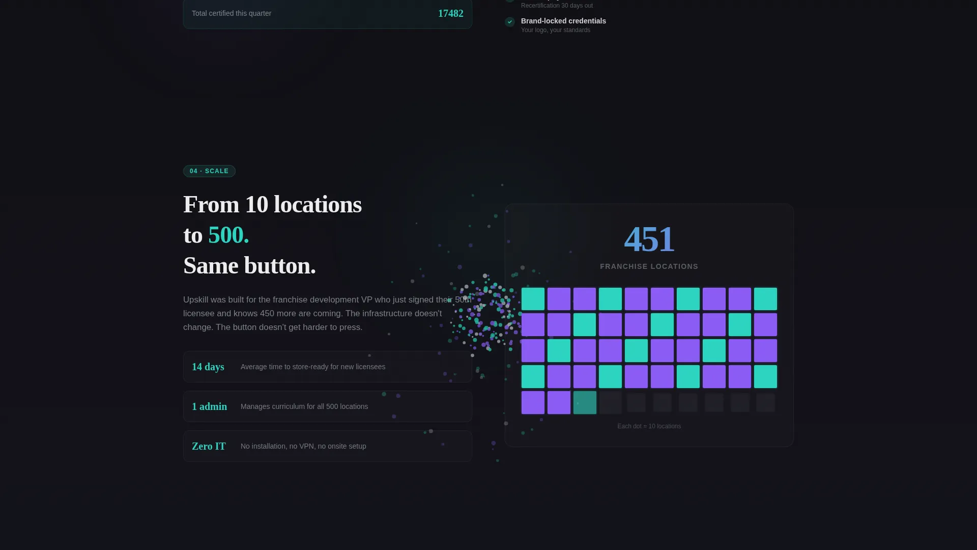
Each of the five content sections uses a distinct animation to demonstrate a platform capability. A franchise map lights up state by state in Deploy. Completion bars fill in real time in Track. Digital badges stamp onto learner profiles in Certify. A particle burst visualizes location growth in Scale. ROI counters tick upward as they enter the viewport in Prove.
Progressive Call-to-Action Design
The primary call to action, "See It Live," appears first as a ghost-outlined button in the header. After the Prove section completes the value case, it solidifies into a filled violet button. A secondary text link for a case study sits beneath the primary button for visitors who need one more proof point before committing.
Iridescent Teal Engagement States
Teal accent color is reserved exclusively for active engagement moments: scroll-triggered counters, animated progress rings, and hovered navigation spokes. This restraint makes every teal appearance feel like a live signal rather than a decorative choice, reinforcing the sense that the interface is responding to the visitor in real time.
Page sections overview
| Section | Purpose |
|---|---|
| Dark Glass Header | Display live-metric panels, typing headline, and ghost call to action button |
| Deploy Section | Animate a module drag onto a franchise map lighting up state by state |
| Track Section | Reveal real-time completion dashboards with filling progress bars |
| Certify Section | Stamp animated digital badges onto individual learner profiles |
| Scale Section | Visualize location growth from ten to five hundred with a particle burst |
| Prove Section | Count up ROI metrics and present the solidified primary call to action |
Design & branding system
The visual identity uses an AI Iridescent color system built on four precise values. The palette feels like the surface of a bubble floating through a server room, dark and reflective, shifting with every viewing angle.
- Void black (#09090B) dominates all backgrounds; liquid chrome (#C4C7CE) carries body text and divider lines; holographic violet (#8B5CF6) marks all primary interactive elements
- Iridescent teal (#2DD4BF) is reserved strictly for active states, progress indicators, and hover pulses, so it only appears when the visitor engages
- The Dynamic Motion theme drives the overall feel, with mouse parallax on header panels, sequential momentum across sections, and each section growing progressively darker until the final Prove section glows
Mobile & speed optimization
The template is designed with a scroll-driven, section-led flow that keeps the experience focused and intentional on any screen size. Animation pacing and visual hierarchy are structured to remain legible at smaller viewports.
- The fixed left-side anchor navigation is built to adapt so the hub-and-spoke flow remains usable without overwhelming a smaller screen
- Heavy visual moments like the particle burst and progress ring animations are contained within clearly bounded section blocks, preventing layout overflow on mobile
- The page carries no embedded forms, no stock photography, and no heavy image assets, keeping the visual weight on motion and color rather than file-heavy media
How this template helps you convert
This template earns the demo click by making the visitor feel the product in motion rather than reading about it. Every design decision removes friction between arrival and action.
- The sequential scroll flow builds a cumulative case from Deploy through Prove, so by the time the filled call to action button appears, the visitor has already experienced five demonstrations of platform value
- The ghost-to-solid call to action transition signals earned confidence, the button only fully commits once the Prove section has delivered turnover reduction rates, audit pass rates, and time-to-competency figures that count up live
- The secondary case study text link provides a low-pressure alternative path for analytical buyers who need written evidence before booking a demo
Other information about this template
This template is categorized under Technology and Franchise Software, with its niche squarely in franchise learning management systems. It is built as a hub-and-spoke anchor navigation landing page using the Dynamic Motion theme and Launch Energy creative direction.
- The template style is Hub and Spoke with an anchor navigation, and the landing page direction is Click-Through, meaning no form is present on the page itself
- The header concept is Dark Glass Panels, a design approach that replaces traditional hero images with live-metric visualizations for a product-led first impression
- The Intersection Match Score for this template is 13, reflecting strong alignment between the Technology category, Franchise Software subcategory, and Franchise Learning Management niche
Theme
Dynamic Motion
Creative direction
Launch Energy
Color system
AI Iridescent
Style
Hub & Spoke (Anchor Nav)
Direction
Click-Through
Page Sections
Dark Glass Panel Header with Live Metrics
Typing Headline Animation
Hub and Spoke Anchor Navigation
Scroll-triggered Section Animations
Progressive Ghost-to-solid Call to Action
Iridescent Teal Engagement States
Related questions
Does this template include a lead capture form?
Can I update the live metric numbers shown in the header panels?
What are the five anchor navigation sections in this template?
Is this template suitable for a franchise platform serving fewer than fifty locations?
What does the secondary call to action link to?



