B2B Training Platform Comparison Landing Page
Upskill is a single-page comparison table landing page built for B2B software-as-a-service training platforms. It uses a Monochrome Steel color system, a Feature Tab Switcher hero, and Launch Energy pacing to move visitors from curiosity to signup. The freemium call-to-action and inline video path keep friction low while the comparison table does the heavy persuasion.
by Rocket studio
Quick summary
Upskill is a focused, single-page landing page template designed for business-to-business course and training platforms. It pairs a kinetic Feature Tab Switcher header with a side-by-side comparison table, animated metrics, and a two-field signup form. The result is a persuasive, low-friction page that turns curious visitors into free-trial signups.
Who this template is for
This template is built for teams and founders who need to communicate the value of a consolidated training platform quickly and credibly. It speaks directly to buyers who have lived through the pain of disconnected tools.
- Learning and Development directors managing multiple disconnected training systems
- Human Resources operations managers running large-scale new-hire onboarding programs
- Startup Chief Technology Officers who need engineers ramped on internal systems fast
What problem this template solves
Corporate training teams often stitch together a legacy learning management system, a video hosting service, and spreadsheet-based tracking. That scattered stack creates confusion, duplication, and lost visibility. This template is built to show visitors, at a glance, why a single command center is the better path.
- Visitors cannot easily compare a unified platform against a fragmented tool stack
- Busy decision-makers bounce before reaching the signup form when friction is too high
- Generic hero sections fail to demonstrate real product value before the scroll ends
What you get with this template
You get a complete, ready-to-customize single-page layout with a clear persuasion arc from hero to conversion. Every section is purposefully sequenced to build momentum rather than lose it.
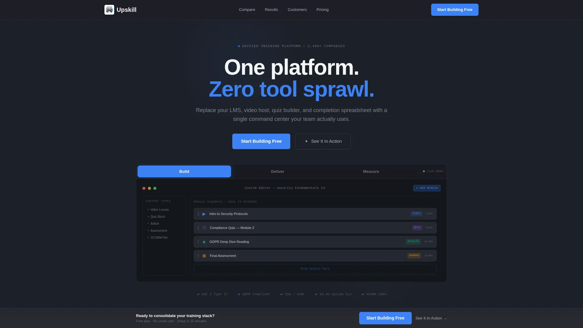
- A three-tab interactive hero that demos the Build, Deliver, and Measure product surfaces
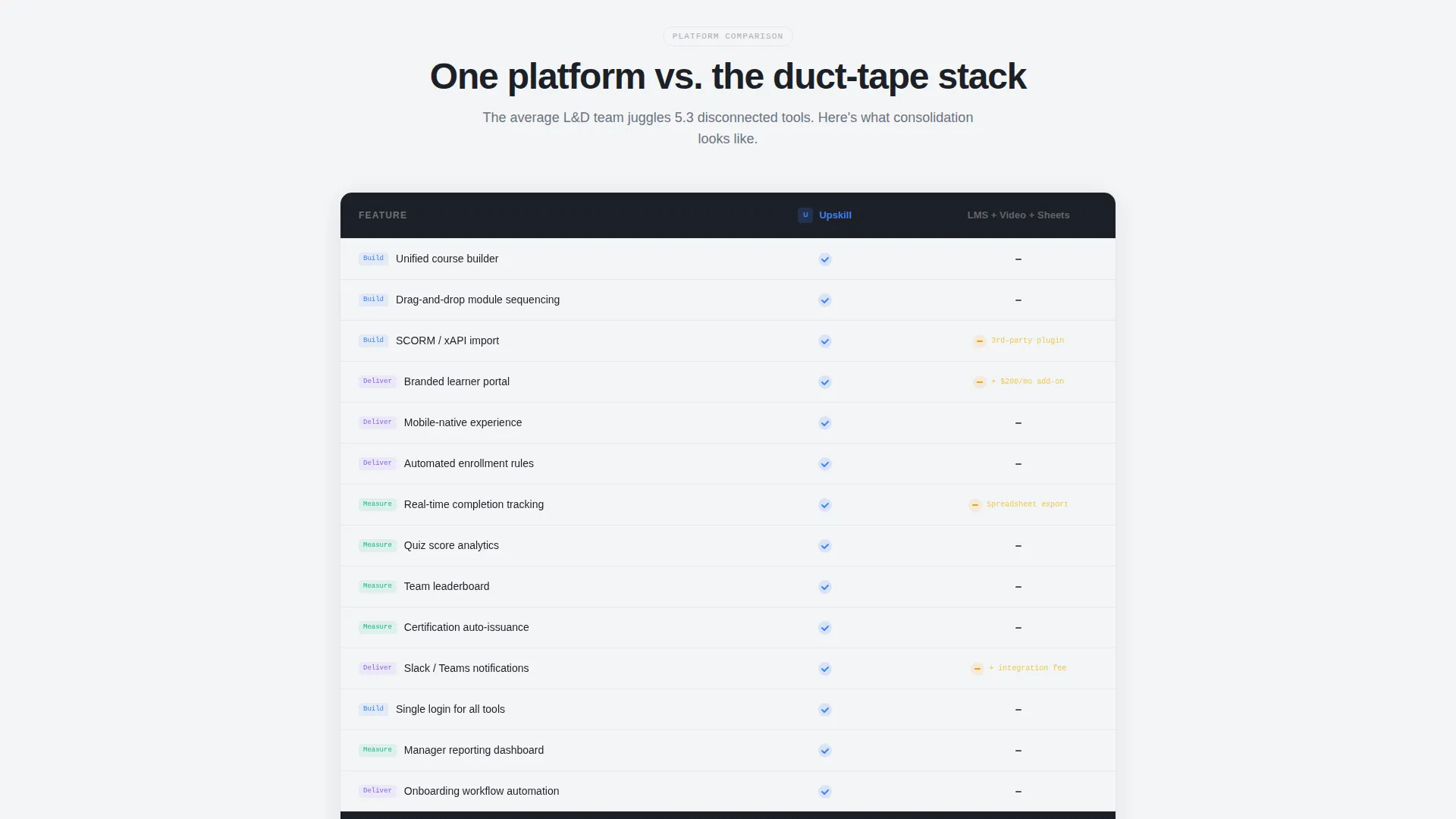
- A structured comparison table with electric blue checkmarks versus gray dashes
- A two-field freemium signup form and a secondary inline video walkthrough path
Feature list
This template ships with a focused set of components, each designed to reduce bounce and accelerate the decision to sign up.
Feature Tab Switcher Hero
Three clickable tabs labeled "Build," "Deliver," and "Measure" sit above a live product mockup. Each tab switch uses a spring-loaded kinetic transition with a subtle motion blur, so the interface feels responsive rather than static. The primary call-to-action button sits inside this section for maximum above-the-fold visibility.
Side-by-Side Comparison Table
The comparison table pits the platform directly against a duct-taped stack of legacy tools. Electric blue checkmarks accumulate on the platform side while gray dashes fill the competitor column. This visual contrast does the persuasion work before a visitor reads a single line of copy.
Animated Metrics Section
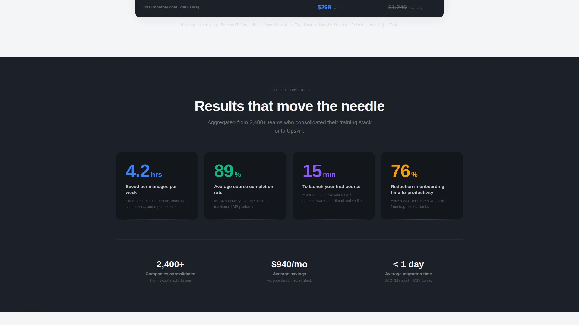
A rapid-fire row of performance statistics counts up as each number enters the viewport. Figures such as "4.2 hours saved per manager per week" and "89% course completion versus an industry average of 34%" are displayed as large, bold counters. The counting animation reinforces credibility and maintains scroll momentum.
Sticky Call-to-Action Bar
After the visitor scrolls past the comparison table, a persistent sticky bar reappears with the "Start Building Free" button in electric blue. This ensures the conversion entry point is always one click away without interrupting the reading flow above it.
Low-Friction Signup Form
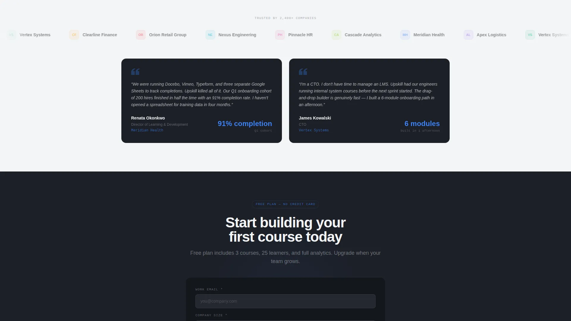
The signup form captures only two fields: work email address and company size via a dropdown with four ranges. Keeping the form to two fields reduces abandonment and gets qualified leads into the funnel faster.
Inline Video Walkthrough Path
A secondary call-to-action labeled "See It In Action" triggers an inline video walkthrough. This gives hesitant visitors a way to learn more without leaving the page, capturing intent from buyers who are not yet ready to start a free trial.
Page sections overview
| Section | Purpose |
|---|---|
| Feature Tab Hero | Demonstrate core product surfaces with interactive tabs and spring-loaded transitions |
| Comparison Table | Contrast the platform against a fragmented legacy tool stack |
| Animated Metrics Row | Reinforce value with counting statistics that activate on scroll |
| Sticky call to action Bar | Keep the signup action visible after the comparison table |
| Signup Form | Convert visitors with a two-field freemium entry point |
| Inline Video Path | Capture hesitant buyers with a no-commitment product walkthrough |
Design & branding system
The visual identity follows a Dynamic Motion theme built on a Monochrome Steel palette. Every color choice reinforces the feeling of a clean, capable, professional platform rather than a decorative marketing page.
- Deep gunmetal (#1C1F26) and bright interface white (#F4F5F7) alternate as section backgrounds to create visual rhythm on the scroll
- Brushed chrome (#A8ADB5) handles borders, dividers, and secondary text to maintain hierarchy without noise
- Electric blue (#3B82F6) appears exclusively on interactive elements: call-to-action buttons, active tabs, and comparison table checkmarks
Mobile & speed optimization
The template layout is structured for clean rendering across screen sizes, ensuring the tab switcher and comparison table remain usable on smaller viewports.
- The Feature Tab Switcher collapses gracefully so mobile visitors can still navigate between Build, Deliver, and Measure screens
- The comparison table is designed to scroll horizontally on narrow screens rather than collapsing into an unreadable stack
- The sticky call-to-action bar is sized and positioned to remain visible without blocking key content on mobile displays
How this template helps you convert
Every design and copy decision in this template is oriented toward one outcome: turning a first-time visitor into a free trial signup. The persuasion arc is deliberate and sequential.
- The Feature Tab Switcher opens the page with an interactive product demo, so visitors understand the platform's value before they scroll past the fold
- The comparison table builds the case against fragmented alternatives, making the choice feel obvious rather than effortful
- The two-field signup form and the "See It In Action" secondary path give visitors two clear next steps that match where they are in their decision process
Other information about this template
This template is part of the Dynamic Motion theme family and uses the Comparison Table template style, which is particularly effective for software-as-a-service products where the competition is a messy status quo rather than a single rival product.
- The Launch Energy creative direction means every section is paced to accelerate toward the conversion moment, never plateau
- The Freemium/Trial landing page direction makes this template well suited for platforms offering a no-cost entry tier or a time-limited trial
- The Monochrome Steel color system is easy to re-skin: swap the gunmetal and white backgrounds while keeping the electric blue accent and the visual logic holds
- The template is built for the SaaS business-to-business digital presence category, making it a strong fit for any platform selling to procurement-aware corporate buyers
Theme
Dynamic Motion
Creative direction
Launch Energy
Color system
Monochrome Steel
Style
Comparison Table
Direction
Freemium/Trial
Page Sections
Feature Tab Switcher Hero
Side-by-side Comparison Table
Animated Metrics Counter Row
Sticky Call-to-action Bar
Low-friction Two-field Signup Form
Inline Video Walkthrough Path
Related questions
Can I change the tab labels from Build, Deliver, and Measure?
Does the comparison table support more than two columns?
How does the inline video walkthrough path work?
Can I update the figures in the animated metrics section?
Is this template suitable for a platform offering a free trial instead of a freemium tier?



