Local Consulting Firm Software Comparison Website Template
Upskill is a scroll-reveal landing page template built for consulting firms that need a serious learning management system. It features an interactive LMS dashboard preview, a launch-sequence content flow, and a comparison table that pits the platform against generic alternatives on consulting-specific criteria. The result is a focused, high-momentum page designed to move learning and development directors from curiosity to commitment.
by Rocket studio
Quick summary
Upskill is a single-page, scroll-reveal landing page template built for consulting firms offering a learning management system to their analysts and associates. It opens with a live LMS dashboard preview, progresses through four capability stages, and closes with a head-to-head comparison table. Every section is engineered to build trust and drive sign-ups from learning and development decision-makers.
Who this template is for
This template is purpose-built for learning and development (L&D) directors and knowledge managers inside professional services firms. It speaks directly to the people responsible for onboarding new cohorts, protecting institutional knowledge, and demonstrating return on training investment.
- L&D directors at Big Four and mid-tier consulting firms managing analyst development programs
- Knowledge managers trying to replace static shared drives with structured, trackable learning paths
- Platform founders or product teams marketing a consulting-specific LMS to firm decision-makers
What problem this template solves
Consulting firms lose hard-won methodologies every time a senior partner retires or a top performer moves on. Generic learning platforms were not built for this problem. This template gives the platform a page that speaks directly to that pain and positions the product as the precise solution.
- Institutional knowledge drains away during partner transitions and new-cohort onboarding cycles
- Generic LMS platforms lack consulting-specific features like methodology version control and client-project tagging
- Decision-makers need a clear, side-by-side argument before they commit to a pilot program
What you get with this template
You get a fully structured, single-page layout with every section pre-built and ready to customize. The template removes the need to design from scratch and gives your product a compelling narrative from the first scroll to the final call to action.
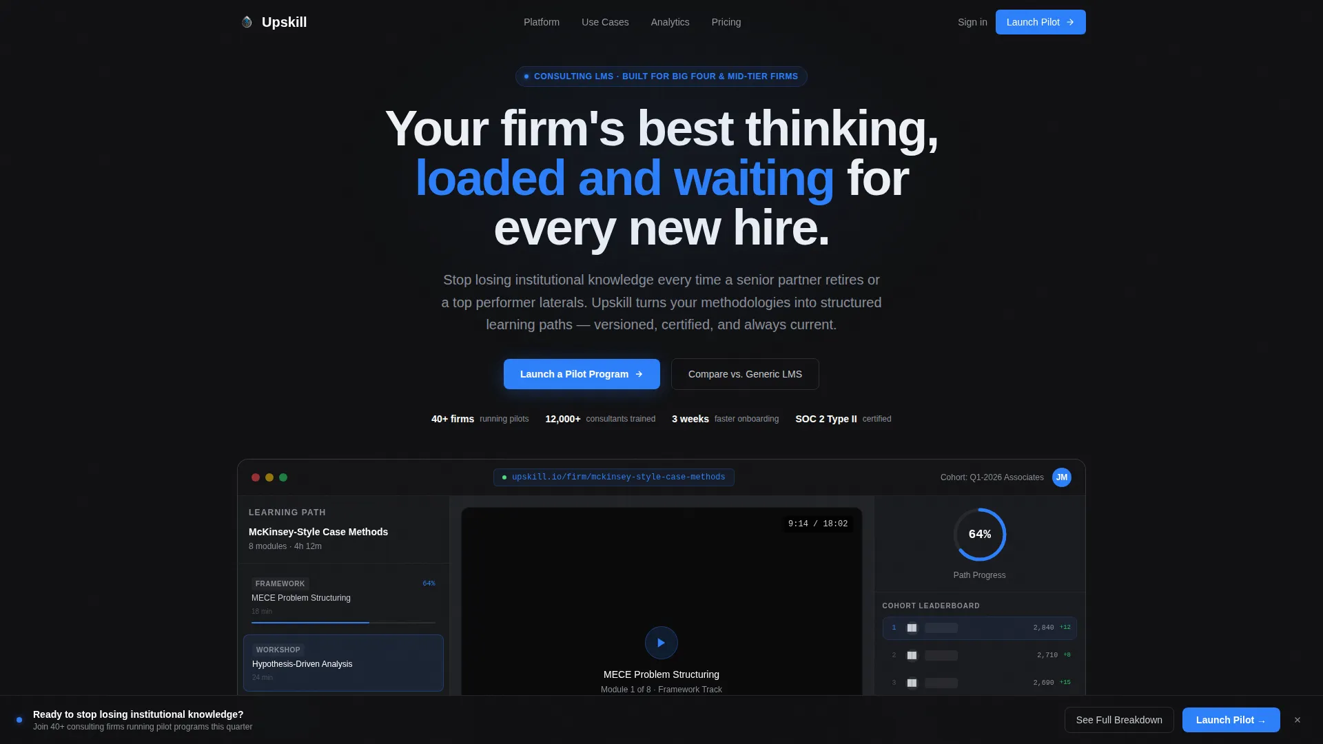
- An interactive LMS dashboard in the header, showing a course mid-progress with completion rings, a video module, a peer leaderboard, and a next-up framework card
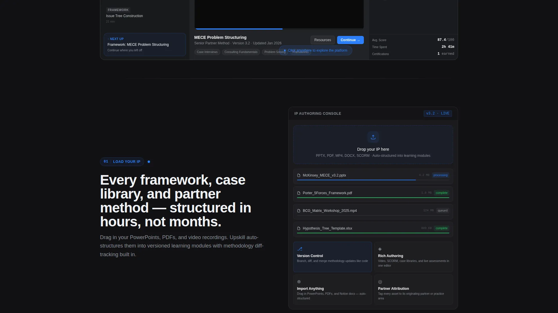
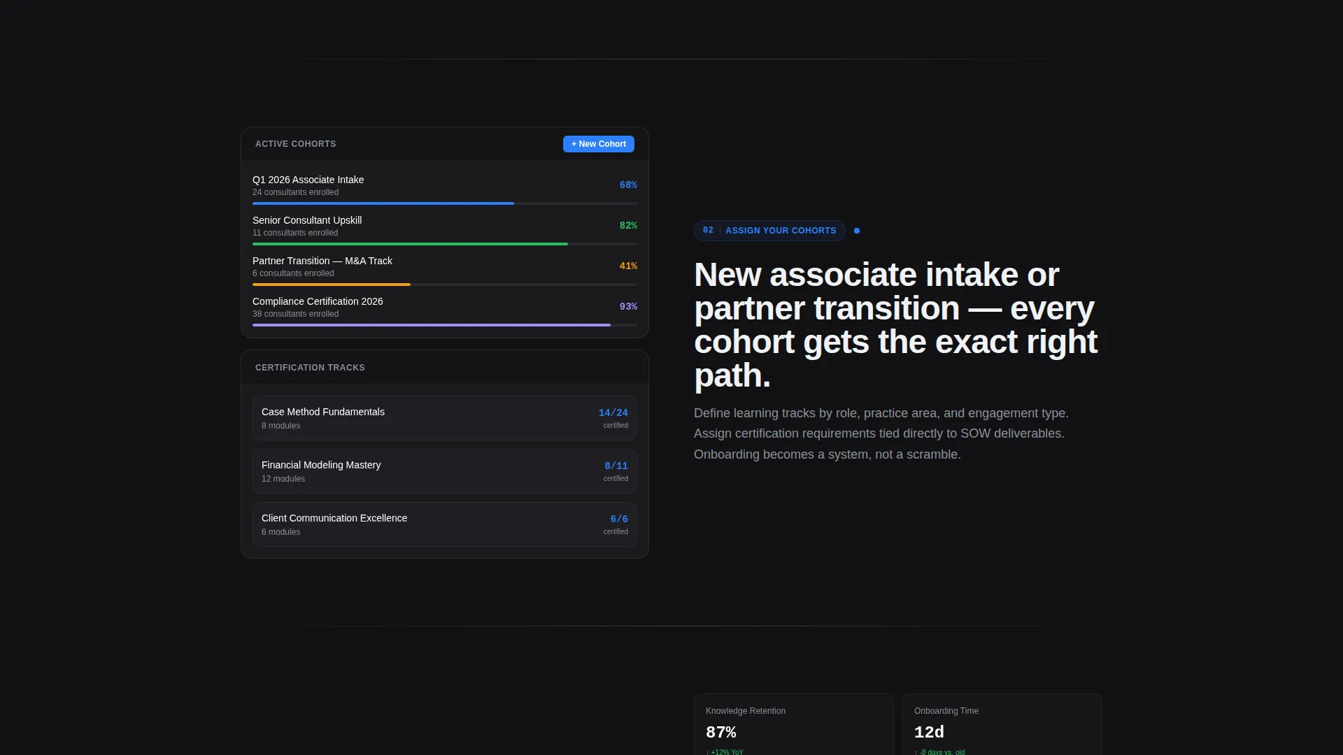
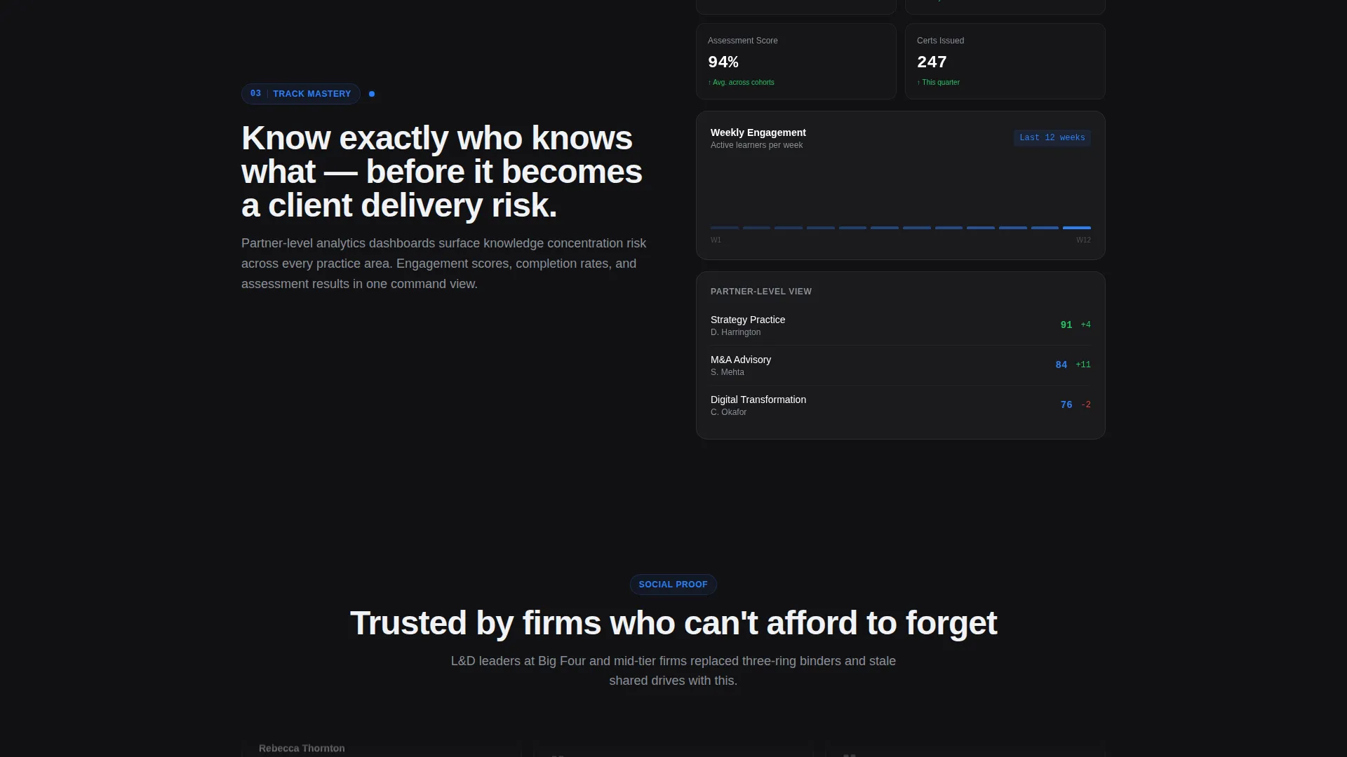
- A four-stage scroll-reveal content flow framed as a launch sequence: "Load Your IP," "Assign Your Cohorts," "Track Mastery," and "Prove ROI"
- A live feature comparison table, a pinned primary call-to-action rail, and a secondary gated PDF download path
Feature list
This template delivers a tightly composed set of interactive and structural features drawn directly from the brief. Each one serves the conversion goal of the page.
Interactive LMS Dashboard Header
The header renders a functioning LMS dashboard at full scale inside the browser. It shows a case method course at 64% completion, a half-watched video module, a blurred peer cohort leaderboard, and a next-up card labeled "Framework: MECE Problem Structuring." The cursor animates for three seconds before handing control to the visitor.
Scroll-Reveal Launch Sequence
Each capability section slides into view only when the visitor reaches it. Micro-animations simulate systems coming online: progress bars fill, nodes connect, and numbers tick upward. Pacing is intentional, with early sections breathing and later sections compressing to build momentum.
Progressive Comparison Table
The conversion climax is a live feature matrix comparing the platform against generic alternatives on five consulting-specific criteria: methodology version control, engagement-based billing, client-project tagging, partner-level analytics, and statement-of-work-linked certification. Rows reveal progressively as the visitor scrolls.
Pinned Primary Call to Action
After the comparison table loads, a "Launch a Pilot Program" button pins to the bottom of the viewport. It links to a focused three-field form capturing firm name, number of consultants, and the visitor's biggest knowledge-loss pain point from a dropdown menu.
Gated PDF Secondary Path
A secondary conversion path, "See the Full Feature Breakdown," gates a downloadable PDF behind an email field. This captures researchers and evaluators who are not yet ready to start a pilot but want to do deeper due diligence.
Monochrome Steel Design System
The visual identity uses four precisely defined values: forge black (#111113), brushed gunmetal (#3A3D42), polished chrome (#C8CDD3), and ignition blue (#2D7FF9). Blue is reserved exclusively for interactive elements and progress indicators, keeping the visual hierarchy clean and purposeful.
Page sections overview
| Section | Purpose |
|---|---|
| Interactive Dashboard Header | Drops visitors into a live LMS preview showing a course mid-progress |
| Load Your IP | Introduces authoring tools for capturing firm methodologies |
| Assign Your Cohorts | Showcases how learning paths are structured and distributed |
| Track Mastery | Presents analytics dashboards and progress monitoring capabilities |
| Prove ROI | Demonstrates certification engines and return-on-investment reporting |
| Comparison Feature Matrix | Pits the platform against generic LMS alternatives on consulting criteria |
| Pilot Program Form | Captures qualified leads through a focused three-field intake form |
| Gated PDF Download | Converts researchers with a secondary email-gated content offer |
Design & branding system
The visual identity is built around the Monochrome Steel color system, channeling a Startup Velocity theme. Every color value earns its place, and the single accent color is used with strict discipline to guide attention without noise.
- Backgrounds graduate from forge black (#111113) at the header through brushed gunmetal (#3A3D42) section dividers to polished chrome (#C8CDD3) in the comparison table zone
- Ignition blue (#2D7FF9) appears only on interactive elements and progress indicators, reinforcing its meaning as a signal of action or advancement
- Typography and spacing reflect the "milled aluminum" aesthetic: no warmth, no decorative softness, just engineered precision in every surface
Mobile & speed optimization
The scroll-reveal architecture is built to feel responsive and intentional across screen sizes. Animations and layout shifts are timed to the visitor's scroll position rather than triggered on load, which keeps the experience smooth on smaller viewports.
- The interactive dashboard header scales to viewport width so the LMS preview remains legible on tablet and mobile displays
- Progressive section reveals mean the browser only renders each stage as it comes into view, keeping the experience paced and controlled
How this template helps you convert
This template is structured as a conversion sequence, not just a feature list. Every design and layout decision moves the visitor closer to a clear action.
- The interactive header earns attention immediately by showing the actual product at work, replacing generic hero imagery with a live proof of value that analysts and L&D directors can relate to on sight.
- The launch-sequence scroll flow builds progressive conviction, staging each capability reveal so the visitor's confidence grows with each section rather than being asked to absorb everything at once.
- The comparison table delivers the deciding argument at the moment of peak engagement, making the choice between this platform and a generic alternative feel obvious before the pinned call-to-action button appears.
Other information about this template
This template is categorized under Technology and the Consulting Firm Software subcategory, targeting the Consulting Firm Learning Management niche. It was designed with a high intersection match for this specific use case, combining a Scroll Reveal (Progressive) template style with a Comparison/Versus landing-page direction, a Launch Energy creative direction, an Interactive Preview header concept, and a Startup Velocity theme.
- The template is built for a single-page layout, making it straightforward to deploy as a standalone pilot acquisition page or as a product marketing page within a larger site
- The three-field pilot form includes a dropdown with four pre-set pain point options: onboarding speed, partner transitions, methodology drift, and compliance tracking
- The secondary PDF gate provides a low-commitment conversion path suited to evaluators comparing multiple LMS vendors before making a recommendation to firm leadership
Theme
Startup Velocity
Creative direction
Launch Energy
Color system
Monochrome Steel
Style
Scroll Reveal (Progressive)
Direction
Comparison/Versus
Page Sections
Interactive LMS Dashboard Header
Scroll-reveal Launch Sequence
Progressive Comparison Table
Pinned Pilot Program Call to Action
Gated PDF Secondary Path
Monochrome Steel Visual System
Related questions
Who is this template designed for?
What does the interactive dashboard header include?
Can I customize the comparison table and competitor columns?
Does the template include the pilot program intake form?
Does this work as a standalone page without a full website?



