Headless Enterprise Software Directory Website Template
Uptime is a headless enterprise asset management (EAM) landing page template built for API-first platforms. It features a live interactive data grid, animated performance metrics, an architecture diagram, and a code playground. The dark mission-control design speaks directly to DevOps leads, IT directors, and platform engineers ready to replace legacy asset management frontends.
by Rocket studio
Quick summary
Uptime is a single-page landing page template for headless enterprise asset management platforms. It leads with an interactive, live-mocked data grid instead of hero imagery. The design uses a deep terminal navy and electric cyan palette. Every section is built to show technical proof fast and move engineering-minded visitors toward a free sandbox signup.
Who this template is for
This template is built for technical founders, product marketers, and developer-relations teams promoting API-first asset management platforms. It speaks to buyers who distrust sales decks and need to see working infrastructure before they commit.
- DevOps leads at manufacturing plants wiring sensor data into predictive maintenance workflows
- IT directors at utilities replacing legacy asset management frontends without a full system migration
- Platform engineers at facilities management companies building tenant-specific dashboards on a shared asset backbone
What problem this template solves
Selling a headless enterprise asset management platform is hard when your product has no visual interface to show. Generic software landing pages rely on screenshots and feature lists. Neither approach works when your value proposition is an API layer, not a graphical user interface.
- Visitors cannot evaluate abstract infrastructure claims without touching something real
- Technical buyers lose trust when a page feels built for a procurement committee rather than an engineering team
- Most templates lack the interactive density needed to communicate live data throughput and low-latency performance
What you get with this template
You get a complete, single-page layout designed for API-first asset management platforms. Every section earns technical credibility before asking for a click. The page is structured to show proof, then convert.
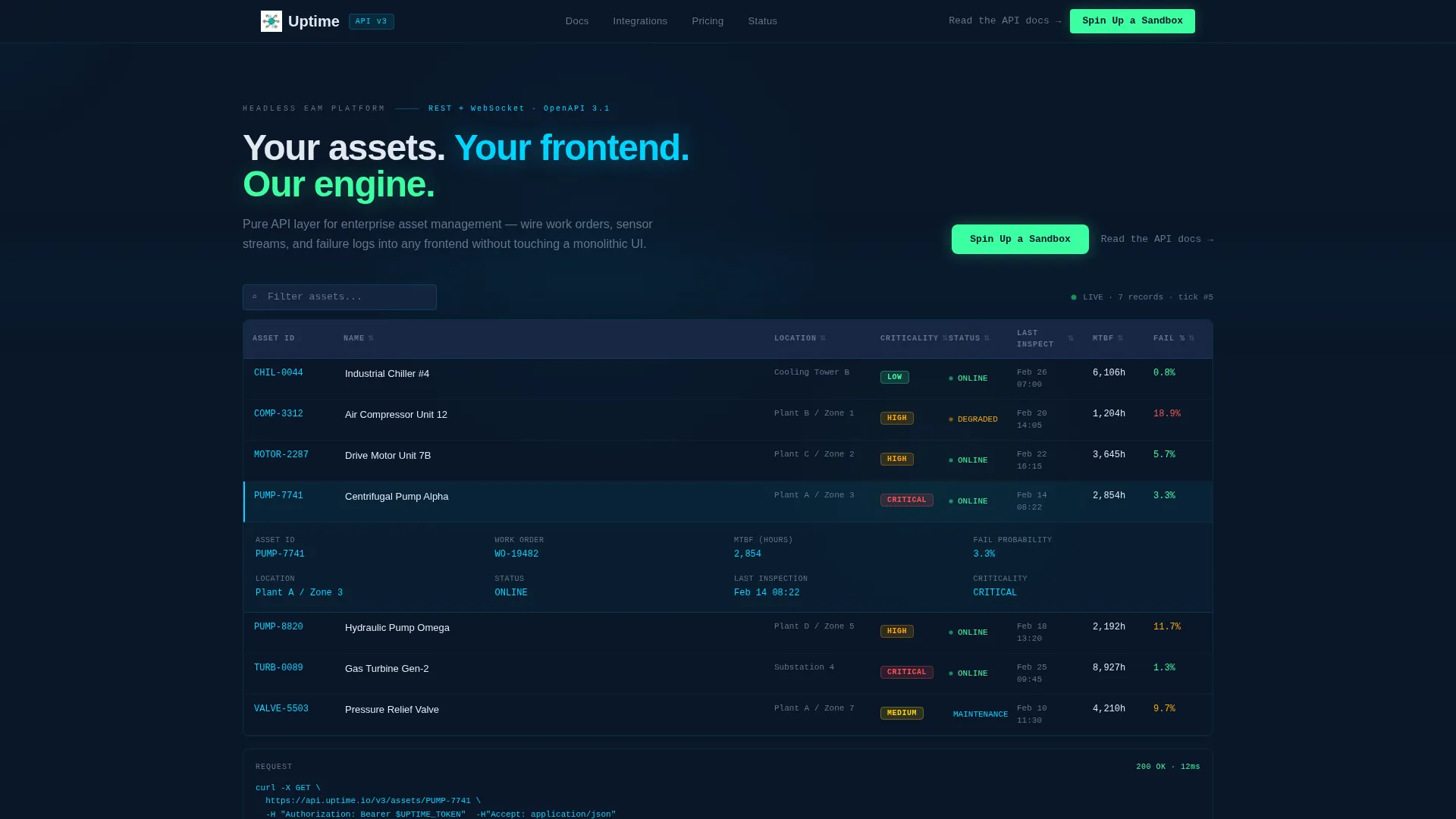
- An interactive header data grid with live-mocked asset records, inline row expansion, column sorting, and real-time asset search
- Animated performance metrics, an integration logo swimlane, a side-by-side architecture diagram, a multi-language code playground, and a customer pull quote section
- A sticky bottom call-to-action bar and a primary "Spin Up a Sandbox" button that routes to a lightweight signup flow requiring only a work email and preferred language
Feature list
This section covers the core built-in components that make the Uptime template work as a conversion tool for headless enterprise asset management platforms.
Interactive Asset Data Grid
The header section replaces a traditional hero image with a functioning data grid. It displays live-mocked asset records including pump identifiers, criticality badges, last-inspection timestamps, and mean-time-between-failure values that update in real time. Hovering a row expands an inline detail panel. Clicking a column header re-sorts the grid instantly, and a search field filters records as visitors type.
Live cURL Code Block
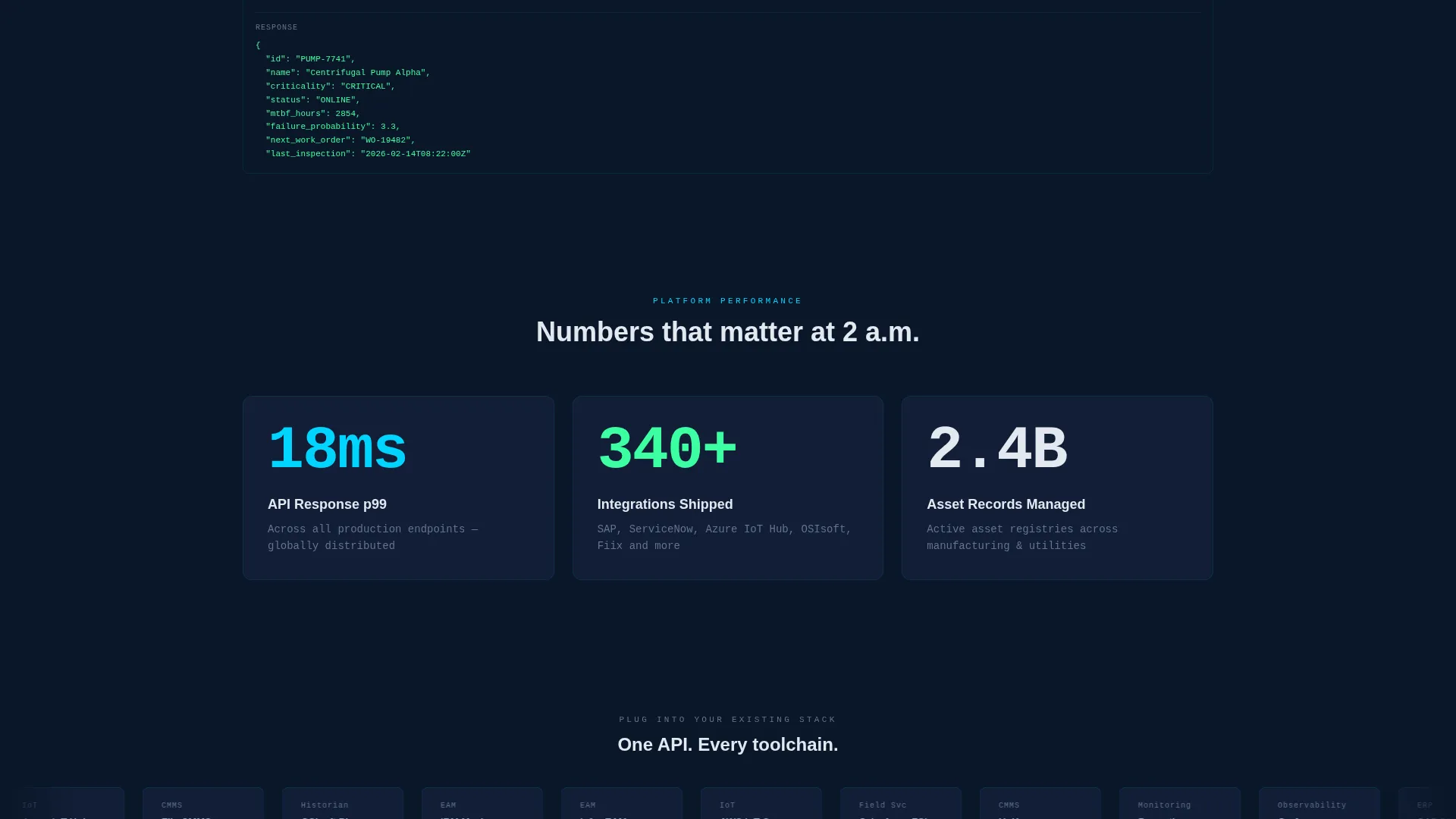
A translucent code block sits pinned to the right edge of the header. It displays an example cURL request and a response body that updates dynamically to reflect whichever asset row is currently selected. This lets technical visitors understand the API contract without leaving the page.
Stats-First Animated Metrics
Three oversized performance metrics animate into view immediately below the fold. Each number counts up at a pace that feels urgent. The metrics cover API response time at the 99th percentile, total integrations shipped by current customers, and total asset records managed across the platform.
Side-by-Side Architecture Diagram
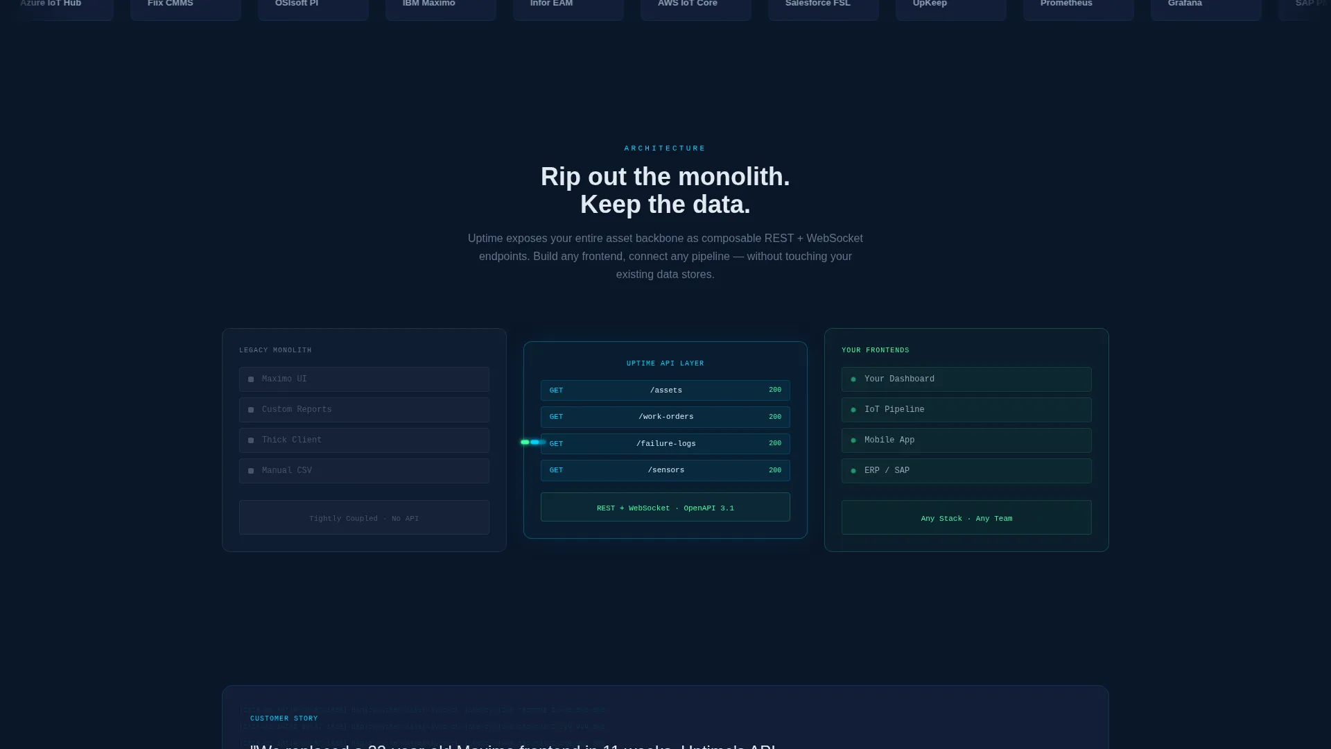
A visual comparison section places a legacy monolith layout on the left in muted gray and a headless application programming interface (API) topology on the right rendered in cyan and signal green. Animated data packets move through the API layer to illustrate how the decoupled architecture works in practice.
Multi-Language Code Playground
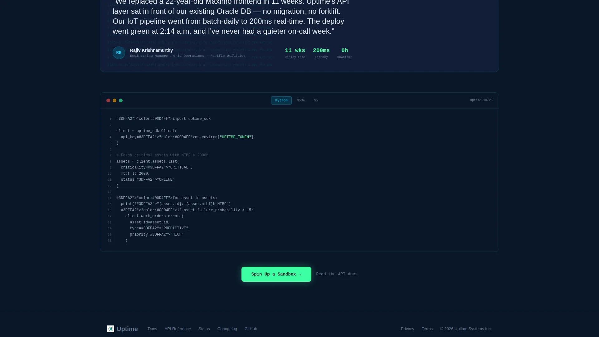
A code playground section shows three programming language examples hitting the same endpoint. The section is designed to reduce the friction of a first technical evaluation by letting visitors see familiar syntax before they sign up.
Sticky Sandbox Call-to-Action
The primary call-to-action "Spin Up a Sandbox" appears first inside the interactive header grid and again as a sticky bottom bar that persists after the second scroll. A secondary text link reading "Read the API docs" sits beside every call-to-action for visitors who prefer to evaluate documentation before committing.
Page sections overview
| Section | Purpose |
|---|---|
| Interactive Header Grid | Lead with live asset data and a cURL preview to immediately demonstrate the API layer |
| Animated Stats Bar | Show three key platform metrics counting up fast to establish scale and performance credibility |
| Integration Logo Swimlane | Auto-scrolling logos ground the platform in familiar enterprise toolchains |
| Architecture Diagram | Side-by-side visual contrast between legacy monolith and headless topology |
| Latency Benchmarks | Technical proof section displaying response-time data to satisfy engineering-level scrutiny |
| Code Playground | Three-language code samples hitting the same endpoint to reduce evaluation friction |
| Customer Pull Quote | Engineering manager quote with visible deploy statistics behind the pull quote |
| Sticky call to action Bar | Persistent bottom bar keeping the sandbox signup action visible throughout the scroll |
Design & branding system
The visual identity follows a Startup Velocity theme expressed through a Midnight Blue color system. The palette is built for a technical audience that reads dashboards at night and trusts data more than marketing copy.
- Core colors: deep terminal navy (#0A1628) for the primary background, desaturated slate (#1B2A4A) for card surfaces and grid rows, electric cyan (#00D4FF) for live-data accents and hover states, and signal green (#3DFFA2) reserved for success indicators and call-to-action buttons
- Text renders in cool white (#E2E8F0), and section dividers dissolve into the navy background so the grid layout breathes without visible borders
- The headline "Your assets. Your frontend. Our engine." sits above the interactive grid in medium weight, intentionally secondary to the live data beneath it
Mobile & speed optimization
The template is structured with a Stats-First Impact creative direction, meaning the most technically persuasive content loads at the top of the page. The layout is designed to translate well across screen sizes while preserving the dashboard density that makes the concept legible.
- The interactive data grid and sticky call-to-action bar are laid out to remain functional on smaller viewports
- Section cadence is deliberately tight, keeping the most data-dense elements near the top so visitors on any device encounter proof before they encounter a pitch
How this template helps you convert
The Uptime template is optimized as a Click-Through landing page. It earns the conversion by letting visitors interact with the product before asking for anything. There is no form on the page itself.
- The interactive header grid functions as the primary pitch. Visitors sort columns, search assets, and watch the cURL response update in real time. By the time they reach the call-to-action, they have already used the interface.
- The "Spin Up a Sandbox" call-to-action appears twice: once inside the interactive header and again as a persistent sticky bar. The signup flow it routes to asks only for a work email and a preferred programming language, keeping entry friction as low as possible.
Other information about this template
This template is categorized under Technology with a subcategory of Headless Enterprise Software and a niche focus on Headless EAM platforms. It is a strong fit for teams building API-first infrastructure products that need a landing page capable of speaking to both engineering buyers and technical evaluators simultaneously.
- The template style is Dashboard and Data Grid, making it visually distinct from standard software as a service (SaaS) landing pages that rely on illustration-heavy hero sections
- The integration logo swimlane references enterprise toolchain context including asset management, IoT data pipelines, and ERP connectivity, helping visitors recognize the platform's ecosystem fit
- The customer pull quote section with visible deploy statistics is designed to provide social proof in a format that resonates with engineering managers rather than procurement teams
Theme
Startup Velocity
Creative direction
Stats-First Impact
Color system
Midnight Blue
Style
Dashboard/Data Grid
Direction
Click-Through
Page Sections
Interactive Asset Data Grid Header
Live Curl Response Preview
Animated Stats-first Metrics Bar
Side-by-side Architecture Diagram
Multi-language Code Playground
Sticky Sandbox Call-to-action Bar
Related questions
Who is this landing page template designed for?
Does this template include a contact form or lead capture form?
Can I adapt the data grid to show my own asset records?
What makes this template different from a standard SaaS landing page?
Is prior coding knowledge required to customize this template?



