Fleet & Transportation Management Cost Calculator Website Template
Uptime is a split-screen fleet maintenance landing page built for B2B SaaS platforms serving fleet managers, transit directors, and last-mile delivery operators. A live savings calculator anchors the hero, spec sheet sections walk through real platform metrics, and a persistent call-to-action bar drives visitors into a guided demo. The dark Data Command aesthetic keeps every element purposeful.
by Rocket studio
Quick summary
Uptime is a single-page, click-through landing page template for fleet maintenance intelligence platforms. The hero opens with a live savings estimator, and each scroll section presents a technical spec card built around real operational metrics. The design follows a dark ops aesthetic with teal status indicators and amber alerts. Every element pushes one action: booking a guided demo.
Who this template is for
This template is built for SaaS teams selling fleet maintenance software to operations-heavy buyers. If your product replaces reactive maintenance chaos with data-driven scheduling, this page speaks your audience's language from the first screen.
- Fleet maintenance platform teams targeting regional trucking companies running 200 or more units
- Software vendors serving municipal transit authorities and last-mile delivery operations managers
- B2B SaaS marketers who need a high-interactivity, demo-driven landing page with a technical tone
What problem this template solves
Fleet managers do not respond to generic software marketing. They respond to numbers. Most landing pages for maintenance platforms lead with features and trust badges. This template leads with the buyer's own projected savings, calculated from their inputs before they ever see a pitch.
- Generic pages fail to connect product value to a fleet manager's specific cost picture
- Scattered spec claims lose credibility without real data visualizations to back them up
- Forms create friction; buyers hesitate to submit before they see proof the product works
What you get with this template
You get a fully structured, single-page layout built around a persuasion sequence that moves from personal savings estimate to deep product intelligence. Every section is a standalone proof point, and the layout escalates from individual vehicle health to fleet-wide predictive modeling.
- A live calculator hero with three slider inputs and a real-time savings breakdown panel
- Three technical spec sheet sections, each pairing a platform metric visualization with tight product copy
- A persistent call-to-action bar that appears after the third spec section and stays on screen
Feature list
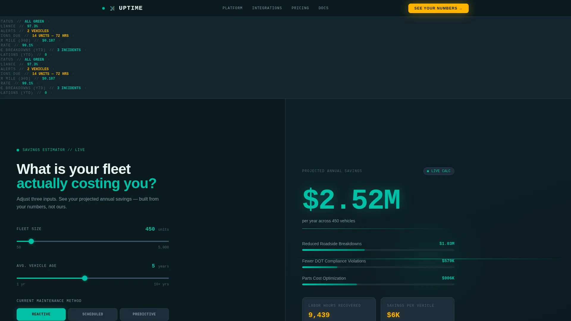
Live Savings Calculator Hero
The hero splits 50/50. The left panel holds three inputs: fleet size via a slider from 50 to 5,000 units, average vehicle age, and current maintenance method (reactive, scheduled, or predictive). The right panel renders a projected annual savings figure in real time, with a breakdown covering reduced roadside breakdowns, fewer compliance violations, and parts cost optimization. Numbers tick and recalculate with every slider adjustment.
Spec Sheet Scroll Sections
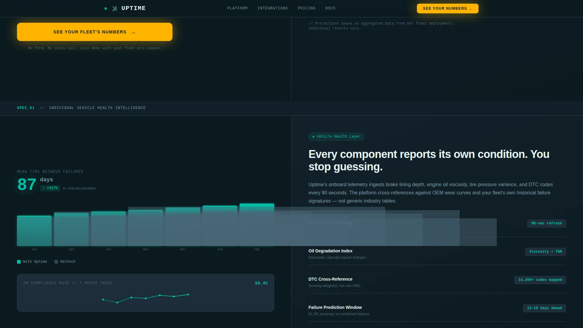
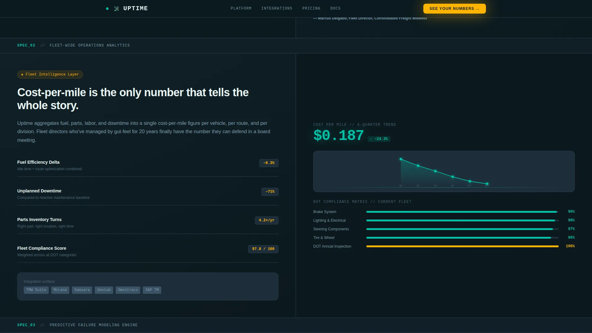
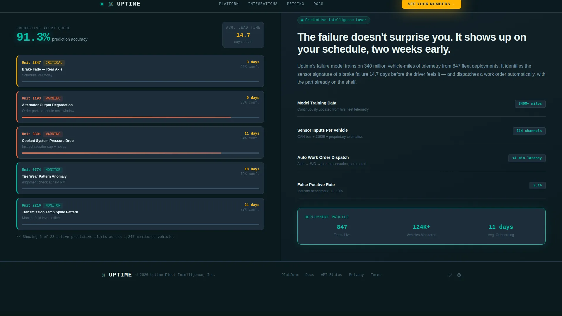
Three technical deep-dive cards follow the hero, each using a 50/50 split. The left side shows a single platform metric, such as mean time between failures, preventive maintenance compliance rate, or cost-per-mile trending, paired with a data visualization. The right side delivers tight, jargon-fluent copy explaining the engine behind each metric. The sequence escalates from individual vehicle health to fleet-wide analytics to predictive modeling.
Persistent Call-to-Action Bar
After the third spec section, a sticky bottom bar appears and stays visible as the visitor continues scrolling. The bar carries the primary call to action and links directly to a guided demo environment pre-loaded with sample fleet data. No form is involved; the click is the only conversion step required.
Data Command Visual Theme
The layout uses a dark ops color palette: deep operations black for the page background, primary teal as a pulse-style status indicator, steel panel gray for card surfaces, and catalyst amber reserved for alerts and calls to action. Typography pairs JetBrains Mono for all data and numbers with DM Sans for body copy, reinforcing the instrument-panel feel throughout.
Animated Data Interactions
The template is built for high animation fidelity. Ticking number counters, SVG path animations, pulse indicators on status elements, and scroll-linked section reveals are all included in the interaction layer. The calculator recalculates client-side in real time without a page reload.
Minimal Developer Footer
The footer follows a GitHub Developer Minimal pattern, keeping the bottom of the page clean and focused. No distracting navigation or secondary offers compete with the primary conversion path.
Page sections overview
| Section | Purpose |
|---|---|
| Hero Calculator Panel | Collects fleet inputs and renders a live projected savings figure |
| Spec Sheet One | Displays mean time between failures and preventive maintenance compliance rate |
| Spec Sheet Two | Covers cost-per-mile trending and fleet-wide compliance analytics |
| Spec Sheet Three | Presents predictive modeling engine and AI maintenance scheduling |
| Persistent call to action Bar | Keeps the demo call to action visible after the third spec section |
| Developer Minimal Footer | Closes the page cleanly without competing conversion elements |
Design & branding system
The visual identity is built around a Data Command theme. Every color choice is functional, not decorative. The palette mirrors the instrument panel of a long-haul cab at night: dark everywhere except the signals that matter.
- Deep operations black (#0B1A1F) as the full-page background, steel panel gray (#1E2D3A) for card surfaces, and primary teal (#00BFA6) as the live-status pulse color
- Catalyst amber (#FFB300) used exclusively for alerts, calls to action, and data spike indicators to keep visual hierarchy sharp
- JetBrains Mono handles all numeric and data display; DM Sans carries all body and interface copy for a clean contrast between instrument and explanation
Mobile & speed optimization
The template is designed desktop-first, matching the dispatch desk environment where fleet managers spend most of their working hours. Tablet responsiveness is included so operations leads can review the page away from their primary screens.
- The hero calculator and spec sheet cards reflow cleanly on tablet viewports without losing the 50/50 structure's legibility
- The client-side calculator runs without server round-trips, keeping recalculation instant regardless of connection speed
- Spec sheet sections use server components for rendering, separating static content delivery from interactive elements for efficient loading
How this template helps you convert
The conversion path is designed around one principle: let the buyer's own numbers make the case before any sales pitch appears. The calculator does the persuasion, and the demo click is the natural conclusion.
- The hero calculator personalizes the value proposition immediately. A fleet manager enters their real fleet size, vehicle age, and current maintenance approach, then sees a projected savings figure built from their own data. A six-figure projection from their own inputs is far more persuasive than any testimonial.
- The spec sheet sequence builds technical credibility across three escalating sections. Each card proves the platform's intelligence layer is real, moving from individual vehicle metrics to predictive modeling. By the time the persistent call-to-action bar appears, the visitor has already reviewed three layers of proof.
Other information about this template
This template sits within the Logistics and Supply Chain category, specifically targeting the Fleet and Transportation Management subcategory and the Fleet Maintenance Platform niche. It is classified as a click-through landing page with a Calculator/Estimator header concept, Spec Sheet creative direction, and a Data Command theme inside a Teal Catalyst color system.
- The template style is Split Screen (50/50) throughout, applied consistently from the hero to each spec section
- The layout is localized for English (United States), uses USD currency references, and applies imperial measurement conventions
- Animation intensity is set to high, covering ticking counters, SVG sparkline path animations, pulse indicators, and scroll-linked reveals
- The intersection match score for this template's category, subcategory, and niche alignment is 13, indicating strong purpose-fit within the fleet maintenance intelligence space
Theme
Data Command
Creative direction
Spec Sheet
Color system
Teal Catalyst
Style
Split Screen (50/50)
Direction
Click-Through
Page Sections
Live Fleet Savings Calculator
Escalating Spec Sheet Sections
Persistent Demo Call-to-action Bar
Data Command Color System
High-fidelity Animation Layer
Related questions
Does this landing page include any form fields?
Can I adjust the calculator's input ranges for my fleet size?
How many spec sheet sections are included?
When does the persistent call-to-action bar appear?
Is this template suitable for transit authority and last-mile delivery audiences?


