AIOps Technology Directory Website Template
Uptime is a split-screen landing page template built for AIOps training and certification platforms. It pairs raw industry pain data on the left with a clear certification path on the right, using a dark Dashboard Pro visual system to guide site reliability engineers, DevOps leads, and IT directors from alert-storm anxiety to confident enrollment in ML-driven observability training.
by Rocket studio
Quick summary
Uptime is a single-page, split-screen landing page template designed for AIOps training and certification platforms. The layout puts industry statistics on the left and curriculum answers on the right, creating a persistent visual argument. The dark Midnight Blue color system and Dashboard Pro theme give every element the weight of a live operations center.
Who this template is for
This template is built for training platforms, certification programs, and IT education providers operating in the artificial intelligence for IT operations space. It speaks directly to technically fluent buyers who need convincing data before they commit to a course.
- Site reliability engineers (SREs) overwhelmed by alert storms who need structured, hands-on anomaly detection training
- DevOps leads evaluating competing observability tools and looking for a tool-agnostic curriculum path
- IT directors building a business case for machine-learning-driven observability before their next major incident
What problem this template solves
Most training pages bury the curriculum behind marketing language. For an audience of SREs and DevOps leads who read alert dashboards for a living, that approach fails immediately. Uptime solves the credibility gap by letting the data do the selling.
- Teams that triage alerts manually waste time that structured AIOps training could reclaim
- Generic course pages cannot articulate the difference between hands-on labs and passive slide decks
- IT directors need a page that doubles as a business case, not just a brochure
What you get with this template
You get a fully structured split-screen landing page built around a comparison-driven conversion flow. Every visual and layout decision in the template serves the argument that the certification gap is real and closeable.
- A 50/50 split-screen layout that pairs industry pain statistics on the left with curriculum modules on the right across every scroll section
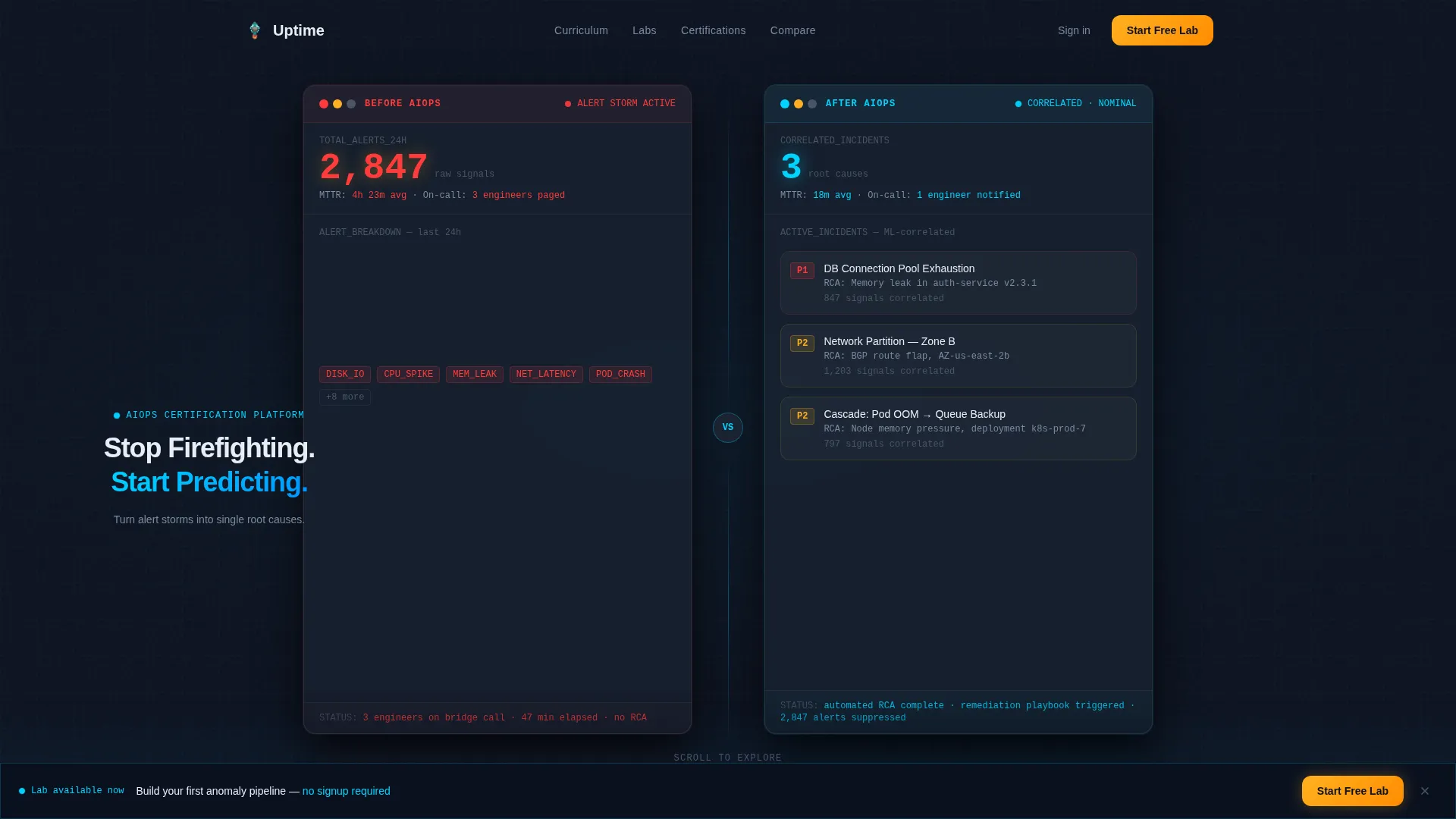
- Dark Glass Panel header cards showing a before-and-after alert reduction story using hard numbers
- A primary inline call to action and a secondary pinned call to action, both positioned at scroll-depth-optimized points in the page
Feature list
This template delivers a focused set of layout and design features grounded in the brief. Each one is built to move a technically skeptical visitor toward a clear next action.
Split-Screen Comparison Layout
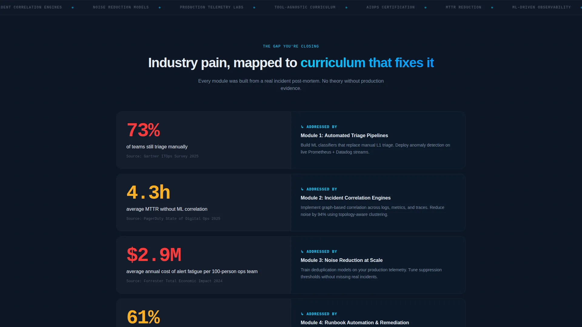
The 50/50 split screen is the core structural engine of this landing page. The left panel consistently presents industry benchmarks, mean-time-to-resolve data, alert fatigue statistics, and vendor lock-in costs. The right panel answers each point with the corresponding curriculum module or lab outcome. Every scroll section escalates the comparison, deepening the perceived gap between a visitor's current skills and the certification path.
Dark Glass Panel Header
Two frosted-glass dashboard cards float over a deep navy background at the top of the page. One card is labeled "Before AIOps" and displays 2,847 raw alerts rendered in stacked red bars. The other is labeled "After AIOps" and shows 3 correlated incidents in live-metric cyan. The panels carry subtle depth-of-field blur at the edges and a faint reflection beneath them, communicating the transformation before a single line of body copy loads.
Stats-First Scroll Transitions
Every scroll section opens with a hard statistic before any explanatory text appears. The anchor stat "73% of teams still triage manually" introduces the left panel, and the right panel reveals the curriculum module that addresses that specific gap. This pattern trains the reader to expect a verdict at each section, keeping scroll momentum high.
Inline Curriculum Expansion call to action
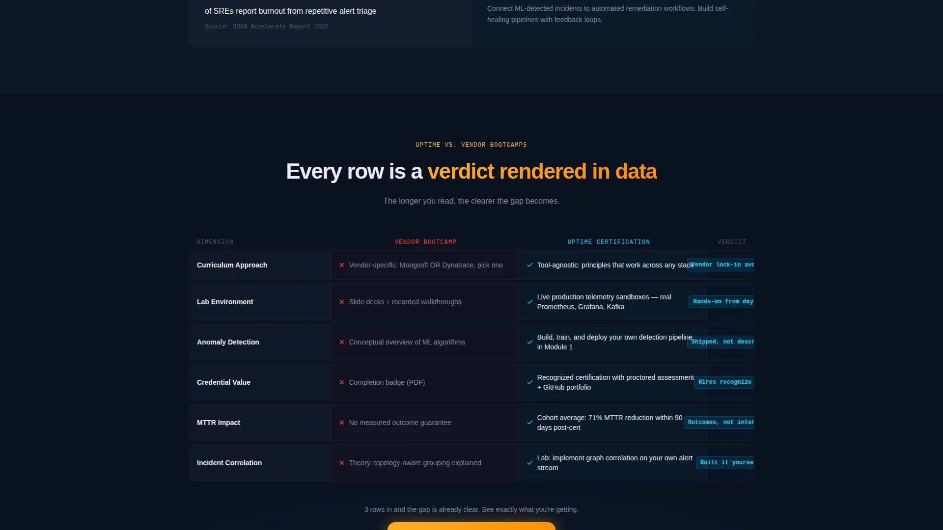
The primary call to action, "Compare the Full Curriculum," appears at the midpoint of the page after the third comparison row. Clicking it opens an expandable inline module breakdown without navigating the visitor away from the page. This keeps the comparison context intact while delivering detail to high-intent visitors.
Pinned Secondary call to action Rail
A secondary call to action, "Start Your Free Lab," pins to the bottom of the viewport once the visitor reaches 60% scroll depth. It offers a no-signup sandbox environment entry point, lowering the commitment threshold for visitors who are engaged but not yet ready to enroll formally.
Midnight Blue Color System
The palette uses deep terminal navy (#0B1120) as the base, operations-center charcoal (#1A2332) for card surfaces, live-metric cyan (#00D4FF) for data highlights and positive outcomes, and critical-path amber (#FFB020) reserved exclusively for calls to action and comparison highlights. The system creates instant visual hierarchy without decorative elements.
Page sections overview
| Section | Purpose |
|---|---|
| Dark Glass Header | Delivers the before-and-after alert reduction story using hard numbers in two floating dashboard cards |
| Headline Panel | Presents "Stop Firefighting. Start Predicting." fading in between the two glass panels |
| Stats Anchor Row | Opens with "73% of teams still triage manually" to frame the left-panel pain argument |
| Comparison Row 1 | Contrasts tool-agnostic curriculum on the right against manual triage reality on the left |
| Comparison Row 2 | Pairs hands-on anomaly detection labs against passive slide-deck alternatives |
| Comparison Row 3 | Highlights recognized credentials versus generic completion badges |
| Primary call to action Block | Deploys the "Compare the Full Curriculum" inline expandable module breakdown |
| Inline Module Breakdown | Expands in place to show full curriculum detail without leaving the page |
| Pinned call to action Rail | Locks "Start Your Free Lab" to the bottom viewport rail at 60% scroll depth |
Design & branding system
The visual identity follows a Dashboard Pro theme that feels like a live network operations center at 2 a.m. Every color in the palette is functional. Nothing decorates; everything signals.
- Base and surface colors: deep terminal navy (#0B1120) as the page background and operations-center charcoal (#1A2332) for card and panel surfaces, creating layered depth without gradients
- Signal colors: live-metric cyan (#00D4FF) marks active, positive, or resolved states; critical-path amber (#FFB020) is reserved strictly for calls to action and comparison verdict highlights, so it always draws the eye to a decision point
Mobile & speed optimization
The split-screen layout is designed to reflow gracefully on smaller screens, stacking the left and right panels vertically so the comparison sequence stays intact and readable on mobile devices.
- The pinned secondary call-to-action rail is position-aware and remains accessible without obscuring primary content on narrow viewports
- The Dark Glass Panel header cards use CSS depth-of-field effects that render cleanly without requiring external image assets, keeping the visual impact intact regardless of connection speed
How this template helps you convert
The entire layout is engineered as a comparison engine. Each section adds evidence until clicking the call to action feels like the rational conclusion rather than a sales step.
- The stats-first scroll pattern creates a rhythm where every new section delivers a data point before an explanation, keeping technically minded visitors engaged long enough to reach the primary call to action
- The inline curriculum expansion keeps visitors on the page at the moment of highest intent, eliminating the friction of navigating to a separate course catalog page
- The pinned "Start Your Free Lab" call to action captures visitors who are convinced but not yet ready to commit, offering a low-barrier entry point that converts fence-sitters into active platform users
Other information about this template
This template is part of the Dashboard Pro theme family and is well-suited to any platform in the AIOps technology space. The layout and copy structure support a range of related use cases within IT operations education.
- The color system and panel style translate well to adjacent categories such as observability platform marketing, incident management software, and IT operations training portals
- The comparison table conversion pattern is reusable across AIOps technology niches where buyers are actively evaluating tools such as Moogsoft versus Dynatrace before committing to a training investment
- The no-smiling-stock-photo design direction makes the template credible to a technical audience that instinctively distrusts generic imagery in professional education contexts
Theme
Dashboard Pro
Creative direction
Stats-First Impact
Color system
Midnight Blue
Style
Split Screen (50/50)
Direction
Comparison/Versus
Page Sections
Split-screen Comparison Layout
Dark Glass Panel Header
Stats-first Scroll Pattern
Inline Curriculum Expansion
Pinned Secondary Call to Action Rail
Midnight Blue Signal Color System
Related questions
Who is the primary audience for this landing page template?
Can I adapt the comparison rows for a different curriculum structure?
What makes the inline call to action different from a standard button linking to another page?
Does this template use real data or placeholder numbers?
Is this template suitable for a platform that covers multiple observability tools?



