Status & Monitoring Professional Website Template
Uptime is a single-page API status landing page template built for SaaS teams and platform engineers. It uses a dark Tech Glass visual identity with a Void and Violet color system, a modular card grid layout, and a lead-generation flow designed to turn skeptical visitors into signed-up users before they leave the first viewport.
by Rocket studio
Quick summary
Uptime is a bold, dark-themed API status landing page template built for DevOps and platform teams. It opens with a scrolling logo bar, drops visitors straight into a live mock status view, then walks them through three escalating grids of glass cards before hitting them with a sticky conversion bar. Every section earns the next click.
Who this template is for
This template is built for technical teams and founders who need to communicate infrastructure reliability to the outside world. It speaks directly to people who feel the pressure of enterprise procurement and overnight incident alerts.
- DevOps leads at SaaS companies shipping products to enterprise customers
- Platform engineers who need to stop answering "is it down?" messages at all hours
- Startup founders and CTOs who need to demonstrate high uptime to close deals
What problem this template solves
Most teams cobble together a status page with a third-party widget or a static document nobody trusts. That approach creates confusion during incidents and erodes confidence during sales cycles. This template gives you a public-facing page that looks as reliable as the infrastructure it represents.
- Visitors arrive and immediately see real endpoint status, removing doubt before it forms
- The card grid layout replaces walls of text with scannable, spec-sheet-style capability proof
- A single-step signup modal keeps the conversion path simple and friction-free
What you get with this template
You get a fully structured, single-page layout built around a card grid system. Every section has a defined role, from the trust-building header to the plan comparison grid at the bottom.
- A scrolling logo bar header with a live mock status display in the first viewport
- Three modular card grids covering integrations, features, and plan tiers
- A sticky bottom conversion bar with a glass modal signup form and a secondary demo link
Feature list
This template is built around a Feature Matrix creative direction, where the layout itself makes the argument. Each section is a deliberate step in the buyer journey.
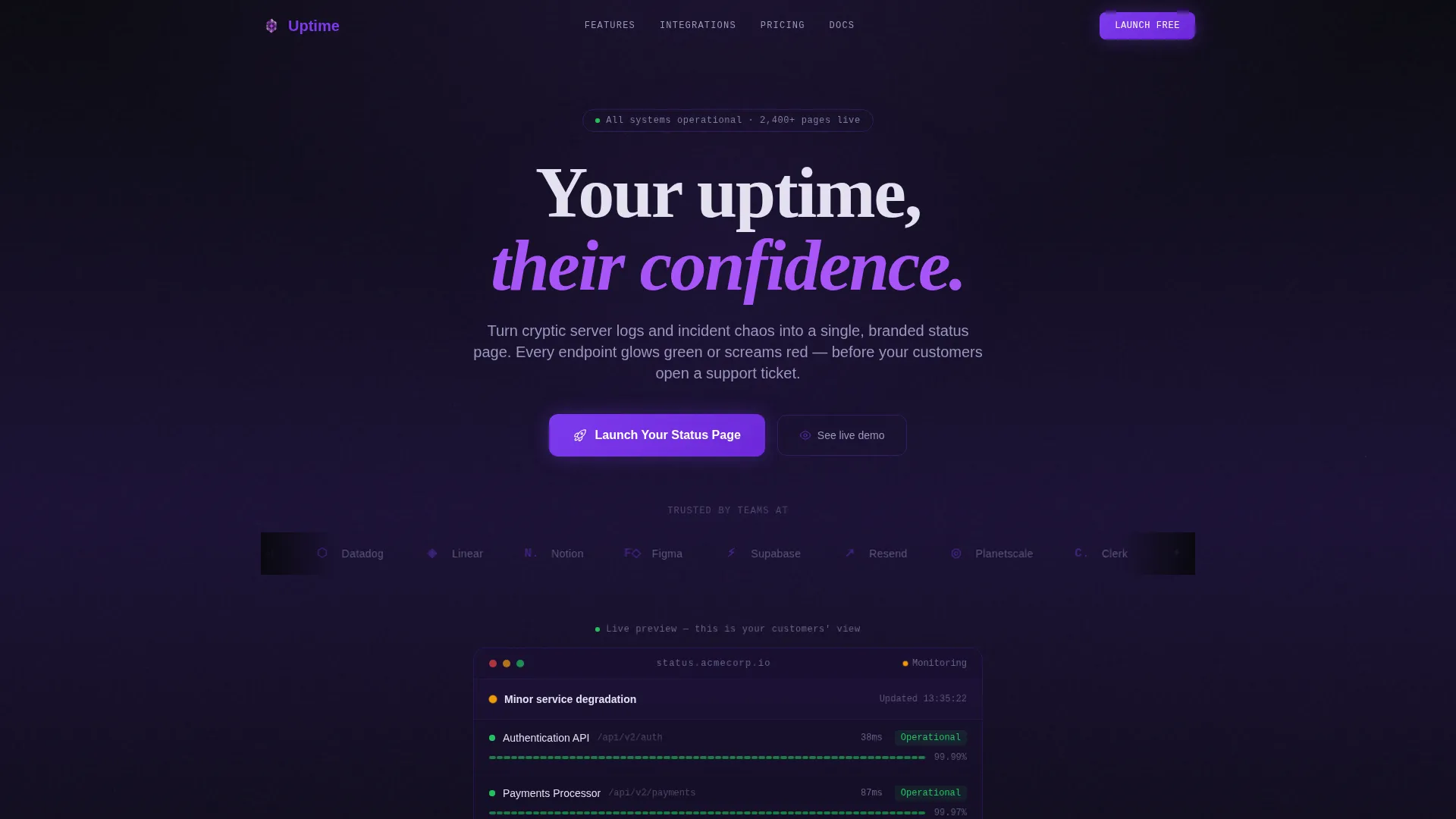
Scrolling Logo Bar Header
The page opens with a horizontal ribbon of recognizable SaaS and infrastructure logo silhouettes scrolling on loop against the void background. Each logo carries a subtle violet tint. A single frosted-white headline sits above, and a live mock status display with pulsing endpoint rows sits below, proving the product works before any copy has to explain it.
Live Mock Status Display
Three endpoint rows pulse green in the first viewport while one flickers to amber. This miniature status page render is embedded directly in the header section. Visitors understand the product instantly without reading a paragraph.
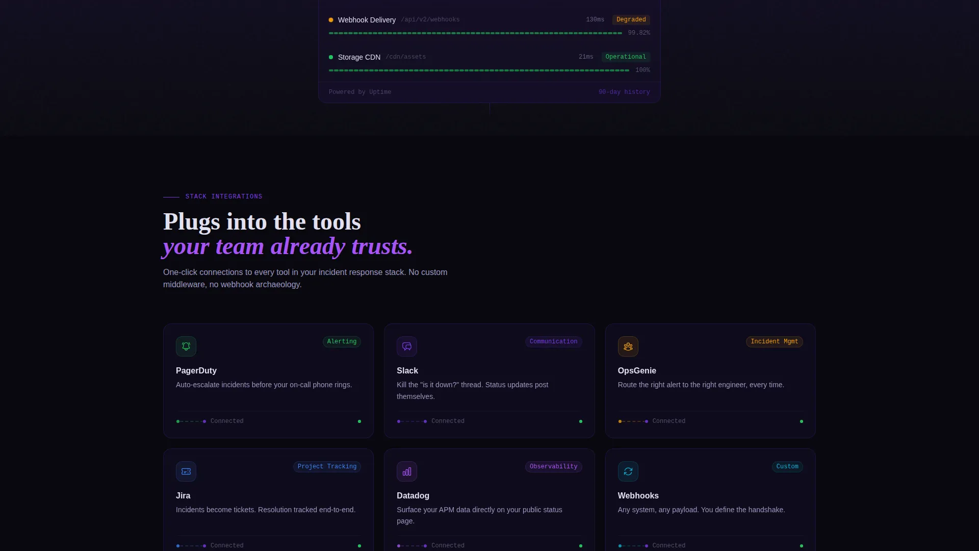
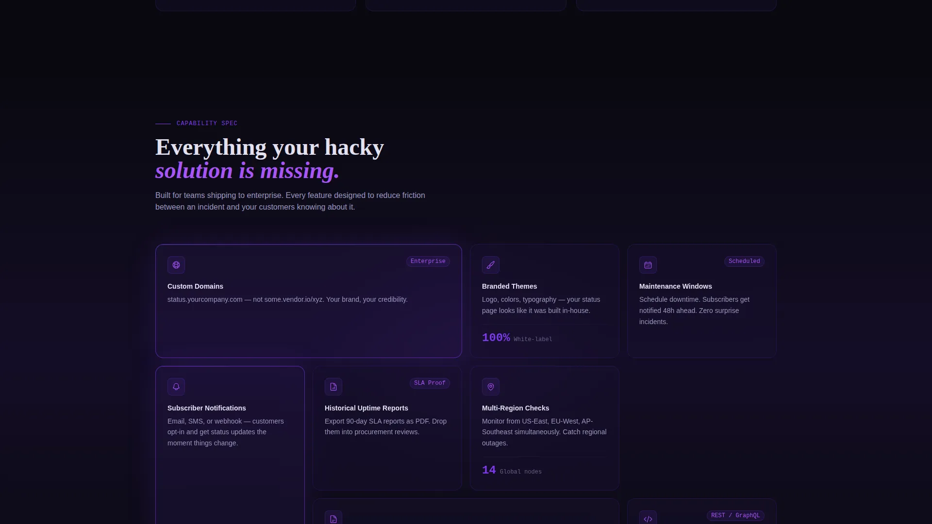
Three-Grid Feature Matrix
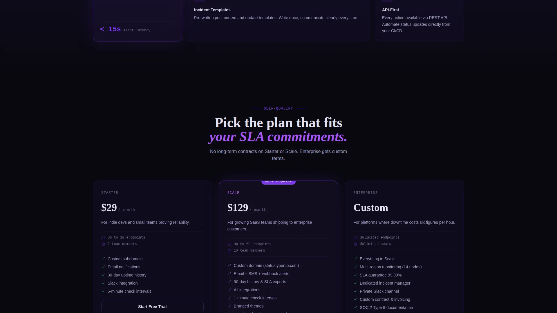
The page is structured around three escalating card grids. The first grid shows integration cards with glowing connection lines. The second grid covers platform features. The third grid presents plan comparison cards. Each grid moves the visitor one step closer to committing.
Glass Card Interactions
Every card in the grid floats on a glassmorphism surface with subtle backdrop blur. Cards tilt slightly on hover, catching violet light like glass catching sunlight. Active states, hover effects, and status indicators all use electric violet as the accent color.
Sticky Conversion Bar with Glass Modal
After the first scroll, a sticky bottom bar anchors the primary call to action: "Launch Your Status Page." Clicking it opens a single-step glass modal with three fields: work email, company name, and a dropdown for estimated monitored endpoints.
Secondary Demo Conversion Path
Below the plan grid, a secondary link reads "See a Live Demo Page" and connects to a fully functional sample status page. This gives skeptical visitors a no-commitment way to experience the product before signing up.
Page sections overview
| Section | Purpose |
|---|---|
| Logo Bar Header | Build trust with recognized brand silhouettes and a live mock status display |
| Live Status Display | Prove the product in the first viewport using pulsing endpoint rows |
| Integration Cards Grid | Show how the platform connects to common tools with glowing visual connectors |
| Feature Cards Grid | Present platform capabilities in a scannable, spec-sheet-style card layout |
| Plan Comparison Grid | Help visitors self-qualify by browsing tier options side by side |
| Sticky Conversion Bar | Keep the primary call to action visible after the first scroll |
| Glass Signup Modal | Capture lead details through a low-friction, single-step form |
| Demo Link Section | Offer a secondary path for skeptical visitors to see the product live |
Design & branding system
The visual identity is built on a Tech Glass theme using the Void and Violet color system. The palette feels like a spacecraft bridge at cruising altitude: dark ambient surfaces with violet telemetry glowing through translucent panels.
- Core colors: absolute void black (#09090F), deep interstellar purple (#1A1035), electric violet (#7C3AED), and frosted glass white (#E2E0F0)
- Backgrounds use layered void-to-purple gradients, while cards float on glassmorphism surfaces with subtle backdrop blur
- Violet illuminates every hover state, toggle, and status indicator dot; frosted white keeps all text sharp and legible against the dark
Mobile & speed optimization
The card grid layout is modular, meaning sections reflow naturally across screen sizes. The glass card system and gradient backgrounds are designed to stay visually coherent on smaller viewports.
- Modular grid sections adapt to narrower screens without losing the visual hierarchy
- The sticky conversion bar and glass modal remain accessible regardless of device size
- Lightweight section structure keeps the layout organized without requiring heavy component nesting
How this template helps you convert
The page is built around a lead-generation flow where every visual decision reduces hesitation and moves visitors toward action.
- The live mock status display in the first viewport makes the product tangible before any text explanation, removing the most common reason visitors bounce early.
- The three-grid Feature Matrix escalates commitment naturally: visitors move from "this fits my stack" to "this replaces my current solution" to "this is what I pay," arriving at the conversion bar already convinced.
- The secondary demo link below the plan grid catches visitors who are not yet ready to sign up, giving them a way to engage without pressure and return later as warmer leads.
Other information about this template
This template sits in the Documentation and Support category under the Status and Monitoring subcategory, making it directly relevant for teams building or marketing an API status page product. The intersection of the Tech Glass theme, Feature Matrix creative direction, and lead-generation flow is intentional and purpose-built for this niche.
- The template is designed for the API status page niche, where trust and clarity are the primary conversion drivers
- Integration card placeholders in the first grid reference tools at the scale of PagerDuty, Slack, OpsGenie, and Jira, giving teams a familiar reference point for customization
- The Void and Violet palette and glassmorphism card system are distinctive enough to stand out in a category where most competitors use flat, utilitarian designs
Theme
Tech Glass
Creative direction
Feature Matrix
Color system
Void & Violet
Style
Card Grid (Modular)
Direction
Lead Generation
Page Sections
Scrolling Logo Bar with Status Preview
Three-grid Feature Matrix Layout
Glassmorphism Card System
Sticky Conversion Bar with Glass Modal
Secondary Demo Conversion Path
Void and Violet Color System
Related questions
Can I customize the endpoint names and status labels in the mock display?
How does the sticky conversion bar work on the page?
What fields does the signup modal collect?
Can the plan comparison grid be updated to reflect my actual pricing tiers?
Is this template suited for a team not yet selling a status page product?


