API-First Enterprise Software Reviews Website Template
Uptime is a single-page comparison landing page built for an API-first enterprise asset management platform. It leads with live performance counters and a real curl command, then walks technical buyers through a head-to-head feature table, collapsible endpoint previews, and a direct app-download call to action. The result is a page that earns trust before it asks for anything.
by Rocket studio
Quick summary
Uptime is a dark-themed, data-forward landing page designed for an API-first enterprise asset management platform. It opens with animated performance metrics, moves into a spec-sheet comparison table, and closes with a mobile agent download form. Every section is built to satisfy a technical buyer who reads before they click.
Who this template is for
This template is built for teams that sell technical infrastructure products to engineering audiences. If your buyers evaluate tools by reading documentation rather than watching demos, this layout speaks their language.
- Reliability engineers at mid-size manufacturers who manage work orders and asset trees across multiple systems
- DevOps leads at facility operators who want to pipe asset telemetry into custom dashboards
- Plant managers evaluating enterprise asset management suites who need clear feature parity evidence before committing
What problem this template solves
Most software landing pages try to sell a feeling. Technical buyers do not respond to that. They want response times, endpoint structures, and a clear comparison against the tools they are already using. This template solves the mismatch between marketing-style pages and the evidence-first mindset of engineers.
- Generic hero sections with stock photography lose credibility with engineers in the first scroll
- Comparison tables buried in PDFs or separate documentation pages slow down the evaluation process
- Vague calls to action do not convert buyers who need to confirm feature depth before downloading anything
What you get with this template
You get a fully structured single-page layout that front-loads proof and backs it up with technical detail. The page is organized to guide a skeptical technical buyer from raw performance data all the way to a confident app install decision.
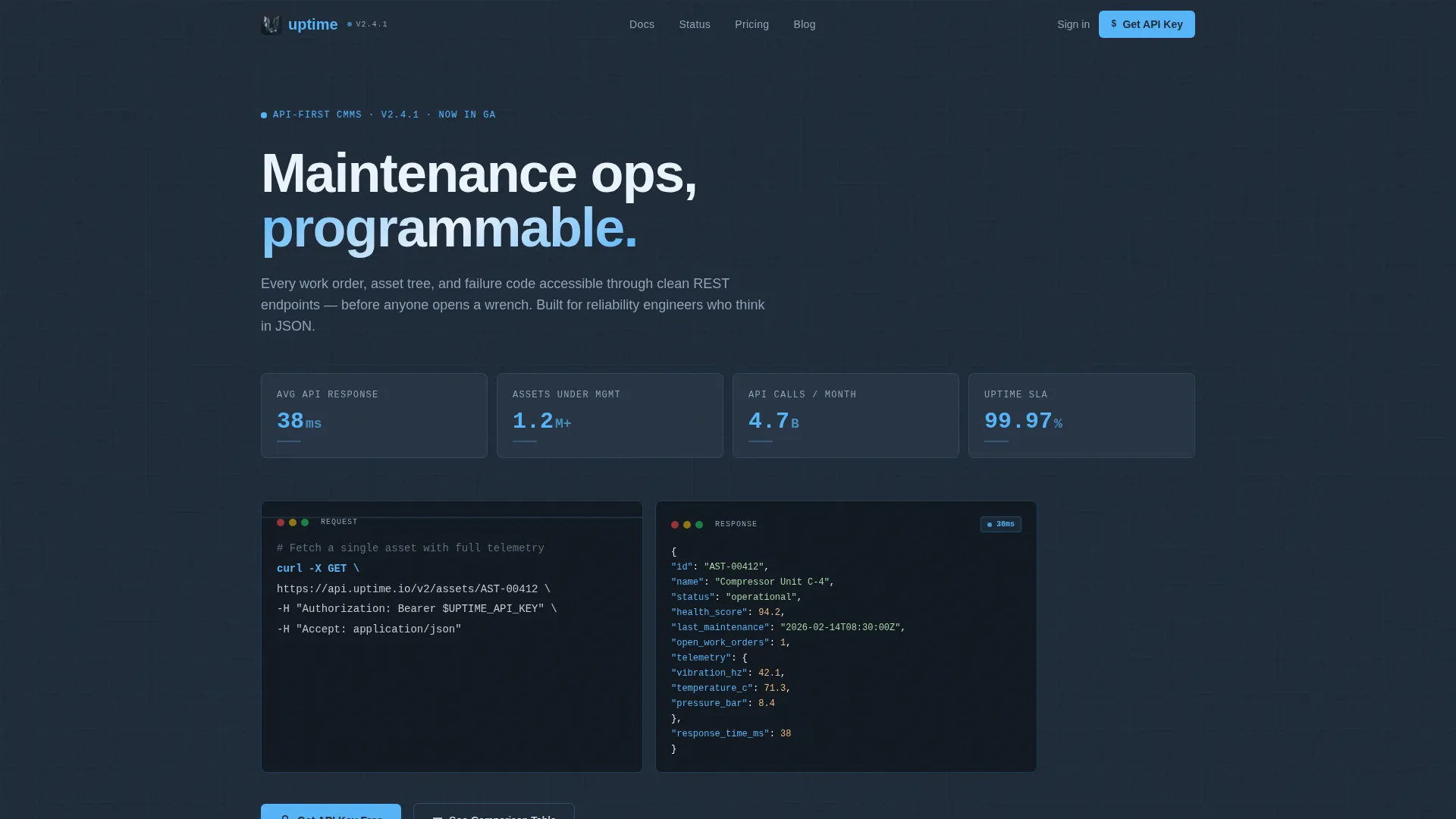
- An animated stats hero panel with four live counters and a styled curl command code block
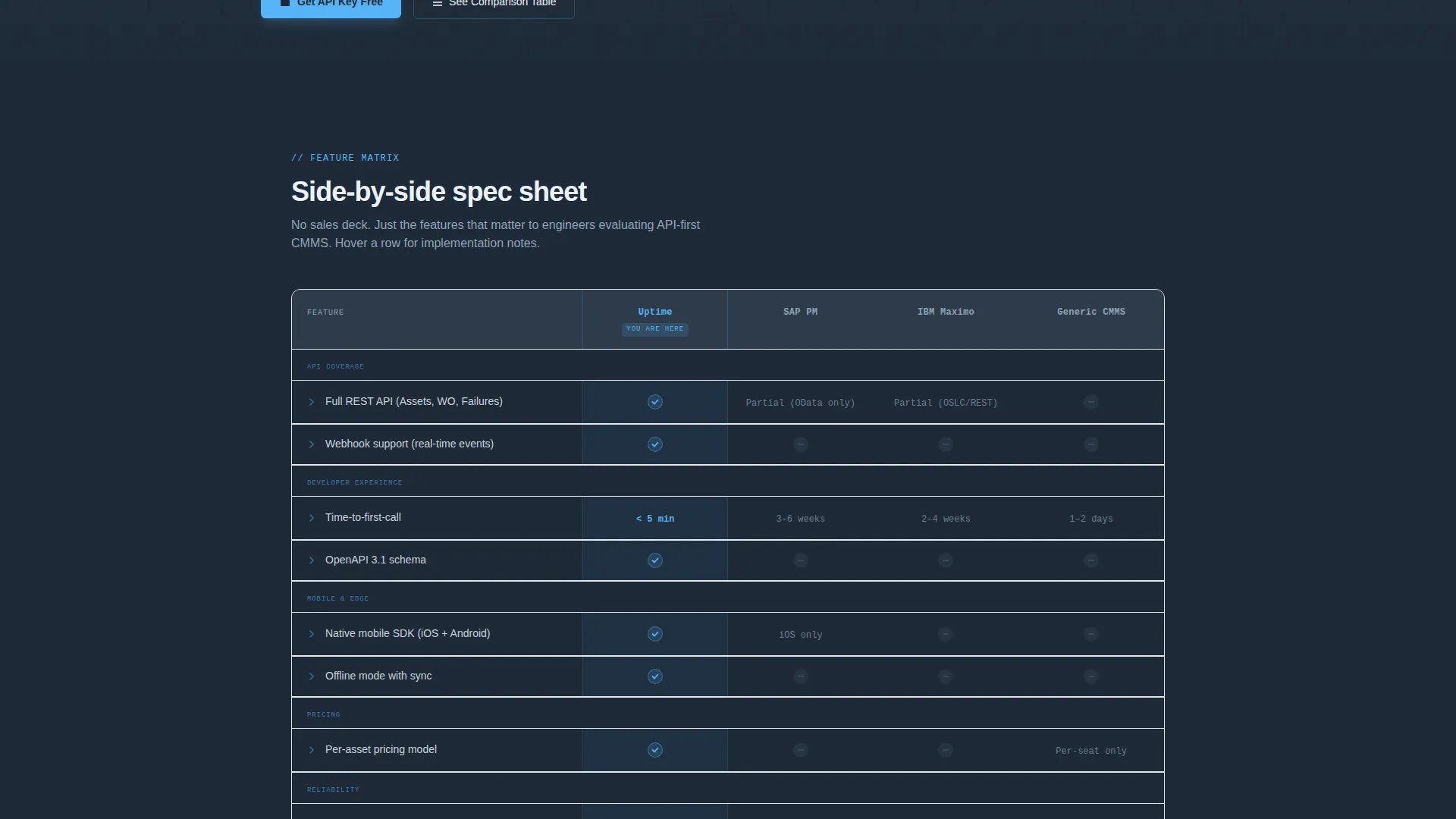
- A head-to-head comparison table covering API coverage, webhook support, time-to-first-call, mobile SDK availability, offline mode, and per-asset pricing
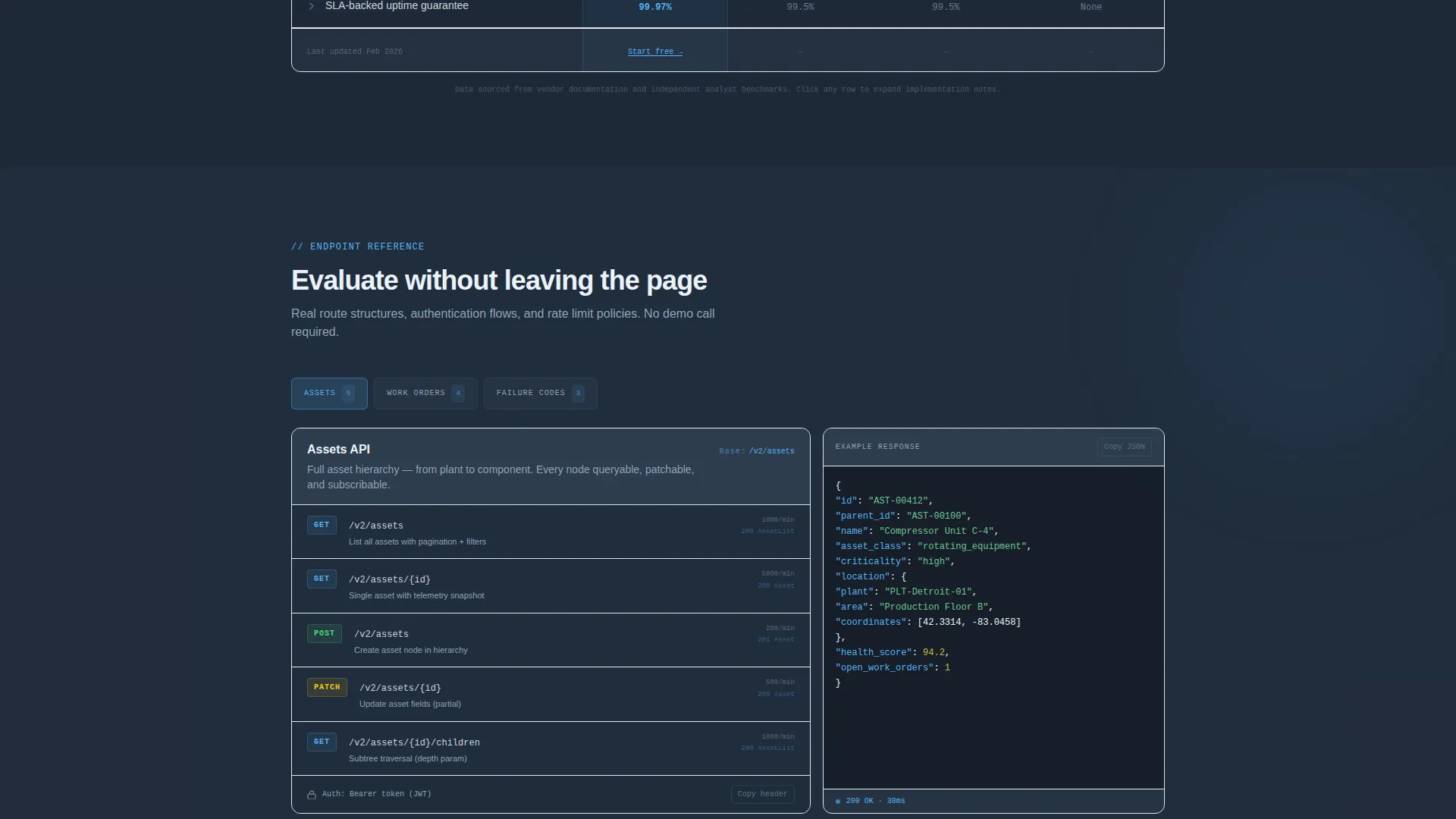
- Collapsible spec blocks with endpoint documentation previews, authentication flow summaries, and rate limit policy details
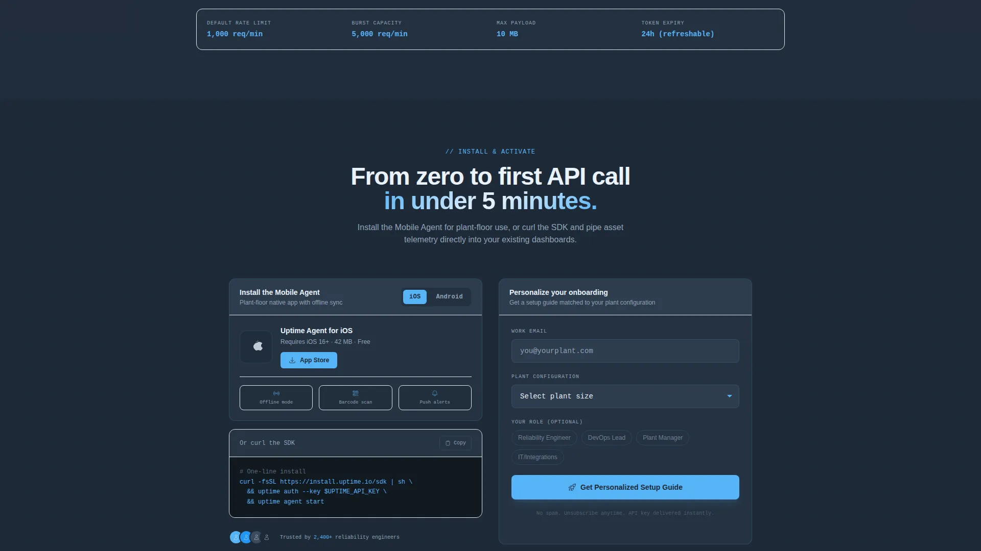
- A conversion section with platform toggle buttons for iOS and Android, a code-copy CLI install button, and a lightweight lead capture form
Feature list
This template is built around a small number of high-impact components. Each one earns its place by serving a specific stage in the technical buyer's evaluation journey.
Animated Stats Hero Panel
Four counters animate upward on page load, displaying API response time, assets under management, monthly API calls served, and uptime SLA. The numbers are rendered in sky-blue monospace type against a deep charcoal background, making the data feel live and credible from the first second.
Styled Curl Command Block
A real GET request to a versioned API endpoint sits below the counters with a truncated JSON response visible inline. This single component replaces abstract claims with something an engineer can read, recognize, and immediately trust.
Head-to-Head Comparison Table
The core of the page pits the platform against legacy enterprise asset management systems across six specification rows. Sky-blue checkmarks and grayed-out dashes build cumulative evidence row by row, making the feature advantage visible at a glance.
Collapsible Endpoint Spec Blocks
Below the comparison table, expandable blocks open into actual route structures, authentication flow outlines, and rate limit policy details. Engineers can evaluate API depth without leaving the page, which keeps them in the funnel longer.
App Download Conversion Section
The primary call to action offers platform toggle buttons for iOS and Android installs alongside a secondary code-copy button for command-line installation. A short form captures work email and plant size to personalize the onboarding sequence after install.
Page sections overview
| Section | Purpose |
|---|---|
| Stats Hero Panel | Display live performance counters and curl command to establish credibility immediately |
| Comparison Table | Pit the platform against legacy enterprise asset management tools across six spec rows |
| Collapsible Spec Blocks | Let engineers preview endpoint routes, auth flows, and rate limits without leaving the page |
| App Download call to action | Drive iOS, Android, or CLI installs with a lightweight lead capture form |
Design & branding system
The visual identity follows a Dashboard Pro theme built on a Slate and Sky color system. The palette is intentionally information-dense, referencing the calm, dark aesthetic of a well-configured monitoring dashboard during a late-night operations session.
- Deep command-line charcoal (#1E2A38) dominates backgrounds, mid-slate panel gray (#3B4B5E) frames secondary panels, sky-blue (#56B4F7) highlights interactive columns and winning checkmarks, and pale cloud white (#EAF2FB) opens breathing room between dense specification blocks
- Active and hover states use a sharper cerulean (#2196F3) to indicate interactivity on table rows and toggle buttons
- Typography leans on sky-blue monospace type for all metric values and code blocks, reinforcing the terminal-window aesthetic throughout
Mobile & speed optimization
The layout is designed to remain legible and navigable on smaller screens without sacrificing the data density that makes it compelling on desktop. Technical buyers often review tools on mobile before returning to desktop for installation.
- The comparison table is structured for horizontal scroll on narrower viewports so no data is hidden or collapsed away
- The animated counters and code block scale cleanly to smaller screen sizes without breaking the monospace formatting
- The app download section leads with the mobile install buttons, making the primary conversion action immediately reachable on any device
How this template helps you convert
This template converts by earning trust before asking for anything. The page architecture is deliberately sequenced so that every scroll reinforces the buyer's confidence.
- The animated metrics panel delivers immediate proof of performance before any marketing copy appears, anchoring the buyer's perception with real numbers
- The comparison table resolves the most common evaluation question, which is how this platform stacks up against legacy enterprise asset management systems, in a single scannable view
- By the time the buyer reaches the app download section, they have already seen response times, read endpoint structures, and verified feature parity, making the install decision feel like a logical next step rather than a leap of faith
Other information about this template
This template was designed specifically for the API-first enterprise asset management category, where the buyer is frequently a technical evaluator rather than a procurement manager. The Spec Sheet creative direction and Dashboard Pro theme were selected to match that audience's expectations precisely.
- The template style is a comparison table layout, which is particularly effective for platforms competing against established legacy tools in the enterprise asset management space
- The header concept is a Stats and Metrics panel, a format that performs well with engineering audiences who distrust abstract value propositions
- The landing page direction is oriented toward app download, with both mobile and command-line install paths available to serve different buyer preferences
- Teams using this template alongside tools like Grafana-integrated dashboards or REST API developer portals will find the visual language immediately familiar to their intended audience
Theme
Dashboard Pro
Creative direction
Spec Sheet
Color system
Slate & Sky
Style
Comparison Table
Direction
App Download
Page Sections
Animated Stats Hero Panel
Styled Curl Command Block
Head-to-head Comparison Table
Collapsible Endpoint Spec Blocks
App Download Conversion Section
Related questions
Who is the primary target audience for this landing page template?
Can I customize the comparison table rows and columns?
What does the collapsible spec block section include?
What conversion actions does this landing page support?
Does this template work for platforms other than enterprise asset management?



