Industrial Management Software Landing Page Template
Uptime is a bento grid landing page template built for industrial management software. It combines a live dashboard header, animated metric counters, a versus comparison table, and a two-step lead capture form into one high-impact single-page layout. Designed for plant managers, operations directors, and maintenance leads who need to show command-level clarity to every audience.
by Rocket studio
Quick summary
Uptime turns a single browser tab into a control room briefing. The template opens with an animated dashboard header showing live OEE scores, maintenance alerts, and production line throughput. Bento grid cells snap into view as visitors scroll, building a picture of total operational awareness row by row until the comparison table makes the decision obvious.
Who this template is for
This template is built for teams selling industrial management software to serious operational buyers. It speaks the language of the plant floor, not the marketing department.
- Plant managers overseeing multiple production lines from a single interface
- Operations directors who report uptime and margin metrics to executive boards
- Maintenance leads who need predictive failure data before equipment goes down
What problem this template solves
Most software landing pages describe features. This one replicates the experience of standing in a control room at 5 AM when every screen reads green. The visitor feels operational confidence before reading a single bullet point.
- Visitors using legacy SCADA systems or spreadsheets cannot see the gap until a comparison forces it
- Procurement buyers need proof of real-time visibility, predictive analytics, and integration reach before they engage
- Generic SaaS templates lack the industrial authority that builds trust with plant-floor decision makers
What you get with this template
You get a complete, single-page bento grid layout engineered for industrial software conversion. Every section has a clear job, and every visual element earns its space by communicating something operational.
- An animated header that replicates the live software dashboard, with OEE counters, a maintenance prediction card, and an extending Gantt bar for production throughput
- A full versus comparison table pitting the software against legacy systems and spreadsheets across five capability dimensions
- A two-step lead capture form and a no-form sandbox path, giving visitors two routes to commitment
Feature list
This section describes the core built-in components delivered with the Uptime template.
Animated Dashboard Header
The header fills the full viewport with a pixel-level replica of the software interface. OEE climbs from 78.4% to 82.1% in real time. A maintenance prediction card flashes for Compressor Unit 7. A Gantt bar for Line 3 extends as throughput increases. A terminal-style headline types itself across the top: "Your entire operation. One screen. Zero guesswork."
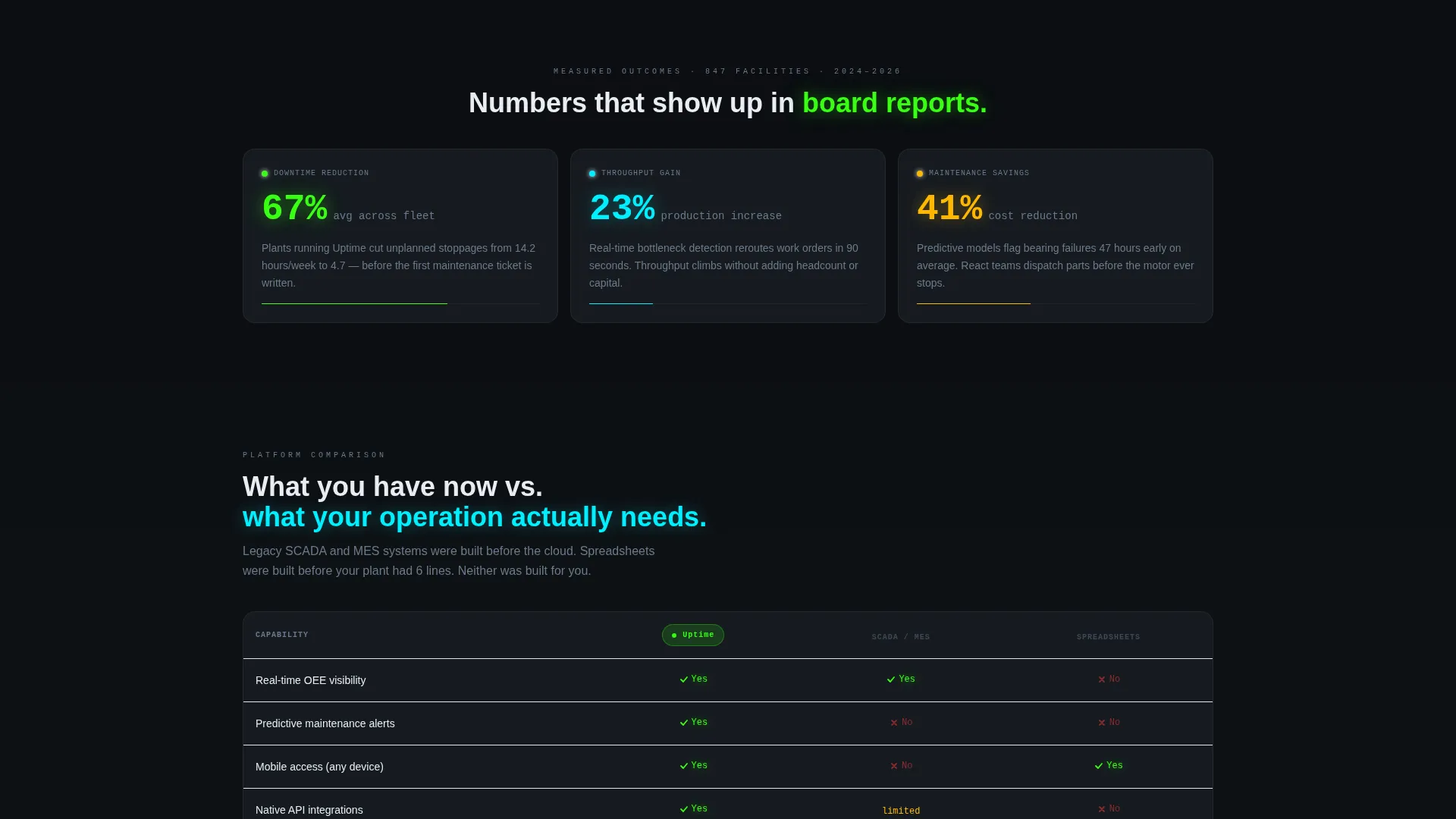
Bento Grid Metric Row
The first content row holds three animated metric cards covering downtime reduction, throughput gain, and maintenance savings. Counters animate as each card enters the viewport, turning abstract percentages into tactile evidence of software value.
Versus Comparison Table
A wide bento cell presents a direct split comparison between the software and both legacy SCADA or MES platforms and spreadsheet-based tracking. Reactor green checkmarks confirm software capabilities. Faded red indicators mark legacy gaps. Dimensions covered include real-time visibility, predictive analytics, mobile access, API integrations, and implementation timeline.
Integration Logo Ticker
A horizontal ticker displays integration partner logos in a continuous scroll. The row communicates ecosystem breadth at a glance and reassures buyers that the software connects to the tools already running on their plant floor.
Two-Step Lead Capture Form
The primary call to action opens a two-step form. Step one collects plant type, number of production lines, and current system via dropdown. Step two captures name, work email, and a toggle to receive the full comparison report. The form is embedded inside the comparison section and also triggers from the sticky bottom bar.
Sticky Conversion Bar
After the visitor scrolls past the versus table, a sticky bottom bar appears with the primary call to action in caution amber. It stays visible for the rest of the scroll journey, keeping the conversion path accessible without interrupting content flow.
Page sections overview
| Section | Purpose |
|---|---|
| Dashboard Header | Animate live OEE, maintenance alerts, and Gantt throughput in viewport |
| Metric Cards Row | Display animated counters for downtime, throughput, and maintenance savings |
| Versus Comparison Table | Contrast software against legacy systems across five capability dimensions |
| Integration Logo Ticker | Show ecosystem breadth with scrolling partner logos |
| Testimonial Card | Build trust with a plant director quote, title, and facility type |
| Two-Step Form | Capture plant type, line count, current system, and contact details |
| Demo Sandbox Path | Let visitors explore live demo data without submitting a form |
| Sticky call to action Bar | Keep the primary call to action visible after the comparison section |
Design & branding system
The visual identity follows a Data Command theme rendered through an Acid Digital color system. Every color exists to communicate operational state, not decoration.
- Void black (#0B0E11) dominates all backgrounds and card surfaces, channeling a server-room terminal aesthetic
- Reactor green (#39FF14) marks live data, active states, and positive key performance indicators; signal cyan (#00F0FF) handles navigation, links, and secondary interactive elements
- Caution amber (#FFB800) fires exclusively on calls to action and warning indicators, making every button feel like a decision with consequence
Mobile & speed optimization
The bento grid layout is structured to adapt across screen sizes while preserving the visual hierarchy of the control room concept.
- Cards and metric counters reflow into single-column stacks on smaller viewports without losing the kinetic snap-in animation sequence
- The sticky conversion bar is designed to remain accessible and visible on mobile scroll without blocking critical content
How this template helps you convert
The Uptime template earns the click by making the visitor feel the gap between their current system and what the software offers, then giving them two immediate ways to close it.
- The versus comparison table shows the visitor their exact operational pain in a structured, side-by-side format, then places the primary call to action directly inside the table so the decision is made in context.
- The no-form sandbox path below the integration row lets cautious buyers explore demo data before committing contact details, lowering friction and building trust before the form appears.
Other information about this template
This template is designed specifically for the industrial vertical software-as-a-service category, where buyer skepticism is high and proof of operational depth matters more than visual style alone.
- The Launch Energy creative direction drives scroll pacing: each bento row snaps into the grid with kinetic precision, raising stakes from capability demonstration to competitive contrast to social proof
- The template style is a bento grid, which allows information-dense layouts to remain scannable and visually organized without feeling cluttered
- The header concept is a Dashboard Preview, meaning the first thing a visitor sees is the actual software experience rather than a static hero image
- The Comparison/Versus landing page direction is the structural spine of the page, with the sticky call to action bar and the two-step form both tied directly to the comparison moment


Theme
Data Command
Creative direction
Launch Energy
Color system
Acid Digital
Style
Bento Grid
Direction
Comparison/Versus
Page Sections
Animated Live Dashboard Header
Bento Grid Metric Cards
Versus Comparison Table
Two-step Lead Capture Form
No-form Demo Sandbox Path
Sticky Conversion Bar
Related questions
Who is this template designed for?
What conversion paths does the template include?
Can I edit the metric values and comparison table content?
Does the sticky call to action bar appear automatically?
Is this template suitable for a demo booking flow?


