IT Services & Consulting Directory Website Template
Uptime is a scroll-reveal landing page template built for IT consulting firms that fix broken infrastructure. It opens with a simulated health dashboard, then cascades through oversized proof metrics, an asymmetric services grid, and a four-phase methodology. A sticky "Get Your Infrastructure Audit" bar and a three-step progressive form drive mid-market CTOs and ops directors toward a qualified lead conversion.
by Rocket studio
Quick summary
Uptime is a single-page IT consulting template designed around one idea: let the data do the persuading. Every section opens with an oversized statistic before any explanatory copy appears. The result is a scroll experience that builds authority metric by metric, ending at a conversion-ready infrastructure audit form backed by a secondary checklist download.
Who this template is for
This template is built for B2B technology consultancies that specialize in infrastructure stabilization, cloud cost reduction, legacy system migration, or security remediation. It speaks directly to firms whose ideal buyers are technical decision-makers under operational pressure.
- Mid-market IT consulting firms targeting CTOs and engineering directors
- Infrastructure specialists offering cloud migration or incident-reduction services
- Consulting founders who need a high-credibility lead generation landing page without a long development cycle
What problem this template solves
Most consulting landing pages lead with services and hope the buyer connects the dots. Technical buyers do not respond to that. They need proof before they read promises. This template reverses the order, delivering outcomes first and context second.
- Visitors with no patience for marketing copy get hard numbers before any pitch
- Firms with strong outcome data have no clean way to showcase it; this template is built around that data
- The audit funnel is buried or missing on most consulting pages; here it is the entire conversion architecture
What you get with this template
You get a complete, single-page layout with five primary content sections and a footer, all built on a dark Data Command visual system. The design is desktop-first and scales to tablet. Every section is structured to load the proof point before the explanation.
- An interactive hero dashboard with animated counters and hover-flip metric tiles
- A stats cascade section, services bento grid, four-phase methodology section, and a three-step audit form
- A sticky bottom call-to-action bar and a secondary email capture for the migration readiness checklist
Feature list
This template is built with specific interactive and structural components. Each one is described below.
Animated Infrastructure Health Dashboard
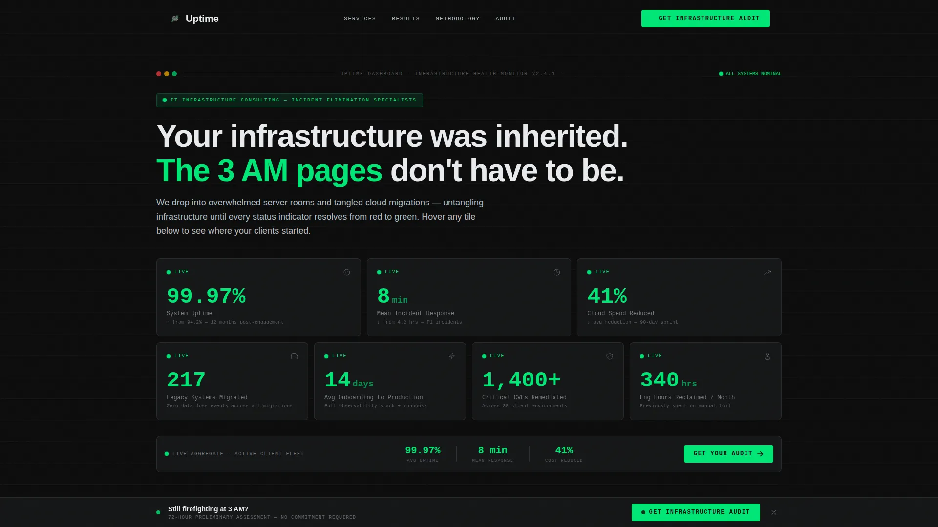
The hero fills the viewport with a simulated monitoring interface. Counters tick upward in real time, displaying metrics like uptime percentage, mean incident response time, and cloud spend reduction. Visitors can hover individual tiles to flip them and reveal the "before" state: red numbers, warning icons, and downtime logs.
Scroll-Triggered Stats Cascade
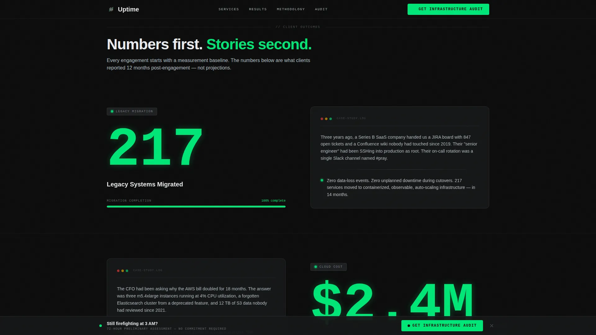
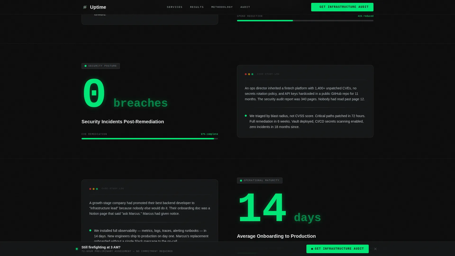
Each content section opens with a single oversized statistic that reveals progressively as the visitor scrolls. The number lands first, then the supporting case study paragraph fades in beneath it. The rhythm trains visitors to anticipate each new proof point and builds cumulative credibility across the page.
Asymmetric Services Bento Grid
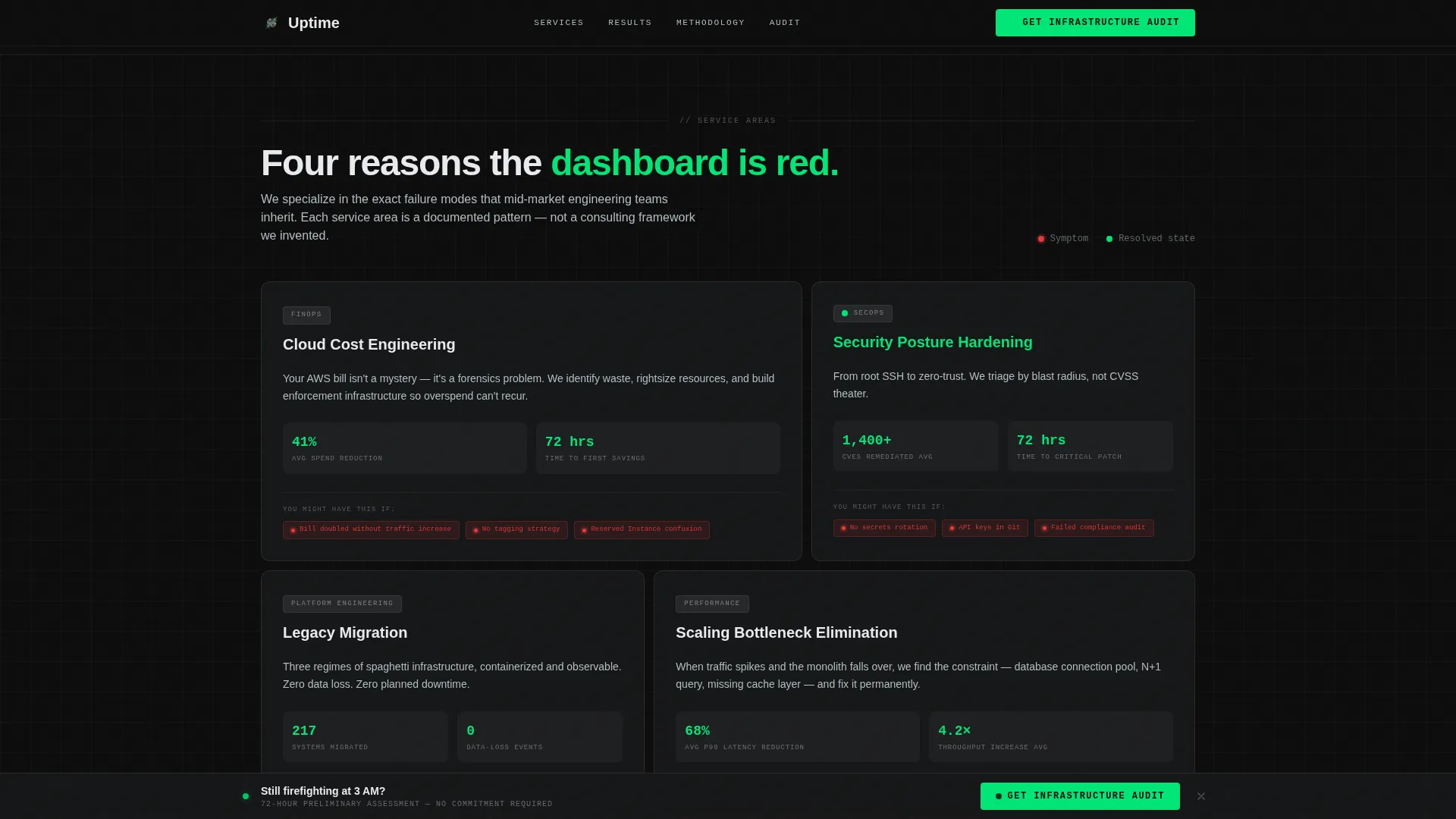
The services section uses an asymmetric bento grid layout to present four consulting focus areas: cloud cost optimization, security posture, legacy migration, and scaling bottleneck resolution. Each cell is sized to reflect relative emphasis, not uniform repetition.
Three-Step Progressive Disclosure Form
The audit call-to-action uses a three-step form. Step one captures company size and primary pain point via dropdown. Step two collects name and work email. Step three offers an optional description field or network diagram upload, reducing friction while qualifying leads progressively.
Sticky Audit Call-to-Action Bar
A persistent bottom bar labeled "Get Your Infrastructure Audit" appears after the second stat reveal. It stays anchored as visitors scroll, reinforcing the conversion action once enough credibility has been established through the preceding metrics.
Secondary Checklist Lead Capture
A lighter-intent conversion path offers visitors the ability to download a Migration Readiness Checklist by submitting only their email address. This secondary path captures early-stage prospects and feeds them toward the full audit funnel over time.
Page sections overview
| Section | Purpose |
|---|---|
| Hero Dashboard | Simulated health dashboard with animated counters and hover-flip tiles |
| Stats Cascade | Oversized stat reveals followed by case study paragraphs |
| Services Bento Grid | Four consulting focus areas in an asymmetric bento layout |
| Methodology Phases | Four-phase scroll rhythm pairing numbers with process narrative |
| Audit Form Section | Three-step progressive form plus secondary checklist download |
| Footer | Linear single-row footer with standard navigation and contact links |
Design & branding system
The visual identity follows a Data Command theme built on a Carbon Fiber color palette. Every design decision reflects the interior of a rack-mounted server chassis: matte surfaces, zero ornamentation, and a dark background that makes every green data point pulse like a healthy heartbeat.
- Core palette: carbon black (#0D0D0D) background, gunmetal panel gray (#2B2D30) for card surfaces, status-green (#00E676) for live metrics and hover states, cool aluminum (#B0BEC5) for secondary text and dividers
- Typography uses JetBrains Mono for all numerical and data-display elements, and DM Sans for headings and body copy
- Status-green appears only on numbers, progress indicators, and hover states, keeping its visual signal strong against the dark background
Mobile & speed optimization
The template is built desktop-first, reflecting the reality that mid-market CTOs and ops directors typically evaluate tools on a workstation. The layout is responsive and scales cleanly to tablet viewports without breaking the grid or animation logic.
- Desktop-first layout with tablet-responsive breakpoints built into the grid and bento sections
- Interactive components including the flip tiles, animated counters, and sticky bar are scoped to client-side rendering while static structural sections use server components
- Scroll-triggered animations are tied to viewport entry, so content reveals happen at the right moment on any supported screen size
How this template helps you convert
The entire page is structured as a credibility-first funnel. Proof comes before pitch, and the conversion ask arrives only after the visitor has seen multiple rounds of outcome data.
- The animated hero dashboard establishes authority within the first viewport, using real-looking infrastructure metrics to earn the next scroll before the visitor has read a single sentence of marketing copy.
- The sticky audit bar appears after the second stat reveal, timing the call to action precisely when credibility has compounded enough to make the ask feel earned rather than premature.
- The three-step form reduces perceived commitment by spreading the qualification questions across stages, keeping the entry point low while still capturing the details needed to qualify a lead.
Other information about this template
This template is specifically designed for the IT consulting and infrastructure services niche, where technical buyers have high skepticism and short patience. The Data Command aesthetic and stats-first content strategy are calibrated to that audience.
- The template uses a scroll reveal (progressive) build style, meaning content enters the viewport sequentially as the visitor scrolls rather than loading all at once
- The creative direction is Stats-First Impact, a structure that places outcome metrics ahead of descriptive copy in every section
- The checklist secondary conversion path is designed to nurture lower-intent visitors over time, bridging the gap between first visit and audit request
- The footer follows a linear single-row pattern, keeping the bottom of the page clean and uncluttered
Theme
Data Command
Creative direction
Stats-First Impact
Color system
Carbon Fiber
Style
Scroll Reveal (Progressive)
Direction
Lead Generation
Page Sections
Animated Infrastructure Health Dashboard
Scroll-triggered Stats Cascade
Asymmetric Services Bento Grid
Three-step Progressive Disclosure Form
Sticky Audit Call-to-action Bar
Secondary Checklist Lead Capture
Related questions
Who is this template designed for?
Can I adapt the metric numbers and statistics to match my firm's real results?
What does the three-step audit form collect?
Is this template suitable for a firm that offers only one service?
What is the secondary conversion path included in this template?



