Cloud-Native Enterprise Software Advanced Reviews Website Template
Uptime is a Bold Brutalist landing page template built for cloud-native manufacturing execution system (MES) software. It leads with a live dashboard preview, walks visitors through a three-column comparison table, and unfolds each metric into its own deep-dive panel. Every design decision signals industrial precision, and every section pushes toward one clear action: running a stack comparison.
by Rocket studio
Quick summary
Uptime is a single-page comparison landing page template designed for cloud-native MES platforms. It opens with a full-width dashboard screenshot, moves into a brutal three-column feature matrix, then explodes each row into a dedicated deep-dive panel. The primary call to action, "Run Your Stack Comparison," pins to the top navigation and repeats after every section.
Who this template is for
This template is built for enterprise software teams selling cloud-native manufacturing execution systems to mid-market industrial buyers. It speaks directly to the people who feel the pain of legacy infrastructure every shift.
- VP of Operations managing 3 to 12 discrete production lines who need real overall equipment effectiveness (OEE) numbers
- Plant IT directors maintaining aging on-premises SQL databases that go down during shift changes
- Continuous improvement managers replacing whiteboard estimates with live, floor-level data
What problem this template solves
Most MES software pages read like feature lists. They do not show the gap between what buyers have today and what they could have tomorrow. Uptime flips that structure by putting the visitor's current stack on trial inside every row of a comparison table.
- Legacy on-premises systems, retrofitted ERP modules, and manual spreadsheets are named and compared directly
- Visitors see their own pain points reflected before a single contact field appears
- The page earns the click by building an argument row by row, not by leading with a form
What you get with this template
The template ships as a structured, single-page layout with clearly defined sections and a hard editorial grid. Every component maps to an industrial creative brief with no decorative elements that do not serve a function.
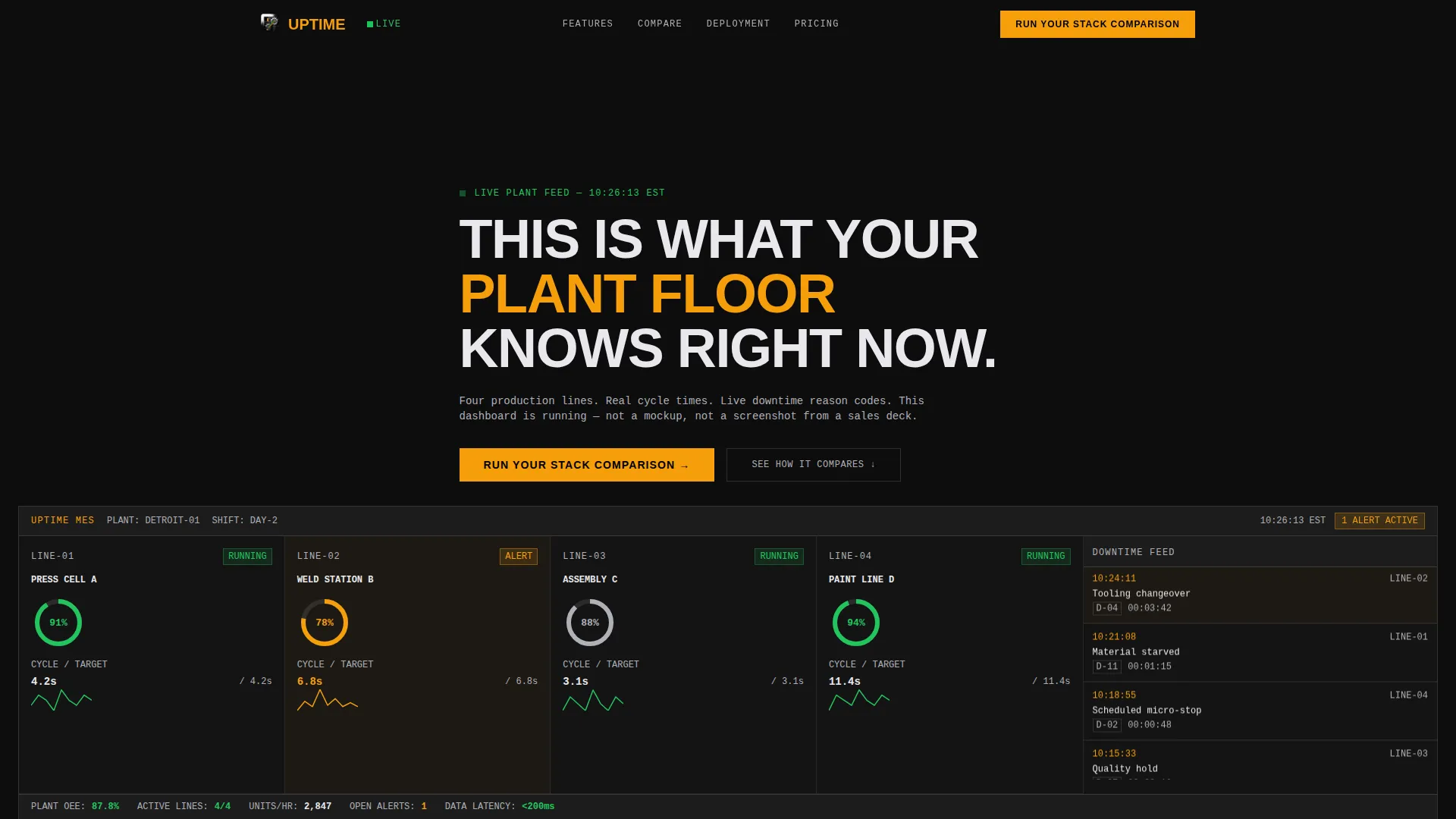
- A live dashboard preview header showing four production lines, OEE donuts, cycle-time sparklines, and a real-time downtime reason code feed
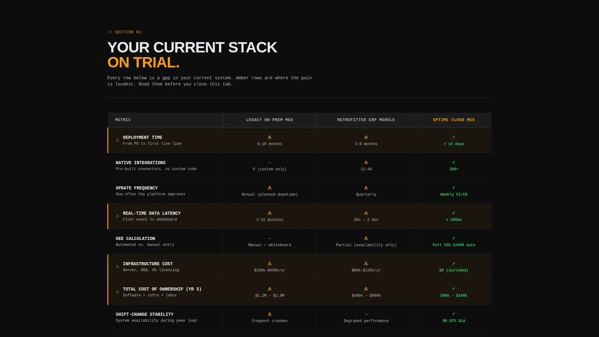
- A three-column comparison table covering deployment time, integration count, update frequency, real-time data latency, and three-year total cost of ownership
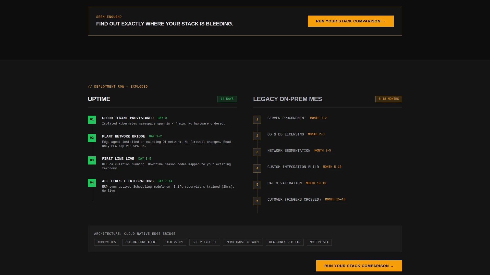
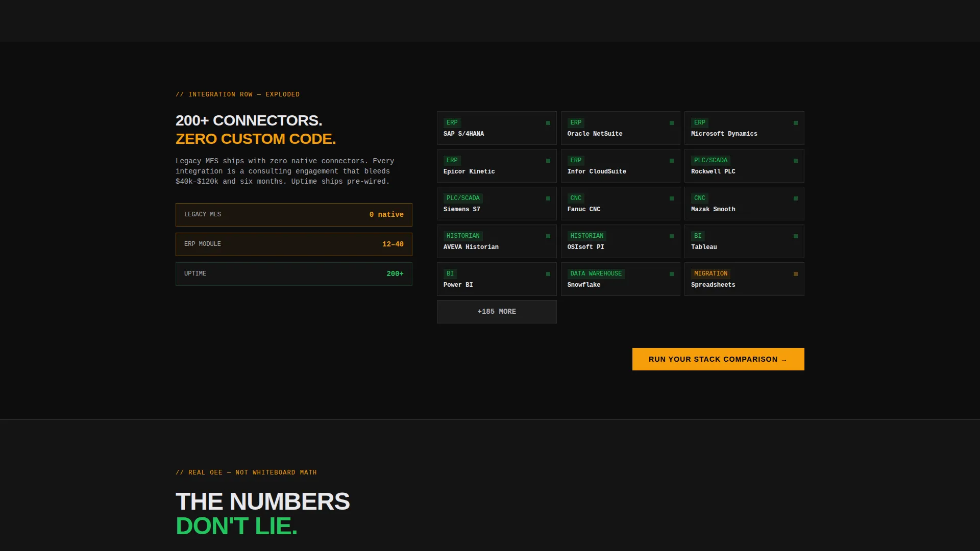
- Deep-dive panels that expand each table row into an architecture diagram, an API connector map, or a version changelog cadence block
Feature list
This section covers every distinct functional block built into the Uptime template.
Dashboard Preview Header
The header section renders a straight-on monitor capture of the MES control panel. Four production lines appear mid-run with OEE donuts, cycle-time sparklines, and a scrolling downtime reason code feed. One line glows amber to show an active micro-stop alert. The headline lands in brutalist all-caps directly below: THIS IS WHAT YOUR PLANT FLOOR KNOWS RIGHT NOW.
Three-Column Comparison Table
The feature matrix places Legacy On-Premises MES, Retrofitted ERP Module, and the platform side by side across five rows. Checkmarks appear in status-green, missing features use aluminum-gray dashes, and caution-amber callout rows highlight the most painful gaps. This table structure is the core argument engine of the page.
Deep-Dive Expansion Panels
Each row of the comparison table connects to its own full-width panel below. The deployment row expands into an architecture diagram. The integration row opens an API connector map. The updates row shows a version changelog cadence block. Visitors scroll deeper to follow the argument they already started reading.
Pinned and Repeated Primary Call to Action
The "Run Your Stack Comparison" call to action appears both pinned in the top navigation bar and repeated after every deep-dive panel. Clicking it opens a two-field qualifier: a dropdown for the visitor's current MES or ERP system and a field for number of production lines. This qualifier captures intent before asking for contact details.
Gated Migration Scorecard Path
A secondary conversion path offers a downloadable migration scorecard PDF. It is gated behind a single work email field. This path serves visitors who are not ready to speak with sales but want to measure their current stack against a structured framework.
Bold Brutalist Typography and Grid
All text uses oversized, flush-left typography. Data fields switch to a monospaced typeface for immediate visual contrast. There are no rounded corners anywhere. The grid is hard-edged and follows strict column alignment, giving the page the feel of a CNC machine panel rather than a standard software site.
Page sections overview
| Section | Purpose |
|---|---|
| Dashboard Preview Header | Opens with live MES control panel screenshot and brutalist headline |
| Comparison Table Matrix | Puts legacy stack versus. platform across five measurable rows |
| Deployment Deep-Dive | Expands deployment row into full architecture diagram panel |
| Integration Connector Map | Shows API connector map tied to the integration count row |
| Update Cadence Panel | Breaks down version changelog frequency from the updates row |
| Primary call to action Block | Repeats "Run Your Stack Comparison" with two-field qualifier form |
| Migration Scorecard Gate | Captures work email in exchange for downloadable scorecard PDF |
Design & branding system
The visual identity follows a Bold Brutalist theme built around the Carbon Fiber color system. Every color choice is functional, not decorative. The palette reads like the side panel of a CNC machine.
- Woven black (#141414) for base surfaces, machined aluminum (#B0B0B8) for secondary text and gray dashes, caution-stripe amber (#F59E0B) for alert callout rows, and status-green (#22C55E) reserved only for checkmarks and live-state indicators
- Oversized flush-left typography with monospaced fonts applied wherever data or metrics appear, and zero rounded corners on any element
- Hard grid lines and matte dark surfaces interrupted only by deliberate, state-communicating color
Mobile & speed optimization
The template is built on a strict grid system that adapts the comparison table and panel layout for smaller viewports without losing the industrial visual logic. Key interactive elements remain accessible at any screen width.
- The comparison table collapses into a scrollable format on narrow screens so row-by-row reading stays intact
- The pinned navigation call to action remains visible on mobile so the primary conversion path is never buried
How this template helps you convert
The page is engineered around a Comparison/Versus conversion model. It does not ask for trust upfront. It builds that trust through evidence before any form appears.
- The comparison table makes the visitor's existing system gaps visible across five concrete, measurable dimensions before the first call to action appears
- The repeated "Run Your Stack Comparison" call to action captures high-intent visitors at the exact moment each deep-dive panel lands its argument, while the gated scorecard PDF captures visitors who need more time
Other information about this template
This template fits within the broader category of cloud-native enterprise software landing pages designed for industrial technology buyers. It is suitable for teams building product-led growth funnels where proof replaces persuasion.
- The template style is a Comparison Table layout, which works well for competitive displacement campaigns in the manufacturing execution system market
- The header concept follows a Dashboard Preview model, a format that builds immediate product credibility with technical buyers who evaluate on interface quality
- The creative direction is a Feature Matrix approach, meaning the scroll itself becomes the sales argument rather than a static value proposition block
- The landing page direction is Comparison/Versus, making it well-suited for campaigns targeting buyers actively evaluating alternatives to legacy on-premises MES or retrofitted ERP modules
Theme
Bold Brutalist
Creative direction
Feature Matrix
Color system
Carbon Fiber
Style
Comparison Table
Direction
Comparison/Versus
Page Sections
Dashboard Preview Header Block
Three-column Competitive Comparison Table
Row-linked Deep-dive Panels
Pinned Primary Call to Action
Gated Migration Scorecard Download
Monospaced Data Typography System
Related questions
Who is this template designed for?
What conversion paths does the template include?
How does the comparison table work structurally?
What does the Bold Brutalist design communicate to buyers?
Can this template support a competitive displacement campaign?



