Cloud & DevOps Professional Website Template
Uptime is a comparison table landing page template built for cloud monitoring and observability platforms. It leads with a scrolling integration logo bar, delivers a head-to-head competitor benchmark table with animated viewport highlights, and drives visitors toward a free-tier signup through two strategically placed click-through calls to action. No form required.
by Rocket studio
Quick summary
Uptime is a single-page, click-through landing page template designed for cloud monitoring and observability platforms. It opens with a scrolling logo bar that signals broad integration support, then transitions into a data-driven comparison table and a rapid-fire feature ticker. The entire page flows toward one goal: getting the right visitor to click "Start Monitoring Free."
Who this template is for
This template is built for technical SaaS products that need to prove their value quickly to a skeptical, experienced audience. It works especially well when the product competes in a crowded space and has real performance data to show.
- DevOps leads and site reliability engineers who evaluate tools by numbers, not marketing language
- Platform teams at growth-stage startups that have outgrown homegrown scripts and need a credible product page fast
- Founders and marketers launching a cloud monitoring or observability tool who want a page that earns trust before asking for a click
What problem this template solves
Most technical product pages either bury the value proposition in feature lists or rely on vague adjectives that experienced engineers immediately distrust. Visitors who manage infrastructure for a living want signal, not noise. This template is built to close that gap.
- Engineers arrive already comparing tools; the comparison table meets them where they are instead of asking them to scroll past hero copy first
- Alert fatigue and dashboard sprawl are real problems for the target audience; the page acknowledges that context visually and structurally
- A single, frictionless call to action removes the hesitation that forms and gated downloads create
What you get with this template
You get a fully structured, section-led landing page layout built around a comparison table as the primary conversion driver. Every section has a defined role, and the visual flow is designed to carry a reader from first impression to click without resistance.
- A scrolling integration logo bar header with a monospace headline, a head-to-head competitor benchmark table with animated winning-cell highlights, and a rapid-fire feature ticker
- Two call-to-action placements: one pinned below the comparison table and one as a full-width bar after the feature ticker
- A Slate and Sky color system that is readable on a second monitor at any hour, with sky-blue interactive signals that direct attention precisely
Feature list
This section covers the core functional components built into the Uptime template.
Scrolling Integration Logo Bar
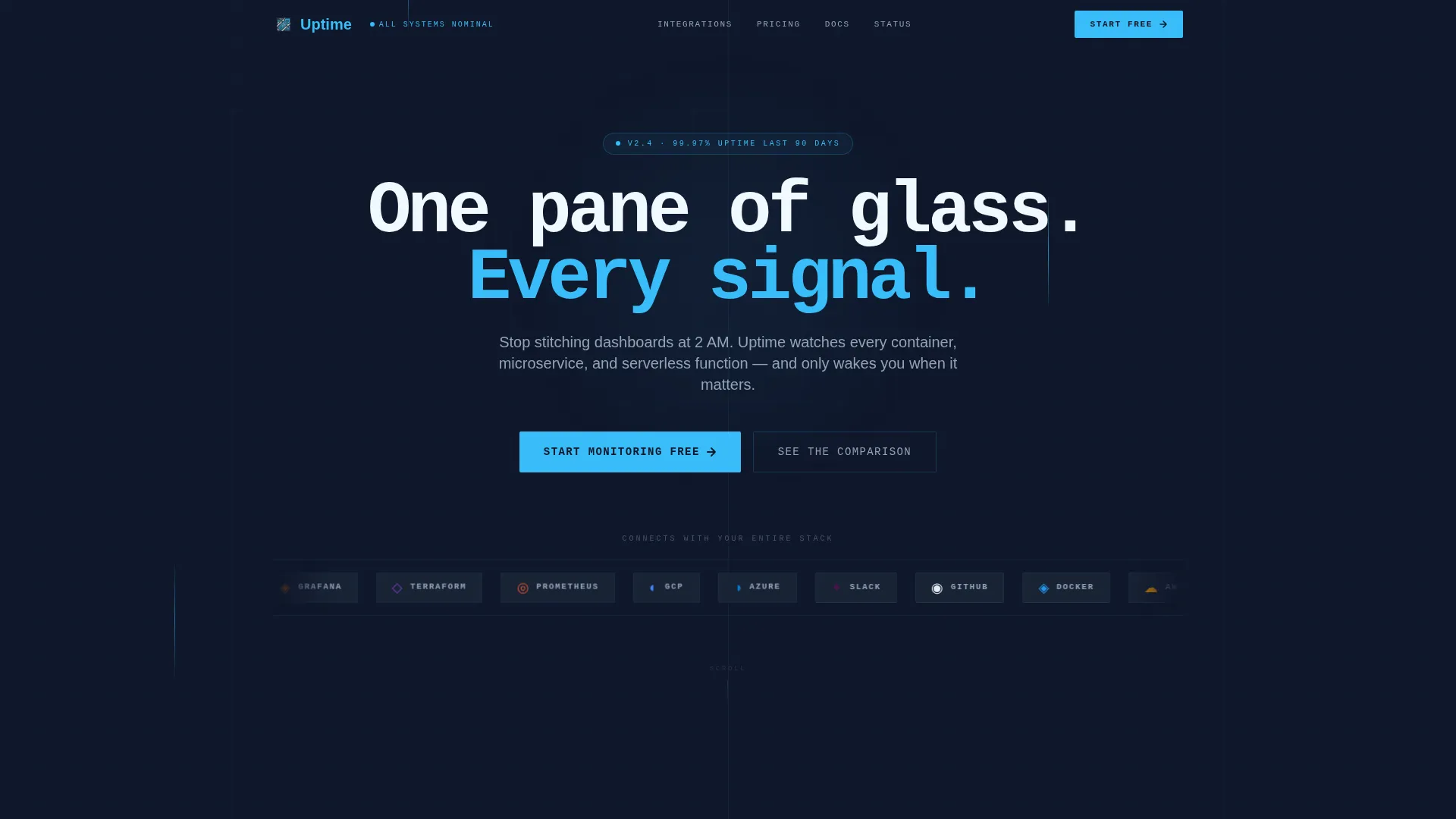
The header opens with a horizontal ribbon of integration logos scrolling in a slow, infinite loop against a deep slate background. A monospace headline sits above the loop, reading like a compatibility promise before any feature is described. The motion is subtle enough to avoid distraction but engaging enough to hold the eye.
Head-to-Head Comparison Table
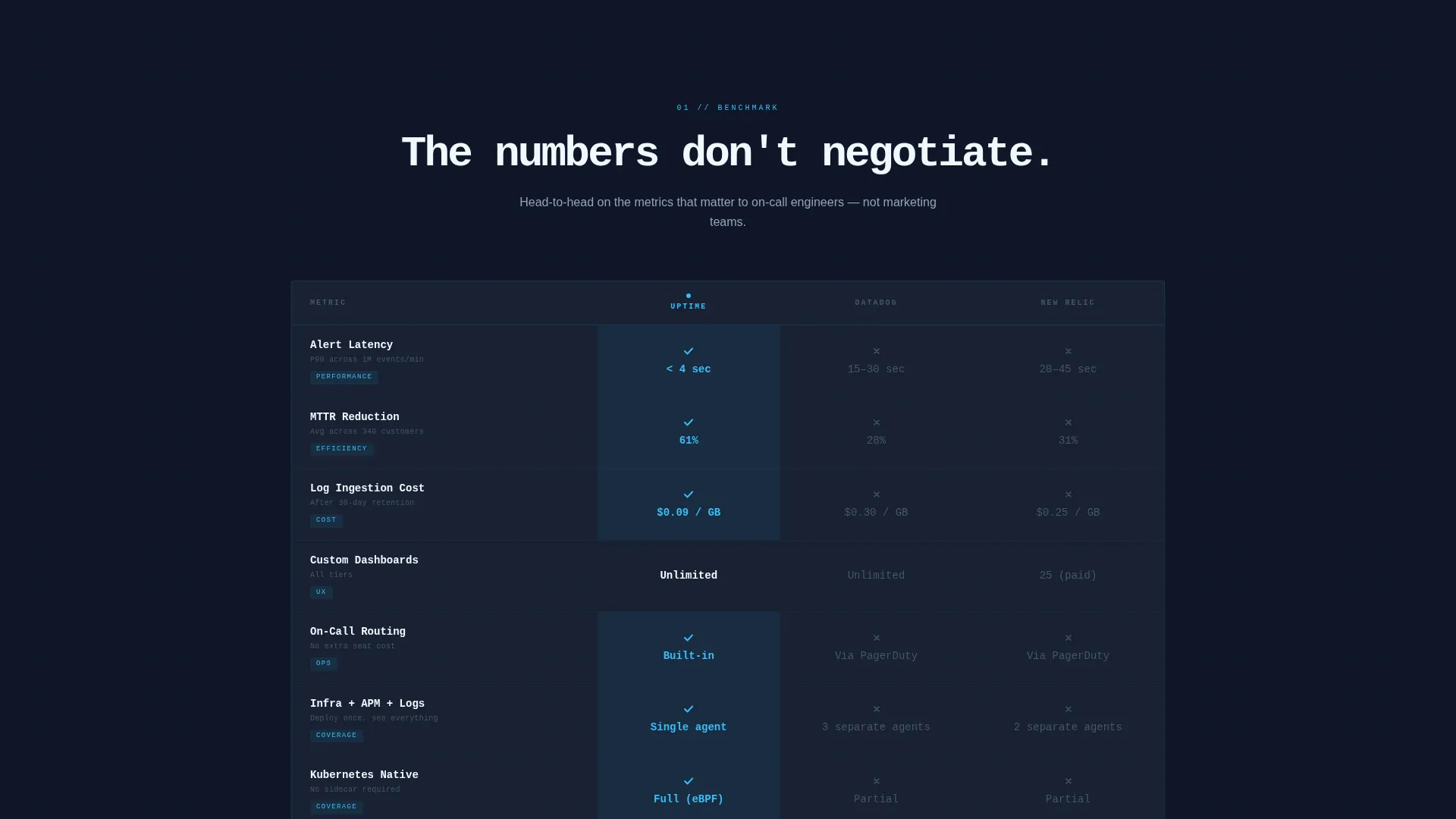
The centrepiece of the page is a structured benchmark table that positions the platform against two or three named competitors. Rows cover dimensions such as alert latency, custom dashboards, log ingestion cost, and mean time to resolution reduction. Each winning cell pulses once with sky-blue as it enters the viewport, turning data into a quiet, confident performance.
Rapid-Fire Feature Ticker
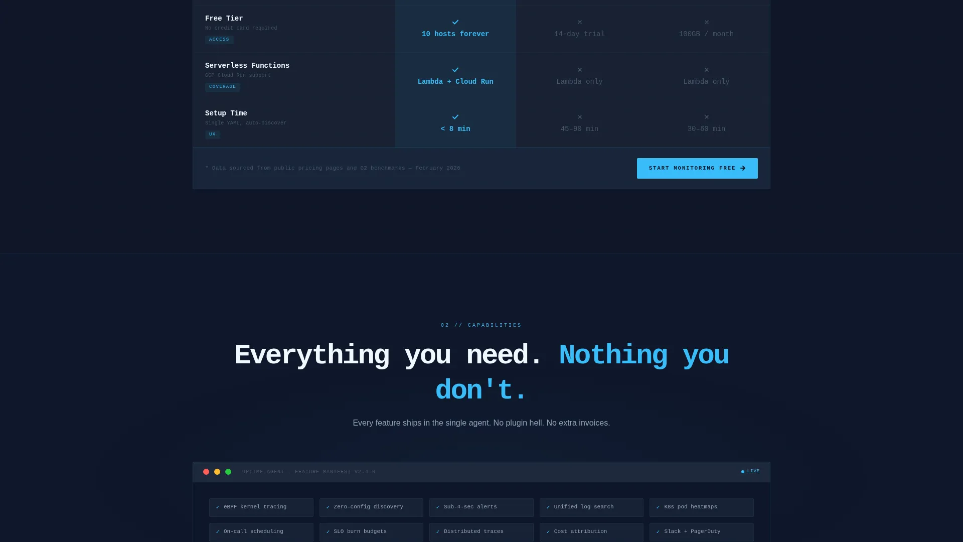
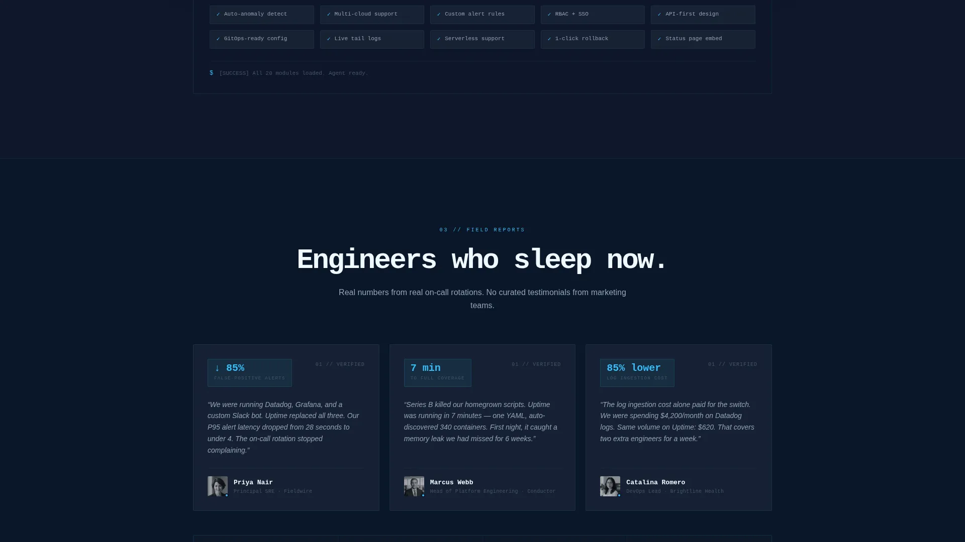
After the comparison table lands the rational argument, a feature ticker animates three-word feature descriptions in sequence, styled like scrolling deploy logs. The rhythm builds forward momentum and keeps the reader moving toward the final call to action without pause.
Dual Click-Through call to action Placement
The primary call to action, "Start Monitoring Free," appears twice: pinned to the bottom of the comparison table and again as a full-width bar after the feature ticker. Both instances carry UTM context and route the visitor directly into the product onboarding flow without a form.
Viewport-Triggered Cell Animations
Winning cells in the comparison table do not light up on page load. They pulse with sky-blue only as they enter the visible viewport, creating a reveal effect that rewards scrolling and keeps the data feeling live rather than static.
Page sections overview
| Section | Purpose |
|---|---|
| Logo Bar Header | Signals integration breadth and sets technical credibility immediately |
| Monospace Headline | Frames the core value promise before any feature detail appears |
| Comparison Table | Benchmarks the platform against competitors using exact, row-level metrics |
| Feature Ticker | Builds momentum with rapid animated feature descriptions before the final call to action |
| Full-Width call to action Bar | Delivers the final click-through prompt after rational and emotional buy-in |
Design & branding system
The visual identity follows a Directory and Discovery theme built on the Slate and Sky color system. The palette is designed to feel like a well-organized operations dashboard, dark and focused, with blue signals that draw the eye to what matters.
- Core colors: deep terminal slate (#1E293B) for backgrounds, mid-gray infrastructure (#475569) for secondary elements, clear-sky blue (#38BDF8) for active states and interactive highlights, and cloud-white (#F0F9FF) for table backgrounds and breathing room
- Typography uses a monospace font for the headline, reinforcing the terminal aesthetic and speaking directly to an engineering audience
- Motion is intentional and restrained: the logo scroll is slow and looping, and the cell pulse fires once per element, keeping the page calm rather than distracting
Mobile & speed optimization
The layout is structured to remain readable and functional on smaller screens without sacrificing the data density that makes the comparison table valuable. The section flow is linear and scroll-friendly by design.
- The comparison table is designed to present benchmark rows clearly, with a layout that adapts to narrower viewports without losing the competitive context
- The feature ticker animation is lightweight by design, relying on text transitions rather than heavy media assets
- The two-call to action structure means a mobile visitor encounters the primary action both mid-page and at the end, reducing the need to scroll back
How this template helps you convert
The entire page is structured as a conversion funnel where each section builds on the trust earned by the one before it. The click feels like a logical next step because the page has already done the persuasive work.
- The logo bar establishes integration credibility in the first three seconds, reducing bounce from visitors who need to know the platform fits their existing stack
- The comparison table replaces marketing adjectives with exact numbers, giving technically minded visitors the evidence they need to feel confident rather than pressured
- The dual call to action placement ensures the "Start Monitoring Free" button is always within reach at both the moment of rational conviction and the moment of emotional momentum
Other information about this template
This template is categorized under Technology, within the Cloud and DevOps subcategory, and is specifically aligned with the Cloud Monitoring and Observability niche. It is built for click-through landing pages where the goal is a direct handoff to a product signup flow.
- The template style is Comparison Table, making it well-suited for platforms that want to benchmark against established tools in the observability and infrastructure monitoring space
- The creative direction is Launch Energy, meaning the layout is designed to feel like a countdown, building urgency and momentum through animation and data reveal rather than static copy
- This template is a strong fit for teams evaluating or marketing tools in the observability category, including platforms that compete in spaces occupied by tools like Datadog and services built around alerting and log ingestion workflows
Theme
Directory & Discovery
Creative direction
Launch Energy
Color system
Slate & Sky
Style
Comparison Table
Direction
Click-Through
Page Sections
Scrolling Integration Logo Bar
Head-to-head Comparison Table
Rapid-fire Feature Ticker
Dual Click-through Call to Action Placement
Viewport-triggered Cell Animations
Related questions
Does this template include a contact form or lead capture form?
Can I replace the competitor names and metrics in the comparison table?
Is the scrolling logo bar limited to specific integrations?
What does the viewport-triggered cell animation look like?
Who is this landing page template designed to convert?



