Site Reliability Engineering Technology Cost Calculator Website Template
Uptime is a bold brutalist landing page template built for site reliability engineering managed services. It uses a hub-and-spoke anchor navigation layout with dark glass panel headers, versus-style comparison modules, and a live incident cost calculator. Designed for engineering-led buyers, it turns operational pain points into a persuasive, data-forward conversion experience.
by Rocket studio
Quick summary
Uptime is a single-page, anchor-nav landing page template for site reliability engineering managed service providers. It pairs a monochrome steel visual identity with high-urgency, comparison-driven copy architecture. Five spoke sections dismantle the visitor's current operational burden column by column, ending every module with a persistent audit call to action and two gated conversion paths.
Who this template is for
This template is built for managed service teams that sell reliability, uptime, and on-call engineering to technical buyers. It speaks directly to the people carrying the operational weight inside growth-stage and mid-market technology companies.
- VP Engineering leads at Series B-to-D startups running container orchestration in production
- Platform teams at mid-market software-as-a-service companies overwhelmed by alert volume
- Chief Technology Officers who have recently lost site reliability engineers and cannot backfill quickly
What problem this template solves
Engineering-led buyers do not respond to generic service pages. They need to see their own pain reflected back at them in precise numbers before they trust a vendor. This template solves the credibility and clarity gap that causes high-intent visitors to bounce.
- Visitors arrive with skepticism and leave without a clear sense of cost or risk reduction
- Comparison pages often list features without showing the operational math behind the switch
- Traditional landing pages bury the conversion action behind walls of marketing copy
What you get with this template
You get a fully structured, section-led landing page that guides an engineering buyer from recognition to conversion without losing momentum. Every component is pre-built and editable.
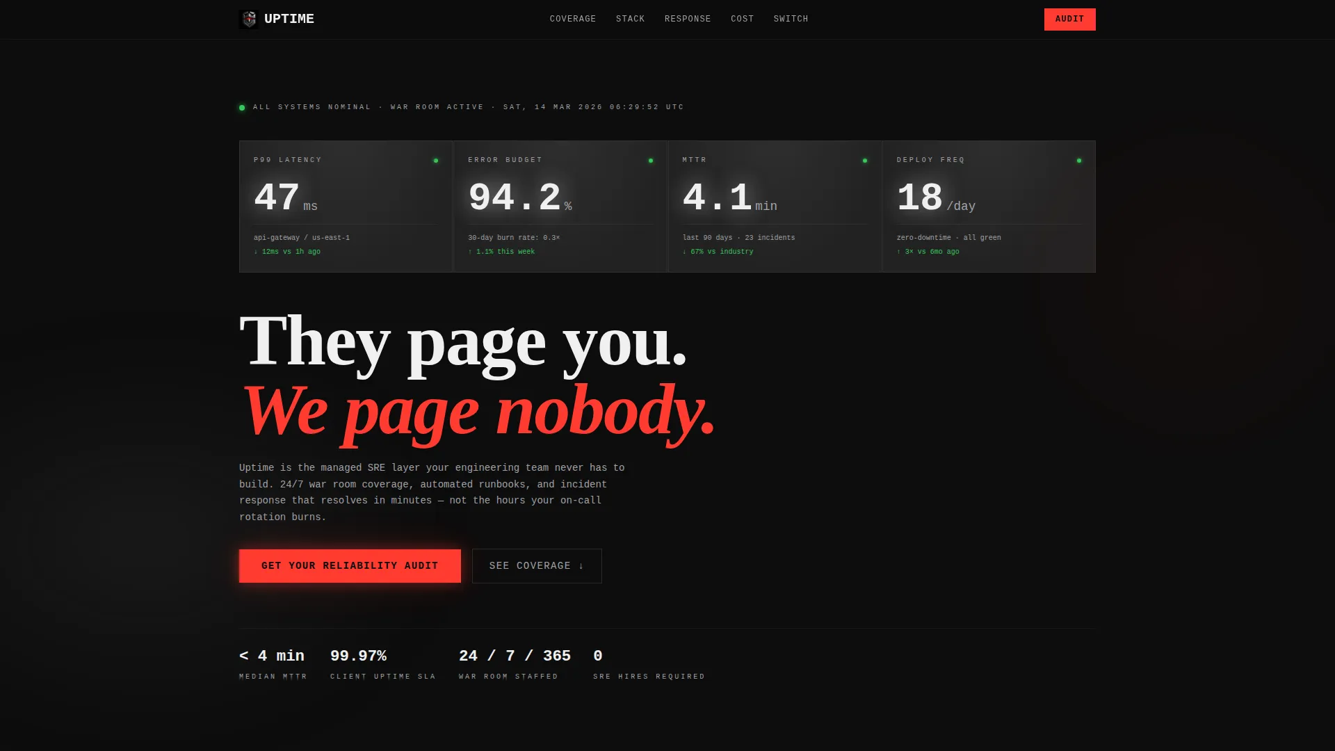
- A dark glass panel header displaying four real-time metric panes (p99 latency, error budget burn rate, mean time to repair, and deployment frequency)
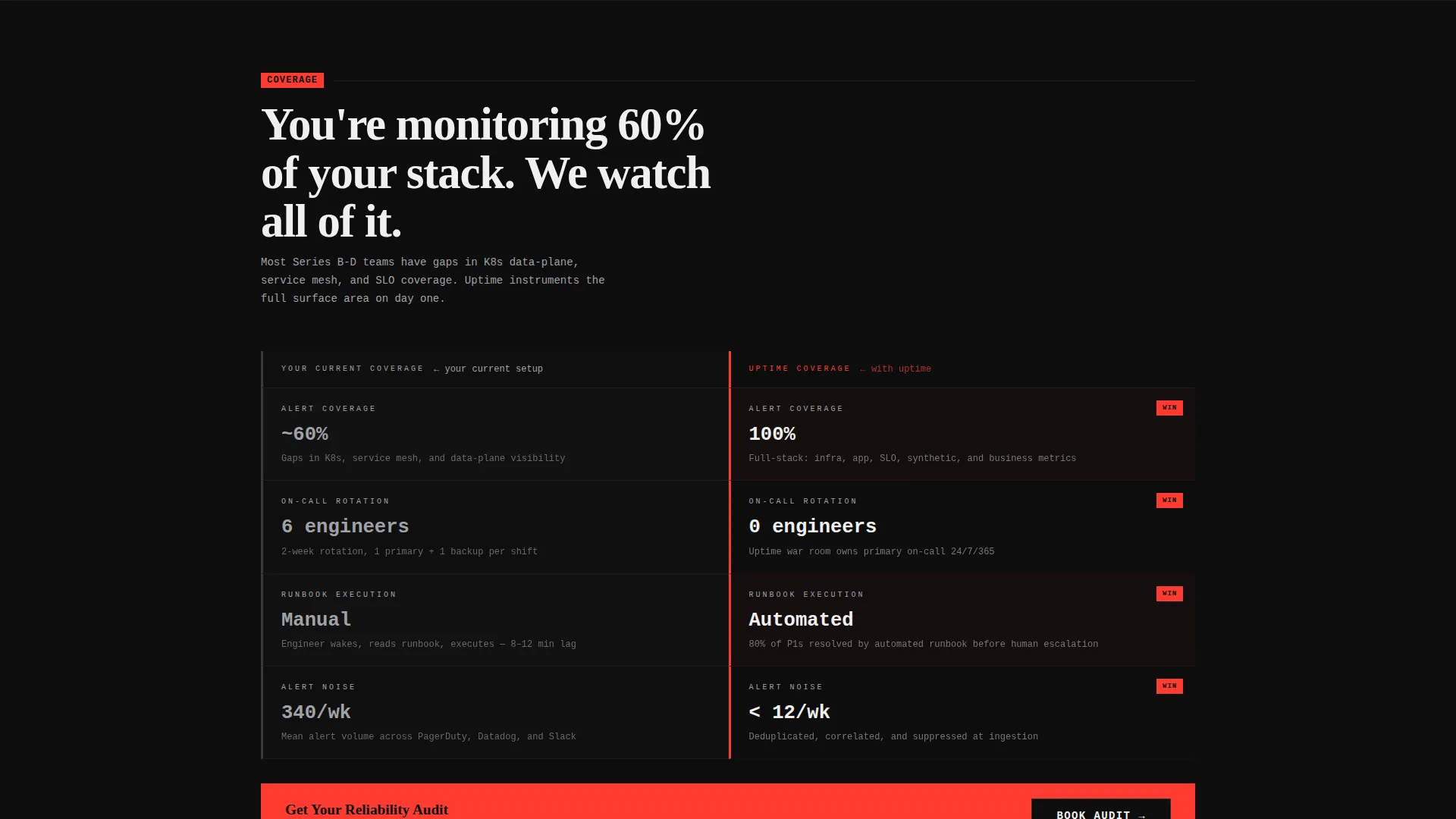
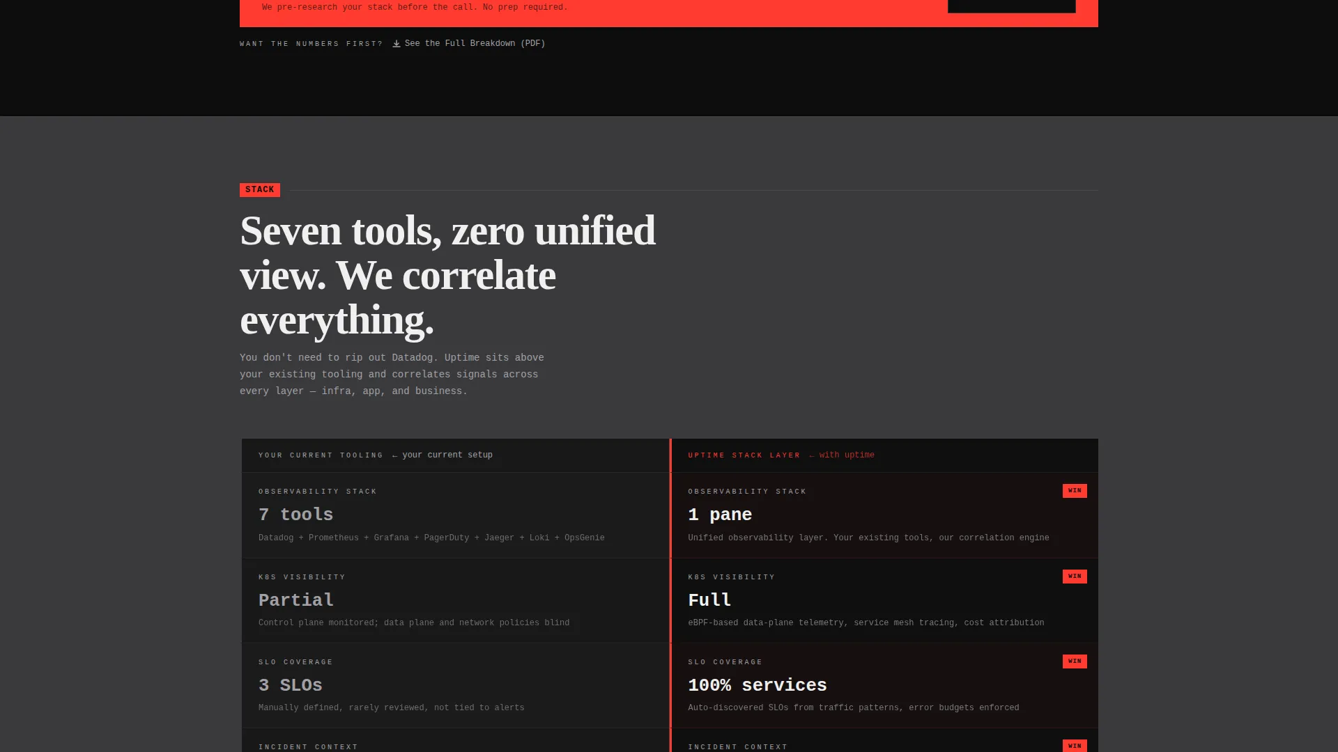
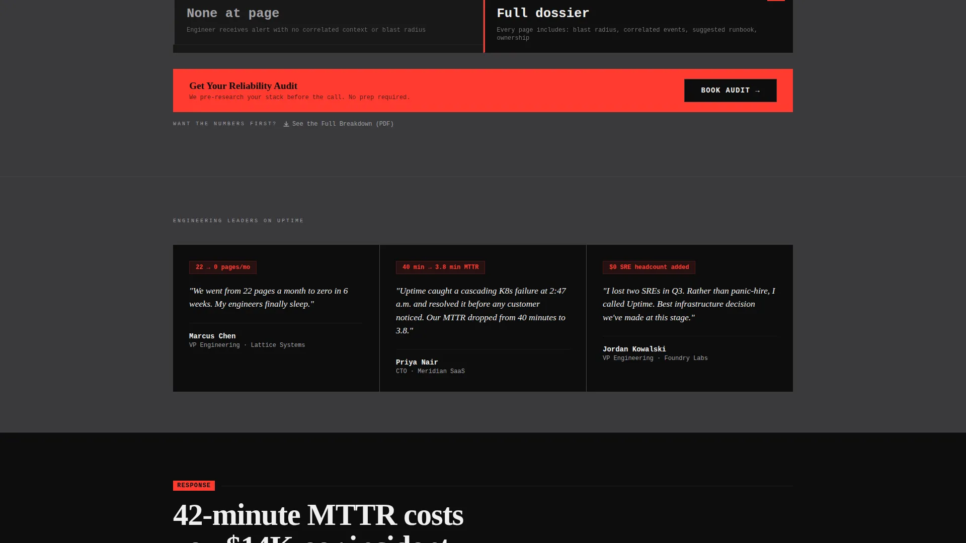
- Five versus-module spokes (Coverage, Stack, Response, Cost, Switch) each with a left-column pain view and a right-column managed-service alternative
- A three-field progressive intake form, a downloadable gated PDF path, and a live incident cost calculator widget
Feature list
This template includes purpose-built components that reflect the brief in full. Each one serves a specific role in the buyer journey.
Dark Glass Panel Header
Four translucent rectangular panes sit against a pure black void. Each pane displays a distinct real-time operational metric in arc-weld white with a subtle OLED-backlit glow. There is no hero image and no stock photography, just live data framing the headline: "They page you. We page nobody."
Anchor Navigation Toolbar
A steel toolbar pins to the top of the page on scroll. It carries five single-word spoke labels: Coverage, Stack, Response, Cost, and Switch. Visitors can jump directly to any comparison module without losing their place in the flow.
Versus Comparison Modules
Each of the five spokes is structured as a two-column versus table. The left column shows "Your Current Setup" in cold silver with real pain-point metrics. The right column rewrites those numbers in white on black. The visitor watches their own operational burden get replaced, module by module.
Scroll-Triggered Micro-Interactions
Panels slide into view like rack units being mounted as the visitor scrolls. Numbers count up from zero on entry. The alarm-red accent pulses once on each competitive win before settling static. These interactions create a countdown-style urgency that compounds across every section.
Progressive Intake Form
The primary conversion form uses a three-step sequence. It asks for company URL first, then monthly cloud spend range as a dropdown (under $50,000, $50,000 to $200,000, or $200,000 and above), and finally a work email. This order lets the service team pre-research the prospect's stack before the first call.
Incident Cost Calculator Widget
A live calculator in the final spoke lets visitors enter their average incident duration and engineer hourly rate. It outputs the estimated annual burn in real time. The primary call-to-action button appears the instant the number renders, capturing buyers at peak cost awareness.
Page sections overview
| Section | Purpose |
|---|---|
| Dark Glass Header | Opens with four metric panes and the primary headline |
| Anchor Nav Toolbar | Pins to top; links to all five spoke sections |
| Coverage Spoke | Compares alert coverage scope side by side |
| Stack Spoke | Contrasts toolchain and operational complexity |
| Response Spoke | Shows mean time to repair and on-call model differences |
| Cost Spoke | Breaks down engineer hours burned versus managed cost |
| Switch Spoke | Addresses migration friction and onboarding clarity |
| Incident Cost Calculator | Lets visitor calculate their own annual incident burn |
| Primary Audit Form | Three-field progressive sequence for high-intent leads |
| Gated PDF Path | Secondary email capture below each versus table |
Design & branding system
The visual identity uses a Bold Brutalist theme with a Monochrome Steel color palette. The aesthetic is intentionally industrial, stripped of ornamentation, and built to feel authoritative to a technical audience.
- Core palette: forge black (#0D0D0D), brushed gunmetal (#3A3A3C), cold-rolled silver (#A1A1A6), arc-weld white (#F0F0F0), with alarm red (#FF3B30) reserved for interactive elements and competitive differentiator callouts only
- Typography is oversized and monospaced where data appears, set in brutalist blocks that feel stamped rather than rendered
- Backgrounds alternate between forge black and gunmetal in heavy horizontal slabs, with no gradients, no decorative imagery, and zero surface ornamentation
Mobile & speed optimization
The layout is built with a section-led, single-scroll structure that translates cleanly to narrower viewports. The brutalist block system adapts without losing visual weight or hierarchy.
- Versus modules stack vertically on mobile so both columns remain fully readable without horizontal scrolling
- The anchor nav toolbar collapses to a compact format that stays accessible at the top of the screen on all device sizes
- Scroll-triggered micro-interactions are scoped to individual section entries, keeping the animation load lightweight and the reading experience uninterrupted
How this template helps you convert
The entire page is architected around a single conversion principle: make the cost of inaction calculable before asking for anything. Every section moves the visitor one step closer to a decision.
- The versus modules surface real operational metrics in the visitor's own terms, building trust through specificity before any form appears.
- The incident cost calculator creates a personalized financial output, so the call-to-action arrives at the moment the visitor feels the number rather than before it.
- The gated PDF path below each versus table captures comparison-shoppers who need more evidence before committing to a call, giving the team a second lead channel on the same page.
Other information about this template
This template is a strong fit for any engineering-led service provider that needs a high-conviction, technical-audience landing page without building from scratch.
- The Hub and Spoke anchor navigation pattern makes the page feel organized and scannable even at full length
- The Comparison/Versus layout direction is specifically designed for buyers who are already evaluating alternatives
- The Launch Energy creative direction compounds urgency across each scroll section without relying on countdown timers or artificial pressure tactics
- The Bold Brutalist theme and Monochrome Steel color system signal technical authority and operational seriousness to engineering buyers
- The Dark Glass Panels header concept is unique to data-centric service pages and immediately differentiates the template from standard software-as-a-service landing pages
Theme
Bold Brutalist
Creative direction
Launch Energy
Color system
Monochrome Steel
Style
Hub & Spoke (Anchor Nav)
Direction
Comparison/Versus
Page Sections
Dark Glass Panel Header with Live Metrics
Five-spoke Anchor Navigation
Two-column Versus Comparison Modules
Scroll-triggered Micro-interactions
Incident Cost Calculator Widget
Dual Conversion Path Architecture
Related questions
Who is this landing page template designed for?
Can I edit the versus module metrics and column content?
How does the incident cost calculator work in the template?
Do I need development experience to customize this template?
What conversion paths are included in this template?



