Status Page Landing Page Template for Engineering Teams
Uptime is a scroll-reveal status page landing page template built for engineering teams who need a public-facing, real-time service dashboard. Its live interactive header, animated incident timelines, and Problem-to-Solution visual arc give buyers an immediate sense of what a polished, trustworthy status page actually looks and feels like.
by Rocket studio
Quick summary
Uptime is a single-page, scroll-reveal landing page template designed for teams building a public system status page. It opens with a fully animated, interactive mock dashboard and unspools a Problem-to-Solution narrative across every scroll reveal. The dark iridescent visual identity feels like a mission-control terminal, and every section pushes visitors toward a free-tier signup.
Who this template is for
This template is built for the engineering and operations professionals who own uptime as a core responsibility. It speaks their language visually and structurally, and it gives them a credible, branded surface to share with the rest of the organization.
- Site Reliability Engineering leads who monitor services around the clock and need a single source of truth for the entire team
- VP of Engineering teams who want a public status page that reflects well on the brand during an incident
- DevOps squads coordinating multiple monitoring and alerting tools into one coherent, customer-facing story
What problem this template solves
Without a dedicated status page, incident communication lives in scattered Slack threads, forwarded alert emails, and reactive support tickets. Customers and internal stakeholders have no reliable place to look. This template solves the presentation problem: it shows potential buyers exactly what a professional, real-time status page looks like and builds the case for having one.
- The chaotic-to-calm scroll arc shows the cost of having no single monitoring surface before demonstrating the solution
- Teams waste trust and time repeating incident updates manually across multiple channels with no structured page in place
- A poorly designed or absent status page makes even minor incidents look catastrophic to customers watching from outside
What you get with this template
You get a fully designed, animation-ready landing page that demonstrates a system status page platform from the first pixel to the final call to action. Every section is purpose-built to move a skeptical engineering leader from awareness to signup.
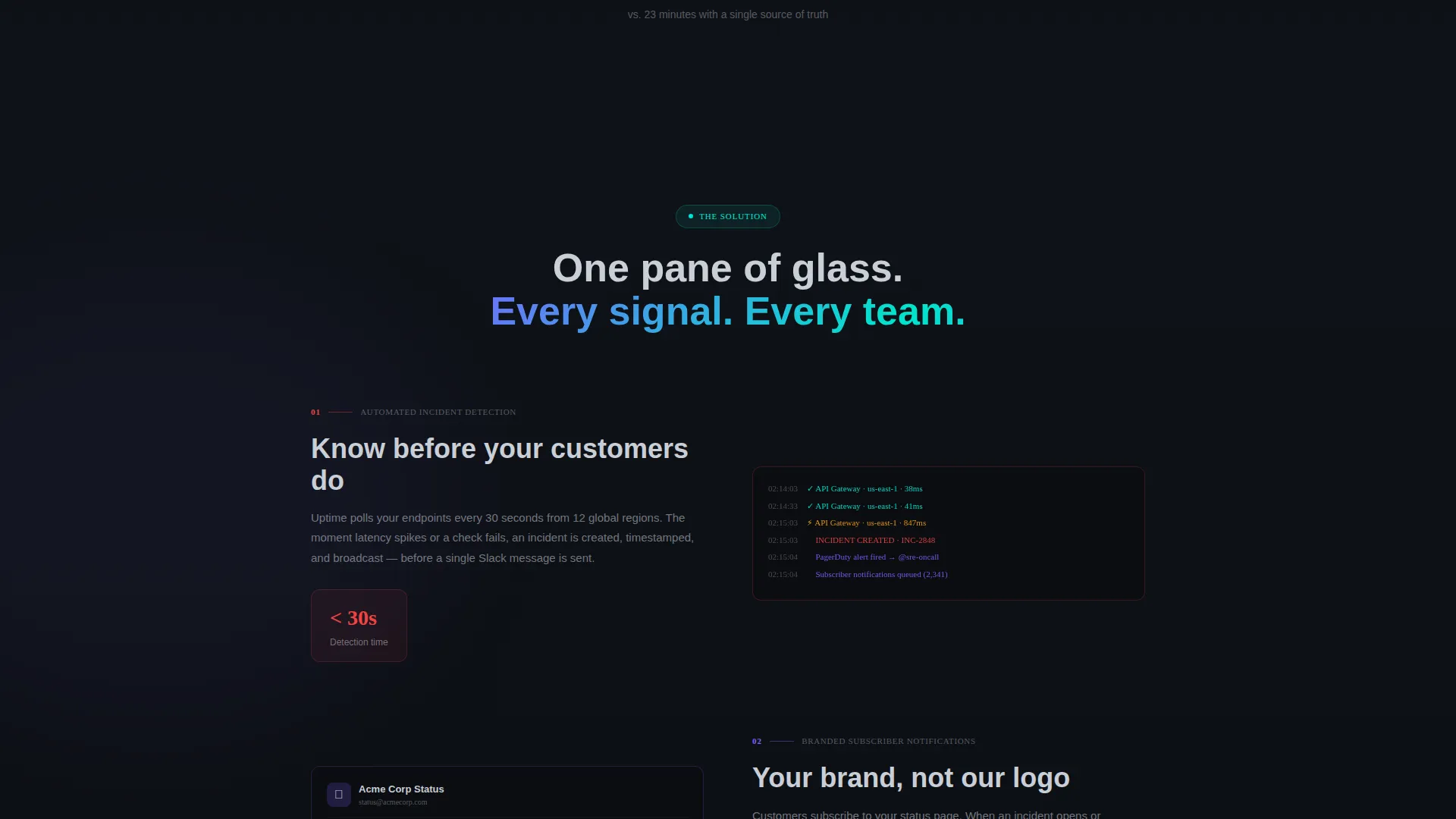
- An interactive mock dashboard in the header that runs live service-state animations, latency sparklines, and an expandable incident postmortem timeline
- A scroll-reveal Problem-to-Solution arc that progressively strips away monitoring chaos and replaces it with clean user interface panels section by section
- A conversion-focused call to action structure with a ghost button that solidifies into a primary action button only after the narrative arc resolves
Feature list
This section covers the core capabilities designed into the Uptime template. Each feature reflects a specific, prompt-stated design or functional decision.
Live Interactive Header Dashboard
The header is not a static screenshot. It renders a fully functional mock status dashboard in the browser, with five service rows pulsing green and one flickering to degraded amber in real time. Visitors can hover component rows to see tooltip details and click an incident bar to expand a mock postmortem timeline.
Scroll-Reveal Problem-to-Solution Arc
Each scroll step reveals a new layer of the narrative. The sequence opens with a chaotic wall of disconnected alerts and Slack threads, then progressively replaces each element with a clean user interface panel: automated incident detection, subscriber notifications, historical uptime graphs, and integration cards snapping into place. The arc resolves when the visitor arrives at a fully assembled status page identical to the header preview.
Animated Latency Sparklines
Real-time latency sparklines animate inside the header preview and within relevant scroll-reveal panels. These small, high-signal charts communicate service health at a glance without requiring the visitor to read a single data label.
Holographic call to action Progression
The primary call to action, "Launch Your Status Page," begins as a ghost button inside the header preview. It solidifies into a full holographic-violet button only after the final scroll reveal completes, earning the click after the full narrative has landed. A secondary "See a live example" text link opens a demo status page in a new tab.
Third-Party Integration Cards
Scroll-reveal panels include integration cards that snap into place like puzzle pieces as the visitor scrolls. These visual elements communicate platform compatibility and breadth of tooling without requiring a separate features page.
AI Iridescent Color System
The template uses a four-token color system: void black as the primary canvas, holographic violet for live-state accents and hover glows, signal cyan for operational and success indicators, and soft chromium for secondary text and divider lines. The palette is calibrated for extended dark-screen viewing during incidents.
Page sections overview
| Section | Purpose |
|---|---|
| Interactive Header Dashboard | Demonstrates live service-state with animated rows, sparklines, and expandable incident timeline |
| Chaos Reveal Panel | Opens the Problem arc with a wall of disconnected alerts, Slack threads, and customer complaints |
| Incident Detection Panel | First Solution reveal showing automated incident detection replacing manual alert triage |
| Subscriber Notifications Panel | Demonstrates branded subscriber notification flow stripped in as chaos clears |
| Historical Uptime Graphs | Scroll-reveal panel showing long-term reliability data as a trust signal |
| Integration Cards Panel | Third-party tool cards snapping into place to communicate platform breadth |
| Assembled Status Page | Final reveal matching the header preview, showing the fully resolved solution |
| Primary call to action Section | Solidified holographic-violet signup button with secondary demo link |
Design & branding system
The visual identity follows the Dashboard Pro theme executed through an AI Iridescent color system. The palette is built for dark-environment readability and carries a mission-control aesthetic that feels purposeful rather than decorative.
- Void black (#0B0D11) forms the primary canvas, signal cyan (#00E5CC) marks operational success states, holographic violet (#7B61FF) drives hover glows and live-state accents, and soft chromium (#C9CED6) handles secondary text and divider lines
- Hover interactions include component-row tooltip glows and incident-bar expansion, keeping the interface feel tactile and responsive
- The overall visual language is described in the brief as a mission-control terminal reflected in polished obsidian: dark enough for incident work, iridescent enough to feel modern
Mobile & speed optimization
The scroll-reveal structure is designed to deliver a coherent, progressive narrative regardless of screen size. The animation sequence and interactive elements are built to function across device contexts.
- Scroll-reveal transitions are sequenced so each panel enters cleanly without requiring a wide viewport to read correctly
- The interactive header dashboard and latency sparklines are designed to remain legible and functional at smaller display widths
- call to action elements, including the ghost button and the solidified primary button, are sized and positioned for easy interaction on touch screens
How this template helps you convert
Every structural and visual decision in this template points toward one outcome: getting a qualified engineering leader to click "Launch Your Status Page" and begin a signup flow.
- The live interactive header creates immediate proof of concept. Visitors see a working status dashboard before reading a word of copy, which builds product confidence faster than any written claim could.
- The Problem-to-Solution scroll arc creates narrative tension and resolution. By the time the primary call to action solidifies into a full holographic-violet button, the visitor has already watched the solution assemble itself in front of them.
- The secondary "See a live example" link reduces hesitation for buyers who need external proof before committing, giving cautious visitors a low-friction off-ramp that keeps them engaged with the product.
Other information about this template
This template sits in the Documentation and Support category under the System Status Page niche, with a Changelog and Release Notes subcategory context. It is well suited for teams already evaluating dedicated status page platforms as part of a broader observability stack.
- The template style is Scroll Reveal (Progressive), meaning each section enters the viewport as the user scrolls rather than loading all at once
- The landing page direction is Click-Through, meaning the primary goal is driving visitors into the next step of a signup or trial flow rather than capturing a lead form on the same page
- The header concept is Interactive Preview, a design pattern where the product demonstrates itself through a live, in-browser mock rather than a static image or video
- The theme is Dashboard Pro, which informs the grid density, data-display conventions, and overall user interface component style used throughout the page


Theme
Dashboard Pro
Creative direction
Problem→Solution Arc
Color system
AI Iridescent
Style
Scroll Reveal (Progressive)
Direction
Click-Through
Page Sections
Live Interactive Header Dashboard
Scroll-reveal Problem-to-solution Arc
Animated Latency Sparklines
Holographic Call to Action Progression
Third-party Integration Cards
AI Iridescent Color System
Related questions
What kind of team is this template built for?
Is the header dashboard actually interactive?
How does the scroll-reveal arc work?
What is the primary call to action in this template?
Can I update the color system to match my own brand?


