AI-Powered Enterprise Software Cost Calculator Website Template
Uptime is a hub-and-spoke landing page template built for AI-powered enterprise asset management platforms. It uses a dark control-room aesthetic, stat-first scroll rhythm, and head-to-head comparison grids to convert reliability engineers and plant directors. The anchor navigation, benchmark calculator call to action, and interstitial data callouts make the case before a visitor ever fills out a form.
by Rocket studio
Quick summary
Uptime is a single-page, anchor-navigation landing page template designed for AI-powered predictive maintenance platforms. It opens with a full-bleed void header and one glowing chartreuse stat, then walks visitors through spoke sections comparing legacy tools against AI-driven asset management. The layout is built to earn trust through numbers before it ever asks for contact details.
Who this template is for
This template is made for enterprise software teams that need to close deals with industrial buyers who live in data. It speaks directly to people who evaluate tools based on hard metrics, not marketing language.
- Reliability engineers managing dense work order queues at mid-market manufacturers
- Plant directors defending large maintenance budgets to executive leadership
- Operations vice presidents who have outgrown spreadsheet-driven preventive maintenance schedules
What problem this template solves
Legacy enterprise asset management (EAM) tools require months of implementation and still leave facilities reacting to failures after the fact. AI-powered predictive maintenance platforms need a landing page that communicates speed, accuracy, and cost savings without burying the proof in paragraphs.
- Visitors leave before trusting the platform because proof arrives too late in the scroll
- Comparison against familiar legacy tools is missing, so buyers cannot see the gap clearly
- There is no structured path from curiosity to a personalized savings calculation
What you get with this template
You get a fully structured, single-page hub-and-spoke layout with a pinned anchor navigation rail and five spoke sections. Each section leads with a comparison grid, and interstitial stat callouts keep the scroll momentum alive between sections.
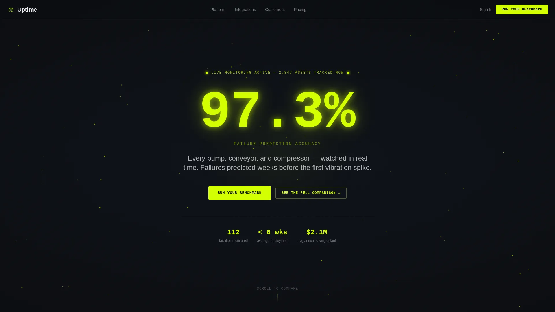
- A dark full-bleed header with a pulsing chartreuse stat, animated particle mesh background, and a single tagline in phosphor white
- Five anchor-linked spoke sections covering CMMS, Predictive Analytics, Work Order Management, Inventory, and Integrations
- A primary benchmark calculator call to action block and a secondary sticky call to action linking to a gated comparison PDF
Feature list
This section covers the core layout and interaction components built into the Uptime template.
Pinned Anchor Navigation Rail
A horizontal spoke rail pins to the top of the page as the visitor scrolls. Each label maps directly to a competitor-familiar category, making it easy for industrial buyers to jump to the section most relevant to their current tool stack.
Head-to-Head Comparison Grids
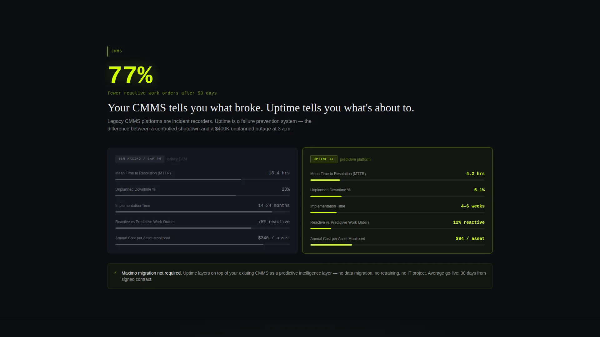
Every spoke section opens with a side-by-side comparison grid. The legacy EAM tool appears on the left in muted slate. The AI platform appears on the right in electric chartreuse. Metrics like mean-time-to-resolution, unplanned downtime percentage, and implementation weeks stack vertically so the performance gap is immediately visible.
Interstitial Stat Callouts
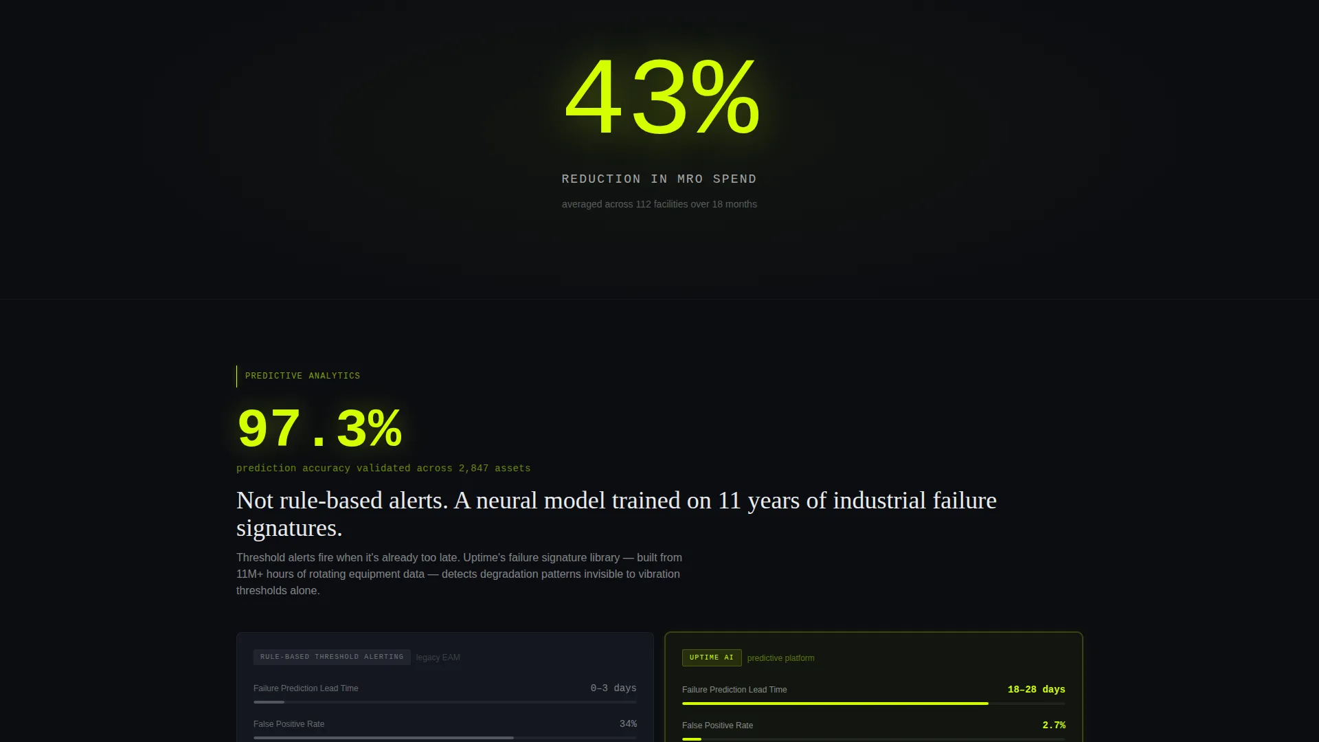
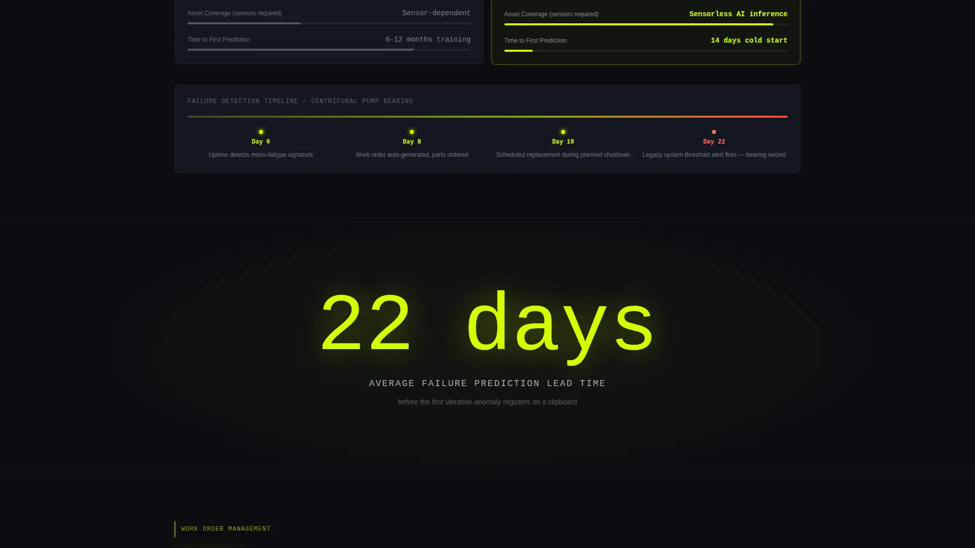
Between each comparison section, a full-width interstitial block displays a single hard number in oversized type. These callouts act as visual palate cleansers and keep the scroll rhythm punchy without requiring the visitor to read dense copy.
Benchmark Calculator call to action Block
After the third spoke section, a dedicated block invites the visitor to enter their current tool name, facility count, and annual maintenance spend. The template is structured so the platform can return a personalized savings projection, making the value case feel specific rather than generic.
Dark Control-Room Header
The header is a full-bleed void with one massive stat centered in neon chartreuse mono type. A soft neon bloom pulses outward from the number. An animated particle mesh drifts behind it to suggest a live data environment. No hero images or stock photography are used anywhere on the page.
Sticky Secondary call to action
A secondary call-to-action lives persistently inside the anchor navigation bar. It reads "See the Full Comparison" and links to a gated PDF, giving the platform a lead-capture mechanism that does not interrupt the main scroll flow.
Page sections overview
| Section | Purpose |
|---|---|
| Dark Header Block | Anchors visitor with a single glowing accuracy stat and tagline |
| Anchor Navigation Rail | Pins category spokes to the top for instant section access |
| CMMS Comparison Spoke | Compares legacy CMMS metrics against AI platform metrics |
| Predictive Analytics Spoke | Shows failure-prediction lead time and accuracy differentials |
| Work Order Management Spoke | Contrasts manual work order volume with automated resolution rates |
| Inventory Spoke | Highlights MRO spend reduction data against legacy inventory tools |
| Integrations Spoke | Demonstrates connection breadth versus typical EAM integration timelines |
| Stat Interstitials | Delivers single-number proof points between each spoke section |
| Benchmark Calculator call to action | Captures facility data to return a personalized savings projection |
| Gated PDF Sticky call to action | Drives secondary lead capture via a persistent anchor nav button |
Design & branding system
The Uptime template runs an Acid Digital color system on a Startup Velocity visual theme. Every color choice reinforces the feeling of stepping into a live industrial monitoring environment at peak alertness.
- Void black (#0B0D11) dominates the background, making every lit element feel urgent and precise
- Electric chartreuse (#D4FF00) is reserved for all metrics, calls-to-action, and glow accents so the eye always lands on what matters most
- Cold slate (#1A1E2A) surfaces card backgrounds and section dividers, while phosphor white (#E8EAED) carries all body text for clean legibility against the dark field
Mobile & speed optimization
The template is structured for a Stats-First Impact creative direction, which naturally supports a lean, content-forward layout. Heavy visual assets are avoided by design.
- No hero images or stock photography means the page loads visual weight only through typography, color, and the animated particle mesh
- The pinned anchor navigation and interstitial stat blocks are built as lightweight layout components, keeping the scroll experience tight on smaller screens
- Comparison grids use a vertical stacking structure that adapts cleanly to narrow viewports without losing the side-by-side data contrast
How this template helps you convert
The Uptime template is built around Comparison/Versus conversion logic. Every layout decision earns trust before asking for commitment.
- The header stat lands the accuracy claim immediately, so the visitor's first impression is a number rather than a brand promise, reducing skepticism from the first scroll
- The spoke comparison grids make the performance gap between legacy tools and the AI platform visceral and self-evident, lowering the buyer's need to seek validation elsewhere
- The benchmark calculator call to action arrives after three sections of proof, meaning the visitor has already internalized the value case and is primed to input real data for a personalized result
Other information about this template
This template is designed to work for teams that sell into industrial and manufacturing environments where buyers are skeptical of software marketing and respond to operational data.
- The layout follows a Stats-First Impact creative direction, meaning every scroll stop opens with a hard number before any supporting explanation arrives
- The hub-and-spoke anchor navigation is labeled with categories that mirror the language legacy EAM and CMMS buyers already use, reducing friction for technical evaluators
- The page is a single-page landing page structure, not a multi-page website, so all conversion paths exist within one continuous scroll session
Theme
Startup Velocity
Creative direction
Stats-First Impact
Color system
Acid Digital
Style
Hub & Spoke (Anchor Nav)
Direction
Comparison/Versus
Page Sections
Pinned Anchor Navigation Rail
Head-to-head Comparison Grids
Interstitial Stat Callouts
Benchmark Calculator Call to Action Block
Dark Control-room Header
Sticky Secondary Call to Action
Related questions
What type of buyer is this template designed for?
Can I adapt the comparison grids for my own platform's metrics?
What does the benchmark calculator call to action collect from the visitor?
Does the template include the animated particle mesh in the header?
Is this a single-page layout or a multi-page website structure?



