Proactive Managed IT Maintenance Landing Page Template
The Uptime landing page template is built for managed IT service providers who need to turn overwhelmed decision-makers into booked leads. A dark NOC-style design, scroll-reveal animations, a live-metrics hero, a progressive comparison table, and a free IT audit form combine to make uptime a clear business argument, not just a technical talking point.
by Rocket studio
Quick summary
Uptime is a single-page, scroll-reveal landing page template for proactive managed IT maintenance providers. It opens with a pixel-perfect isometric dashboard screenshot, builds tension through an animated Problem-to-Solution arc, and converts visitors with a progressive Break-Fix versus Managed Maintenance comparison table and a prominent free IT audit form. Every section loads with purpose, stripping chaos away layer by layer.
Who this template is for
This template is designed for B2B IT service providers who sell proactive managed maintenance to small and mid-sized businesses. It speaks directly to the people sitting on both sides of the problem, the ones experiencing the pain and the ones selling the cure.
- CTOs and operations directors juggling legacy systems, 2 AM Slack alerts, and looming migration deadlines
- Office managers dealing with broken printer fleets, expired licenses, and reactive chaos they cannot diagnose alone
- Managed service providers (MSPs) who need a landing page that converts tech-skeptical buyers into booked consultations
What problem this template solves
Most IT service landing pages read like product spec sheets. They list features without acknowledging that the reader just got woken up by a server alert they cannot decode. This template leads with empathy before offering solutions, which is exactly the sequence that earns trust from busy, stressed decision-makers.
- Decision-makers cannot easily translate IT jargon into board-level business outcomes, so they stall before buying
- Break-fix IT relationships leave companies reactive and exposed, but most landing pages never contrast this clearly enough to create urgency
- Disorganized landing pages with too many navigation paths confuse users and scatter attention away from the single conversion goal
What you get with this template
You get a fully structured, single-page scroll-reveal layout purpose-built for IT maintenance sales. The template ships with every section pre-planned, pre-styled, and pre-sequenced so you can present your service with confidence from the first pixel to the final call to action (call to action).
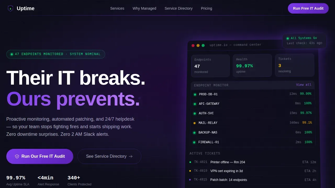
- A hero section with an isometric product screenshot, live status metrics, and the headline "Their IT breaks. Ours prevents."
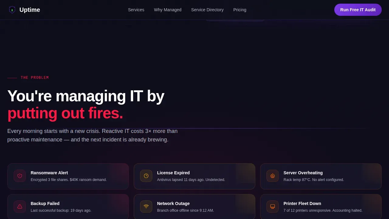
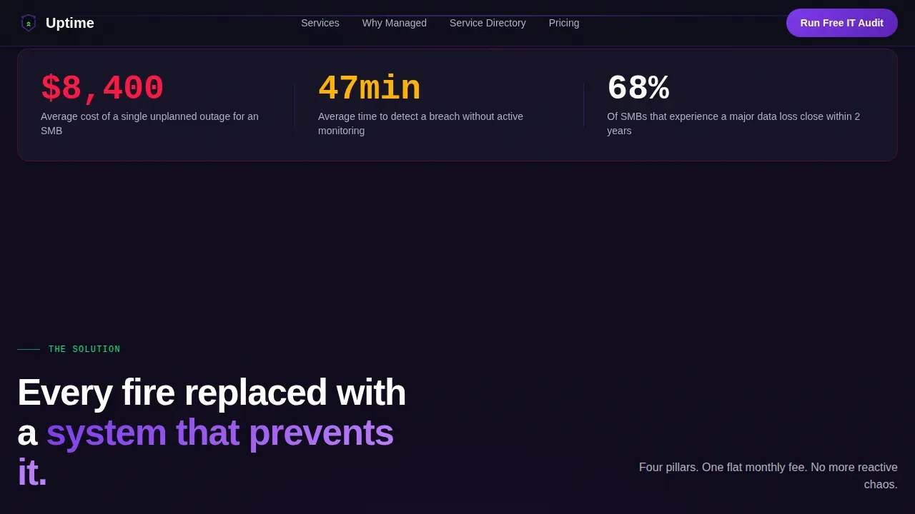
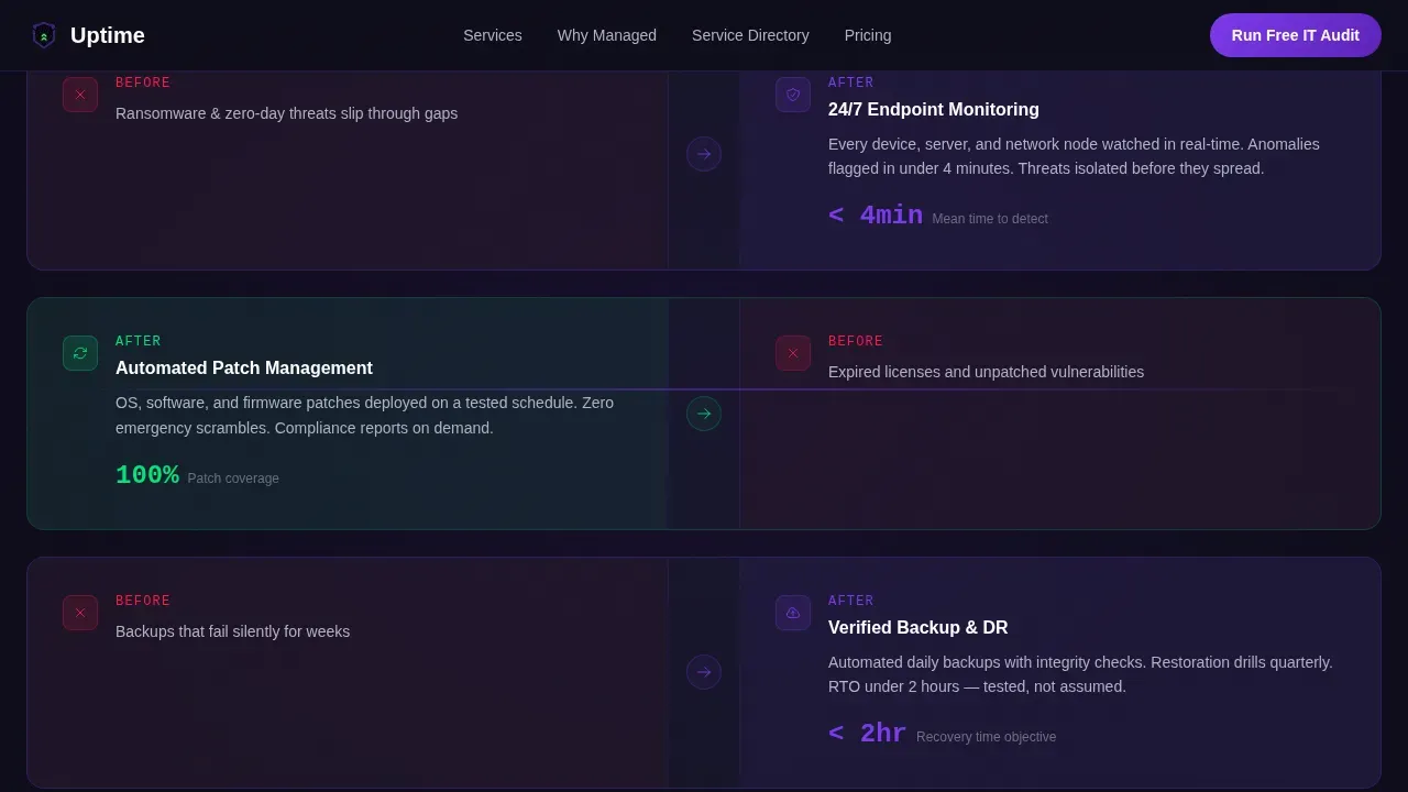
- An animated Problem-to-Solution arc that cascades disaster icons before resolving them into four managed service pillars: monitoring, patching, backup, and helpdesk
- A sticky two-column progressive comparison table, a free IT audit form, a searchable service directory link, and a linear single-row footer
Feature list
This section covers the key features built into the Uptime template. Each one is drawn directly from the design brief and serves a specific conversion or communication purpose.
Isometric Hero with Live Status Metrics
The hero section opens with a product screenshot placed on a subtle isometric plane tilted five degrees. It floats above a terminal-black background with a soft indigo glow radiating from behind it. Floating status cards display live-style figures, 47 endpoints monitored, three tickets resolving, system health at 99.97%, making the company's status visible and credible before the visitor reads a single word of body copy.
Animated Problem-to-Solution Arc
The scroll-reveal arc is the emotional engine of the page. As the visitor scrolls, animated icons of IT disasters cascade in: ransomware alerts, expired licenses, a server rack thermometer climbing toward red. Each subsequent reveal strips one layer of chaos away, replacing it with a corresponding managed service. The sequence feels like watching a messy desk get organized in time-lapse, building tension, then releasing it with calm, indigo-toned solutions.
Progressive Comparison Table
A sticky two-column table contrasts Break-Fix IT against Managed Maintenance across four dimensions: response time, monthly cost predictability, downtime hours, and security posture. Each row animates into view as the visitor scrolls to it, using GSAP ScrollTrigger stagger effects. This layout gives tech-savvy buyers and non-technical decision-makers alike the side-by-side clarity they need to make informed decisions without additional research.
Free IT Audit Conversion Form
Positioned immediately after the comparison table, when conviction is highest, the audit form asks for three inputs: company name, number of employees, and the visitor's biggest current IT headache as a free-text field. The form is the primary call to action and keeps friction low while collecting enough context for a meaningful first sales conversation.
Service Directory Navigation Path
A secondary navigation path labeled "See the Full Service Directory" lives in the nav bar for visitors who are still in discovery mode. Below the fold, an indexed, searchable service catalog allows users to explore the full range of offerings at their own pace. This dual-path structure respects different buying stages without pulling attention away from the primary conversion goal.
GSAP Scroll-Reveal Animation System
Every section of the page is governed by GSAP ScrollTrigger animations, counter animations on metrics, stagger reveals on service icons, cascade effects on the disaster sequence, and progressive row reveals in the comparison table. The animation system keeps the experience dynamic and engaging without sacrificing page clarity or overwhelming the visitor with motion.
Page sections overview
| Section | Purpose |
|---|---|
| Hero with Screenshot | Establish credibility with live-status metrics and bold headline |
| Pain Point Section | Surface real IT frustrations to create emotional resonance |
| Solution Arc Strip | Replace each problem with its managed service counterpart |
| Comparison Table | Contrast Break-Fix versus Managed Maintenance row by row |
| IT Audit Form | Capture qualified leads at peak conviction |
| Service Directory Link | Guide discovery-mode visitors to full catalog |
| Single-Row Footer | Close the page cleanly with minimal distraction |
Design & branding system
The visual identity follows a Directory and Discovery theme rendered through an Electric Indigo color system. The aesthetic evokes a network operations center (NOC) at midnight, rows of monitors casting violet light across a dark room, green status dots pulsing steadily across a topology map.
- Color palette: deep terminal black (#0D0D1A) for backgrounds, charged indigo (#4B0082) and live-wire violet (#7C3AED) for structural elements, status-green (#00E676) for uptime indicators, and cool interface gray (#B0B3C1) for body text
- Typography: DM Sans for headlines and section titles, JetBrains Mono for metrics, code-style data points, and status readouts, a pairing that balances approachability with technical authority
- Layout style: minimalist and focused, reducing visual noise so that critical information reads clearly during high-stakes decision moments, a visually appealing design that never clutters the message
Mobile & speed optimization
The template is designed desktop-first, which reflects the NOC and CTO audience that typically evaluates IT services from a workstation or laptop. The layout is responsive and adapts cleanly for mobile viewports without losing the visual hierarchy or animation intent.
- GSAP ScrollTrigger animations are scoped to Client Components, while static sections use Server Components to keep initial load lean and efficient
- The minimalist design philosophy reduces unnecessary assets and distractions, keeping the visitor focused on the status page content and the primary conversion path
- The isometric hero image and scroll-reveal structure are built to support fast progressive rendering so the page feels immediate even before animations initialize
How this template helps you convert
This template is engineered around a single business goal: turn an overwhelmed IT decision-maker into a qualified lead. Every design and structural choice serves that outcome. Proactive maintenance is a strategic investment to prevent revenue loss, and this page makes that argument visually and sequentially before asking for anything.
- The Problem-to-Solution arc builds emotional tension and then resolves it, so the visitor feels relief rather than pressure by the time they reach the comparison table, mimicking the experience of a system coming back online after an outage
- The progressive comparison table delivers the rational business case row by row, giving the visitor time to absorb each contrast between reactive break-fix IT and proactive managed maintenance before the next point lands
- The free IT audit form arrives exactly when conviction peaks, after the emotional arc and the rational comparison, asking for minimal input while signaling that the next step is low-risk and high-value
Other information about this template
This template is the uptime proactive managed it maintenance landing page template built for IT service providers who need to speak plainly to decision-makers at every level of technical fluency. It is grounded in the principle that uptime is a profit-driver, not just a technical metric, and the page design communicates that without requiring the visitor to decode jargon.
- The status page concept is central to this template's communication model. A good status page provides real-time updates on system status, communicates downtime transparently, and keeps users informed without requiring them to contact the support team. This template structures its hero metrics section to function as a public-facing status display that informs users about current performance and operational status at a glance.
- A comprehensive status page within an IT services context should communicate service status clearly, surface historical data about uptime, and use proactive notifications to manage user expectations before problems escalate. This template's hero and solution arc together deliver that comprehensive status narrative in visual form.
- Status page design best practices call for clear information hierarchy, subscription options for status updates, and open communication about service disruptions. This template's layout respects those principles by surfacing critical information at the top, keeping status updates visible, and offering communication channels through the audit form and service directory.
- A good status page is also visually appealing and user friendly, it does not confuse users with technical language they cannot act on. This template uses plain-language section headers and a user friendly interface that translates system performance data into business-outcome language that resonates with non-technical buyers.
- Hosted status pages and private status pages serve internal stakeholders and external audiences differently. This template's dual navigation path, a public status page view in the hero and a searchable private catalog below the fold, allows the provider to serve both potential customers and existing clients from a single page.
- Website monitoring indicators, detailed system metrics, and historical data about uptime are surfaced in the hero screenshot and live metric cards. These elements provide a comprehensive view of the company's status and give visitors the valuable insights they need to assess service quality before reaching out.
- The comparison table touches on service level agreement implications by contrasting response time, predictability, and security posture between break-fix and managed models. This gives internal stakeholders and budget holders the detailed information they need to justify the switch.
- Uptime robot is one of the well-known tools in the website monitoring space that IT teams reference when evaluating monitoring capabilities. This template provides a design language and page structure compatible with teams already familiar with monitoring dashboards and topology maps, making the visual vocabulary immediately recognizable for tech savvy buyers.
- A good status page reduces the volume of support tickets by allowing users to self-serve information about system issues. This template's service directory section provides support resources and allows users to explore detailed information before submitting a request, lowering pressure on the support staff from day one.
- For online businesses and online services that depend on continuous uptime across various systems and multiple locations, the financial stakes of downtime are real. The average cost of IT downtime exceeds $5,600 per minute. A 1% improvement in uptime can boost revenue by 7%. This template positions proactive maintenance as a response to those numbers, not a luxury, but a sound business decision.
- Proactive notifications and email notifications are referenced in the template's call to action structure. Visitors who complete the audit form enter a communication flow, while social media accounts are referenced as supplemental channels for status updates during scheduled maintenance windows.
- Custom status pages built with strong brand identity and clear status page design principles improve customer experience and drive customer satisfaction. This template gives providers a brand-coherent, visually precise foundation to build their own set of service communications on, without starting from scratch.
- Continuous improvement is built into the template's tone. Each scroll reveal strips away a layer of IT chaos and replaces it with a calmer, more controlled managed service, a visual metaphor for the ongoing, iterative nature of good proactive IT maintenance.
Theme
Directory & Discovery
Creative direction
Problem→Solution Arc
Color system
Electric Indigo
Style
Scroll Reveal (Progressive)
Direction
Comparison/Versus
Page Sections
Isometric Hero with Live Status Metrics
Animated Problem-to-solution Arc
Progressive Comparison Table
Free IT Audit Conversion Form
Dual-path Service Directory
GSAP Scroll-reveal Animation System
Related questions
What types of IT service businesses is this template best suited for?
Does this template include animations and interactive components?
Can I customize the color palette and typography to match my brand?
What is included in the conversion form section?
Is this template designed for desktop or mobile use?



