SaaS Availability Intelligence Landing Page Template
The Uptime Real SaaS Availability Intelligence Landing Page Template is a bento grid landing page built for B2B data platforms that expose the true reliability records of major SaaS vendors. It combines a classified-dossier visual identity with interactive comparison tools, a scrollable incident timeline, and a gated report download to convert CTOs, DevOps leads, and procurement teams into qualified leads.
by Rocket studio
Quick summary
This landing page template gives SaaS intelligence platforms a high-impact, data-first canvas. Built on a bento grid layout with a Tech Glass visual identity, it turns raw availability records into a compelling narrative. Visitors arrive at a void-black hero dominated by a live uptime score, then scroll through glass-panel comparison cards, an interactive incident timeline, and a gated full-report download.
Who this template is for
This template is designed for B2B data and analytics publishers whose value proposition rests on independent, third-party evidence. It suits any team building a SaaS intelligence platform, uptime tracking service, or reliability benchmarking product. The target audience includes founders, product marketers, and developers who need a landing page that communicates authority before a single word is read.
- CTOs and VP Engineering teams evaluating vendor SLAs before signing six-figure contracts
- DevOps leads who need third-party evidence for incident post-mortems and team collaboration reviews
- Procurement teams looking for data to renegotiate renewal terms with underperforming vendors
What problem this template solves
Enterprise buyers cannot trust vendor-published status pages at face value. Public status pages are curated, not comprehensive. They often omit the outages that users actually felt, leaving CTOs and procurement teams without solid evidence during negotiations. A clear value proposition requires clear data, and this template is built to deliver that immediately.
- Vendors control their own status page narratives, hiding degraded periods behind vague "investigating" labels
- Buyers lack a structured, third-party source of historical uptime data to challenge SLA claims
- Most uptime reporting sites fail to present data in a way that feels credible or premium enough for enterprise-level decisions
What you get with this template
You get a fully structured, single-page bento grid landing page with every section pre-built and ready to populate with your platform's real data. The layout is designed to guide visitors through escalating layers of evidence, from a hero stat to deep comparison data, without ever feeling like a marketing page. It earns trust section by section.
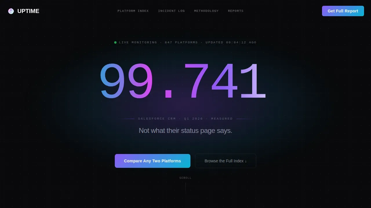
- A void-black hero section with a pulsing radial glow and a large monospaced uptime figure that grabs attention immediately
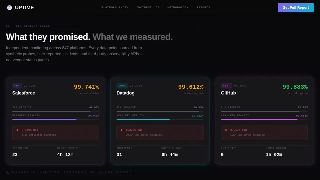
- Three glass-morphism bento comparison cards in the first data row, each contrasting SLA promises against measured reality
- An inline two-platform selector call to action, a full-width horizontal incident timeline, a methodology section with quarterly sparklines, and a gated email capture form
Feature list
This template is defined by the features it puts in front of users. Each section is purpose-built to move a skeptical enterprise buyer from curiosity to trust to action. Below are the key features that make this landing page work.
Void-Black Hero with Live Uptime Score
The hero stretches edge to edge in pure void black, with a soft radial glow pulsing behind the headline. A single monospaced percentage, styled to shimmer with iridescent accents, floats in the center. There is no stock image, no illustration. Just the number and a single line of copy that creates immediate intrigue. This benefit-driven headline approach captures attention faster than any visual demonstration could.
Bento Grid Comparison Cards
The first data row presents three frosted-glass bento cards. Each card shows one recognizable platform's promised SLA versus its measured reality. Glass-morphism borders catch the iridescent violet and cyan accents, giving the cards a sleek design that feels premium without being decorative. This layout lets visitors scan three data points at a glance, delivering tangible benefits before they scroll further.
Inline Two-Platform Selector
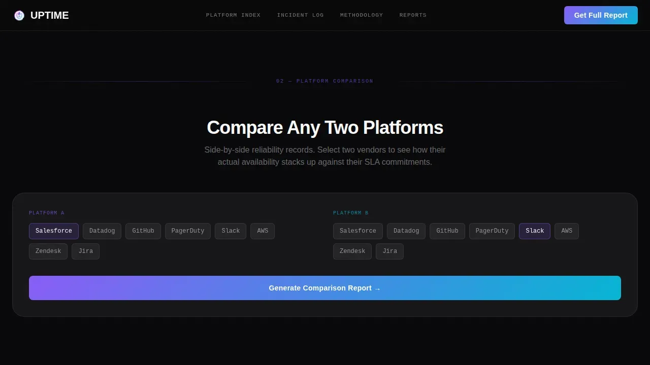
After the first bento row, the primary call to action invites visitors to compare any two platforms. An inline selector renders a side-by-side uptime card in real time. This interactive element is one of the most important features because it lets potential customers generate a personalized insight without leaving the page. It is user friendly, fast, and requires no form fields at this stage, which reduces friction significantly.
Horizontal Scrollable Incident Timeline
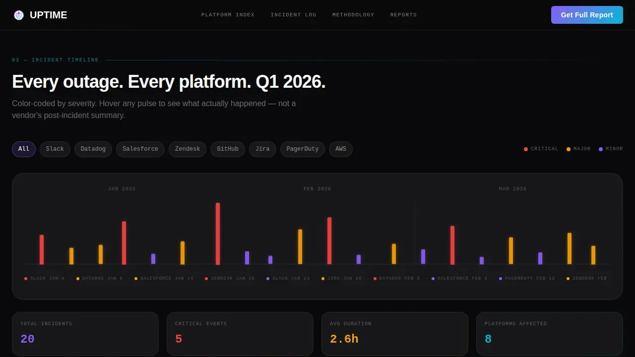
A full-width, horizontally scrollable chart maps outage events as colored pulses on a dark axis. Visitors can filter the timeline by provider. This visual demonstration of historical incidents gives the page its "living archive" character. The chronological structure mirrors the best practices found in effective status page design, where past incident timelines and 90-day uptime percentages prove long-term reliability to prospective customers.
Methodology and Trust Section with Sparklines
Deeper scroll reveals a section dedicated to data sourcing, methodology transparency, and quarterly trend sparklines embedded in each card. This is where users trust the platform most, because the page shows its work rather than asserting credibility. Specificity builds trust in any reporting context, and this section is built entirely around that principle. The social proof here comes from data citations, not customer stories or testimonials.
Gated Report Download with Email Capture
After visitors have scrolled through at least three data sections, a single-field e-mail capture appears and offers the full report as a download. Keeping the form fields minimal reduces friction and improves conversion rates. The gate triggers only after the visitor has already received genuinely useful free data, so by the time the form appears, the exchange feels fair. This approach follows proven lead generation strategies for SaaS platforms targeting enterprise buyers.
Page sections overview
| Section | Purpose |
|---|---|
| Hero Score Panel | Grab attention with a live monospaced uptime figure on a void-black, radial-glow background |
| Bento Comparison Row | Display three glass-card SLA-versus-reality comparisons for recognizable platforms |
| Compare Platform call to action | Provide an inline two-platform selector that renders a real-time side-by-side uptime card |
| Incident Timeline Chart | Show a full-width, horizontally scrollable outage event chart filterable by provider |
| Methodology Trust Section | Present data sources, quarterly sparklines, and transparency details to build credibility |
| Gated Report Download | Trigger a single-field email capture after three scroll-depth sections for report access |
| Footer Row | Deliver a clean linear single-row footer with essential navigation and contact details |
Design & branding system
The design language is Tech Glass with an AI Iridescent color system. The aesthetic feels like a classified analyst dossier rendered in a dim server room. Every surface is dark by default, and color appears only at edges and highlights, making each data point feel deliberate and important. Modern SaaS products require a user interface that feels contemporary and engaging, and this palette delivers exactly that.
- Void black (#09090B) as the dominant background, frosted glass panels at 6% white opacity with backdrop blur for bento cards, iridescent violet (#8B5CF6) and shifting cyan (#06B6D4) as primary accent tones, and aurora pink (#D946EF) reserved for hover states and chart highlights
- JetBrains Mono for all monospaced numerals and data labels, DM Sans for body copy, with crisp zinc white (#FAFAFA) as the primary text color across the entire page
- High-intensity animations including pulsing glow in the hero, iridescent shimmer tracing the uptime digits, scroll-reveal transitions on bento cards, and GPU-accelerated transforms throughout for engaging visuals and strong visual appeal
Mobile & speed optimization
The template is desktop-first by design, reflecting the reality that CTOs reviewing vendor data typically do so on a large screen. However, mobile optimization is built into the layout so the page remains fully usable on tablet and mobile devices. This is consistent with best practices for SaaS landing pages, where a significant portion of visitors may access the site via mobile during or after an incident. The best status pages load fast, work on mobile, and stay available even when core services are degraded.
- Bento grid columns reflow to stacked single-column layouts on smaller screens, keeping all data readable without horizontal overflow
- CSS custom properties handle theming and color transitions, allowing the iridescent accent system to perform well across device types without extra render cost
- The horizontal incident timeline uses scroll-snapping behavior that works on touch devices, preserving the interactive filtering experience on tablet-sized screens
How this template helps you convert
This landing page is built around a Comparison and Versus conversion strategy. The page earns the click by giving away genuinely useful data before asking for anything. This is one of the most effective lead generation strategies for SaaS platforms targeting enterprise buyers, because it builds users trust progressively rather than demanding commitment upfront.
- The hero score and first bento row deliver immediate social proof and a clear value proposition with no gate, encouraging visitors to keep scrolling and engage visitors who are already evaluating competitive data
- The inline two-platform selector drives conversions by giving potential customers a personalized output in seconds, creating a direct, tangible reason to share an e-mail address later in the page
- The gated full-report download appears after the visitor has consumed three sections of free insight, making the single-field form feel like a logical next step rather than an interruption, which measurably improves conversion rates
Other information about this template
This template sits at the intersection of data journalism, enterprise sales enablement, and SaaS intelligence reporting. It is purpose-built for a niche that sits between traditional status page tools and premium analyst platforms. There are several additional details worth knowing before you customize and launch it.
- The page structure supports a custom domain setup, so your uptime intelligence platform can live at a memorable URL that reinforces your brand authority
- The template is built to encourage easy access to data at every scroll depth, ensuring visitors never have to hunt for the insight they came for and maintaining a seamless user experience throughout
- Status pages should be public for customer-facing services and can be private for internal systems or teams. This template handles both contexts. Public status pages benefit from the open comparison cards, while private status pages or internal reporting dashboards can use the gated download section as the primary access point
- The social proof model here differs from traditional SaaS landing pages. Rather than compelling testimonials or customer stories, the credibility layer comes from data citations, incident counts, methodology transparency, and quarterly trend evidence. This is well suited to an audience of technical buyers who are skeptical of subjective endorsements
- Users should be able to subscribe to updates to receive real time updates about any unavailability or important changes. The gated e-mail capture section supports this by collecting contact details that can feed into email platforms for ongoing subscriber communication via RSS feed or digest formats
- The template supports content creation workflows where your team publishes new quarterly reports or incident analyses. The design system is flexible enough to absorb new data cards and sections without breaking the layout
- AI tools and ai agents are increasingly used in uptime monitoring platforms to process large incident datasets. If your platform uses machine learning or artificial intelligence to score availability, the methodology section is the ideal place to surface that detail. The template provides the visual structure; your platform supplies the intelligence
- The bento grid layout is well-suited to saas projects of varying complexity. Whether you are launching a minimum viable version with basic features or a full enterprise intelligence platform, the layout scales by adding or removing bento cards from each row
- The sleek design of this template signals quality immediately. Templates for modern SaaS products should be polished and high-performance to signal quality to users, and this one achieves that without relying on stock imagery or generic hero illustrations
- No-code and low-code users can customize the color tokens and typography variables using CSS custom properties, making the template accessible beyond engineering teams. AI-powered templates can streamline content creation and layout updates for faster iteration, and this template is structured to support that workflow with clearly labeled sections and modular bento blocks
- The faq section included in this page structure helps address potential concerns from enterprise visitors who want more context before committing to a download or a platform selector interaction. It is a user friendly addition that can address common objections about data sourcing, update frequency, and methodology without requiring a support team interaction or a free consultation call
- Effective SaaS website design should guide users through a logical flow from awareness to conversion, and this template does exactly that. It moves visitors from a hero stat, through ungated comparison data, into an interactive tool, then into a gated premium asset, following the most effective patterns seen in high-converting landing page examples across the B2B data and analytics space
- github status is one of the most referenced examples of a well-known public status page. The template's comparison card design can be adapted to include any major platform, including those with well-documented incident histories, making it easy to engage visitors who already have a reference point for what a good or poor status page looks like
- video conferencing platforms are among the most scrutinized in uptime reporting, given how visible their outages are to distributed teams. This template is a strong fit for any intelligence platform that tracks team collaboration or productivity tools, where downtime has direct and measurable business impact
- The template's value proposition extends to any SaaS landing page use case where independent data is the product. If your platform scores, ranks, or benchmarks any category of software service, the bento grid structure and the progressive disclosure model can be adapted with minimal rework to suit your specific niche and target audience
Theme
Tech Glass
Creative direction
Industry Report
Color system
AI Iridescent
Style
Bento Grid
Direction
Comparison/Versus
Page Sections
Void-black Hero with Pulsing Glow
Bento Grid SLA Comparison Cards
Inline Two-platform Comparison Selector
Horizontal Scrollable Incident Timeline
Methodology and Sparkline Trust Section
Scroll-triggered Gated Report Download
Related questions
Can I customize the comparison cards to show different platforms?
How does the scroll-triggered email capture work?
Is this template designed for desktop or mobile use?
Can this template work for a platform that scores uptime using AI?
Does the incident timeline support filtering by provider?



