Site Reliability Engineering Technology Professional Website Template
Uptime is a Bold Brutalist landing page template built for site reliability engineering consulting services. It pairs a live-styled dashboard header with brutalist comparison tables that make reliability gains measurable and undeniable. Designed to convert VP Engineering leads and CTOs at growth-stage startups, the template moves visitors from wall-of-red dashboards to a signed reliability audit conversation.
by Rocket studio
Quick summary
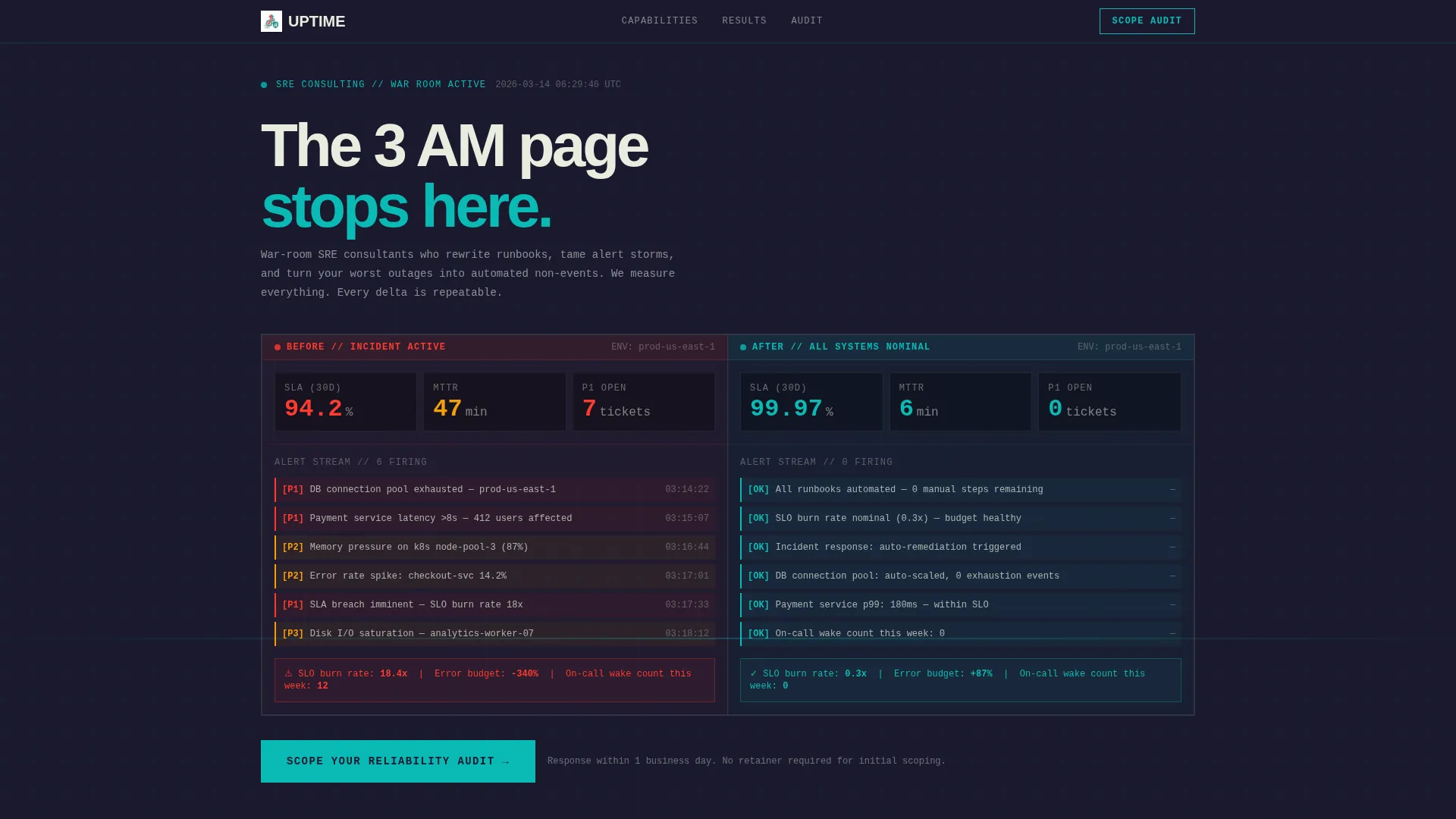
Uptime is a single-page lead generation template for site reliability engineering consulting firms. It opens with a viewport-filling dashboard preview that contrasts a red-alert "Before" state against a teal-lit "After" state. Every scroll section stacks comparison tables that quantify reliability gains, building a data-driven case before asking for a conversation.
Who this template is for
This template is built for engineering consultancies that sell measurable reliability outcomes, not vague promises. It speaks directly to buyers who live in monitoring tools and trust numbers over narrative.
- VP Engineering leads at Series B to Series D startups managing a wall of red alerts
- Platform teams at mid-market SaaS companies buried in toil and escalation volume
- CTOs who have survived a public outage and need to prevent the next board conversation about one
What problem this template solves
Most consulting landing pages describe services in abstract terms. Engineering buyers ignore that. They want proof that the gap between their current state and a calm infrastructure is quantifiable and closeable.
- Visitors cannot quickly see the before-and-after delta that justifies a consulting engagement
- Lead capture forms ask the wrong questions, missing context like cloud provider, team size, and incident volume
- Pages offer no lower-commitment path for buyers who are researching but not yet ready to talk
What you get with this template
You get a fully structured single-page layout that does the selling through data. Every section is designed to stack evidence before the call to action appears.
- A viewport-filling dashboard header showing a "Before" versus "After" state with oversized monospace counters for uptime percentage, mean time to recovery, and error budget
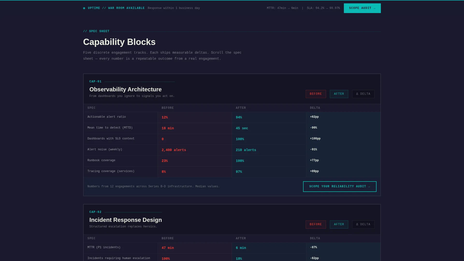
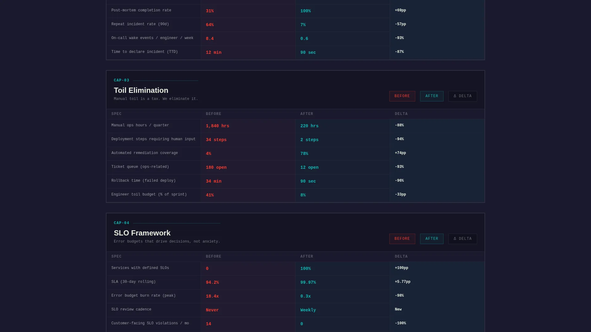
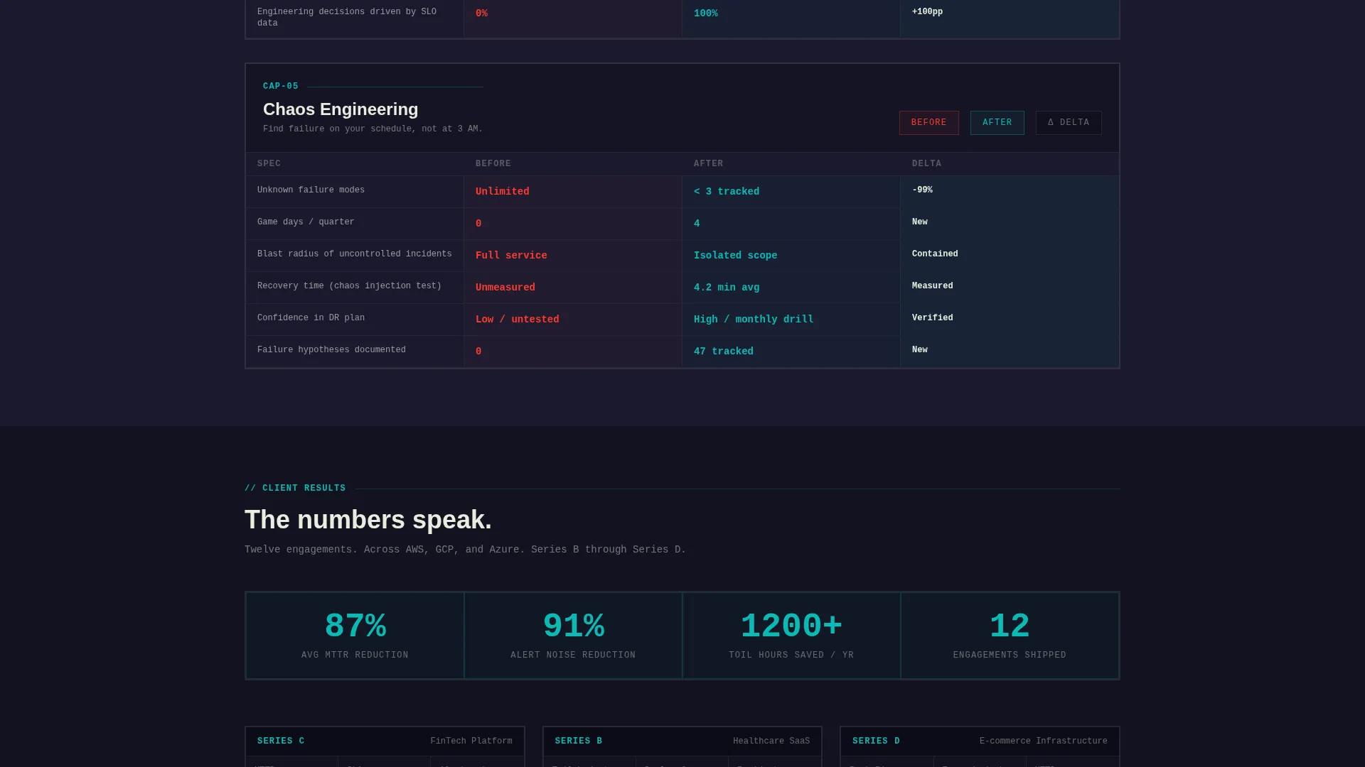
- Five brutalist comparison table sections covering Observability Architecture, Incident Response Design, Toil Elimination, SLO Framework, and Chaos Engineering
- A dual-path lead generation system with a primary audit scoping form and a secondary downloadable SLO Maturity Assessment gated by work email
Feature list
This section covers the core functional and design components built into the template.
Brutalist Dashboard Header
The header fills the entire viewport with a concrete-framed monitoring interface. The left panel displays cascading amber and red alerts, a 94.2 percent service level agreement, and stacking P1 tickets. The right panel mirrors it with teal indicators, a 99.97 percent service level agreement, and mean time to recovery dropped from 47 minutes to 6. Numbers are typeset in oversized monospace with no decoration.
Spec Sheet Comparison Tables
Each capability block is formatted as a brutalist comparison table. Sections cover Observability Architecture, Incident Response Design, Toil Elimination, SLO Framework, and Chaos Engineering. Raw specs include hours saved per quarter, alert reduction percentages, and error budget burn rates before and after engagement.
Dual-Path Lead Generation
The primary call to action reads "Scope Your Reliability Audit." The intake form collects cloud provider selection (AWS, Google Cloud Platform, Azure, or Multi-Cloud), team size, monthly incident volume, and a free-text field for the visitor's last worst outage. A secondary download path offers a gated SLO Maturity Assessment requiring only a work email.
Fixed Scroll call to action Bar
A brutalist fixed bar stays pinned to the viewport during scroll. It surfaces the primary call to action persistently after the first comparison table, keeping the conversion path visible without interrupting the data narrative.
Teal Catalyst Color System
The palette uses reactor teal for active and healthy states, slab charcoal for structural backgrounds, incident red exclusively for "Before" states and warning indicators, and terminal white for body text. The result reads like a Grafana dashboard at 2 AM: dark, deliberate, and alive only where it matters.
Page sections overview
| Section | Purpose |
|---|---|
| Dashboard Preview Header | Show the before-and-after delta in a single viewport |
| Observability Architecture Table | Quantify monitoring gaps and improvements |
| Incident Response Table | Compare alert volume and response metrics |
| Toil Elimination Table | Show hours saved and automation gains |
| SLO Framework Table | Display error budget and SLA improvements |
| Chaos Engineering Table | Present resilience testing outcomes |
| Primary Audit call to action | Capture scoped leads via intake form |
| SLO Assessment Download | Offer a low-commitment self-diagnosis path |
Design & branding system
The visual identity follows a Bold Brutalist theme. Structural weight comes from thick concrete-gray borders and slab charcoal backgrounds. Color is used with surgical intent, never decoratively.
- Reactor teal (#0ABAB5) marks healthy states, active indicators, and "After" data points throughout the page
- Incident red (#FF3B30) appears only in "Before" states and warning contexts, never as a decorative accent
- Terminal white (#E8EDDF) renders all body text in a monospaced-output feel against the dark slab background
Mobile & speed optimization
The template is structured for clarity at every screen width. Brutalist layouts with defined grid columns adapt naturally to narrower viewports without losing the data-table readability that engineering buyers expect.
- Comparison tables are designed to remain legible on tablet and mobile without horizontal scrolling
- Oversized monospace numerals in the header scale with viewport units to stay impactful on smaller screens
- The fixed scroll call-to-action bar is sized for thumb-friendly interaction on mobile devices
How this template helps you convert
The page earns the click before it asks for it. Every structural decision builds trust through evidence, then presents a frictionless next step.
- The dashboard header delivers the core value proposition in under five seconds. Visitors see the exact delta between a failing and a healthy infrastructure before reading a single word of body copy.
- Each comparison table adds a layer of proof. Stacking specific metrics like alert reduction percentages and quarterly hours saved makes the reliability improvement feel repeatable and real, not aspirational.
- The dual-path lead generation system reduces drop-off. Visitors ready to engage complete the audit intake form. Visitors still researching download the SLO Maturity Assessment, entering the funnel at a lower commitment level.
Other information about this template
This template is purpose-built for the site reliability engineering consulting niche and will feel immediately credible to engineering buyers who evaluate vendors on technical specificity.
- The template style is a Comparison Table layout, chosen specifically because engineering audiences make decisions by comparing measurable states
- It is built under the Bold Brutalist theme with a Teal Catalyst color system, giving it a visual identity distinct from generic SaaS marketing templates
- The header concept is a Dashboard Preview, a format familiar to on-call engineers and SRE practitioners who spend their working hours inside monitoring interfaces
- The creative direction follows a Spec Sheet model, meaning sections are structured like engineering reference documents rather than marketing narratives
- This template fits naturally into the Technology category and the Site Reliability Engineering Technology subcategory
Theme
Bold Brutalist
Creative direction
Spec Sheet
Color system
Teal Catalyst
Style
Comparison Table
Direction
Lead Generation
Page Sections
Brutalist Dashboard Preview Header
Five Spec Sheet Comparison Tables
Dual-path Lead Generation System
Persistent Fixed Scroll Call to Action Bar
Teal Catalyst Color System
Related questions
Who is this landing page template designed for?
What lead capture options does the template include?
Can I adapt the comparison table content to my own service metrics?
What does the fixed scroll bar do?
Is this template suitable for a solo consultant or only for larger firms?



