Uptime - Resilient SRE Landing Page Template
Uptime is a scroll reveal landing page template built for site reliability engineering research labs. It pairs a Data Command visual identity with a Stats-First Impact layout to lead every section with a number before its context. The result is a dark-mode, data-dense page that builds trust through evidence and earns conversions before the first form field appears.
by Rocket studio
Quick summary
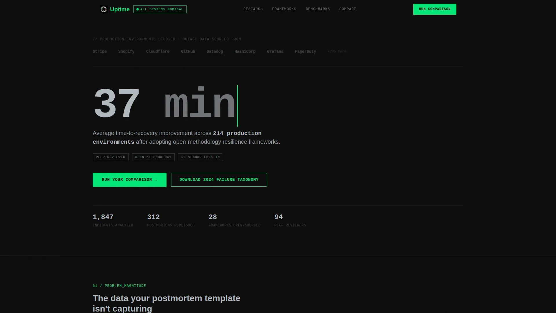
Uptime is a single-page, scroll reveal landing page template designed for a site reliability engineering research lab. It opens with an institutional logo bar and a headline statistic, then progressively reveals research data, a methodology section, a comparison table, and two conversion paths. Every design choice reflects the calm focus of a healthy production environment after a resolved incident.
Who this template is for
This template is built for technically credible organizations that need to earn trust before asking for a click. It speaks directly to the kind of buyers who read postmortems before pitch decks.
- VP-level engineering leaders at Series C and beyond who are losing revenue during every priority-zero incident
- Infrastructure architects at large enterprises migrating to distributed systems who need peer-reviewed frameworks
- Site reliability engineering managers building on-call cultures who want runbooks backed by real data, not vendor marketing
What problem this template solves
Most technology landing pages lead with adjectives. This template leads with numbers. That matters when your audience includes engineers who dismiss marketing copy on instinct but stop scrolling for a compelling data point.
- Generic hero sections fail to establish credibility with technical buyers who expect evidence, not claims
- Vendor whitepapers and promotional content erode trust with SRE practitioners who have seen too many inflated benchmarks
- Standard call-to-action flows ask for commitment before the visitor has absorbed enough context to feel the decision is already made
What you get with this template
You get a fully structured, single-page scroll reveal layout that sequences data, methodology, and comparison content in a deliberate order. The layout is designed to move a skeptical technical audience from curiosity to confirmed intent.
- A logo bar header, a 144-pixel headline statistic, and a subline that establishes methodology credentials above the fold
- A progressive scroll reveal flow that materializes numbers first and context second across every major section
- A full versus comparison table with a primary call-to-action form and a secondary mid-page PDF download gate
Feature list
This section describes the core capabilities built into the Uptime template as specified in the design brief.
Stats-First Scroll Reveal Layout
Each section loads a prominent number before its explanatory sentence fades in. Visitors interpret the data point first, which creates active engagement rather than passive reading. This pattern runs consistently across the entire page.
Institutional Logo Bar Header
The header opens with a horizontal strip of monochrome engineering logos above a single large statistic. No hero image, no illustration. The statistic rendered in 144-pixel type is the visual anchor, supported by a 16-pixel subline confirming the lab's open methodology and vendor independence.
Progressive Versus Comparison Table
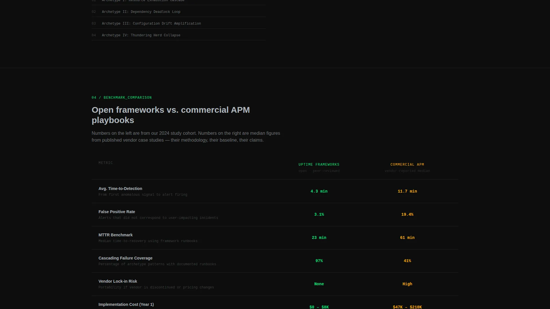
A full comparison table materializes row by row on scroll. It places the lab's open framework metrics on the left in status-green and commercial vendor benchmarks on the right in warning amber. Rows cover time-to-detection, false positive rates, mean time to recovery, and total cost of implementation.
Dual Conversion Path Design
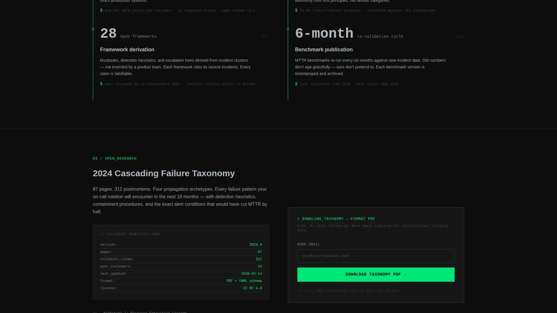
The primary conversion path sits directly below the versus table: a three-field form collecting infrastructure type, current monitoring stack, and work email. A secondary path appears mid-page after the methodology section, gating a downloadable cascading failure taxonomy report behind email-only capture.
Data Command Color System
The Monochrome Steel palette uses terminal black for backgrounds, brushed chromium for body text, status-green reserved strictly for positive metrics and active calls to action, and warning amber used only for comparison callouts. Interactive elements pulse with status-green on hover.
Methodology and Postmortem Sections
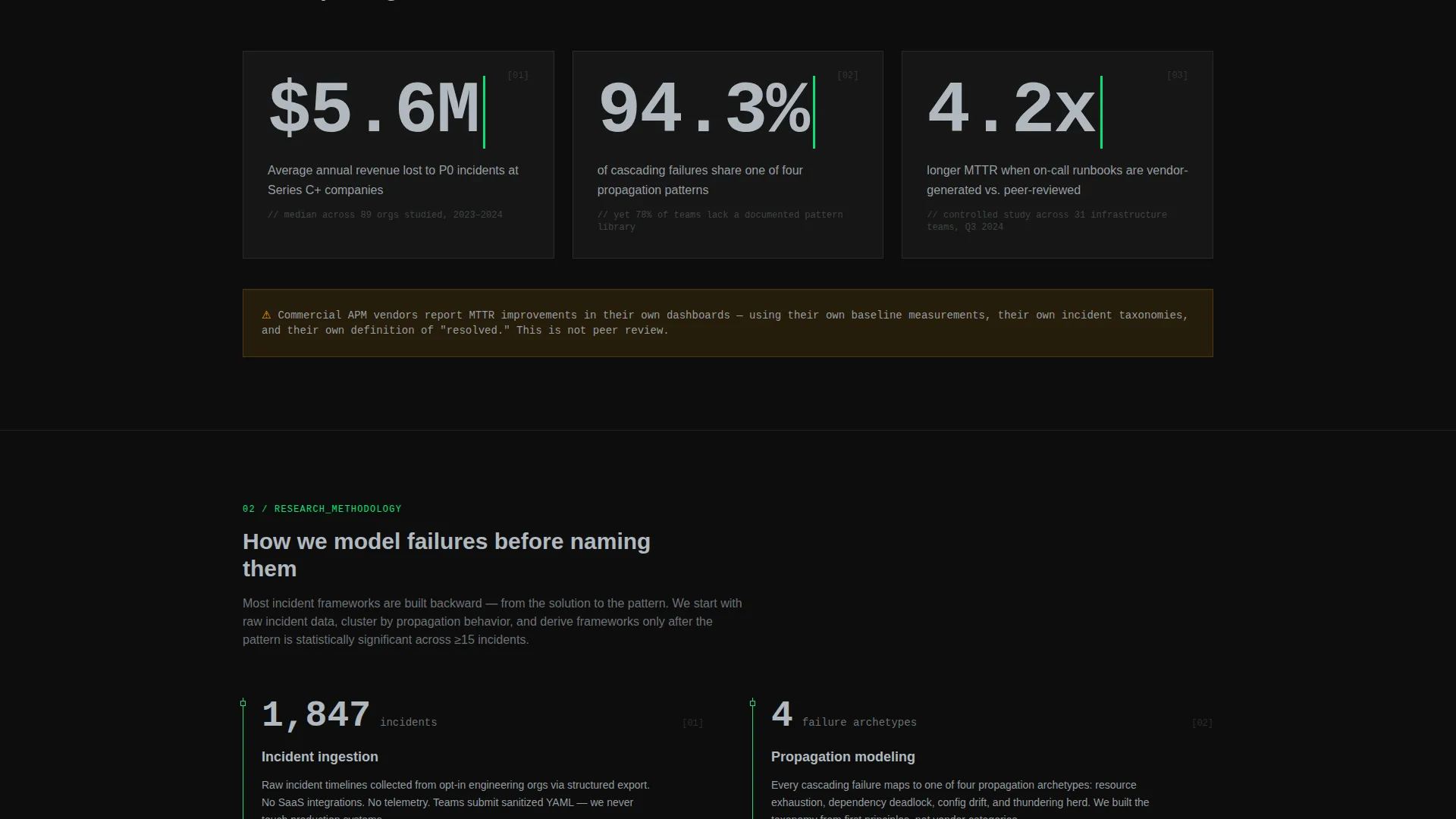
Dedicated sections explain how the lab models cascading outages and publishes incident postmortems. This content positions the research output as peer-reviewed and open-methodology, giving technical visitors the professional context they need before they encounter a conversion element.
Page sections overview
| Section | Purpose |
|---|---|
| Logo Bar Header | Establishes institutional credibility with engineering logos and a headline statistic |
| Headline Stat Block | Anchors visitor attention with a 144-pixel data point before any prose |
| Downtime Cost Stats | Opens with problem magnitude data to frame the lab's relevance |
| Research Methodology | Explains how the lab models production failures and cascading outages |
| Mid-Page PDF Gate | Captures email in exchange for the cascading failure taxonomy download |
| Versus Comparison Table | Compares lab frameworks against commercial monitoring vendor benchmarks row by row |
| Primary call to action Form | Collects infrastructure type, monitoring stack, and work email below the table |
Design & branding system
The template uses a Data Command theme built on the Monochrome Steel color system. Every color in the palette has a specific, non-interchangeable role, which keeps the visual language precise and meaningful.
- Terminal black (#0D0D0D) for all backgrounds; brushed chromium (#B0B8BF) at 85% opacity for body text; single-pixel chromium lines at 20% opacity for section dividers
- Status-green (#00E676) reserved exclusively for positive metric callouts and active call-to-action elements; warning amber (#FFAB00) used only inside comparison callouts
- Typography uses a 144-pixel chromium display size for the hero statistic, 16-pixel chromium for the subline, and consistent sizing that references a dark-mode monitoring dashboard aesthetic
Mobile & speed optimization
The scroll reveal interactions and progressive data reveals are designed to work within a layout that adapts to the reading context of its audience.
- The Stats-First reveal sequence is built to maintain its narrative order across viewport sizes so the number always appears before its explanatory sentence
- Section dividers, color roles, and typography hierarchy are structured to remain legible and purposeful at reduced screen widths
- The versus comparison table is laid out to preserve the green-versus-amber column distinction even when reflow occurs on smaller screens
How this template helps you convert
The Uptime template is structured around a specific insight: technical buyers do not respond to persuasion, but they do respond to data that confirms a conclusion they were already forming.
- The scroll reveal sequence introduces the problem with downtime cost statistics, then builds to the methodology, so by the time the versus table appears the visitor already understands the stakes and is primed to compare their current stack against the lab's benchmarks.
- The versus table shows the visitor their current vendor's numbers in warning amber before a single form field is visible, making the primary call-to-action feel like confirmation rather than commitment.
- The secondary mid-page PDF gate offers a concrete, high-value asset after the methodology section, creating an earlier, lower-friction conversion point for visitors who are not yet ready for the full comparison form.
Other information about this template
The Uptime template is a strong fit for any site reliability engineering organization that publishes research, frameworks, or runbooks aimed at engineering leadership. A few additional details worth noting:
- The template style is classified as Scroll Reveal (Progressive), meaning the reveal sequence is a core structural feature, not a decorative add-on
- The landing page direction is Comparison/Versus, which means the layout is specifically optimized around the moment a visitor compares two options side by side
- The header concept is Logo Bar, which prioritizes proof-by-association over decorative imagery from the very first scroll position
- The theme is Data Command and the color system is Monochrome Steel, both of which reinforce the precision and credibility the target audience expects
- This template is well suited for teams referencing or citing real incident data from production environments, given the postmortem and cascading failure framing built into its section structure
Theme
Data Command
Creative direction
Stats-First Impact
Color system
Monochrome Steel
Style
Scroll Reveal (Progressive)
Direction
Comparison/Versus
Page Sections
Stats-first Scroll Reveal Layout
Institutional Logo Bar Header
Progressive Versus Comparison Table
Dual Conversion Path Design
Data Command Color System
Methodology and Postmortem Sections
Related questions
Who is this landing page template designed for?
What makes the scroll reveal layout different from a standard landing page?
How does the versus comparison table work?
What are the two conversion paths included in the template?
Can this template be used for a research lab that publishes incident postmortems?



