Cloud-Native Enterprise Software Privacy Policy Website Template
Uptime is a cloud-native learning management system landing page template built for enterprise buyers who care about scale, reliability, and audit-ready compliance. It pairs a high-contrast Acid Digital color system with a Stats-First layout, a head-to-head comparison table, and two distinct lead capture paths, making it purpose-built for technical evaluators and L&D decision-makers alike.
by Rocket studio
Quick summary
Uptime is a single-page, lead-generation landing page template for a cloud-native learning management system. It opens with a dark full-bleed header, transitions into live-feel performance stats, and anchors its persuasion around a twelve-row comparison table. Two conversion paths, a migration audit request and a whitepaper download, serve buyers at different stages of the purchase decision.
Who this template is for
This template is designed for teams selling infrastructure-grade learning platforms to buyers who already know what bad looks like. The audience is technical and skeptical, so the layout earns trust with data rather than promises.
- VP-level Learning and Development leaders at mid-market SaaS companies evaluating scalable alternatives to their current platform
- EdTech Chief Technology Officers planning a migration away from legacy on-premise installs
- Compliance directors at regulated firms who need audit-ready completion records that hold up under formal reviews
What problem this template solves
Most learning management system landing pages bury their strongest differentiators in marketing copy. Technical buyers skip past it. This template puts the numbers and comparisons front and center, so evaluators reach the conversion point already convinced.
- Legacy platform comparisons are hard to find, forcing buyers to do their own research and often stall
- Stat-heavy value props get lost inside paragraphs instead of hitting like a live dashboard
- Compliance and architecture buyers need a secondary conversion path before budget is approved, which generic templates do not offer
What you get with this template
You get a fully structured, single-page layout that guides a technical buyer from curiosity to conversion in one scroll. Every section has a defined role, and no section wastes the visitor's attention.
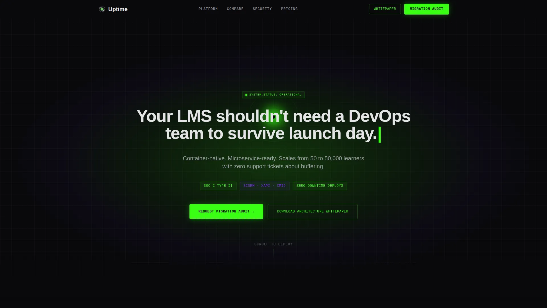
- A dark full-bleed header with a pulsing phosphor green orb and a typewriter headline animation that sets the product tone immediately
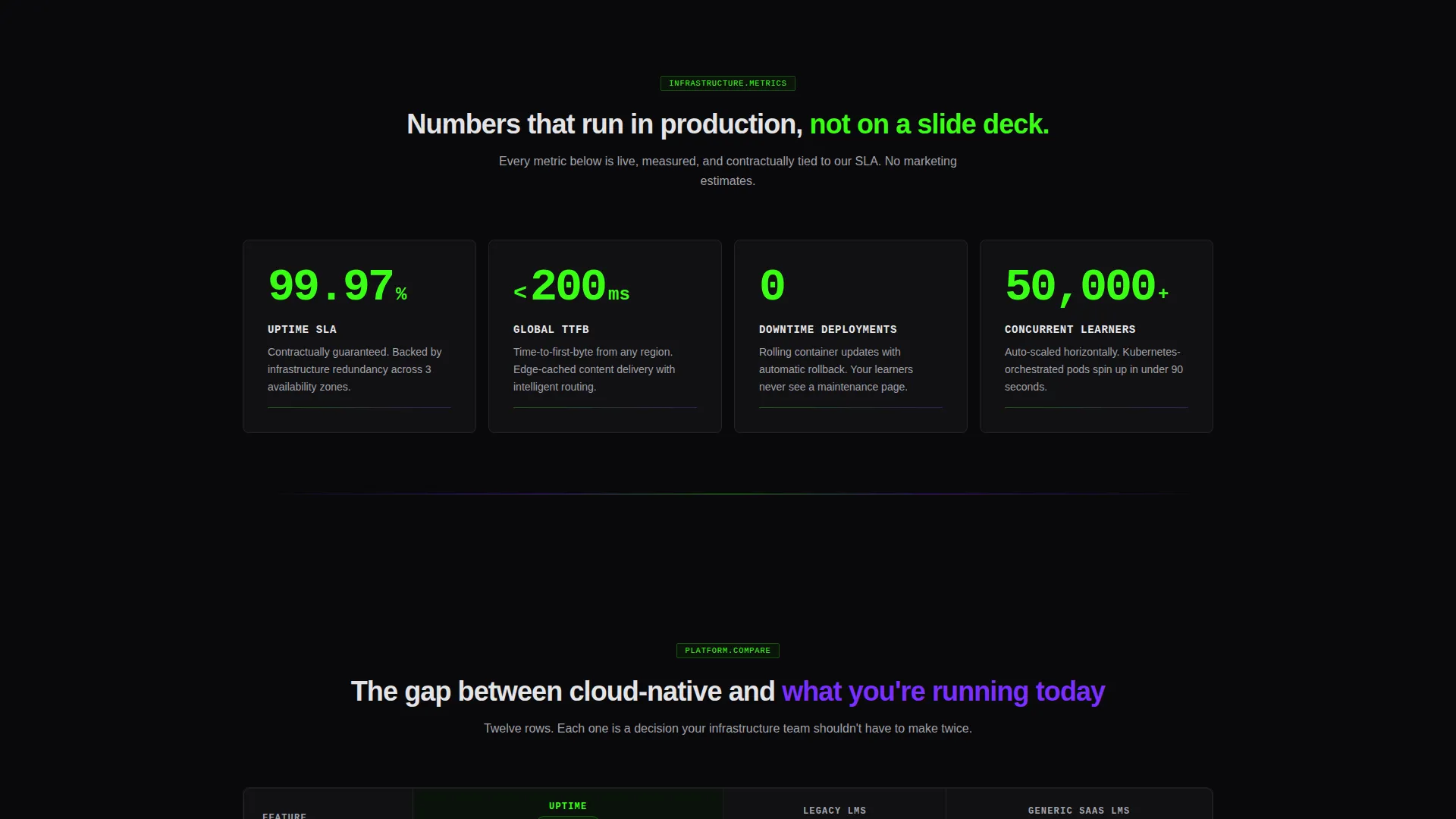
- A stats block with animated counters for uptime SLA, global time-to-first-byte, and zero-downtime deployment claims
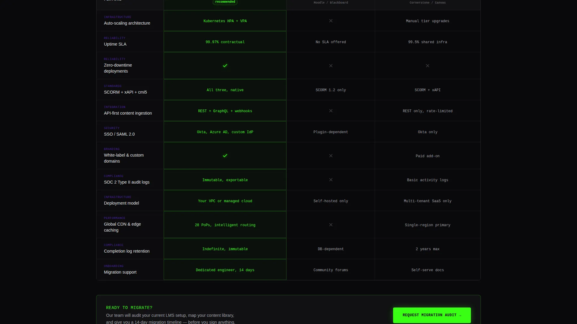
- A twelve-row comparison table contrasting your product against legacy and generic SaaS alternatives, with glowing winning cells
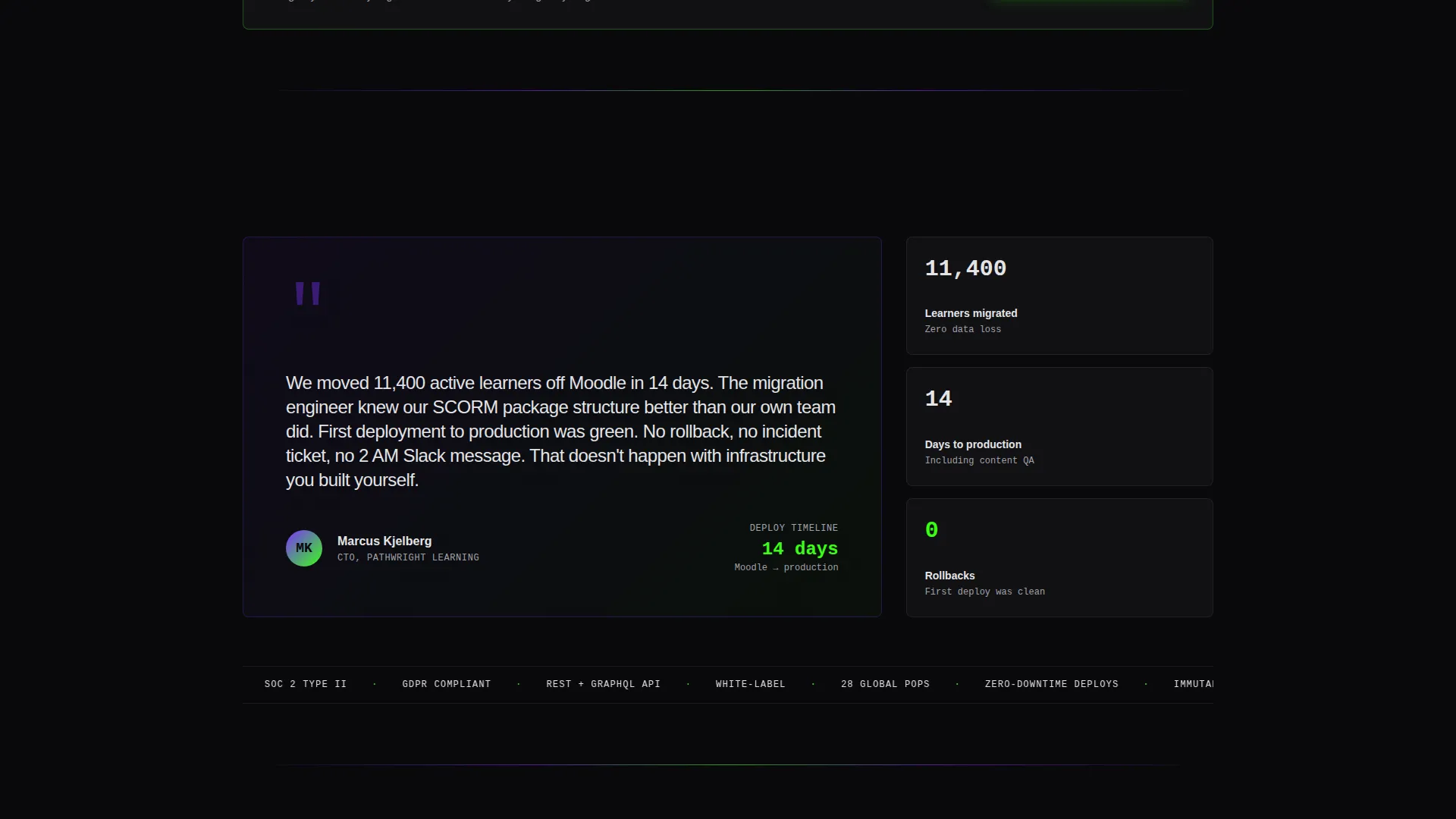
- A named customer quote with a concrete deploy-to-production timeline for social proof
- Two lead capture forms: a migration audit request and an email-gated architecture whitepaper download
Feature list
This template is built around a small number of high-impact components. Each one does specific work in the buyer journey.
Dark Full-Bleed Header with Glow Animation
The header fills edge to edge in void black with a single phosphor green orb pulsing at center frame. After a one-second pause, the headline renders in cold white using a typewriter animation. The glow intensifies on scroll, bleeding visually into the first content section.
Animated Stats Dashboard
Three core performance claims animate into view as the visitor scrolls past the header. Each number ticks upward using a counter animation, with green numerals on black. The effect reads like a live monitoring dashboard rather than a static bullet list.
Twelve-Row Comparison Table
The comparison table is the narrative engine of the page. It pits your product against a legacy learning management system and a generic SaaS alternative across twelve decision-relevant rows. Winning cells pulse with a faint green glow to direct the eye without requiring extra copy.
Dual Lead Capture Paths
The primary call to action requests a migration audit and collects current platform, estimated active learner count, and work email. A secondary path offers an architecture whitepaper gated behind email only, giving technical evaluators a reason to convert before budget is confirmed.
Sticky Header Call to Action
The migration audit button lives in a sticky header so it stays reachable at every scroll depth. A second instance appears below the comparison table at the moment buyers are most persuaded. Neither placement requires the visitor to scroll back to act.
Page sections overview
| Section | Purpose |
|---|---|
| Full-bleed header | Set tone, animate headline, establish brand identity |
| Stats impact block | Lead with hard numbers before any narrative copy |
| Comparison table | Contrast cloud-native against legacy and generic alternatives |
| Customer quote | Reinforce credibility with a named CTO and timeline |
| Migration audit form | Capture high-intent buyers ready to discuss a switch |
| Whitepaper download | Capture technical evaluators before budget approval |
Design & branding system
The visual identity follows a Dynamic Motion theme using an Acid Digital color system. Every color choice signals infrastructure engineering, not consumer marketing.
- Void black (#09090B) dominates all backgrounds; terminal phosphor green (#39FF14) activates on calls to action, counter numerals, and winning comparison cells; ultraviolet (#7B2FFF) marks section transitions and hover states; cold interface white (#E4E4E7) handles body text and table borders
- Typography and motion are deliberately utilitarian: typewriter rendering on the headline, counter ticks on stats, and faint cell glows in the table all reinforce the sense of a system running in real time
- The overall palette deliberately avoids warmth, communicating that this product was engineered rather than designed for aesthetics alone
Mobile & speed optimization
The Dynamic Motion theme uses targeted animation rather than heavy visual layers, keeping the layout practical on smaller screens without removing the kinetic energy that defines the design.
- Counter animations and the typewriter headline are viewport-triggered, so they only run when visible, avoiding wasted render cycles on mobile
- The comparison table is structured for horizontal scroll on narrow screens, keeping all twelve rows legible without collapsing data
- The sticky call-to-action header and both form sections are sized for thumb-friendly interaction on mobile viewports
How this template helps you convert
The page is structured to move a skeptical technical buyer toward action through evidence accumulation rather than persuasion copy.
- The stats block establishes credibility before the visitor reads a single marketing claim, framing the product as a measurable system rather than a feature list
- The comparison table converts passive reading into active evaluation, making the performance and capability gap between options feel concrete and quantifiable
- The dual conversion paths ensure that buyers at different stages both have a next step: high-intent buyers request an audit, while earlier-stage evaluators download the whitepaper and stay in the funnel
Other information about this template
This template is specifically matched to the cloud-native enterprise software category and is designed for the intersection of learning management system platforms, compliance-driven buyers, and infrastructure-minded evaluators.
- The form design deliberately omits a phone number field, reflecting the buying behavior of the target audience who prefer async and self-directed evaluation
- The architecture whitepaper gate uses email-only capture, lowering friction for technical readers who are not yet at a vendor conversation stage
- The template supports use cases spanning from fifty active learners scaling to fifty thousand, covering SCORM, xAPI, and cmi5 content standards alongside SSO and SAML authentication rows in the comparison table
- White-labeling, API-first content ingestion, auto-scaling, deployment model, and uptime SLA are among the twelve comparison rows included in the table structure
- The template is well-suited to teams migrating from platforms such as Moodle, Blackboard, Cornerstone, and Canvas, as those platform names appear as selectable options inside the migration audit form dropdown
Theme
Dynamic Motion
Creative direction
Stats-First Impact
Color system
Acid Digital
Style
Comparison Table
Direction
Lead Generation
Page Sections
Dark Full-bleed Header with Glow Animation
Animated Performance Stats Block
Twelve-row Comparison Table
Dual Lead Capture Forms
Sticky Header Call to Action
Named Customer Quote Block
Related questions
What types of buyers is this landing page template designed for?
Can I adapt the comparison table rows for my own product?
How do the two lead capture forms work together?
Does the template include the animation logic for the stats counters and typewriter headline?
Is this template suitable for a product serving compliance-regulated industries?



