Resort Booking System Dashboard Landing Page Template
Vacancy is a dashboard-style resort booking landing page built for hospitality revenue teams who need instant clarity across every channel. It uses a Stats-First layout with real-time availability grids, dynamic pricing visuals, and a Comparison/Versus scroll structure that shows broken operations fixed in one view. Purpose-built for boutique beach resorts, mountain lodges, and multi-property hospitality groups.
by Rocket studio
Quick summary
Vacancy is a single-page, data-grid landing page template designed for resort booking systems. It opens with a full-width dashboard screenshot and moves through animated KPI tiles, side-by-side comparison panels, and a two-step lead form. The visual identity is Slate and Sky: dark slate backgrounds, steel card surfaces, and sky-blue accents on every live metric.
Who this template is for
This template is built for hospitality technology brands that need to speak directly to operations-minded buyers. It communicates in the language of dashboards, not marketing brochures.
- Revenue managers at boutique beach resorts managing between 80 and 200 keys
- Operations directors at mountain lodges currently reconciling channels in spreadsheets
- Hospitality group CFOs who need portfolio-wide occupancy data readable from a phone
What problem this template solves
Resort revenue teams lose money through manual rate updates, channel lag, and overbooking risk. Most booking system landing pages rely on paragraphs to explain these problems. Vacancy solves this by showing the pain visually, then resolving it in the same scroll.
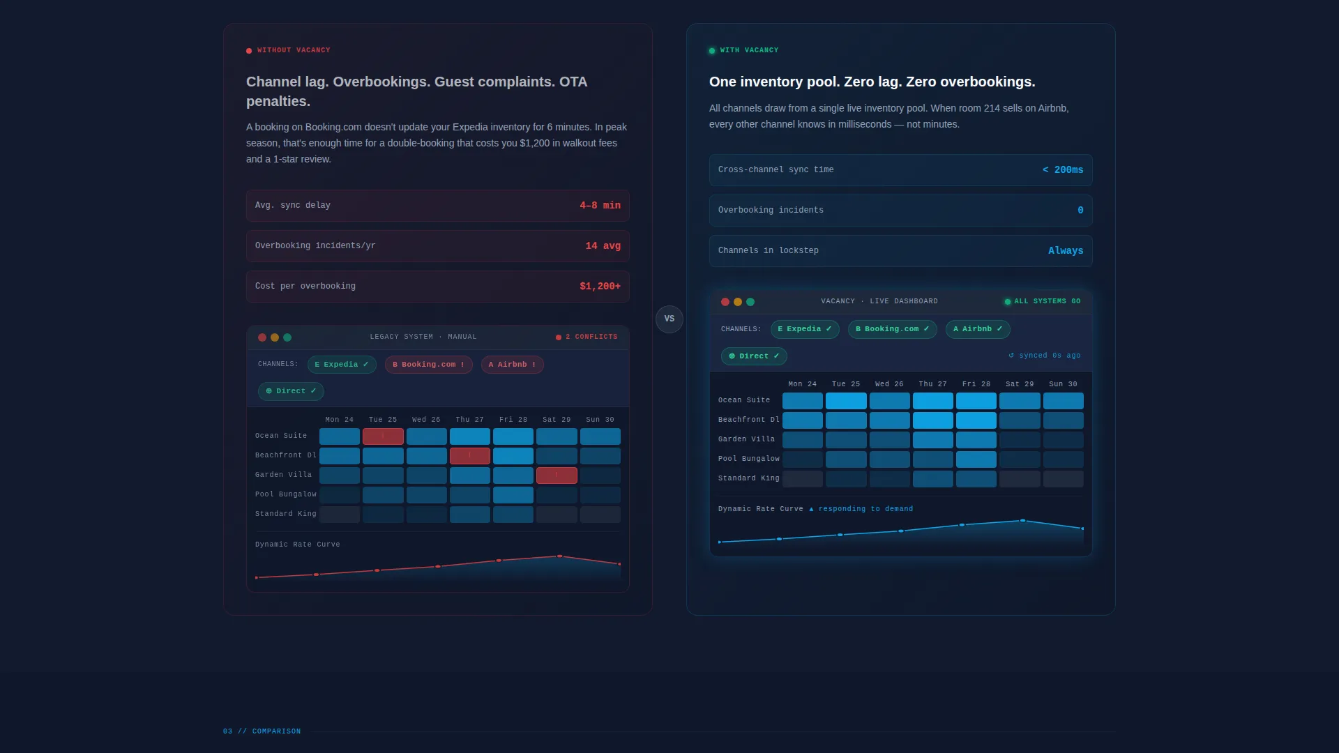
- Visitors see broken dashboard states on the left and resolved, live-data states on the right
- The comparison layout makes the operational case without asking anyone to read a wall of text
- A two-step lead form captures property type, key count, and current tech stack before the first conversation
What you get with this template
You get a complete, conversion-structured landing page layout built around a dashboard-forward visual identity. Every section is designed to earn trust from a technically literate hospitality buyer.
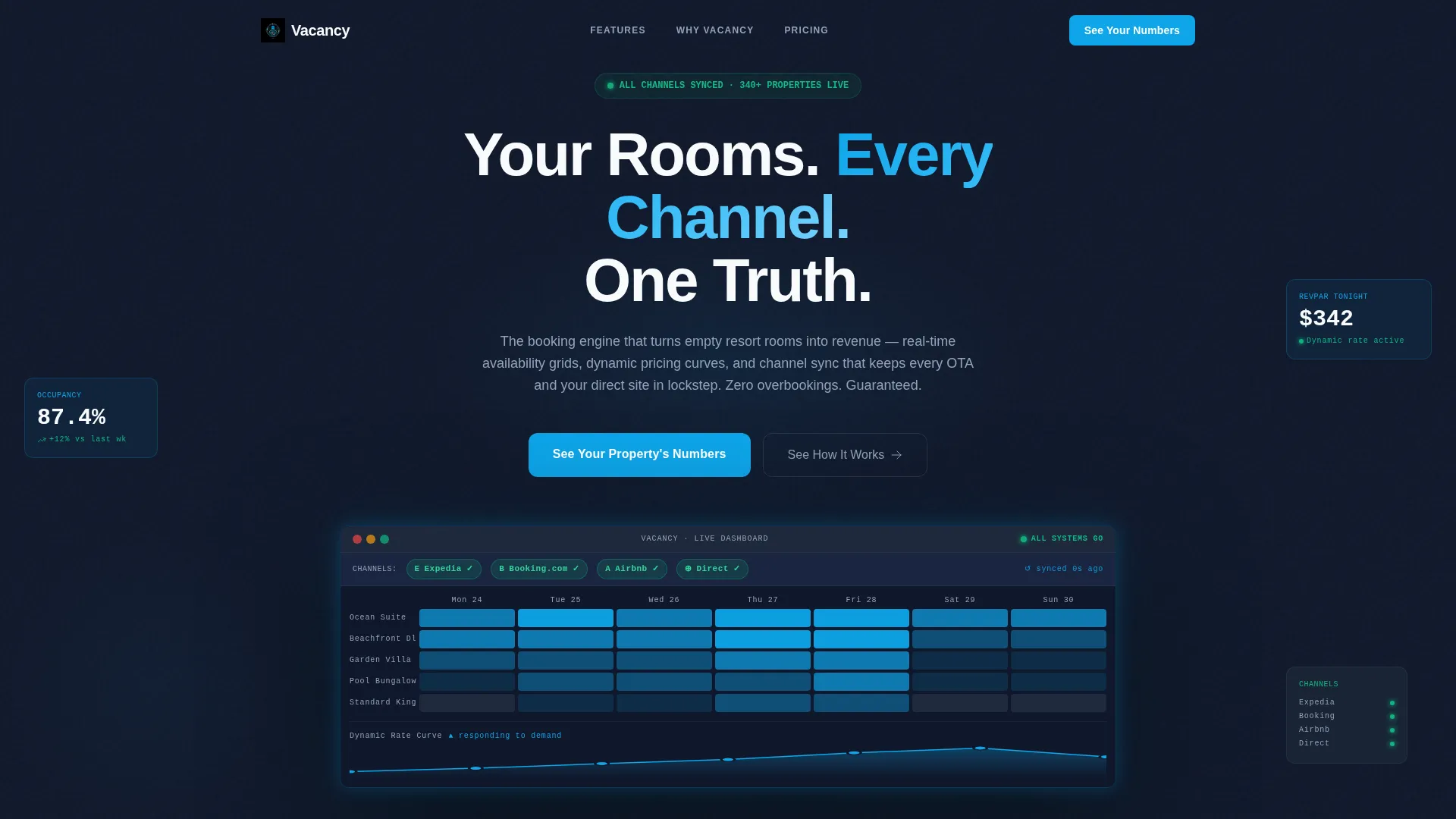
- Full-width product screenshot header with a seven-day availability grid, dynamic pricing curve, and channel health indicators
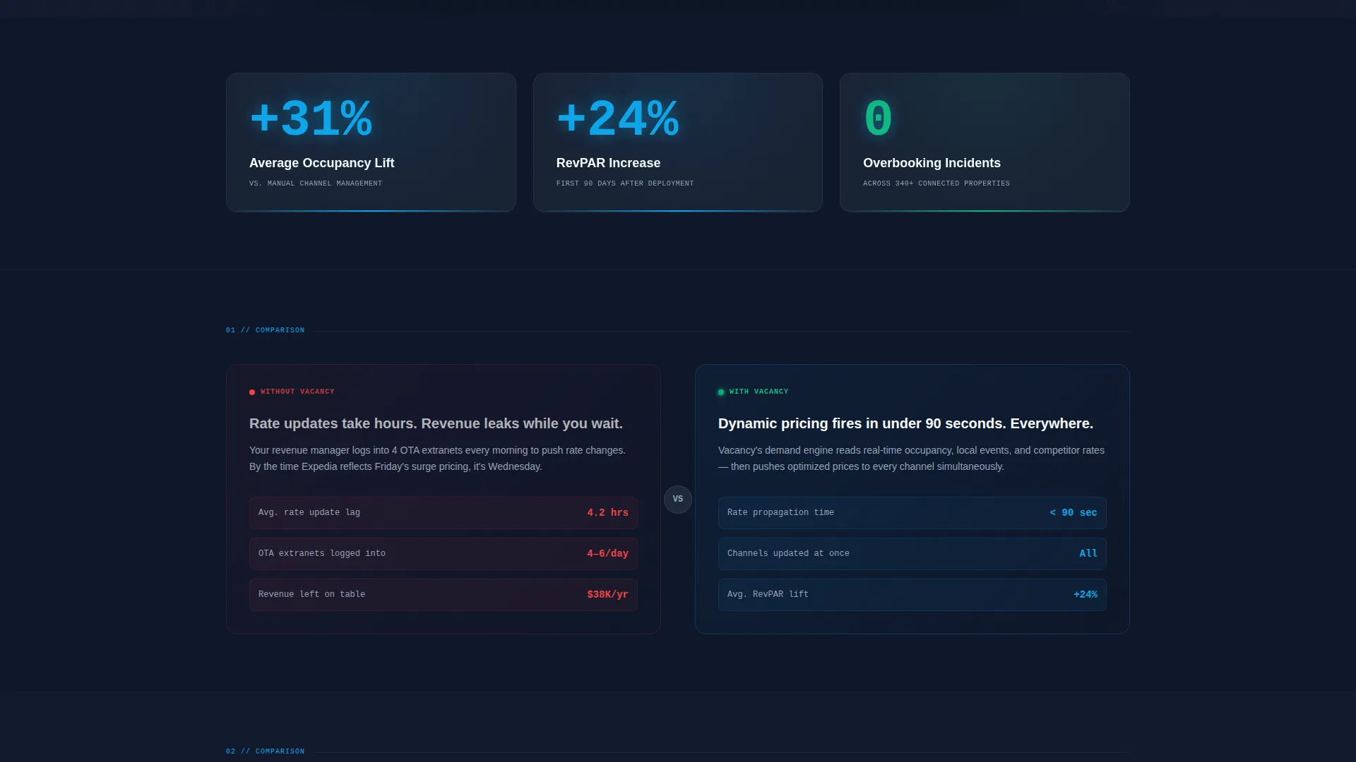
- Three animated KPI tiles counting up on scroll entry, covering occupancy lift, revenue per available room, and overbooking reduction
- A sticky mobile call-to-action bar and a three-tier pricing grid framed by property size and revenue impact
Feature list
This landing page template includes purpose-built components for resort booking system campaigns. Each feature serves the buyer's need to see the product working before they commit.
Seven-Day Availability Grid Header
The header renders a pixel-perfect dashboard screenshot showing room types on the vertical axis and dates across the top. Cells are color-coded by occupancy percentage. A sky-blue dynamic pricing curve overlays the grid, and a channel health bar across the top confirms sync status with direct-booking and online travel agency indicators all reading green.
Animated KPI Tiles
Three large stat tiles sit immediately below the header. Each one counts up on scroll entry, displaying average occupancy lift, revenue per available room increase, and overbooking incidents reduced to zero. The animation gives the page an immediate sense of live data without requiring a backend connection.
Comparison/Versus Panel Layout
The core scroll structure pairs "without" and "with" states side by side. Left panels show dim, red-flagged dashboard states representing manual processes and channel lag. Right panels show the same metrics inside the live system, glowing sky blue and resolved. The contrast drives the conversion argument without a single persuasive paragraph.
Two-Step Lead Capture Form
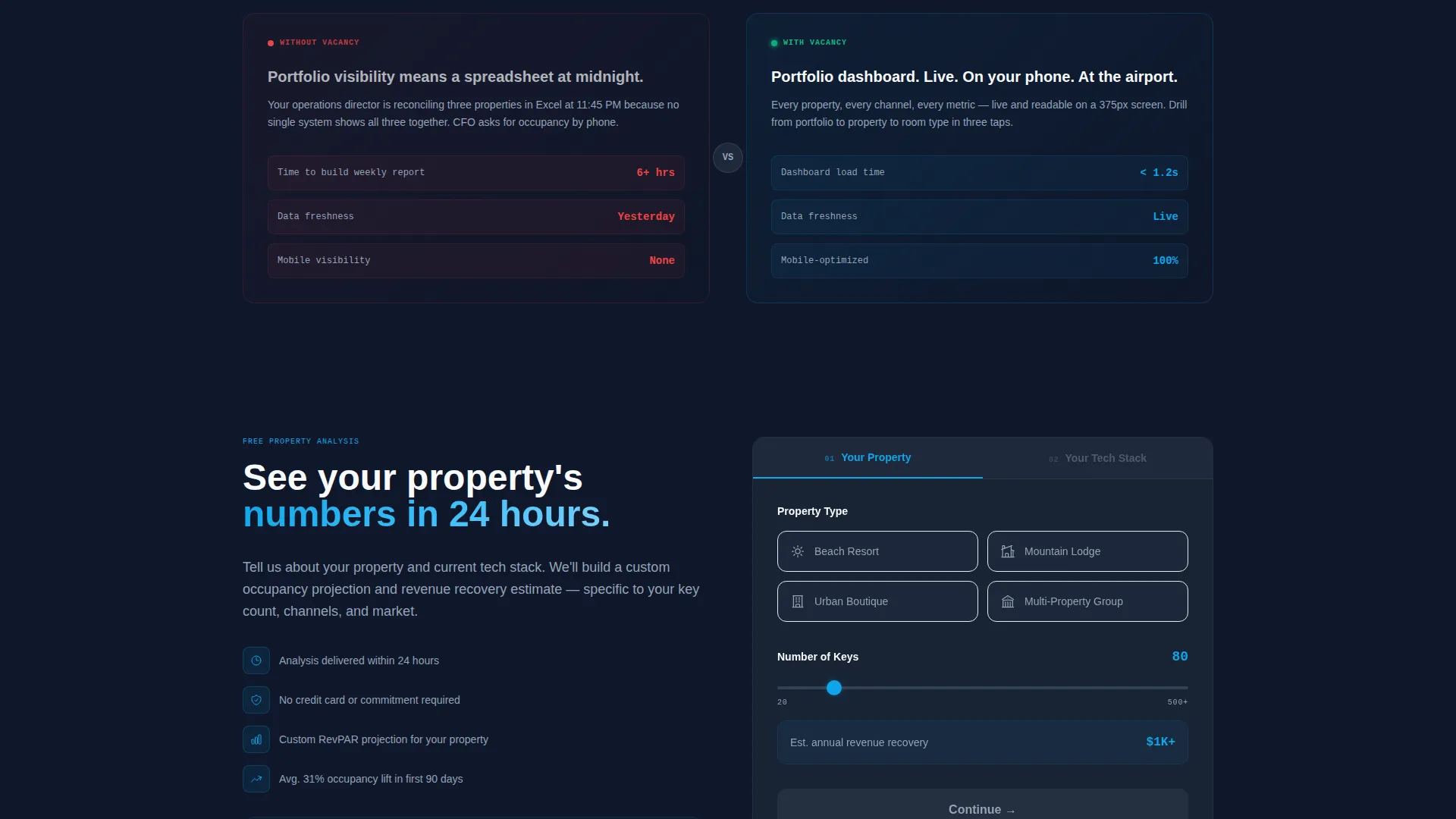
The primary call-to-action opens a two-step form. Step one asks for property type via a radio selector and key count via a slider. Step two presents tech stack checkboxes covering current property management system name, connected online travel agencies, and pricing method. This approach qualifies leads while lowering form friction.
Three-Tier Pricing Grid
The pricing section presents three tiers framed not by feature lists but by property size and projected revenue impact. Each tier is positioned to match a specific buyer profile from the page, creating a direct line from the comparison panels to the plan selection decision.
Sticky Mobile Call-to-Action Bar
On mobile viewports, the primary call-to-action persists as a fixed bottom bar throughout the scroll. This keeps the conversion path accessible at every point in the page without interrupting the comparison panel experience.
Page sections overview
| Section | Purpose |
|---|---|
| Dashboard Screenshot Header | Establishes product credibility with a live-state visual |
| Headline Fade-In | Anchors the core value proposition on load |
| KPI Tiles Row | Delivers immediate impact with three animated stats |
| First Comparison Panel | Contrasts manual rate updates with automated pricing |
| Second Comparison Panel | Shows channel lag versus real-time sync resolution |
| Third Comparison Panel | Highlights revenue leakage versus closed-loop visibility |
| Primary call to action Block | Prompts the visitor to input their property details |
| Two-Step Lead Form | Captures property type, key count, and tech stack |
| Pricing Tiers Grid | Matches plan options to property size and revenue goals |
| Sticky Mobile call to action | Keeps conversion path accessible throughout scroll |
Design & branding system
The Slate and Sky color system creates a cockpit-like environment where every illuminated element earns its place. Deep operations slate forms the primary background, while mid-gray steel surfaces define card areas and secondary panels. Sky blue appears exclusively on live data accents, interactive buttons, and status indicators that confirm a positive state. Cloud white handles all text and negative space.
- Deep operations slate (#1E293B) for primary backgrounds, mid-gray steel (#475569) for card and panel surfaces
- Open-sky blue (#0EA5E9) reserved for moving numbers, action buttons, and green-state indicators only
- Cloud white (#F8FAFC) for all body text, headlines, and negative space across the layout
Mobile & speed optimization
The template is structured to deliver the full comparison-panel experience on smaller screens without losing the data-grid visual hierarchy. The sticky call-to-action bar replaces inline buttons on mobile, keeping the conversion path visible throughout the scroll.
- Comparison panels stack vertically on mobile while preserving the left-broken, right-resolved visual logic
- The two-step lead form is sized and spaced for thumb interaction on phone-sized viewports
- KPI tile animations trigger on scroll entry and are scoped to viewport visibility for smooth rendering
How this template helps you convert
Vacancy is structured around a single conversion truth: hospitality buyers trust dashboards more than marketing copy. The page builds that trust progressively, from a credible header to a qualified lead form.
- The dashboard screenshot header establishes immediate product familiarity for revenue managers who live inside similar interfaces every day, reducing the gap between "landing on a page" and "recognizing a tool."
- The comparison panels make the operational cost of not switching viscerally clear. Seeing a broken channel-lag state next to a resolved, sky-blue sync confirmation is more persuasive than any bullet point about features.
- The two-step form and tiered pricing grid work together to move a qualified visitor toward a sales conversation segmented by property size, removing the uncertainty of "is this product even for me?"
Other information about this template
This template is designed for technology vendors targeting the resort vertical software as a service market. It is well-suited for any product positioning campaign where the buyer needs to see operational pain resolved visually before committing to a demo or trial.
- The Dashboard Pro theme and Slate and Sky palette are consistent with enterprise hospitality software aesthetics
- The template style is classified as Dashboard and Data Grid, making it suitable for any data-forward product in the travel and hospitality technology space
- The Stats-First creative direction prioritizes numbers before narrative, which aligns with how revenue managers and CFOs evaluate new tools
- The Comparison/Versus landing page direction is repeatable across different resort booking system use cases, including channel management, rate optimization, and portfolio reporting
Theme
Dashboard Pro
Creative direction
Stats-First Impact
Color system
Slate & Sky
Style
Dashboard/Data Grid
Direction
Comparison/Versus
Page Sections
Dashboard Screenshot Header
Animated KPI Tiles on Scroll
Comparison and Versus Panel Sections
Two-step Qualifying Lead Form
Three-tier Pricing Grid
Sticky Mobile Call-to-action Bar
Related questions
Who is this landing page template built for?
What makes the Comparison/Versus layout effective for this niche?
Can I customize the KPI tile numbers and comparison panel content?
How does the two-step lead form help qualify buyers?
Is the sticky mobile call-to-action bar always visible?



