Beauty & Salon Digital Presence Reviews & Social Proof Website Template
Vanity is a scroll reveal landing page built for beauty and salon supply businesses. It leads with a live cost-comparison calculator, then progressively reveals product cards, a drag-to-compare module, and reorder data bars. The Bold Brutalist design in Midnight Blue makes every number, ingredient count, and price feel like hard evidence rather than a sales pitch.
by Rocket studio
Quick summary
Vanity is a single-page, scroll-driven landing page template for professional beauty and salon supply stores. It opens with a functioning cost-comparison calculator and builds a case through progressive reveals: brutalist product cards, a drag-to-compare module, and scrolling reorder data. Every section is designed to turn a visitor's own numbers into the reason they switch suppliers.
Who this template is for
This template is built for businesses selling professional-grade beauty and salon products at a wholesale or direct-to-pro level. It speaks directly to buyers who already know what they need and want proof before they commit.
- Independent stylists restocking treatments and tools between client bookings
- Makeup artists building or refreshing kit bags for seasonal wedding work
- Salon owners comparing unit costs against their current distributor's pricing
What problem this template solves
Most beauty supply pages lean on lifestyle photography and brand language. Buyers who are actually restocking inventory do not need mood boards. They need unit costs, ingredient transparency, and a fast way to compare what they currently pay against what they could pay.
- Visitors arrive with no easy way to validate whether switching suppliers makes financial sense
- Product pages rarely show side-by-side pricing, specs, or reorder frequency data
- Generic store layouts do not adapt to a buyer's specific product category or purchase habits
What you get with this template
You get a fully structured, scroll reveal landing page with five functional sections that work together as a single comparison engine. Each section hands off evidence to the next, moving the visitor from curiosity to a concrete reason to act.
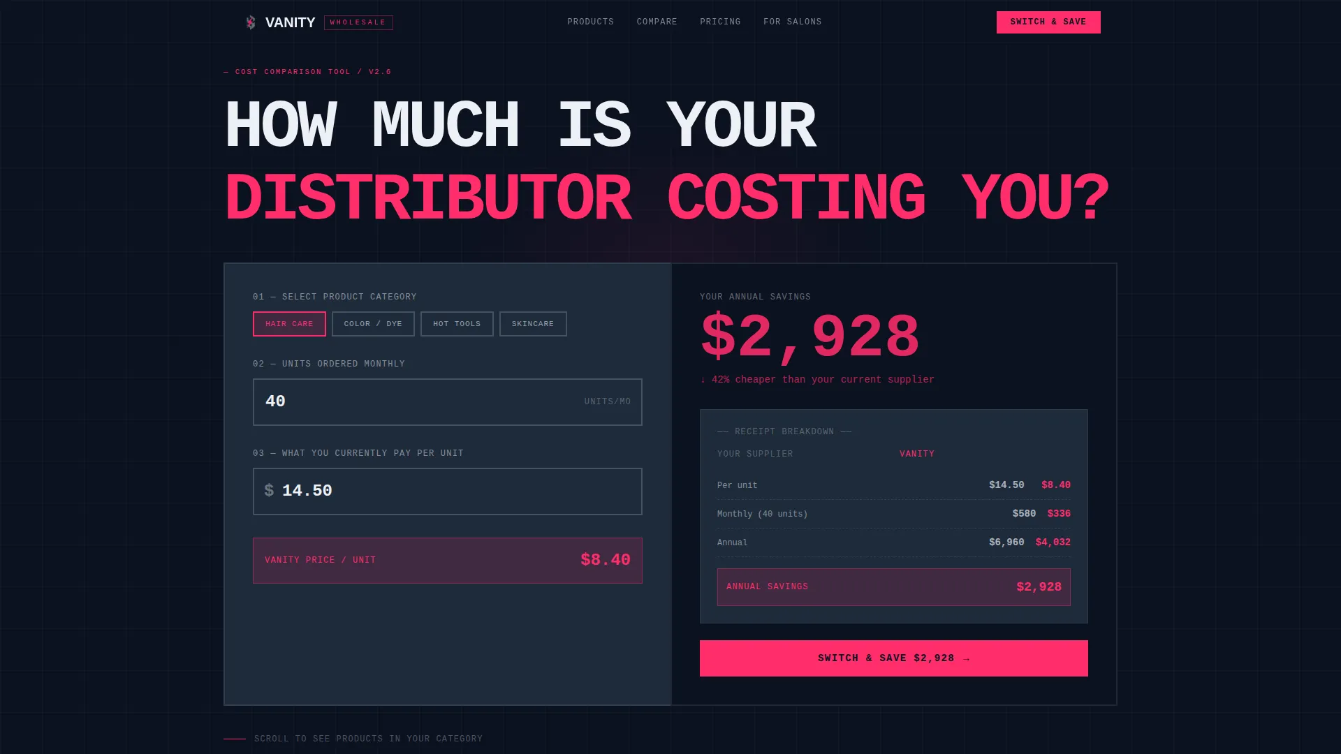
- A header calculator that captures category and unit volume, then returns annual savings in real time
- Three progressive scroll reveals: product cards, a drag-to-compare module, and animated reorder data bars
- Two conversion paths: a primary "Switch & Save" call to action and a secondary PDF price-comparison download gate
Feature list
This template's capabilities are built around one goal: making the visitor's own purchase data do the selling.
Header Cost-Comparison Calculator
The page opens with an oversized, brutalist-styled estimator. Visitors select a product category, enter monthly unit volume, and input their current price per unit. The tool instantly returns projected annual savings in large shock-pink numerals alongside a receipt-style breakdown comparing their current supplier against Vanity pricing.
Category-Driven Scroll Reveals
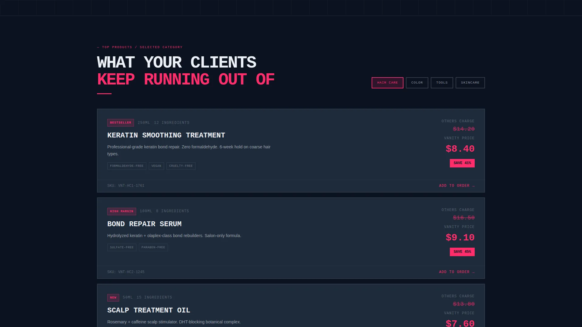
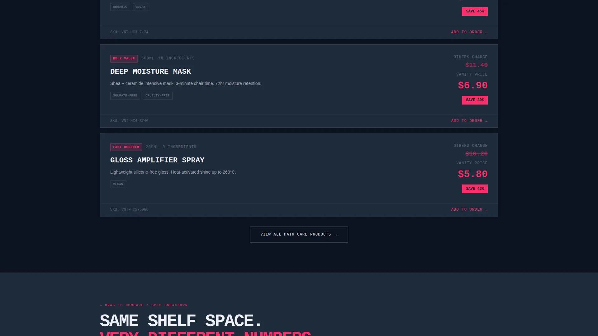
After the calculator captures a visitor's category selection, the page rebuilds its content around that choice. The first reveal surfaces the top five products in the selected category as full-weight brutalist cards. Each card shows ingredient counts, unit cost, and a competitor price struck through in pink.
Drag-to-Compare Product Module
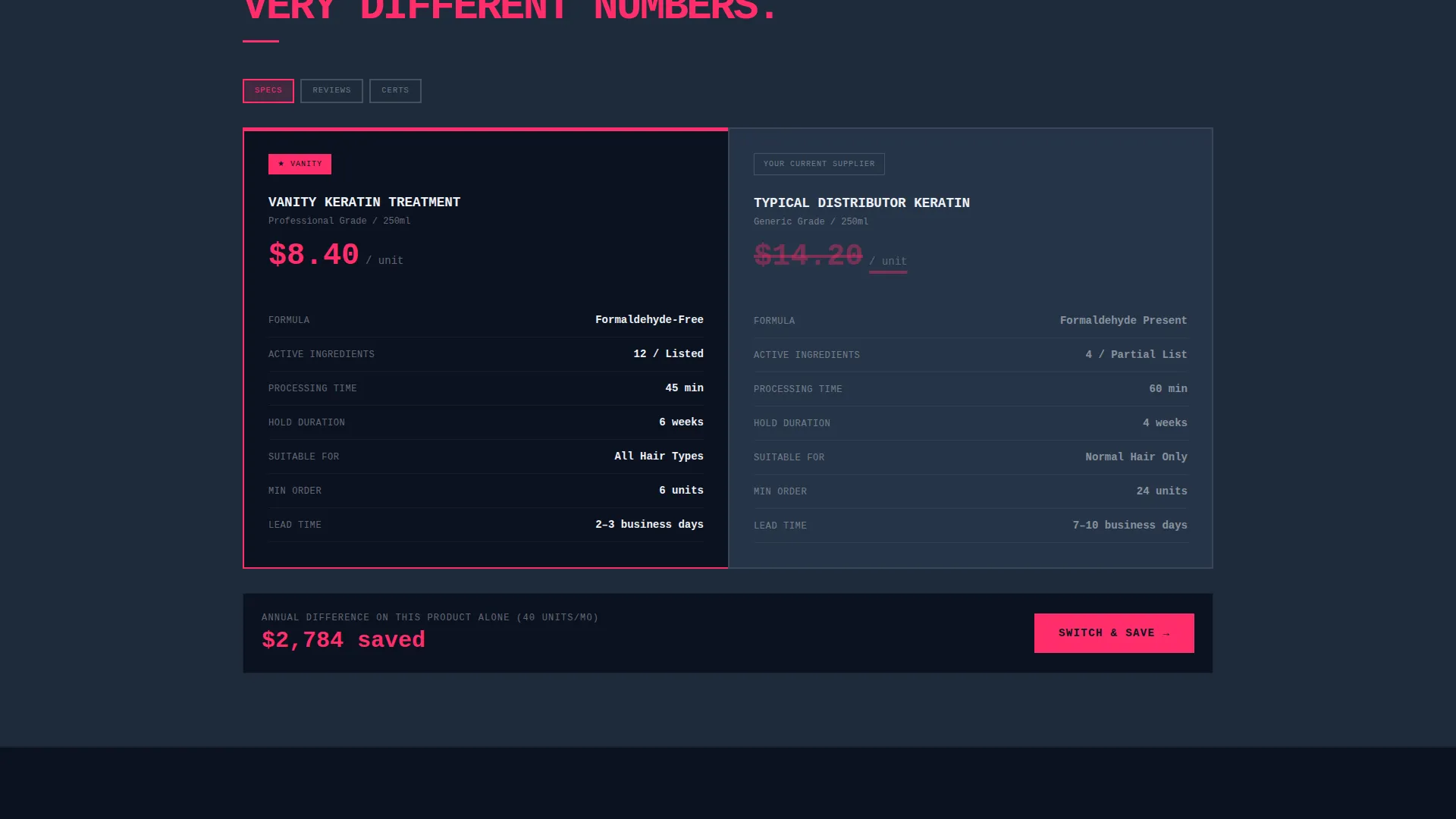
The second scroll reveal places two products side by side on concrete-textured card surfaces. Visitors drag to swap specs, reviews, and certifications between products. This hands-on interaction keeps engagement high and surfaces the information a professional buyer actually uses to make a decision.
Progressive Reorder Data Bars
The third reveal presents real reorder frequency data as thick, fill-on-scroll bar charts. Statements like "Austin stylists reordered this 3.2x per quarter" load progressively as the visitor scrolls into view. The effect builds a sense of cumulative evidence without requiring the visitor to read dense paragraphs.
Dual Conversion Path Layout
A "Switch & Save" button appears first inside the calculator results, then pins to the bottom of the viewport after the second scroll reveal. A secondary call to action offers a downloadable PDF price comparison behind a lightweight email-and-salon-name gate, giving buyers something tangible to share internally.
Bold Brutalist Visual System
Typography is rendered in a raw, monospaced typeface that looks stamped onto the screen. Thick-bordered input fields, oversized numerals, and gunmetal card surfaces create a warehouse aesthetic. The shock-pink accent is used exclusively for interactive states, price callouts, and call-to-action buttons, keeping the visual hierarchy clear and intentional.
Page sections overview
| Section | Purpose |
|---|---|
| Calculator Header | Capture category, volume, and current unit price; return annual savings instantly |
| Category Product Cards | Reveal top five products for the selected category with cost and ingredient data |
| Drag-to-Compare Module | Let visitors swap specs and certifications between two products side by side |
| Reorder Data Bars | Show scrolling bar charts of real reorder frequency to build purchase confidence |
| Sticky call to action Bar | Keep "Switch & Save" visible in the viewport after the second scroll reveal |
| PDF Download Gate | Offer a price-comparison PDF in exchange for an email address and salon name |
Design & branding system
The visual identity is built around confrontation rather than comfort. The palette and typography are chosen to feel industrial and evidence-first, the opposite of the soft tones common in beauty retail.
- Color system: abyssal navy (#0B1120) as the dominant background, gunmetal slab (#1E2A3A) for card surfaces and section dividers, clinical white (#EDF0F5) for body text and product names, and shock-pink (#FF2D6B) reserved for interactive states, price callouts, and call-to-action buttons
- Typography: raw monospaced typeface used for all headings and numerals, giving the page a stamped, receipt-printed quality that reinforces the data-first tone
- No lifestyle photography or model imagery; all visual weight comes from numbers, thick borders, and oversized typographic elements
Mobile & speed optimization
The template's layout is designed to retain its brutalist impact at smaller screen sizes. Thick borders, full-width cards, and large numerals scale naturally to mobile viewports without losing hierarchy.
- The calculator's input fields and results display are formatted for touch interaction, with oversized tap targets and clear numeric outputs
- Progressive scroll reveal animations are tied to viewport entry, meaning each section loads its visual state as it enters the screen rather than all at once
How this template helps you convert
Every design and layout decision in this template is aimed at reducing the distance between a visitor's first question and their decision to act.
- The calculator leads with the visitor's own numbers, so the case for switching is built from their actual monthly spend before any product is promoted
- The progressive reveal structure means each scroll adds one more layer of evidence, from product specs to peer reorder data, building trust incrementally rather than front-loading claims
- The dual call-to-action system captures both the visitor who is ready to switch now and the one who needs internal sign-off, by offering both an immediate action and a shareable PDF comparison
Other information about this template
This template is categorized under Beauty and Salon Digital Presence within the broader Technology category. It is built specifically for the beauty and salon online store niche, where professional buyers need more than a product listing to justify switching suppliers.
- The template style is Scroll Reveal (Progressive), meaning sections animate into view as the visitor scrolls rather than loading all content at once
- The header concept is a Calculator/Estimator, a format that anchors the entire page to the visitor's real purchase context from the first second of the visit
- The landing page direction is Comparison/Versus, positioning every section as a direct argument against the visitor's current supplier
- The creative direction is Interactive Explorer, where the visitor's own inputs actively shape what content the page surfaces
Theme
Bold Brutalist
Creative direction
Interactive Explorer
Color system
Midnight Blue
Style
Scroll Reveal (Progressive)
Direction
Comparison/Versus
Page Sections
Header Cost-comparison Calculator
Category-driven Scroll Reveals
Drag-to-compare Product Module
Progressive Reorder Data Bars
Dual Conversion Path Layout
Bold Brutalist Visual System
Related questions
Who is this landing page template designed for?
Does this template require product photography?
How does the calculator section work?
Can the page adapt to different product categories?
What are the two conversion paths in this template?



