Authoritative Accounting Services Landing Page Template
Ledger is a financial services welcome landing page built around a live portfolio growth calculator. It greets newly onboarded investors with personalized projected numbers, a feature comparison grid, and frosted glass data cards. The dark, iridescent design mirrors a professional trading terminal, making every new signup feel like they just unlocked something built specifically for them.
by Rocket studio
Quick summary
Ledger is a single-page financial welcome experience that opens with an interactive calculator pre-loaded with the user's data. It guides visitors through projected returns, a competitive feature matrix, and persona-matched social proof. The design is a dense, glass-dark dashboard aesthetic built for retail investors, first-time budgeters, and professionals who just completed a 401(k) rollover.
Who this template is for
This template is built for financial services platforms that need to convert newly onboarded users into first-funding action. It speaks directly to people who need validation before they move money.
- Newly onboarded retail investors who want to see projected returns before committing further
- First-time budgeters moving away from spreadsheets and looking for fee transparency
- Mid-career professionals who completed a 401(k) rollover and need confidence in their choice
What problem this template solves
New signups on financial platforms often feel uncertain after onboarding. They need one clear moment that confirms they chose correctly. Most welcome pages fail to provide that moment.
- Generic welcome screens don't use the user's own data to build confidence
- Visitors abandon because they can't compare fees or features quickly and clearly
- No contextual call to action means the visitor leaves before they act on their intent
What you get with this template
You get a fully structured, single-page welcome layout that takes a new signup from curiosity to commitment. Every section is designed to reduce doubt and raise conviction.
- An interactive hero calculator with animated dual trendlines and a draggable contribution slider
- A structured feature comparison grid with micro-data cells and pulsing iridescent highlights
- Floating frosted glass stat cards, persona-matched testimonials, and a contextual pinned call to action
Feature list
This template bundles high-interactivity components with a purposeful visual hierarchy. Each feature below is built from the source brief.
Interactive Portfolio Growth Calculator
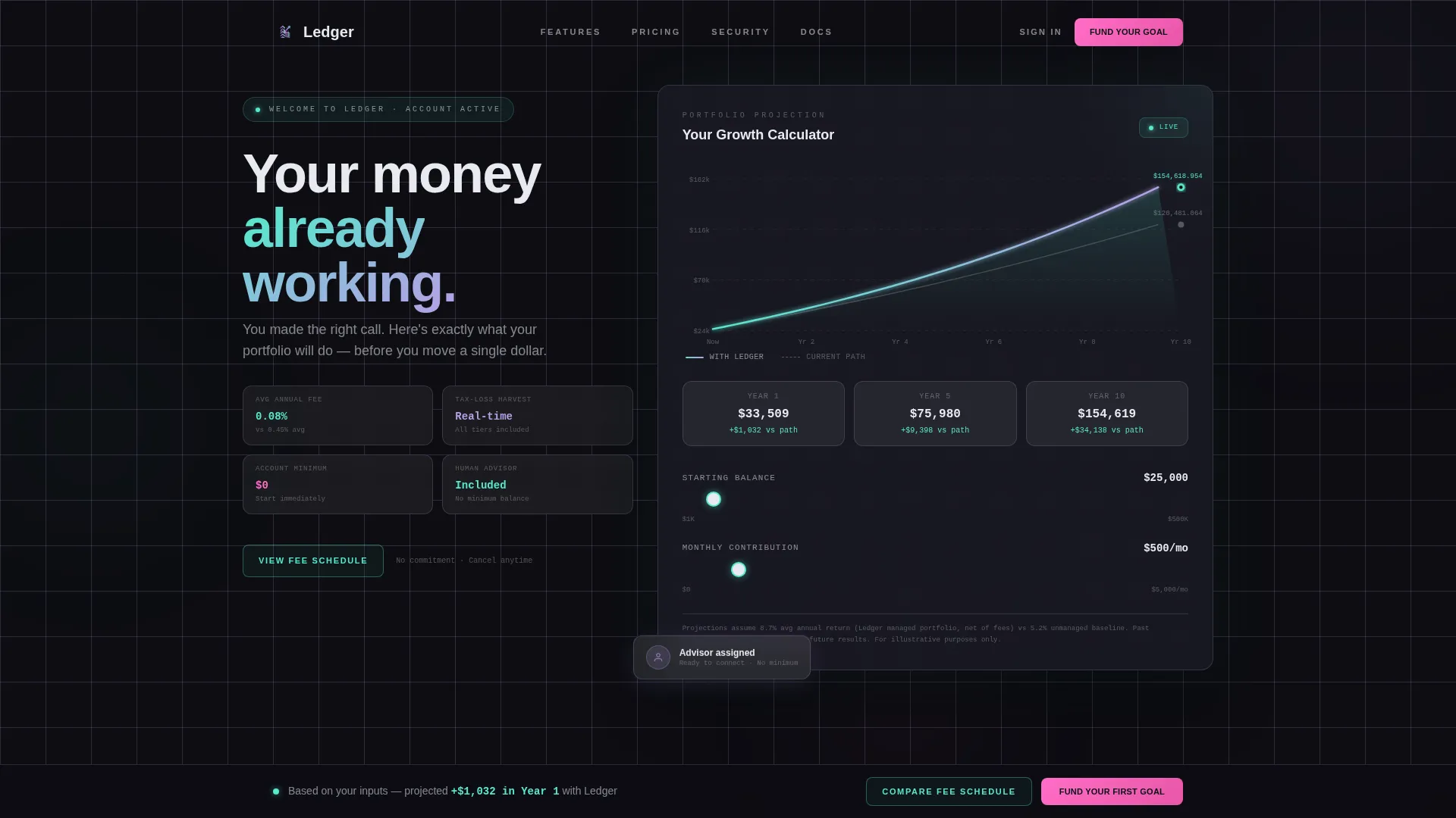
The header section contains a live calculator widget pre-populated with onboarding data or smart defaults. A draggable monthly contribution slider sits below a dual-line animated chart. Two trendlines diverge in real time: a muted gray line for the current path and a teal-to-lilac gradient line for the projected Ledger path. Every slider adjustment redraws both curves instantly.
Feature Comparison Matrix
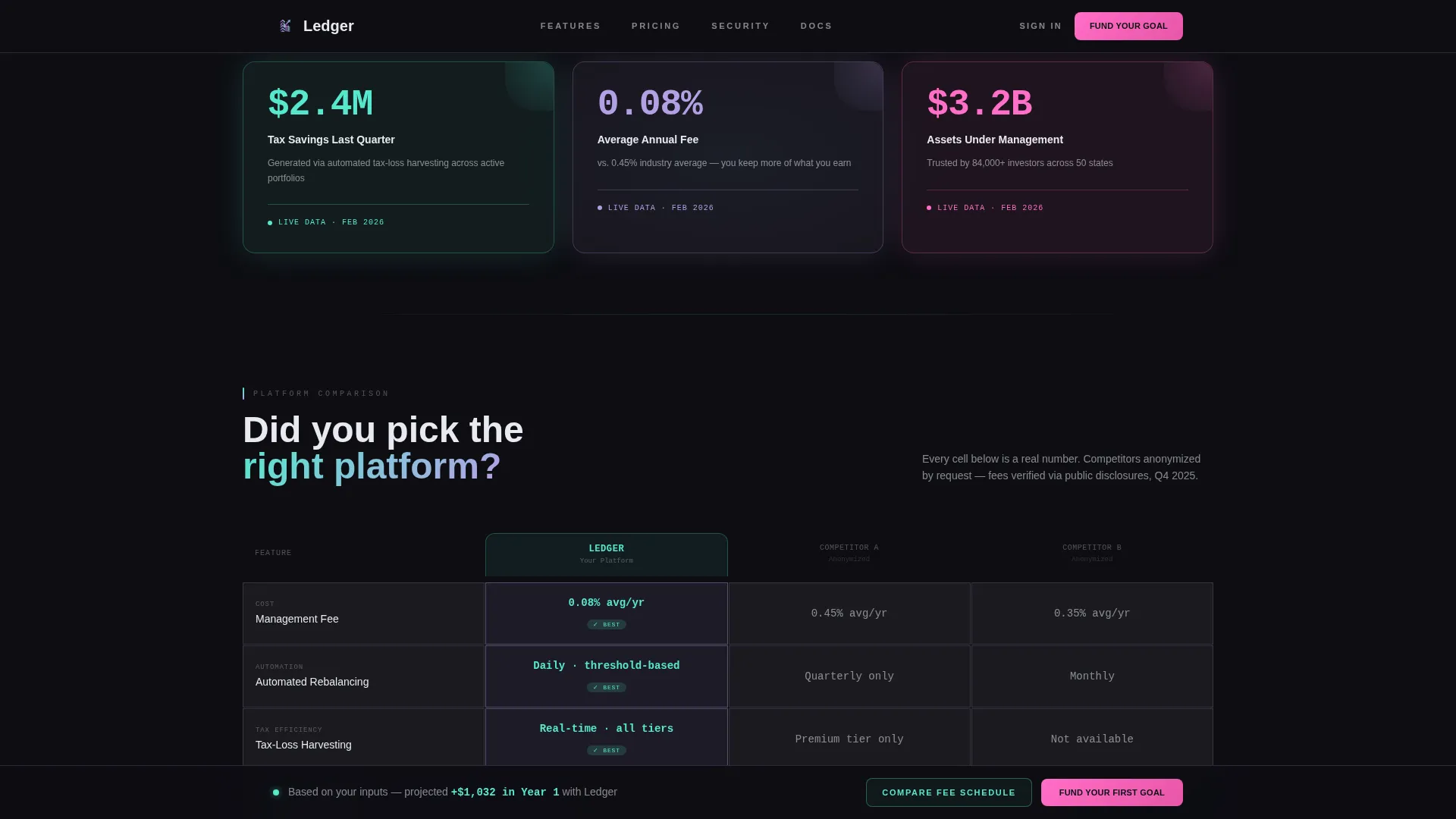
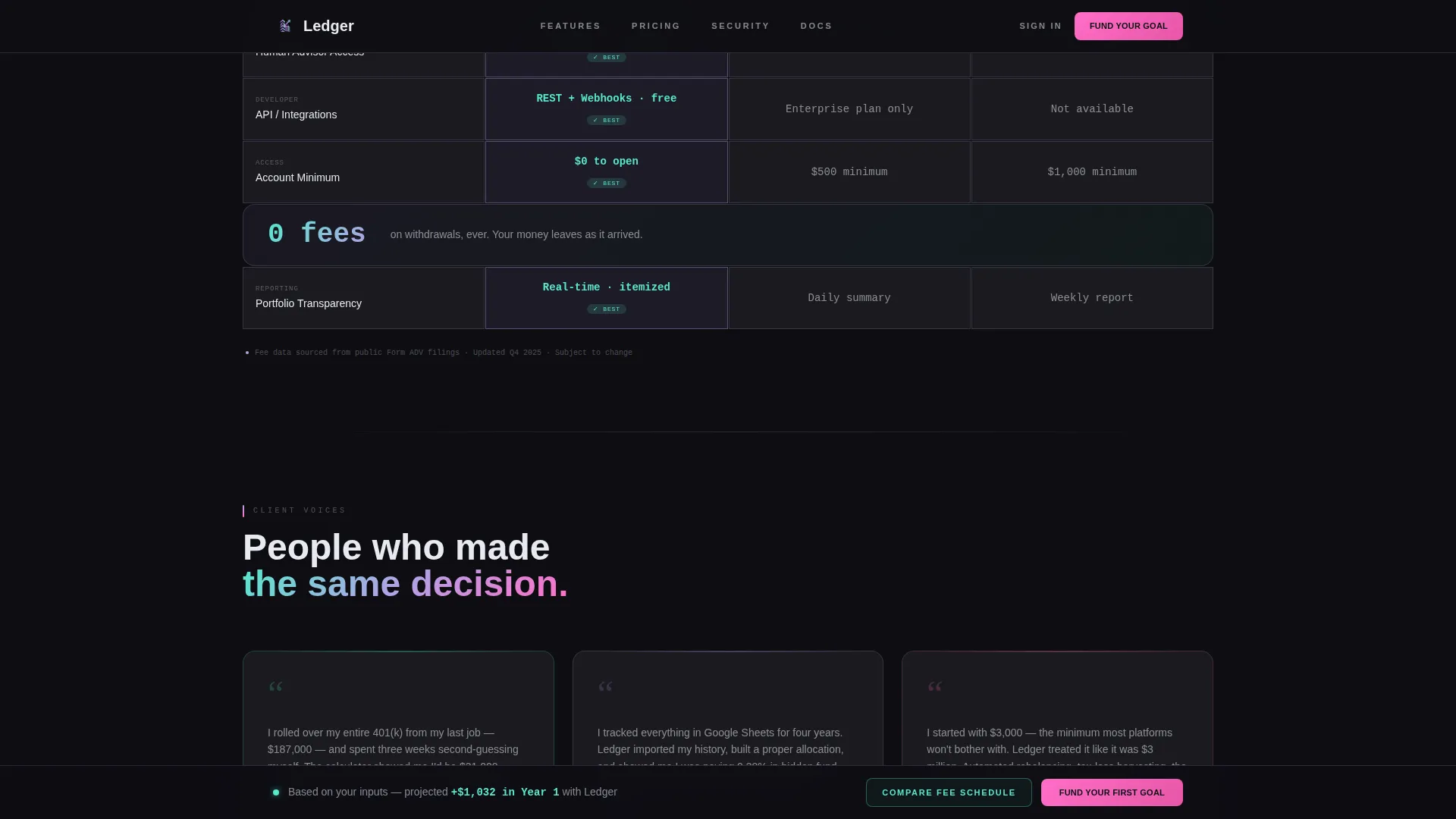
A row-by-row grid compares platform capabilities against two anonymized competitors. Rows cover automated rebalancing, tax-loss harvesting, fee transparency, human advisor access, and API integrations. Cells show micro-data rather than plain checkmarks, for example "0.08% avg fee" versus "0.45% avg fee." Ledger's winning cells pulse gently with iridescent highlights on scroll reveal.
Floating Stat Callout Cards
Three frosted glass metric cards break the scroll between major sections. Each card surfaces a single high-impact number, such as platform tax savings from the prior quarter, average fee rate, or total assets under management. The frosted panel white surface on an obsidian background gives each card visual weight without interrupting the grid rhythm.
Contextual Pinned Call to Action
After the user interacts with the calculator, a primary call-to-action bar pins to the bottom of the viewport. The label updates dynamically to reflect the visitor's projected gain, for example "Fund Your First Goal, projected +$14,200 in Year 1." A secondary path opens a slide-out panel with granular fee schedule breakdowns for visitors still in evaluation mode.
Persona-Matched Testimonials
Three testimonial cards are each matched to a specific user persona: a 401(k) rollover client, a first-time budgeter, and a retail investor. Each card displays a role and context label alongside the quote, making the social proof feel specific rather than generic.
Page sections overview
| Section | Purpose |
|---|---|
| Hero Calculator | Interactive trendline widget with draggable slider and live projected gain |
| Stat Callout Strip | Three floating glass metric cards showing tax savings, average fee, and assets under management |
| Feature Matrix Grid | Row-by-row capability comparison with micro-data cells against two competitors |
| Testimonials Block | Three persona-matched quote cards with role and context labels |
| Final call to action Section | Contextual pinned call to action with projected number and fee schedule slide-out |
| Single-Row Footer | Linear single-row footer with navigation and legal links |
Design & branding system
The visual language is Tech Glass: dark, dense, and precise. Color appears only where it earns attention. The base is a deep obsidian (#0D0D12), with iridescent accents reserved for data, gradients, and calls to action.
- Typography uses DM Sans for all headings and body copy, with JetBrains Mono for numerical data and grid cells
- The color system pairs holographic lilac (#B4A0E5) and spectral teal (#56E8CD) as gradient accents on cards and chart lines, with iridescent pink (#FF6EC7) reserved exclusively for calls to action and active states
- Data grid borders use 1-pixel lilac strokes at 20% opacity, giving each module the look of etched glass floating above a dark surface
Mobile & speed optimization
The template is designed desktop-first to reflect a Bloomberg terminal aesthetic, with a mobile-responsive fallback layout for smaller viewports. Static sections use server-rendered components, while interactive elements are isolated as client components.
- The calculator and chart run as client components to keep live interactivity fast and contained
- GSAP scroll reveals and animated trendlines use Canvas and SVG rendering to stay smooth on supported devices
- Static sections such as the testimonials, stat cards, and footer are built as server components to reduce client-side load
How this template helps you convert
Every section is arranged to move a skeptical new signup toward a single, confident first action. The page does not ask visitors to trust a brand; it asks them to trust their own numbers.
- The hero calculator plants a personal projected number in the visitor's mind before any feature claim is made, making the rest of the page feel like proof rather than persuasion.
- The feature matrix answers the comparison question directly, showing fee data and capability gaps row by row so the visitor does not need to leave the page to research competitors.
- The contextual pinned call to action references the exact projected gain the visitor calculated in the header, so clicking feels like confirming a decision already made rather than taking a leap.
Other information about this template
This template ships as a dashboard and data grid layout within the Financial Services Email Templates subcategory. It is built under the Technology category and is designed for the financial services welcome email niche. A few additional details worth knowing before you build with it:
- The template style is Dashboard and Data Grid, meaning the core layout logic is structured around rows, columns, and modular data cells rather than editorial flow
- The creative direction is Feature Matrix, so the comparison section is the structural centerpiece of the page
- The header concept is Calculator and Estimator, making the interactive widget the primary hook rather than a static hero image or headline
- The landing page direction is Comparison and Versus, which means the page architecture is explicitly built to answer the question "why this platform over the alternatives"
- The color system is AI Iridescent, using a controlled palette where holographic color appears only on meaningful data points and calls to action
- Localization defaults to English (US) with USD currency formatting and MM/DD/YYYY date display

Theme
Tech Glass
Creative direction
Feature Matrix
Color system
AI Iridescent
Style
Dashboard/Data Grid
Direction
Comparison/Versus
Page Sections
Interactive Portfolio Growth Calculator
Feature Comparison Matrix with Micro-data
Floating Frosted Glass Stat Cards
Contextual Pinned Call to Action
Persona-matched Testimonial Cards
Tech Glass Dashboard Layout
Related questions
Can I customize the projected numbers shown in the calculator?
Does the feature comparison grid require real competitor data to work?
Is the pinned call-to-action label editable?
What typography does this template use?
How many sections does the template include?



