Vault — Fintech Platform Landing Page Template
Ledger is a comparison table landing page built for financial services storefronts. It presents tools, platforms, and service subscriptions side by side in a dense, data-forward layout styled like a dark-mode fintech dashboard. Visitors browse by category, compare products in detail, and click through to purchase, all without filling out a single form.
by Rocket studio
Quick summary
Ledger is a single-page financial services storefront template built around a three-level comparison experience. Visitors start with broad category tiles, drill into a full sortable comparison table, and land on a focused single-product view. The Acid Digital color system and Dashboard Preview header make the page feel like a live research tool, not a static brochure.
Who this template is for
This template is designed for anyone building a digital storefront around financial tools and service subscriptions. It fits operators who need to present dense product information clearly and move buyers from research to purchase without friction.
- Solo financial advisors rebuilding their technology stack and comparing service options
- Fintech startup founders evaluating payment processors, portfolio platforms, or tax tools
- Compliance officers comparing audit and regulatory software before renewal deadlines
What problem this template solves
Buyers of financial software often leave pages without deciding because the information is scattered, shallow, or buried behind forms. Ledger removes that friction by surfacing every relevant data point directly in the page layout.
- Visitors cannot compare products side by side on most storefront pages, so they leave to search elsewhere
- Generic layouts fail to communicate the density and specificity that financial buyers expect before committing
- Form-gated flows create resistance at the exact moment a buyer is ready to act
What you get with this template
Ledger delivers a fully structured comparison table landing page with three progressive scroll levels, each narrowing the buyer's focus from browsing to deciding. Every component is built around click-through conversion, not lead capture.
- A Dashboard Preview header with a live-rendered comparison grid, animated star ratings, and a self-typing headline
- A three-section Feature Matrix that moves from category tiles to a full comparison table to a single-product deep-dive
- A sticky bottom comparison bar, chartreuse call-to-action buttons on every product row, and an "Add to Comparison" shortlist system
Feature list
This template is built around a specific set of components drawn directly from its brief. Each feature serves the goal of turning a financial product browser into a confident buyer.
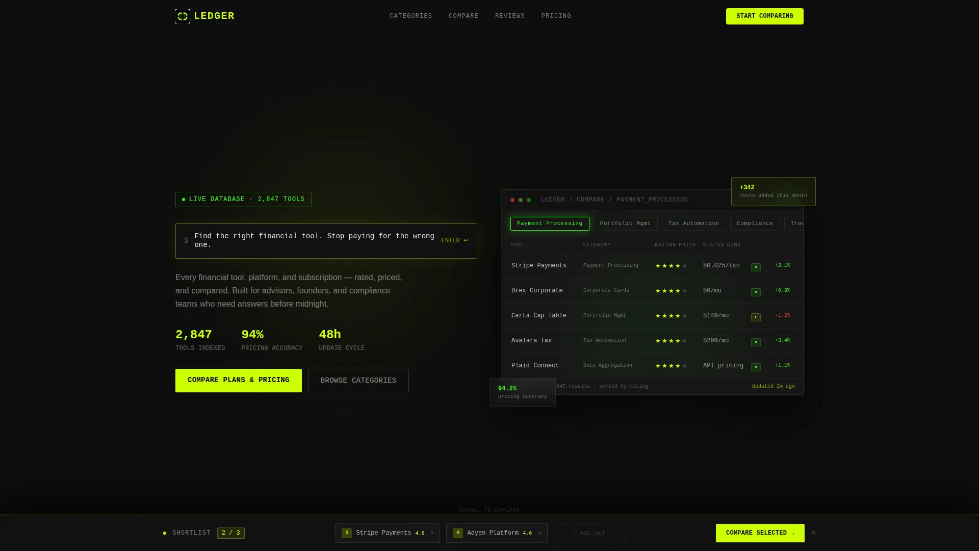
Animated Dashboard Preview Header
The header opens with a live-rendered comparison grid already populated with three financial service categories and real product names partially visible. Star ratings pulse in, filter chips sit toggled along the top, and a subtle parallax shifts the dashboard rows as the cursor moves. A headline types itself into a search bar interface, giving the impression of an active research session already in progress.
Three-Level Feature Matrix Scroll
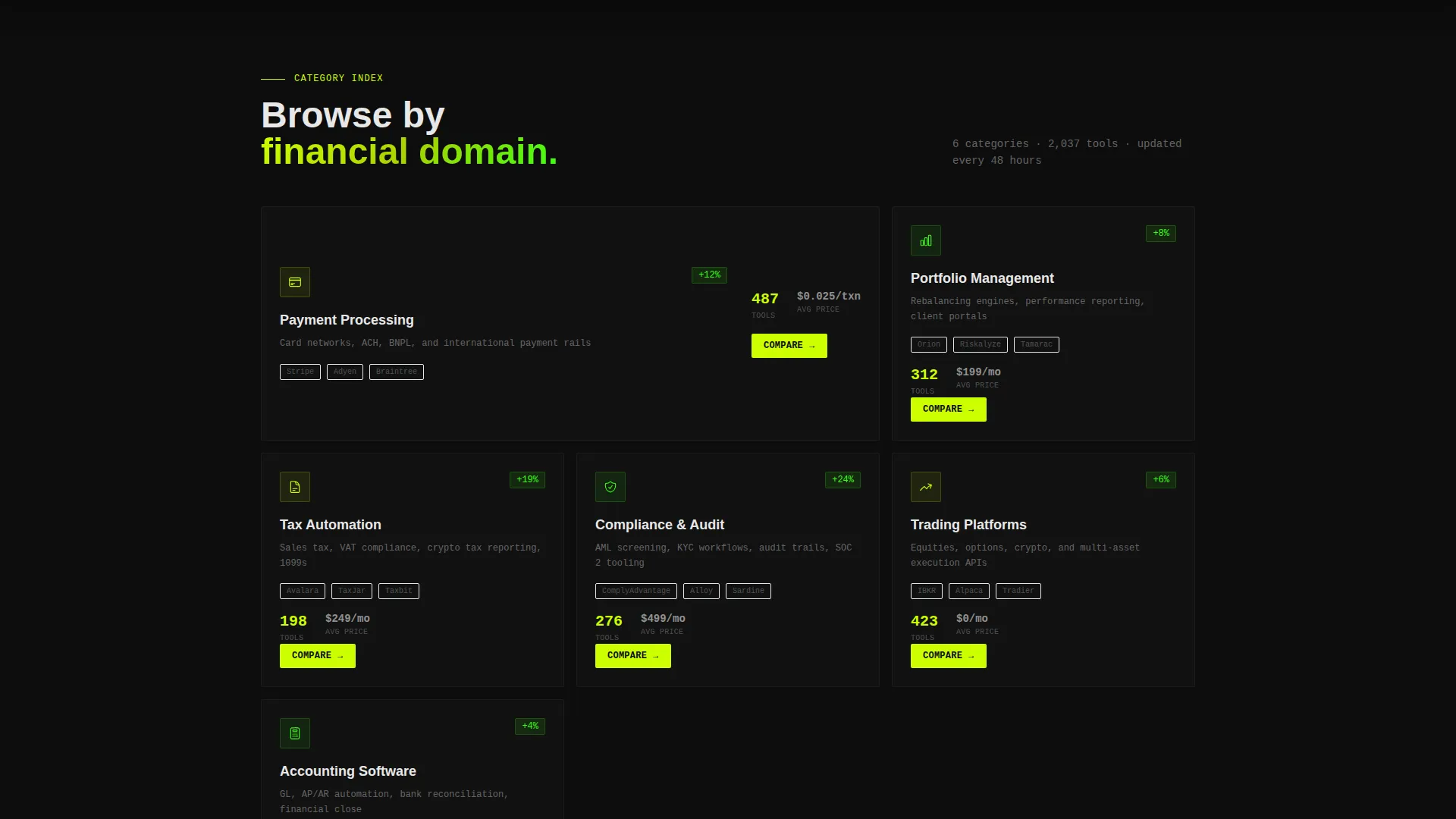
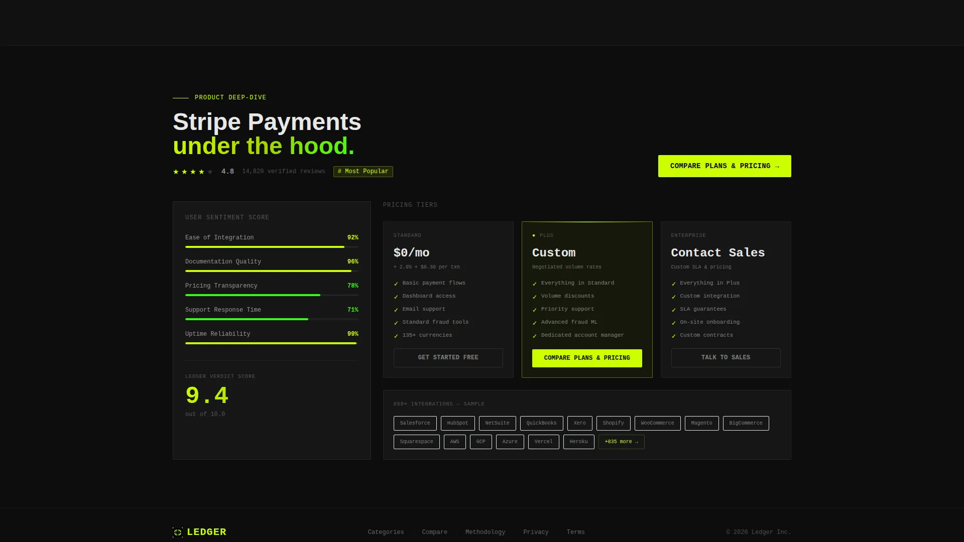
The page guides visitors through three escalating layers of specificity. The first level presents broad category cards for areas like payment processing, portfolio management, and tax automation. The second drops into a full sortable comparison table with expandable rows, checkmarks in acid chartreuse, and rejection marks in muted red. The third isolates a single product with pricing tiers, integration lists, and a user-sentiment score.
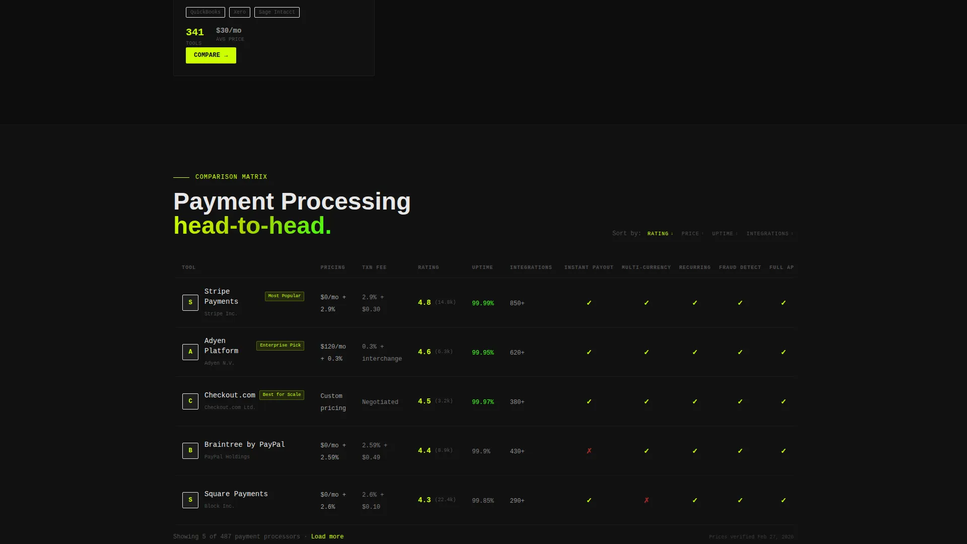
Sortable and Expandable Comparison Table
The comparison table at the heart of the page supports sortable columns and expandable product rows. Checkmarks and cross marks use the Acid Digital palette for instant visual clarity. Visitors can scan dozens of features at a glance without scrolling through separate product pages.
Sticky Shortlist Comparison Bar
A persistent bottom bar lets visitors add products to a custom shortlist as they scroll. This keeps their research context intact across the full page without requiring a login or form submission. The shortlist bar stays visible until the visitor is ready to act.
Click-Through Product calls to action
Every product row carries a primary call-to-action button labeled "Compare Plans and Pricing" rendered in electric chartreuse. Clicking routes the visitor directly to that product's dedicated purchase page. No interstitial forms interrupt the path from research to purchase decision.
Acid Digital Color System
The visual layer uses void black backgrounds so data appears to float forward like light on glass. Electric chartreuse drives call-to-action buttons and hover states. Terminal phosphor green marks active filters and selected rows, while cool data gray and interface white handle table headers and supporting text.
Page sections overview
| Section | Purpose |
|---|---|
| Dashboard Preview Header | Opens the page with an animated comparison grid and self-typing search bar headline |
| Category Tile Grid | Presents broad financial service categories as clickable browsing tiles |
| Full Comparison Table | Delivers sortable, expandable product rows with visual checkmarks and pricing signals |
| Single Product Deep-Dive | Isolates one product with pricing tiers, integrations, and a sentiment score |
| Sticky Comparison Bar | Lets visitors build and hold a custom product shortlist throughout the session |
Design & branding system
The template follows a Directory and Discovery theme executed through the Acid Digital color system. Every design decision reinforces the feeling of a high-precision, dark-mode fintech dashboard.
- Void black (#0D0D0D) owns every background, keeping data elements visually elevated
- Electric chartreuse (#CCFF00) drives call-to-action buttons and hover states; terminal phosphor green (#39FF14) marks active filters and selected rows
- Cool data gray (#1A1A2E) and interface white (#E8E8E8) anchor table headers and body text for strong contrast and readability
Mobile & speed optimization
The layout is designed to keep its information density readable and navigable at smaller screen sizes. The comparison table structure and sticky bar are built to function without horizontal overflow or layout collapse on mobile viewports.
- The three-level scroll structure keeps content logically layered so mobile visitors can progress through the funnel at their own pace
- Filter chips, sortable columns, and expandable rows are sized for touch interaction, not just cursor-based navigation
How this template helps you convert
Ledger earns the click before asking for it. The entire layout is built to answer objections through information rather than persuasion copy or form barriers.
- The Dashboard Preview header immediately signals that this is a research tool, not a marketing page, building instant credibility with detail-oriented financial buyers
- The three-level Feature Matrix progressively narrows the buyer's focus from category exploration to a direct product decision, reducing cognitive load at each step
- The chartreuse "Compare Plans and Pricing" button sits at the end of every row, so the call to action appears exactly when the visitor has enough information to act
Other information about this template
This template is well suited for financial services digital presence projects where trust, data clarity, and directional navigation matter more than visual minimalism. It fits within a broader technology category serving fintech storefronts, comparison platforms, and financial tool directories.
- The no-form-field approach is deliberate: conversion is earned through information density, not persuasion sequences
- The template style is a Comparison Table layout with a Click-Through landing page direction, meaning every design element points toward a product page visit rather than an on-page conversion event
- The header concept, Feature Matrix creative direction, and Directory and Discovery theme are all aligned to serve buyers who arrive with specific research intent and need structured information to move forward
Theme
Directory & Discovery
Creative direction
Feature Matrix
Color system
Acid Digital
Style
Comparison Table
Direction
Click-Through
Page Sections
Animated Dashboard Preview Header
Three-level Feature Matrix Scroll
Sortable and Expandable Comparison Table
Sticky Shortlist Comparison Bar
Click-through Product Row Ctas
Related questions
Who is the Ledger template built for?
Does this template require visitors to fill out a form?
Can visitors compare multiple products at once?
How is the comparison table structured?
What makes the header different from a standard hero section?



