Pharmacy Software Portfolio & Case Study Website Template
The Dispense Command Center Portfolio Management Landing Page Template is built for pharmacy property management firms that need to turn lease data into decisive action. It presents a dark glassmorphism dashboard aesthetic, a six-dimension comparison grid, and a case-study-backed conversion flow that moves CFOs and portfolio operators from skepticism to a qualified lead in a single scroll.
by Rocket studio
Quick summary
This portfolio landing page template puts your entire pharmacy real estate operation on one screen. Every lease term, every CAM variance, and every occupancy cost is presented as live-looking data inside frosted glass panels. The page is built to showcase your service portfolio with confidence and convert qualified visitors into leads through a metric-driven comparison experience.
Who this template is for
This template is designed for pharmacy property management firms presenting their services to a data-literate, high-stakes audience. It speaks directly to operators who run multiple locations and expect every portfolio decision to be backed by numbers.
- Regional pharmacy chain operators overseeing 15 to 80 locations
- Private equity groups holding pharmacy-anchored retail portfolios
- Independent pharmacy owners managing rent escalations alongside DIR fee compression
What problem this template solves
Generic property management firms leave pharmacy operators exposed. Overbilled CAM charges go undetected, lease renewal windows get missed, and occupancy costs quietly compress margins. A standard corporate website cannot communicate the precision required to win this audience's trust. This portfolio landing page is built to change that.
- Visitors arrive skeptical; the data-forward design answers that skepticism immediately
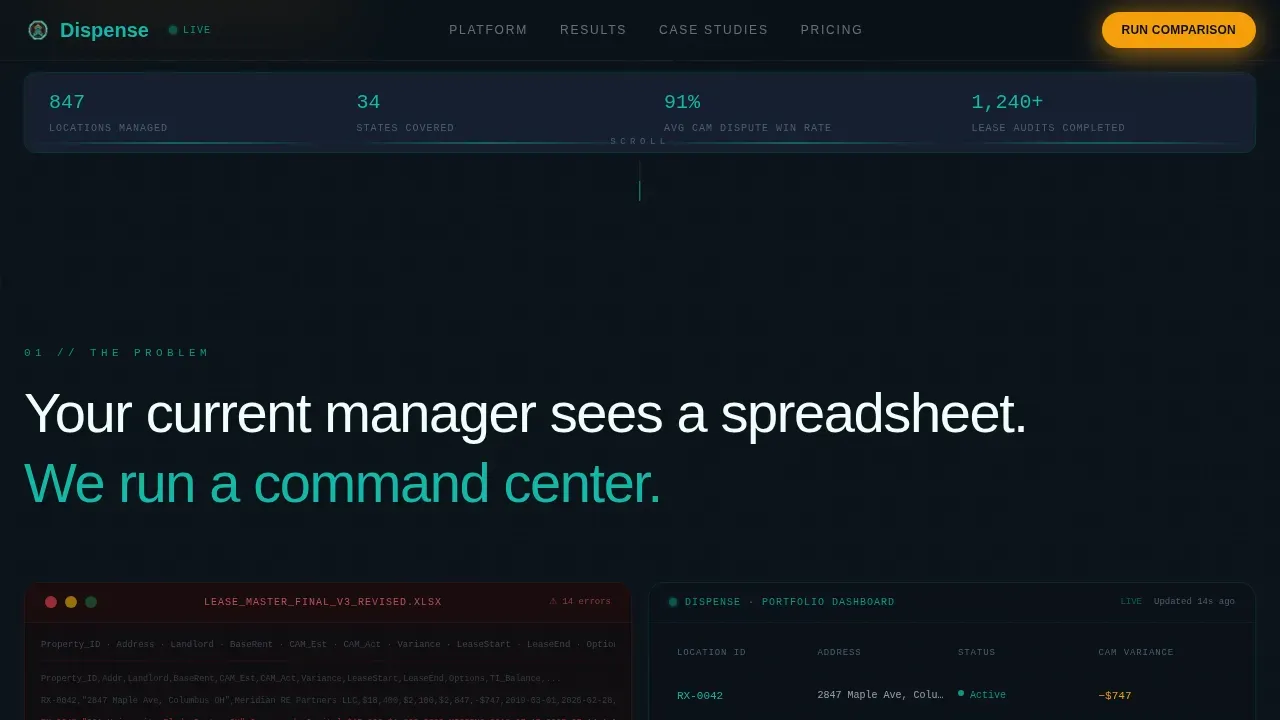
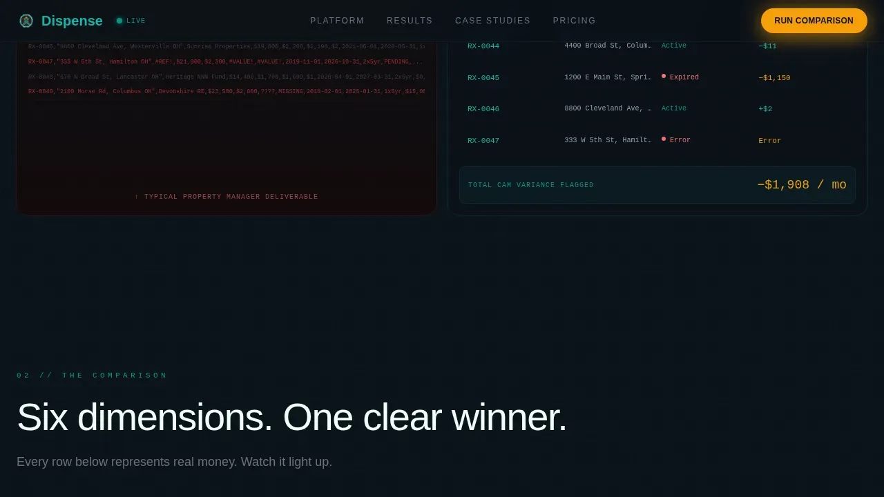
- The old spreadsheet-versus-dashboard contrast makes the cost of inaction visible
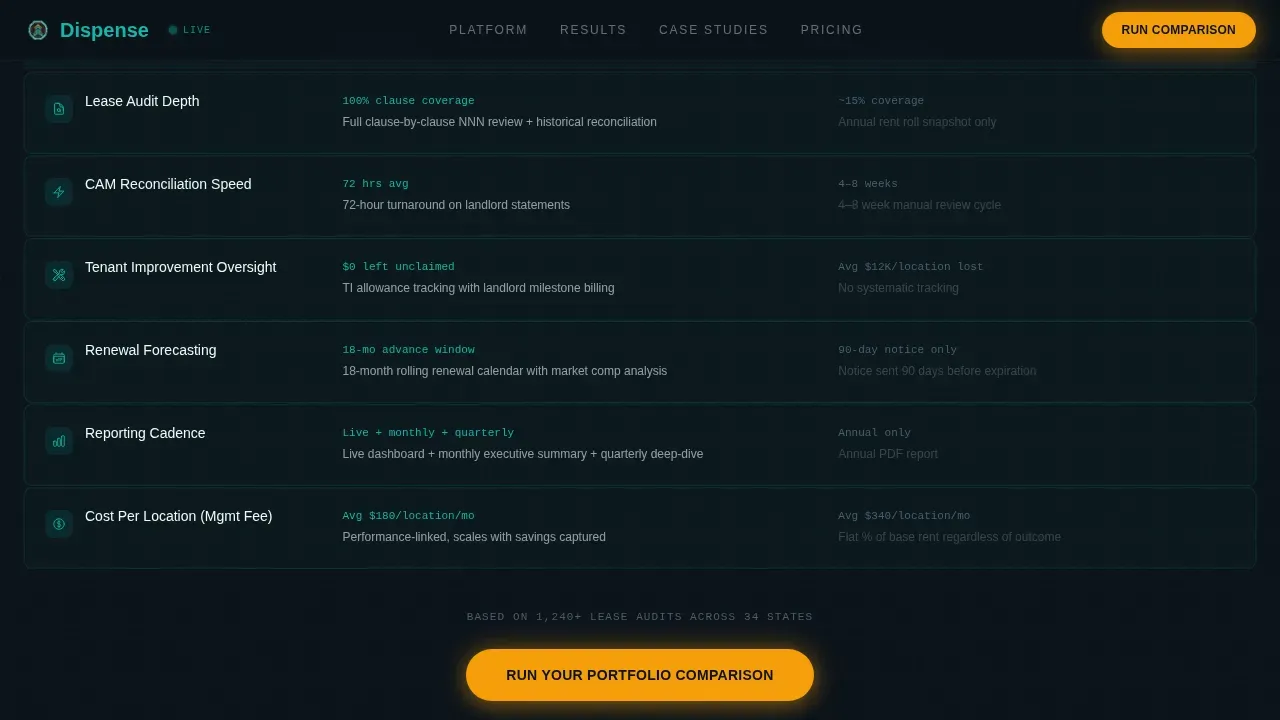
- The six-dimension comparison grid removes ambiguity about which service is superior
What you get with this template
You get a fully structured, single-page conversion experience built around a dark command center visual identity. The layout is clean, modular, and designed so critical information lands in the visual field first. Every section exists to move an operator closer to clicking the primary call to action.
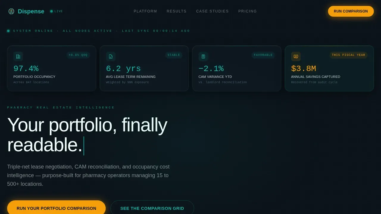
- A glassmorphic hero section displaying four live-looking portfolio metrics
- A six-row comparison grid with teal and gray row lighting for each service dimension
- A two-field lead qualifier form and a secondary checklist download path
Feature list
This template delivers six prompt-backed capabilities that work together to present your service portfolio with authority and generate qualified leads.
Glassmorphic Metric Hero
Four frosted glass panels display occupancy rate, average lease term remaining, CAM variance, and annual savings captured. The panels slide into view against a near-black background, creating the immediate impression of a live operations dashboard. No stock photography is needed because the data is the visual.
Six-Dimension Comparison Grid
A structured versus grid compares your firm against a generic competitor across lease audit depth, CAM reconciliation speed, tenant improvement oversight, renewal forecasting, reporting cadence, and cost per location. Each row lights up in pharmaceutical teal when your firm wins the metric, and stays dim gray for the competitor column. This is service portfolio management presenting itself as an obvious choice.
Case Study Detonation Block
A dedicated section details how a 42-location pharmacy chain recovered $620,000 in overbilled CAM charges within a single audit cycle. Quantifiable metrics from real engagements help demonstrate the effectiveness of the service management approach in a way that client testimonials alone cannot.
Amber-Pulse Lead Qualifier
The primary call to action reads "Run Your Portfolio Comparison" and glows in catalyst amber. Clicking opens a two-field modal asking for number of pharmacy locations and current annual occupancy cost. This focused qualifier keeps lead generation efficient and filters for high-value prospects.
Secondary Checklist Download Path
A softer conversion option offers the Pharmacy Lease Audit Checklist as a download in exchange for an email address and portfolio size. This path supports visitors at various stages of their decision process and keeps the page working even when a visitor is not ready to engage directly.
GSAP Scroll Animation System
Sections fire into view using GSAP ScrollTrigger with staggered row reveals, typewriter headline effects, counter animations, and scan-line effects. The scroll feels like a countdown sequence, with each section building momentum. Interactive elements include comparison grid row hover lighting and an amber pulse on the call-to-action button.
Page sections overview
| Section | Purpose |
|---|---|
| Glassmorphic Hero Panels | Display four live-looking pharmacy portfolio metrics |
| Old versus. New Contrast | Split view showing spreadsheet chaos against dashboard clarity |
| Six-Dimension Versus Grid | Compare services row by row with color-coded lighting |
| Case Study Block | Present the 42-location, $620K CAM recovery result |
| Lead Qualifier Form | Capture location count and occupancy cost for qualification |
| Checklist Download Path | Secondary conversion for visitors exploring services |
| Developer Minimal Footer | Clean footer closing the page with minimal distraction |
Design & branding system
The visual identity follows a Data Command theme built on the Teal Catalyst color system. The palette feels like the glow of a monitoring dashboard in a darkened operations room: cool, controlled, and precise. Catalyst amber is reserved for alerts, comparison highlights, and call-to-action pulses so it always commands attention when it appears.
- Deep operations black (#0B1219) as the dominant background, pharmaceutical teal (#0D9488) as the primary accent, clinical white (#F0FDFA) for body text, and catalyst amber (#F59E0B) for action moments
- DM Sans for headings, JetBrains Mono for data and metrics, and Manrope for body copy
- Glassmorphism depth with light refracting at panel edges, scan-line graphics, and zero stock imagery
Mobile & speed optimization
The template is built desktop-first, reflecting the 6 AM command center operator audience who works from a large screen. The layout is clean and modular so that all elements scale predictably across device sizes. Designers can adapt the grid and panel components without disrupting the visual hierarchy.
- Modular widget panels resize cleanly to support various screen contexts
- Client-side animation components are separated from the server component shell for smoother rendering
- The overall page structure supports fast-loading practices, since load time directly impacts conversion rates on portfolio landing pages
How this template helps you convert
This portfolio landing page earns the click before the button is ever pressed. The comparison grid does the selling. By the time a visitor reaches the call-to-action block, the page has already demonstrated, metric by metric, that their current service management approach is likely leaving money on the table.
- The hero metrics create immediate authority by presenting your service portfolio as a live, controlled system rather than a brochure.
- The versus grid removes the need for persuasive copy by letting structured data represent the superiority of your services across every dimension.
- The dual conversion path captures both ready-to-engage operators and exploratory visitors, maximizing lead generation across the full audience.
Other information about this template
This template fits naturally into the broader practice of service portfolio management, where organizations must make informed decisions on which services to invest in, maintain, or retire. A well-structured service portfolio includes the service catalog, service pipeline, and retired service catalog, covering various stages of the service lifecycle. This landing page presents that full picture in a single, readable view.
- The service pipeline feeds into the service portfolio and enables the entire service lifecycle. This template supports presenting those catalogs and stages in a way that is immediately readable to a financial audience.
- Retired services and retired service catalog entries can be referenced within the comparison grid to show how your service strategy has evolved, reinforcing a corporate narrative of continuous improvement.
- The template structure supports service knowledge management system principles by surfacing only the most relevant data for immediate action, avoiding the data clutter that undermines decision-making.
- Designers can explore the customizable layout to adapt icons, graphics, and slide-style panels for adjacent niches such as contract management, retail real estate, or broader service catalogue presentation needs.
- The template is free to customize with your own metrics, icons, and case study figures. Download the template and test different portfolio landing page structures to find what resonates best with your specific audience.
Theme
Data Command
Creative direction
Launch Energy
Color system
Teal Catalyst
Direction
Comparison/Versus
Page Sections
Glassmorphic Portfolio Metric Hero
Six-dimension Versus Grid
Case Study Detonation Block
Dual Conversion Path with Lead Qualifier
GSAP Scroll Animation System
Modular Dark Dashboard Layout
Related questions
What type of business is this template built for?
Can I customize the metrics and comparison grid rows?
Does the template include the lead qualifier form?
What animations are included in this template?
Is this template suitable for presenting a full service portfolio to enterprise clients?



